
I’ve only been complaining all year about how I didn’t think my Lost & Found Trilogy covers were doing their jobs. Ten months after the fact, I finally had time in my schedule to redo them. Actually, as with my Christmas cover I talked about last week, redoing them was a process over several weeks (even months), and can outline it for you here.
I always had the basic idea of a city background in mind. Billionaire book covers usually have a city behind them and sometimes the look of the male model positioned in front of a window, alluding to him being in his office. This was the look I was going for here:
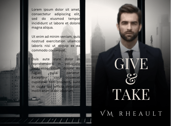


I really, really like the background, and I still wish I could have made it work somehow. But the windowpanes are in a bad spot, and while Canva has tools that could get rid of them on the back cover, it just wasn’t working. I realized I wanted color.
I went the complete opposite way and came up with these. I’m not sure why I didn’t do the third, or maybe I did and deleted it, but at one point, I was almost sure I was going to go with these and even announced it on Twitter.

They aren’t bad. I remember looking through Google searches of Billionaire book covers and this was a style I borrowed off of a premade, I think. Floating around somewhere is a book that actually uses this background, but I’m not going to waste time trying to find it. Let’s just say she probably did a better job than I did. There’s nothing precisely wrong with these… I love the ombré look of the blurb… but they aren’t eye catching, either.
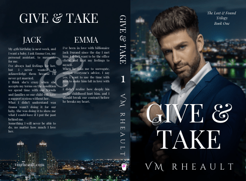
I went back to square one, and came up with different renditions of the the covers I published:
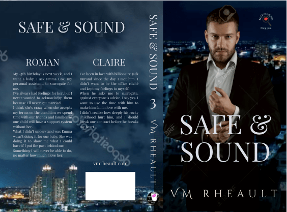
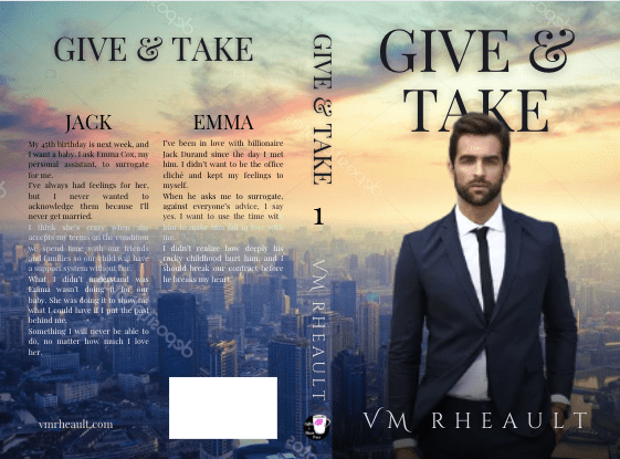
Part of the problem I had, and will always have, is looking for age-appropriate men. Two characters are in their middle forties, and one is in his middle thirties. I liked the dark background enough that I kept it, but I wasn’t sold on the models. Especially for Safe & Sound since he came from 123rf.com and I don’t have a package with them. Not that that would deter me if I found the perfect model, but as you can tell by now, I change my mind a lot, and there was no point throwing money at him if he wasn’t going to stick around.
In the end, I did stay with the background but swapped out the men at the last second. The only requirement was that they wore a navy suit, and my standards, no offense to the models I did use, should have been higher. Even if I’ve seen them on covers before, they were just not romance cover material.


By now I was at my wits’ ends, and I just didn’t care about anything but getting my books published, which was a bad move. I’m usually pretty patient when it comes to things like that, but It took me eight months or so to write and edit them. I’d been experimenting from the beginning because I knew how important the covers were going to be, but I blew it anyway.
So, since my Christmas novel was pretty much a wrap while the proof was with my proofer but I didn’t want to start working on my six book series until it was scheduled and the final files were uploaded, I decided to use the time to redo my trilogy. It was a long time in coming, but like A Heartache for Christmas things just kind of fell into place while I was scrolling. I’m waiting on the proofs now (I always order proofs whenever I change something significant with a book).
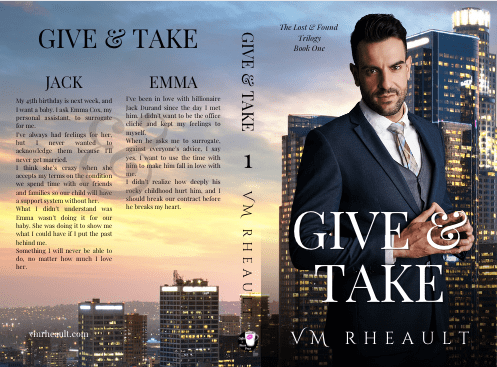


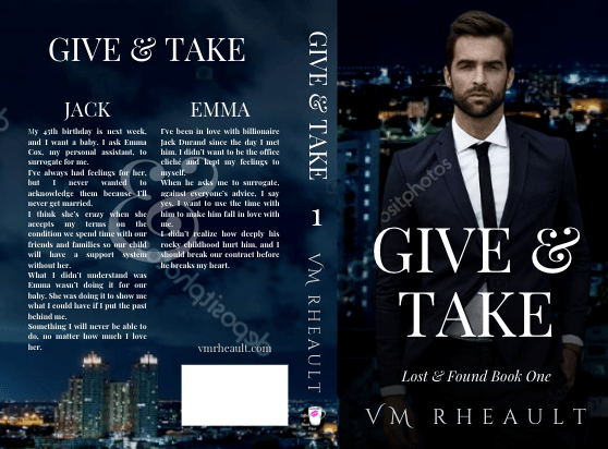
You can see I found a background image that depicts what I was trying to go for before. The sunset, but almost an arial view of the city. Like I commented in last week’s post, don’t be afraid to zoom in and move your photo around. This is the original:

I like the first guy a lot better than the smarmy man (my apologies to the model I chose for Jack) I published with, and the second guy is the same but in a different pose. He was fine, I didn’t have much to say about him. Maybe he’s a little plain with a guppy look thrown in, but hot businessmen are pretty picked over on DepositPhotos. The last guy I’ve seen around, but he’s a better fit than the model I used before and looks more like the character I think of. Plus his coloring blends in with the background which was lucky for me. I also like that they are all standing in a bit of an angle which makes them look cohesive.
Changing out covers is a pain, and my track record so far hasn’t been the best–something I was trying to avoid when I started this pen name. I switched out the covers to my duet too, so out of eleven books if you include the Christmas one coming out soon, I’ve changed the covers to a little less than half. Surprisingly, I like the covers to my two standalones, and Rescue Me sells well. I don’t push Faking Forever because I don’t like the storyline all that much, but I’m thinking of putting it on sale for .99 and running an FB to it, just to see if I can sell some.
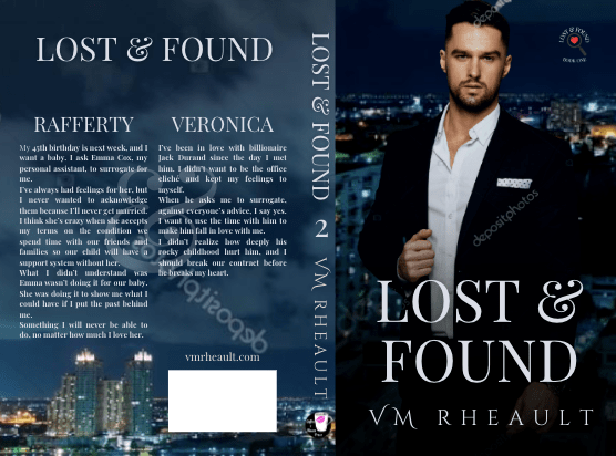
I’m relieved to have this done–I’ve lamented about the covers since practically I published, but I was so busy moving forward that I just didn’t want to take the time to redo them. I would scroll through photos when I was tired and didn’t feel like doing anything else, and I lucked out with the background. I had starred the model I used on the first book a while back so finding him was just a matter of going through my favorites on DepositPhotos and plopping him in front of the skyscrapers. Once I look over the proofs and okay them and change out the ebook covers and swap out the covers on IngramSpark, I’m not going to worry about those books anymore. It will be interesting to see if they sell better, and I’ll run some FB ads to the first one. I’ll definitely report back.
It would be nice if I could not have to redo covers at all, and I’ll try harder going forward. I love my rockstars, and those aren’t going anywhere. They sell well, and there’s nothing wrong with the models I chose. I’m also in love with A Heartache for Christmas, so that will be sticking around for a long time too.

Don’t feel bad if you have to or want to switch out covers to your books. Sometimes a refresh is needed to give older titles a boost, and since my trilogy was published in January, almost a year later a refresh could be just what they needed whether I liked the covers or not.
I’ll definitely be more careful with my six book series. I’m not going to do those covers over again, ever. I can’t think of a bigger pain. It’s bad enough I have to replace all the files for the trilogy, and the interior files too, since I name the photo contributor and photo ID on the copyright pages, but I refuse to do that for six books.
Hopefully, my mistakes can help you not to make any.
Do you have any before and after pictures of your book covers? Email them to me at vaniarheault(at)gmail(dot)com, and if I get enough, I’ll make a blog post out of them.
Thanks for listening to all the whining! Have a good week!


Discover more from Vania Margene Rheault
Subscribe to get the latest posts sent to your email.


Hiya after a long time!
I keep switching up my covers, too. I was doing a lot of this when I was posting on Wattpad; though at the time, I was using images from Pinterest and such. I can email you some of them if you want, including the three covers for The Young Foreigner (the published book). Yes I changed the covers three times. Thankfully, the previous covers were all made by me, so I didn’t have to change the interior, unless I made formatting changes or made changes in the wording somewhere. Also, I don’t really intend to hire anybody else, just my friend who’s currently making illustrations for me, so no changes inside again.
As much as possible, I’d like to make covers for my paperbacks such that I won’t have to change them again.. unless it’s an anniversary edition.. in which case, I want to make a separate book of it. What do you think – with the current rules of KDP, would I be able to do that? – or would it consider that as a duplicate copy?
LikeLiked by 1 person
Thank you for sharing!
LikeLiked by 1 person