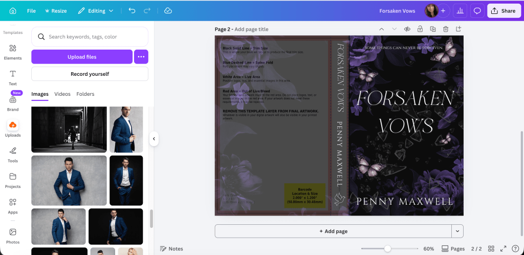
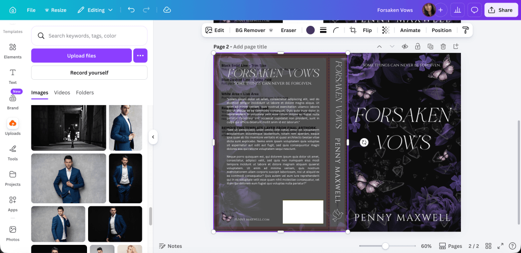
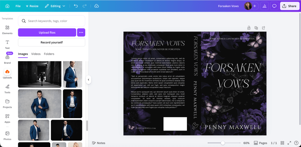
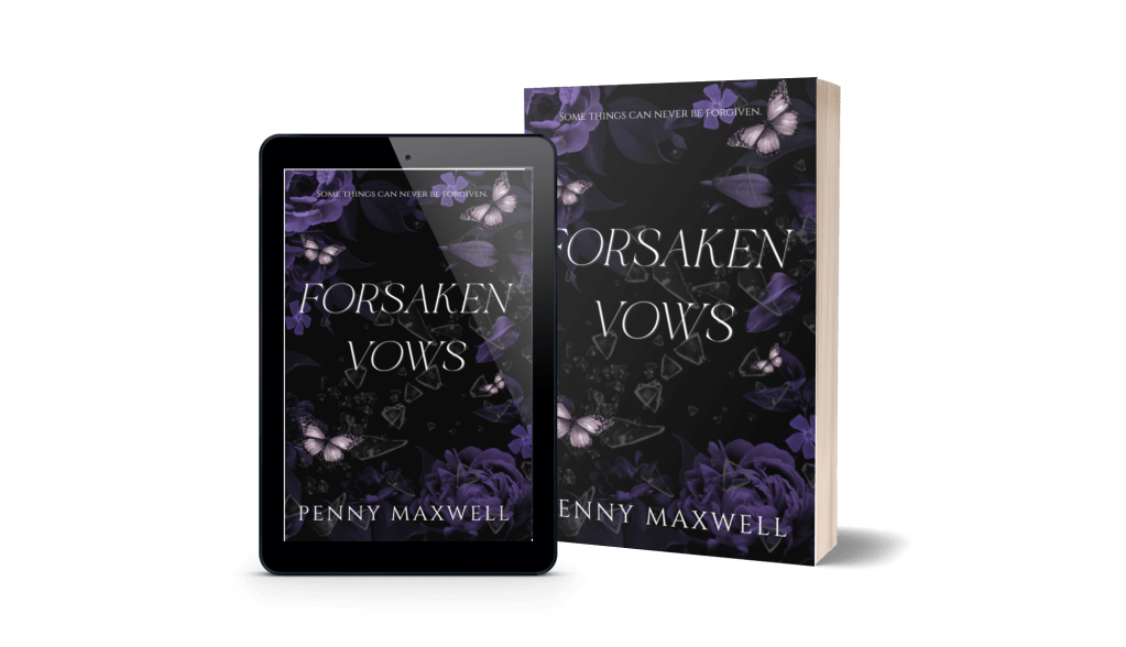
Happy New Year! I hope all of you can look back at 2022 with few regrets. I’m sure there are things we all wish we would have done differently, but we can either let that hold us back or use it for inspiration for the coming year. We have 365 new days at our disposal–let’s make them count.
I started off the new year publishing my trilogy paperback to Amazon. I did them a little ahead of time only because KDP’s approval system is so arbitrary and I had no idea how long it would take for them to approve my paperbacks. It took them less than 12 hours, so the publication dates for them are officially December 28th, 2022, but that’s okay. Better early than late. I’m sticking to the ebook publication dates of January 16th, 23rd, and 30th. I usually don’t put my books on preorder, only because I don’t have an audience waiting for them, and since they’re going into KU, they won’t be available for a while yet, but this time I did and everything is ready to go. I published the paperbacks so they would be available on Booksprout for reviews, and I’m happy to say that in the first three hours half of all three were claimed. With the new plan I can post three books at a time for reviews, and I put up all three of them. I wanted honest reviews for the whole trilogy, so hopefully when/if they get to book three, their last review will reflect they liked the trilogy as a whole, as well as enjoying each individual book.
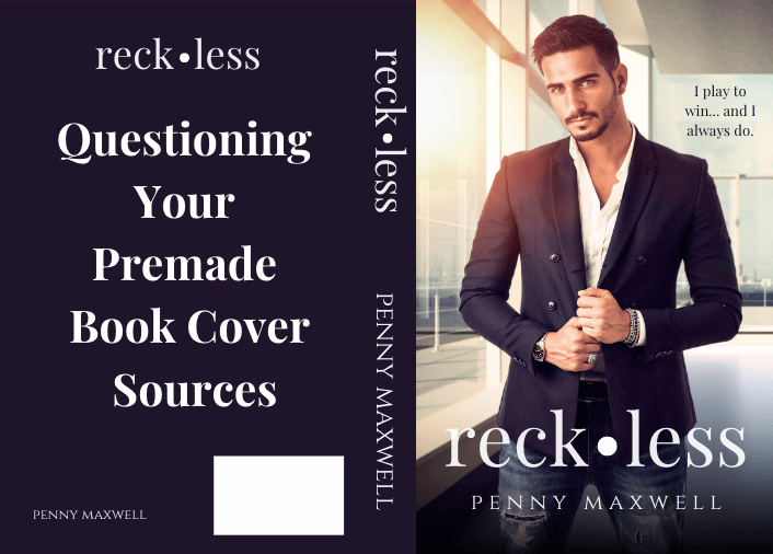
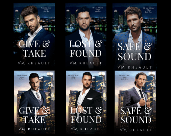
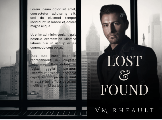
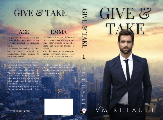
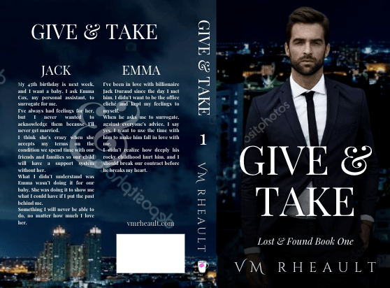
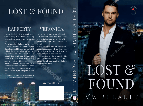
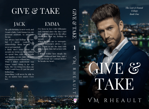
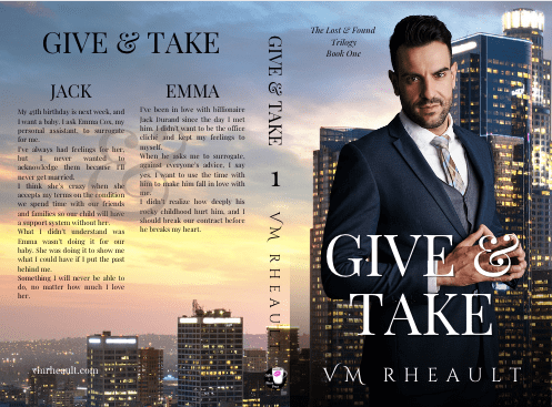
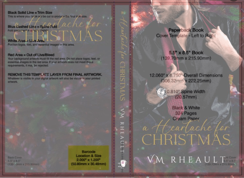
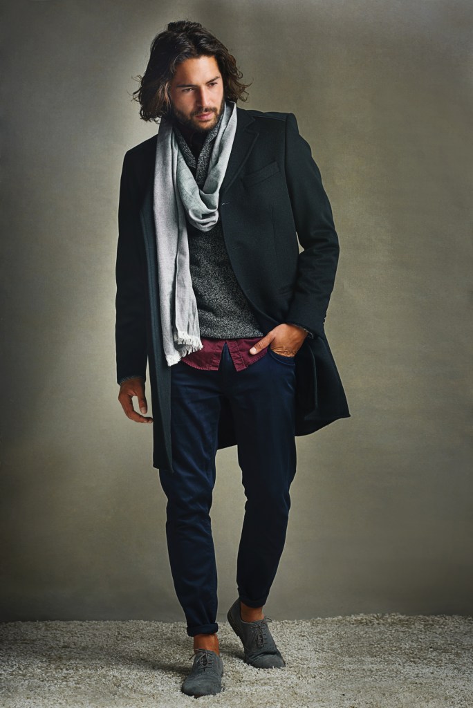
In preparation for some promos I plan to buy when my trilogy is officially released, I re-edited my duet. I was looking for snippets for Instagram and found a couple of typos here and there. Maybe not many but annoying ones like DYI for Do It Yourself instead of DIY, so I reread both of them and made a few changes. They aren’t that old and I had the time to do it, so it is what it is. But I also decided that if I was going to do the insides, I was going to redo outsides. I have a problem with choosing male models, and I have terrible buyer’s remorse when it comes to that kind of thing. One of the great things about being indie is that we can change things that don’t work, but that’s also one of the terrible things. We’re constantly plagued by the idea that what we’re putting out there isn’t as good as it can be. Anyway, I my covers went from this:
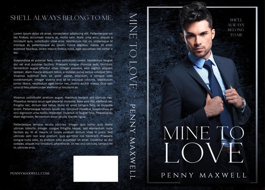
to this:
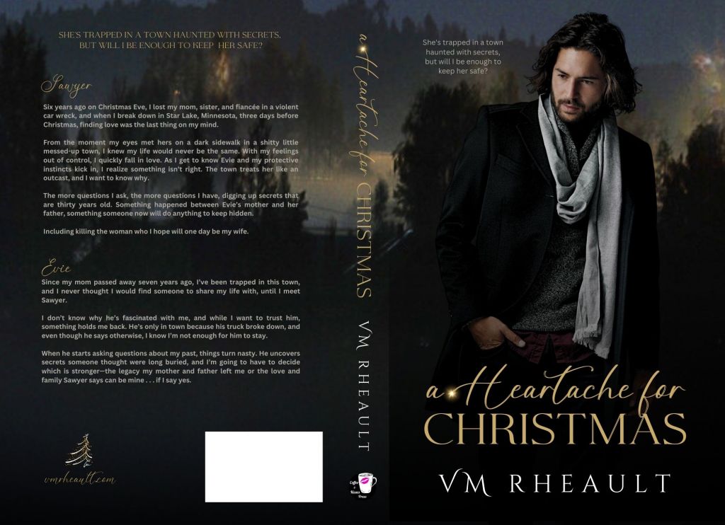
Not a significant change, especially the first one since it’s the same guy, only a crisper photo with a better pose and coloring. I decided I didn’t like the second guy at all and went for a model that’s been used before, but I like the dangerous glint in his eyes and the undone tie speaks to his partying nature in the book. I’m hoping that this change will help with sales. It was a pain the ass to change the ebook, paperback, and hardcovers on KDP as well as update them on IngramSpark. Ingram is giving me a hard time with spine width again, but I think I have it figured out now, and with the fee I paid to join the Alliance of Independent Authors and discounts that go with it, my revision costs were nothing. It took me the better part of a day, and I hope all that work pans out.
Whenever I put together a cover and publish it, I always think I can do better. I think the only cover so far where I haven’t thought that was for Rescue Me. I still love it and I’ve never been able to see anything wrong with it. The guy is perfect, the fonts are perfect. Of course, this means I’m having doubts about the trilogy, even though they haven’t been published for even day. I went around and around and around with those stupid things. It would be easy to say to just hire out–Getcovers makes it incredibly affordable–but I think I would have the same problem. In fact, I might even be worse and never be happy with what they come up with.
The good news is I can stop messing around with my duet. The insides are as perfect as they are ever going to be, and the covers are fine now. I don’t know what I would do with my trilogy covers even if I did want to change them. I searched for hours for the background and the models I finally chose, and the covers went through several drafts. As I’ve said before, my characters are older–Jack is 45 and Roman is 50, and finding models to portray that realistically is difficult. I can always start cutting their heads off, but I’m not that desperate yet.
For now, as the trilogy releases, I’m going to focus on finishing up Twisted Lies and Alibis. The holidays have kind of slowed me down, and now that New Year’s is over, I don’t have anything standing in my way. When I started it, I said I would like to be done with it by the end of January, but I’d really like to get it done within the next two weeks. I’m 67k into it now, and I have no idea how much longer it needs. There is still a lot that needs to go into it, and I want to take my time with the ending and nail it just right.
Luckily, when indies have buyer’s remorse, we can act on it, but obsessing about something and wondering if it can be better can drag you down and hold you back. We always want to do better, and it’s tough when we think changes could somehow elevate sales. I loved my covers until I published, and now I’m not sure. That’s probably common. I can’t say I didn’t follow my heart with my duet, because I did. The covers I published at first weren’t a last resort scenario at all. I was thinking about my brand overall, how they would fit in with other covers, all of it. I haven’t been publishing for 7 years for nothing. I was determined to use all the lessons I’ve learned and start my pen name on the best foot I could. But I guess it doesn’t matter if you’ve been publishing for 7 years or 70, you’ll make judgments in error. You can hang in there and see how things turn out, panic at the first feeling something isn’t right and change immediately, or know that you might need to adjust and take your time with that adjustment so you don’t have to do it again. What’s funny is I love my covers for all my 3rd person books (though all of them are on their second covers except for my Rocky Point Wedding series). I wouldn’t change any of them. I was thinking an illustrated cover for Wherever He Goes would be a good fit since they’re popular now, but ultimately I decided to keep what I have. No, I think I’m putting pressure on myself because I really want this pen name to work out. I know one thing–if I’m going to change my covers, I’ll do it before I publish the hardcovers, and before I publish to IngramSpark, and before I push any promo dollars at them.
Anyway, so that’s all I have for this first blog post of 2023. I hope you all have a wonderful start to this new year!
I’m writing this very late, Sunday night, in fact, because I spent all weekend putting in the edits to book four of my series. It took me a little longer than I thought it would just because I was starting to make changes that I didn’t enter into my proof. I guess since this is such a large project, it won’t be a simple wham-bam-thank-you-ma’am-press-publish-and-hope-for-the-best type thing. You might say that no book should be like that, but if you’ve never written, edited, and packaged 540,000 words, it does feel just a little more serious than writing a 20k word novella and hitting publish the second you type “the end” at the end of the book. I’ve never had a problem editing and publishing with no regret, but I think, no matter how many times I go over these, they may never feel good enough, never feel ready. This will probably be the biggest project I’ll ever write, and while I know from the bottom of my heart I will never reach perfection, I’ll probably always have a little regret I didn’t do more. So for now, the plan is to edit the proofs for books five and six, put those edits in, tweak the covers because I think they could be better, and order more proofs. Then I’ll sit on them and read them all through again in February and pray to God I feel like they are good enough because I want book one ready to go by March 1st. By then the series will be two and a half years old. It’s time.
I got into another discussion the other day about the stigma of indie publishing. I really hate those conversations, but honestly, I think people use it as an excuse as to why their books don’t sell.
There are so many ways to publish now, and who can even accurately define what indie publishing is? There are huge independent publishers like Graywolf Press who are so successful that maybe authors don’t consider them independent anymore. Then we have publishers that are legit like Bookouture and Belt Publishing. Then we have the companies that aren’t vanity presses, but they aren’t exactly publishers, either, like BookBaby, Bublish, Lulu, and She Writes Press (Brooke Warner is great–you should check them out.) Then we have the smaller presses that pop up, and maybe they’re legit, maybe they aren’t. I mean, if you know how to edit, create a cover, or format a book, almost anyone can consider themselves a publisher. I’ve helped plenty of authors put together their books, but I would never consider myself a small press, nor would I want to. Then we have the vanity presses that walk the line of what’s legitimate and what’s not (like Austin McAuley, iUniverse, and Author Solutions). So when you think about the million different ways to publish, how can anyone say that readers don’t read indie? How in the heck are they even supposed to know?
I get cranky when I hear the theory there is still stigma against indie publishing, and my argument is that no reader is going to go out of their way to search who published your book. You know how a reader knows if your book is indie? If the cover is bad, if it’s not edited properly (by yourself or someone else), if the formatting is poor. That all screams unprofessionalism, and yes, self-publishing. All a reader wants is a good story in a nice package because they forked over their hard-earned cash to read your work. If you can’t give them quality, then you have no business publishing, and if you do publish, you have no right to be angry with poor reviews or returns. There are plenty of big-time indie authors who started out small, and yes, as they made more money their teams grew and some even go on to publish other people like Michele Anderle and his publishing company through LMBPN, and to me, that just blurs the line even more. Don’t push your failure on to other people. If my books don’t sell, it’s 100% my fault, not because I’m indie. WTF is wrong with people? (This is a rhetorical question, and I’m laughing.)
So, you know I went ahead and listed my book with Booksprout. I was hesitant because of the poor quality of reviews last time and since they did their overhaul, I was hoping for a better outcome. A couple reviews have come in, and it seems for the most part they’re at least reading the book. I got one sweet review and it’s always nice when a stranger can validate you’re putting out a good book:
I dislike for the cheapest plan reviewers have to include in the review that they received the book on Booksprout in exchange for a review. It seems dirty and just a little skeezy but there are plenty of review services so paying for a review I guess isn’t the end of the world. But when you give away 25 review copies, and all 25 have that at the bottom, and all the reviews are five stars, it doesn’t look honest or sincere and if a reader comes by and happens to see that, a review won’t make a bit of difference to them.
So you have to weigh the options here of publishing without reviews, which I did for my duet. I guess there’s not a right answer either way.
I really don’t have much else this week. I’ve been so busy proofing my proofs that between that and working, I don’t have much time for anything else. I thought briefly of doing NaNo in November, but I’m going to be way too busy getting my trilogy read to publish in January. I may not even be writing new stuff until next year which is sad, but I need to get my back list going. Sales for my duet have been so-so. I get a lot of impressions, but no clicks, which at first glance means my covers aren’t doing well. It could also mean my categories and targets are off, but I know they aren’t because I put a lot of time into my 7 keyword fields when I published and I emailed KDP and added more categories. Those are all on target. I knew but didn’t want to admit, through feedback on FB that the men chose weren’t sexy enough for covers. I just liked the look of them and went against my own advice which is to bend when you can because nothing is more important than doing what you need to do for your books to sell. Now that they’re on KDP in ebook, paperback, and soon hardcover, and I uploaded them to IngramSpark, changing them out won’t be easy. I’m going to wait for a while and see what happens, but learning from this, I do realize the covers for my trilogy I was playing around with won’t work. I need stronger, sexier men, even if they’ve been used on covers before. If you don’t know what my duet covers look like, here they are:
I still love them, but again, time will tell if they’ll do the job.
Housekeeping before I jump into the post: There is still time to read Jeeves Reads Romance’s interview and enter the giveaway. The last time I looked at the entries, there weren’t that many, so there is a good chance of winning! I’ll ship to the US and Canada and the giveaway goes on until July 4th, 2022.
Sometimes it’s great not to have anything to report. Kind of makes for a boring blog, but I’d almost rather have nothing to say than too much to grouse about because my luck went sour (who am I kidding–it’s been sour for a long time and only now just starting to turn around). I’m hoping those days are over for a little bit as for now, nothing is going on with my health (feeling better with the girly issues that have been plaguing me for the past year and a half) and I’m slowly getting over my breakup. I think it will hurt for a long time, but it’s not as heart-shattering as it used to be. The next couple of weeks are all about finishing up my adulting with a mammogram, eye doctor appointment, and a dental cleaning scheduled. But once I get those checked off my list, I won’t have much more to do and I can enjoy the rest of the summer. I’m loving the heat and I spend as much time outside as my schedule allows.
It’s been 27 days since the launch of my first book in my duet and the first book under my initials as a pen name. I’ve gotten a sale and some page reads, but I expected that. Book ones (in my experience) never do well because readers wait for the other books to release. When the second comes out, I’ll use a couple of free days in Kindle Select for book one and buy a cheaper promo. I’ve always gone with Freebooksy which is $120 for a steamy romance, but I’ll try something new like Ereader News Today or Fussy Librarian, maybe even Mark Dawson’s Hello Books. Authors are saying they don’t see the return on investment they used to, but I’ve never used any of those before and if the readers see a new name maybe they’ll take a chance on a free book. It still has 0 reviews and I wonder if I made a mistake not using Booksprout. There is just something about a book that doesn’t have any reviews. The product page looks like something’s missing. I’d even settle for a four-star a this point. At least it would tell potential readers it’s an honest review.
Wha’t I’m probably more excited about is I’m 73k into a new book that will be book one of a trilogy. I think I’ll work on them through the summer and into the fall, and just drop them all at once after Christmas. I need more books on my author page and if I do that, I’ll have six by the end of January. Then I can slowly release my 6 book series like I planned and have 12 by the beginning of 2023. I’ll have a good gauge if my books will resonate with readers by then. Right now the reads I’ve gotten from KU for Captivated are slow and spread out enough I know the people who have borrowed it read until the end, so that’s good news, at least, and probably the only perk to a snail’s pace start.
I’m looking forward to starting an editing series on the blog, and I’ll be interviewing up to 5 editors who edit for indie authors. I’ll start posting those after the 4th of July. I think craft and quality go a long way to how well you can market your book. It doesn’t matter how much money you spend on a cover, ads, or if you pay to get your blurb written for you. If the inside is disappointing, you won’t turn your readers into repeat customers. I (hopefully) geared the questions as something indie writers can learn from, so whether you’re writing your first book, indie publishing and looking for writing tips, or querying, you can read advice from editors who have seen it all.
I’ve been a little disappointed with the quality of covers on Twitter these days, and to keep my hand in with my own cover skills, sometimes I’ll redo them (for my own satisfaction). I would never approach an author and say their cover is bad and offer to replace it, so mostly they stay in Canva. I like this one, and maybe one day I’ll even write a book for it. The cover I redid also had a snowy cabin at the bottom and a couple up top, but I wanted to see if I could mesh the colors in a more cohesive manner and find a way to position the title better. This is not the name of the book nor the author who published the original. Actually, I think it’s one of my better covers, and I’m pleased with the stock photos I found. I didn’t buy the photos since I didn’t think it was worth it for now, and I used a combination of Canva and GIMP.
Speaking of Canva for book covers, the updated instructions I published this month have been viewed 94 times, so it’s it’s still a popular topic. The older post gets the most hits, but the information is still good and I pointed them to the updated post if they want to read that instead.
I’m eagerly anticipating what the rest of the summer will bring. More writing and more blogging, for sure, and book 2 of my Cedar Hill duet will release August 1st.
I think it was two weeks ago I blogged a list of the things I needed to accomplish in the short term to get the ball rolling on publishing some books. I am happy to say that I’ve managed to check of quite a few of those.
I proofed the proof for Faking Forever, put the changes into Vellum, generated new files and corrected the mistakes on the cover/full wrap–more on that. I created a Large Print edition and ordered a new proof of the regular print and the proof of the large print. Since I never used to utilize the back matter of my 3rd person books, it was strange to add a sign up link to my newsletter to the back matter of these. I should add a buy link to the next book as well, but I’ll have to go back and edit those as I have books available. For now the back matter only has one call to action, and that’s to sign up for my newsletter. Organic sign-ups are the best though, so I will be happy if I get any from that.
To ease some of the pressure of learning Bookfunnel and how to segregate lists in MailerLite, I decide to forego offering a reader magnet for the moment. I can write something quickly, maybe after Christmas, but I was putting too much pressure on myself when really what I want to do for right now is publish a couple standalones and start getting my pen name out there. I don’t know how Bookfunnel works, and I need to figure that out and spend more time in the MailerLite dashboard to figure out who goes where when they sign up for what. It will help when I get some signups, and then I can see what happens. I don’t want anyone not to be offered a free book because I don’t know what I’m doing. Needless to say, I decided to sell the book I’d decided to use as a reader magnet, but once I get the ball rolling and familiarize myself with my newsletter I’ll write something else. It was a blow, but at the same time a ball of anxiety loosened in my chest. I know offering a reader magnet is the best way to entice people to sign up, and I will get to that eventually, but for now. I just want to focus on getting some books ready to publish.
I also formatted My Biggest Mistake and did the cover. I have another blog post coming about this, but I asked for feedback on the blurb in my various FB writing groups. Here is the cover for this ugly duckling standalone, and the interior I formatted with Vellum:
Probably I’m not going to be able to use a dark-haired sad guy looking down again, since he looks similar to the cover to Faking Forever:
Initially I had my name at the top, above his head, but since I’m trying to keep more of an idea of branding for my books and not having to go back and redo anything, I moved my name to the bottom. I think it looks nicer. The proofs I have coming will have my name at the top, but I won’t need to order proofs again for such a small change.
I have seen other photos of the two men, and they are two different gentlemen (with some stock photos, you never know), but I’ll have to keep this in the back of my mind and go for a different look for my next few books. That should be easy to do since after I proof the proof to My Biggest Mistake, I’ll be starting to (finally) edit and get my series ready that I wrote last year during the lockdown. I am really excited to take a look at those books with fresh eyes, and it will be a challenge to do six covers, a trilogy for Zane and Stella and a trilogy for Zarah and Gage, but have them all feel similar since the story reaches over all six books. I should do the smart thing and hire out, but I like the control, and with so many scammers out there, trust is hard to come by.
This week I’ve been taking a break–it’s hard not be writing anything, but the proof for My Biggest Mistake will come Saturday, and after that I’ll be jumping into a few months of non-stop work. I’m trying to enjoy the time off, but not actively writing anything, especially since I know what I want to write next, (and it isn’t a reader magnet) is a bit strange. I’ve been reading a domestic thriller I bought a few months ago and I need to format and do a cover for the box set of my wedding series. I think that is the biggest item on my list I haven’t crossed off yet. It’s not hard–just moving Vellum files over to create a large one, but it’s busy work. I need to make a mug of coffee one evening, put on some music and get it done. I don’t want to wait too long–the Christmas books are already starting to pop, and I think I could get some good KU page reads and sales, especially if I sell it at .99 from October until December.
They’re all in KU singly, but I haven’t gotten many reads on them in the past few months. In fact, I’ve stopped looking at my sales dashboard, and only keep an eye on my ads to the extent that they are breaking even. I was going to try to find a different couple for the front so I can run some ads to the box set, but I don’t know if it’s worth it. I tried looking for a different pose of the couple on the first book, but they are all in bed, or doing dopey things like being sad at a pregnancy test result. I could zoom in on their faces to take the “lying down” element out of it and see if that works, but as they are positioned right now, Amazon won’t let my ads go through, and it’s been very hurtful for the series as a whole.
That might actually work. It would be an easy fix to upload new ebook covers for books without having to change too much if the new cover could get through Amazon’s cover guidelines. All I can do is try to submit and see what happens. It would be nice to be able to advertise these this winter. I can add zooming in on their faces to my to-do list.
As far as health news goes, my infection is gone, but an ultrasound revealed an ovarian cyst that is making me feel not so great. So I have a follow up next month to see what’s going on with that. I’m not in pain, just a sense of discomfort most days and some bloating. I’m getting old though, so I suppose it’s to be expected.
I guess that’s all for now. Things are moving along, though this week slowly. It will be nice when things pick up. I didn’t want to start writing a book. Then I would be suck for six weeks while I finished it. I’m trying to convince myself that having a week off isn’t a bad thing, and today all I’ve done is take a walk and write this blog post.
Later I’ll be creating author interview questions for Nina Romano, and there will be a giveaway…I’m thinking for fall… so stay tuned for that in coming weeks.
Thanks for checking in! Have a great rest of your week!
I’ve come across this question a lot these days, mostly I think because a lot of authors use Canva for their ebook covers and graphics for promos. Some bloggers have compared Canva to Book Brush, and while Book Brush can do many things Canva can’t, I feel that Canva is more versatile and I prefer to use it over Book Brush. Especially since Book Brush is more expensive and if you already pay for Canva Pro, you’re not looking to plop down another $146 (for their popular package) a year on another program.
I’ve never made a full wrap in Book Brush, though it is a feature they have available in their paid plans. I made my first paperback wrap in Canva not even knowing if it was possible. It was the old cover for Wherever He Goes and it was a complete experiment applying what I knew from making covers in Word before I knew Canva existed. I ordered a proof not knowing what to expect, but the cover came out beautifully, and since then I’ve done all my wraps in Canva and for a couple other authors too.
These days if there is trouble with a cover, it’s probably a KDP Print glitch. Their POD printers are overworked and underpaid just like all of us these days and I’ve heard reports of covers not printing well, interiors that are crooked, pages falling out of the binding, and even text of other books inside yours. That is a KDP Print problem, not a Canva problem. The only issue I’ve ever encountered doing a paperback wrap in Canva is that IngramSpark requires a CMYK color file while Canva saves in RGB as does GIMP. IngramSpark will still accept your file, but they warn you the coloring in the cover might be off. If this is truly a concern of yours, don’t use Canva for a full wrap. Learn PhotoShop or hire out. I publish with IngramSpark and in a blog post from a couple years ago, I compared the books from IngramSpark and KDP Print. While everyone insists IngramSpark prints with better quality, I did not find that to bethe case, and Canva had nothing to do with it.
That being said, there are a couple things you need to know before you do a full wrap in Canva.
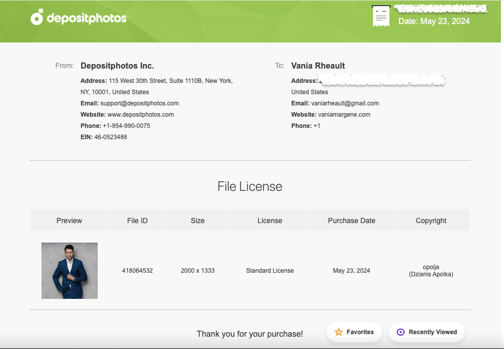
Your stock photo must be in 300 dpi. I buy my photos from Deposit Photos, and lately when I download a photo, the image size is huge but the dpi is only 72. You have to fix this or your cover will come out pixelated and you won’t know why. You can download GIMP for free and use the SCALE IMAGE (under Image in the menu) to fix this, or if you already have Photoshop, adjust the dpi and save. That is the photo version you want to upload into Canva.
This is the screenshot from a photo I used to make a mock cover the other day. You can see that the dpi is only 72. And if you take a look at the width and height, sometimes that is too huge for Canva to accept and they’ll ask you to fix the size. The width and the height doesn’t matter so much, and you can change the width to a lower number. This is a horizontal photo and I chose 3000 for the width. Press Enter and it will automatically resize the height. With the DPI set to 300, export it as a jpg or png, it doesn’t matter, Canva accepts both. (If I’ve lost you on this step, you’ll have to do your own digging. I rarely use GIMP and this post is by no means a tutorial on how to use it, because yeah, I don’t know how to do very much.)
You have to have your interior already formatted for paperback. That includes the front and back matter, the font you chose, gutters and margins and all the rest. Unless you want to play, it’s helpful if this is the final version of your paperback interior. It’s already been through betas and your editor. It should be ready to publish. If it’s not, you can experiment with your cover for practice, but you need the final number of pages for your spine’s width. KDP Print gives you ten pages of wiggle room. That’s not much and more often than not, they’ll make you resize your cover using an updated template.
Choose the trim size you want and page color you want. I see this question all the time in the FB groups, and most say it doesn’t matter. It doesn’t matter. Though if you’re concerned with printing costs, the more pages you have–250+–the larger the trim size you want (6×9 is best) because more pages means higher printing cost. My novels run anywhere between 70k to 90k and the only thing that I use as a yardstick is this: My series books are 5×8. My standalones are 5.5×8.5. I don’t know why I do this, but it’s a system I’ve fallen into. If you write epic fantasy and your books are 400 pages, choose the 6×9.
This is one of Lindsay Buroker’s epic fantasies. Amazon makes it easy for you to check out what other authors in your genre are doing. You can see that this book is 528 printed pages and she chose a 6×9 trim size. Her spine is 1.32 inches. It’s a thick book. When you publish and set your prices, KDP Print will offer you a royalty calculator and you can price your book based on the royalties you’ll make when you sell a paperback. Price too high and you won’t get many takers. Price too low and you won’t make anything on the sale. Try to find a happy medium and fit in with what other authors in your genre are doing.
As for the color, I always choose cream for fiction. Seems the standard is cream for fiction, white for nonfiction. There may be exceptions, but that’s what I go with.
When you have the number of pages from the formatted file, know your trim size and page color, you can Google KDP paperback templates.
This is only for paperback. As of this writing, they are rolling out a hardcover option. It’s in beta right now, but offering a hardcover is what you’ll need to decide based on your business goals. I write romance and I focus my marketing on readers in Kindle Unlimited. A hardcover edition of my book doesn’t interest me, and if I ever wasted the time to create one, it would be for vanity purposes only.
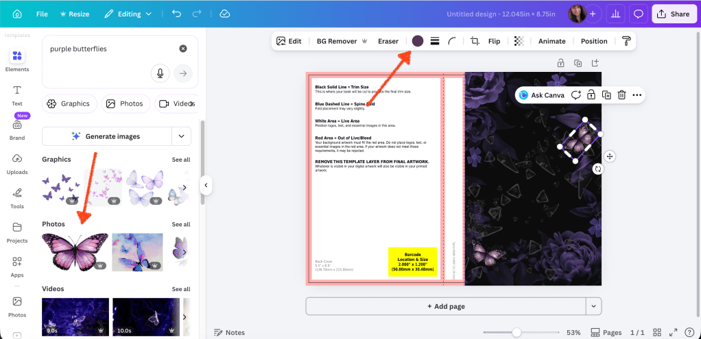
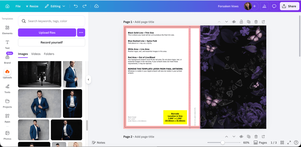
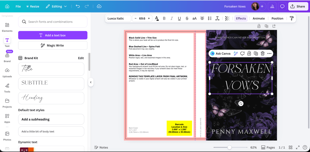
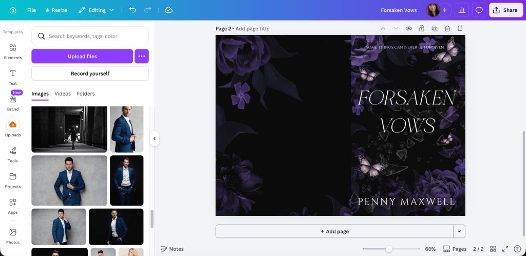
Download the template. It will come in a ZIP file. Open it up and save the PNG as a name you’ll be able to find later. You can’t upload a PDF into Canva, only download, so the PNG is the one you’ll want.
Now it’s time to do some math.
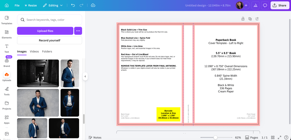
When you want to do a full wrap in Canva, you need to know the canvas size. This is where I think a lot of people get tripped up. How do you figure out the size of the canvas so your template will fit? Your canvas size has to be the size of your book’s trim, plus spine width, plus the bleed. These numbers will change based on the trim size you choose for your books and the spine size. You won’t be able to use the same canvas size over and over unless you choose the same trim size AND your book is the same number of pages every time. That’s going to be highly unlikely, so it’s best just to realize you’re going to need to learn how to do the math.
We’ll start with the template:
The template will tell you how wide your spine is. You need this for the math. There is another way to figure out spine if you don’t download the template first, but this is the easiest way so no use giving you more math.
Then this is how you figure out the size of the canvas:
For the width of the canvas: The width of the back cover plus bleed, plus spine, plus the width of the front cover plus bleed.
If we use the template above as an example, the template is 5.5 x 8.5. This is what we add together:
That is the inch width you put into the custom dimensions box in Canva. The default is pixels, you’ll need to change it to inches.
If you need to see it in a different way, I made this for a friend:
The height of the book is 8.5 + the bleed .25 = 8.75. This is the number you put into the height box in the custom dimensions.
Hit enter or click on Create New Design and you have the canvas for a 5.5x 8.5 sized book with a .65 spine. It might not look like much, but now you can upload the PNG of your template and put that into the canvas.
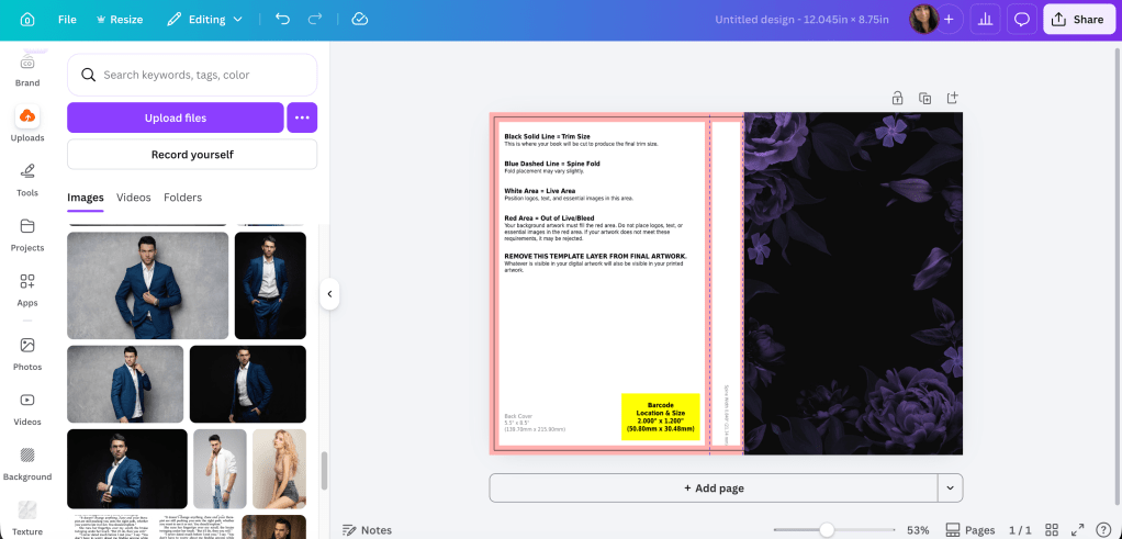
It will take a little moving around, but keep as much orange as possible because that’s your bleed line. Anything on the orange or beyond has a chance of getting cut off in printing. The spine guidelines keep your text from bring printed on the front or back covers. Make sure the template covers the entire canvas.
You might have noticed I didn’t tell you your template needs to be at 300 dpi, and it doesn’t. You’ll be building your cover on top of this template and you won’t see it at all when your book is printed.
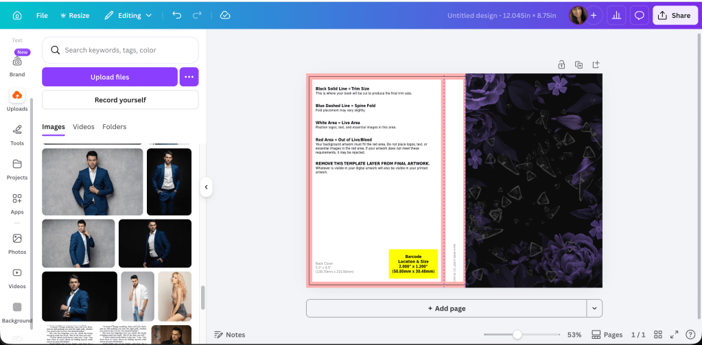
When I say that you’ll be building your cover on top of this, I mean you’ll be putting the stock photo and all the text on top of the template. What you use for your front cover and the back cover is going to be up to you. Some authors use a horizontal photo like the woman on the dock above and use it to create a full wrap from the one photo, like this:
Woman in white dress sitting alone on the pier. Back view (purchased from Deposit Photos)
You can see I flipped her and used a filter, but I used the whole photo for a full cover wrap. I built it on top of the template using the transparency feature and it looks like this:
Using the bleed lines, you can put the font where it needs to go. It’s not perfect–the author name isn’t centered and can come down more. When you’re done with the bleed lines, change the transparency of the photo back to 0 and this is what you’ll download. Download the file in print-ready PDF for your KDP dashboard when you upload your files for publishing.
Lots of people say they don’t know what to put on the back of their covers. The sky is the limit, really, from just the blurb to reviews of the book to your author photo. I’ve only done my author photo once, and that was for the back of All of Nothing:
The only thing I would caution you on is you don’t need to make the blurb font huge. It was one of my mistakes first starting out. And if you don’t want to put a white box for the bar code, you don’t have to. KDP Print will add it when they print your cover. Google for more full wrap ideas.
For the woman on the dock, I blew up the part of the water giving the back cover a grainy texture that matched the photo but some authors like the full photo wrap. It keeps them from. having to worry about getting the bleed lines on the spine perfect for printing. POD printing isn’t an exact science anyway, so chances are even if your PDF is perfect, the spine will be a little off. No matter how centered my title and author name are, almost 100% of the time they won’t be centered on the spine when you order a copy. Now that I’ve done it both ways, I think I prefer the full photo wrap.
I added a white gradient (that you can find in Canva) to the bottom to white out the dock a little bit making Penny’s name more readable. When it comes to cover design you know your own abilities. I’ve often said I’m lucky I write romance and can find a cute couple and slap some text over them and call it good. It’s not that simple, obviously, but if I wrote in epic fantasy, or even thriller, I would have to hire out. I’m not interested in learning beyond what I know. I’m a writer, not a graphic designer.
Developing an eye for book covers takes time and a lot of practice. Sometimes what you think looks good on the screen won’t translate well to a printed cover at all and you’ll be back to the drawing board. If you’re tackling book covers for the first time, you may be investing in some proof copies just to see how your work looks printed. If your business model makes paperbacks important, then you’ll put a lot of time into learning how to make your paperbacks look amazing. Like I said before, my business model centers around KU readers and it’s more important to make sure my cover grabs attention at thumbnail size and indicates to readers the second they look at it what genre it is.
It might seem like I skimmed over the most important part: the math. We can do another book with a different trim size just for practice.
This is the template the first book in my Rocky Point Wedding series. The trim is 5×8 and the spine is .70 inches. If we do the math for the Canva canvas it would look like this:
5.0 (back cover) + .125 (bleed) + .70 (spine) + 5.0 (front cover) + .125 (bleed) = 10.95. That is the width you would need to put into the custom box.
The height would be 8.0 (cover) + .25 (bleed) = 8.25. That is the height you would put into the custom dimensions box.
This is the cover I did for the first book in the series:
I did most of it in Canva, though I added some transparent gradient in GIMP for blending the two photos. Everything I know I taught myself, and it’s not fair i’m trying to shove four years of practicing and learning into one blog post. You’ll have to do your own experimenting.
Some odds and ends I picked up on the way:
Don’t buy a bar code. You don’t need one. KDP Print and IngramSpark will generate one for you. I buy my own ISBNs though, and that will be a choice you need to make if you’re in the States and expected to pay god-awful prices.
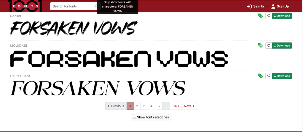
Don’t use free photos from Unsplash, Pixabay, Pexels, et al. Cover your butt and secure your business and use photos that you pay for from trusted sites like Shutterstock or Deposit Photos. Same with fonts. Not everything is available for commercial use. Be careful.
Use caution when choosing the models on your covers if you write romance. Amazon has gotten very picky lately, and the cover for His Frozen Heart disqualifies me from being able to run ads on Amazon Advertising to that series. Needless to say, that sucks.
You can use the same canvas size for an IngramSpark template. The one difference between an IS template and a KDP Print template is the spine for IS is narrower. The only adjustment you’ll be making is your font size for your title and author name on the spine will be smaller.
Elements (font, symbols ) can shift when you download your PDF and they will look “off” when you upload to KDP. I haven’t found a solution for this except to overcorrect, save, and re-download so the elements are in the place they are supposed to be. When you download the PDF, check the file before uploading to KDP. You’ll see if anything has shifted and you can correct it. The KDP Print previewer will show you exactly how your book cover and interior will print. If you don’t like ANYTHING in the previewer, fix it because printing won’t change it.
There are videos on how to create a full cover wrap in Canva–and you might find them helpful–but the few I’ve watched leave out important steps like making sure your photo is 300 dpi. This is going to take some trial and error. I remember being soooo nervous waiting to see if the cover for Wherever He Goes was going to look good.
I think that’s all I have. I know it seems like a lot of information, but blogs and videos won’t take the place of practice. If you have any questions, leave me a comment. I’ll answer to the best of my ability. If you’re making covers with my tips, tweet me at @V_Rheault on Twitter. I want to see what you’re doing.
If you’ve followed my blog for any amount of time, you guys know I love talking about book covers. I especially love talking about scammers trying to rip you off by slapping a pretty font over a free photo from PIxabay and charging you $50.00 for something you can do yourself in Canva for free. I recently called out a “designer” for doing exactly that, and the icing on the cake was another member of the FB group posted her cover with the same exact photo and said she, too, had been taken for a ride. The universe was on my side that day! I would post a screenshot, but the original poster took it down a couple minutes after. Hopefully in embarrassment with her tail tucked between her legs!
I know I can’t save the world, and if I tried, I wouldn’t have enough time to write. I do like talking about covers though and what draws readers to buy our books. I’m watching a replay of a webinar with Nick Stephenson, and like any webinar talking about sales, he goes briefly goes over a book cover case study with one of his own books.
Taken from Nick’s free webinar
What he said is that the first cover wasn’t doing a good job. So they tried book cover number two, and eventually number three. Number three had the highest click-through and he explained in the next slide why:
Taken from Nick’s free webinar
Apparently, the red title that is associated with thrillers helped, along with the placing the elements that draw the eyes toward the center of the book. I like the first cover though, and I wonder how it would have done had he just changed the butter yellow font color to the dark red that works with thrillers. I think the guy running through the tunnel draws the eye to the center of the book just as well as the silhouette on the third cover. What do you think?
But it just goes to show that even a perfectly good cover may not be doing its job.
Anyway, in the FB group I’m in, there was a thread about cover pet peeves, and I thought it was a silly thread because this is something that authors seem to forget. Your book’s cover isn’t for you.
Just like most people agree that reviews aren’t for the author, they’re for readers finding their next book, covers, also, are only for readers. If you get too precious about your cover, or you’re too attached, or you let pride stand in the way of sales, what are you trying to prove? And to who?
names protected to hide the . . .
Listen, if I have to find a picture of a pig and a chicken falling in love to sell my book, then that’s what I’ll put on my cover. I didn’t write my book so it would sink to the bottom of the charts because I cared more about my likes than what will sell my book.
Stock photo provided by Canva. Template provided by Canva.
Genres have cover expectations, and unless you have a solid audience already in place, you need a cover that will sell books. I’m not sure why authors have such a hard time understanding this. I know some of it is cash. Especially if you pay out and you can’t afford to swap. I mean, I’ve heard of that happening, and it’s too bad. But you’re not going to make anything off a book that has a cover on it that isn’t appealing to readers.
Authors can make fun of man-chest covers, or the boring couple with the script font on the front, or all the thriller covers that look the same (girl in red jacket running away from the camera in the fog), or all the Urban Fantasy with the tough girl holding a fireball, but in doing so it just closes their minds to the possibility that being the same as other books might not be a bad thing. And why make things harder than they need to be? Discoverability is difficult!
That thread just really boggled my mind like so many indie decisions do, I guess.
I want my books to sell. That means genre specific tropes, cover to market, good blurb, correct categories and keywords, a nice look inside without typos.
Readers have a lot of choices these days, over 8 million to be exact. Why purposely give them a reason to keep scrolling?
Okay, I think I’m done musing and I’m going to bed. One day I’ll probably get kicked out of all my Facebook groups, but I just can’t help it. I just shake my head at the authors who want to do it their way then end up crying because they don’t sell books.
Can you ever really have your cake and eat it too?
Let me know, because I don’t care enough to try.
Man chest? Yes please. 🙂 Stock photo provided by Canva. Font provided by Canva. Cover design by yours truly.
I was supposed to be flying to Georgia today to help my fiancé drive up from the Savannah area. I had a tooth start hurting, and because of my unwillingness to wait for a root canal, I’m getting it pulled. I was supposed to go Wednesday, but they had a cancellation and I’m going in at 3:00 today. Needless to say, I’m a bit nervous and because alcohol is a blood thinner, I can’t take a few nips before I head in. I don’t have much dental anxiety, but I don’t know anyone who wouldn’t be a little scared to get a tooth pulled out of their head. I’m only happy he said he could do it and didn’t need to refer me to an oral surgeon. The sooner the better. The bright spot is, I can run errands afterward because my mask will hide the big wad of gauze I’ll have shoved into the back of my mouth. There is, my dear readers, always a silver lining!
As for my trip, I rescheduled for next Monday, August 24th. Pray all goes well because between the two of us (me and my fiancé) we have horrible luck. Case in point: who would have predicted he’d need to move in the middle of a pandemic. That’s something we didn’t need.
I am still writing, and last night after I transcribed the bit I was able to write at work I’m up to 45k for book 5 in my series. It’s going well–I still love the characters and the plot is coming along. This mystery/thriller stuff isn’t my cup of tea though. All the breadcrumbing and making sure if a character says something, (dun dun dun) someone, somewhere, follows up. I have a few subplots weaving through this book and keeping them straight is tougher than making sure my earbud cords don’t tangle. But it’s interesting to note that my skills are improving writing-wise, and I may not have been able to write a plot like this two years ago. It makes me think about a book I had to abandon about 3 years ago because like this series, there’s a bit of a mystery I just couldn’t figure out, no matter how much brainstorming I did. Now if I look at the notes, I wonder if I could fit together the pieces. I wasn’t ready to write that book. It could be after writing this series I will be.
I read My Dark Vanessa over the weekend, and if you haven’t read it, you should! I read that book faster than almost any book I’ve every dug into, even faster than when I started Daisy Jones and the Six and couldn’t put that down until I was done.
I just ordered Midnight Sun by Stephenie Meyer, and I have Butterfly in Frost to read next by Sylvia Day. I am trying to make more of an effort to read first person present books while I write it in, and I wish I didn’t have such a hard time reading on my Kindle. I could get good use out of my KU subscription reading all the top 100 romance books on Amazon to keep up with what my fellow authors are doing.
Anyway, my ads are still doing well. I’m up 100 dollars this month so far! It’s a little scary thinking of all the money I’m spending, and I wish that Amazon would bill me at the same time they pay out royalties. It wouldn’t look like it hurts so much then. But surprisingly, or not, my biggest seller is The Years Between Us, after I redid the cover. I can’t express how important a cover is. Even if you think your cover is good, if it’s not selling your book, don’t be afraid to change it!
I will always be grateful that I have the flexibility as an indie to change things that aren’t working, and the humbleness to admit that the choices I’ve made may not always be the right ones. People can get so stuck with their choices thinking that once a choice is made there is no other way, but that kind of thinking keeps you from broadening your horizons and maybe finding a different path that really works.
As far as anything else goes, my daughter is starting 9th grade next month, and things are still up in the air. She chose to do the hybrid plan instead of all online, and I supported that. She didn’t do so well at the end of last year. She may be an introvert, but we all crave human contact. So this week I’ll be taking her to get her hair done and doing a bit of school shopping for some new clothes and school supplies. So I suppose it worked out that I had to postpone my trip, but I do miss him and I’m excited for the changes that will happen once we’re finally in the same town!
I’m watching the replay of the marketing webinar Jane Friedman put on last week. I linked it to you in last week’s blog post. She has a lot to say on marketing for both traditionally published authors and indies, and the very first thing she said was you have to make sure your cover, blurb, and the product as a whole are good. After you put your book for sale, your book is no longer just a book, but a product. I joined an Amazon Ads Facebook group after Bryan Cohen’s Ads Challenge finished, and lots of people forget that you need a good product. All the time I see, I’m tweaking my ads all over the place but I’m not getting any sales. So I take a look at their books and I can see right away. Poor cover, or the blurb is a big block of text. Maybe they have a genre mashup and they don’t have the correct categories chosen, and who knows what they’re using for keywords. I’m not saying I have it all together. My cover for TYBU is a good example. But, if you’re going to ask for advice, at least listen to what someone has to tell you. They could be right on point, even if it means more work for you.
I suppose that’s all I have for now. I try to give my readers some kind of value or tip, but while I still listen to a lot of podcasts and I’m in the middle of that webinar, I haven’t discovered anything to pass on. Bryan does have his next ads profit challenge starting in October, but God, for some reason that just seems so far away right now. And with David (please, God) finally here, I may not sign up for it. It’s going to take a bit to get him settled in and I’ll still be working and doing as much writing as I can to finish up these last two books before all the plot flies out of my head and I don’t know what I’m writing anymore. Sounds silly, but I don’t keep notes. I’m writing these back to back to back and all the details of every little thing are in my head. Maybe not the best way, but it’s my process nonetheless.
I hope you all have a wonderful week ahead, and if you want to know how my dental appointment goes today, let me know and I’ll post a comment. Tell me something yucky you have to do this week!
Besides trying to get the last of my thoughts on the 2020 predictions from Written Word Media into this blog while they are still relevant, I’ll be working on a few other things.
I’m done editing the Tower City Romance Trilogy. I lost the Vellum files for the single books, but I did still have the boxed set file. That means I could extract the formatted books from the boxed set and turn them back into single books. I didn’t have to read through them again, but I’m glad I did. I found typos, lots of telling, some passive voice, and even some slight formatting errors. I think my books sound better, and they’ll definitely look better.
I know we’re not supposed to read reviews, but one in particular stuck out at me on Goodreads.
She said I ended my books too quickly. I felt that in book three, and to fix that, I’m going to write an extended Epilogue that will put a pretty bow on top of the trilogy.
The plan right now is to jump about a year and a half into their future and show the reader what happened to everyone.
Epilogues aren’t Band-aids, and I don’t have plot holes or loose ends (I would have fixed them in the editing if I had) but as with couples who were about to get married and have babies, this will be a nice closure. I’m not sure if I’ll just add that to the boxed set to encourage KU read-through, or tack it on to the end of book three.
I’ll write it first then decide. If things go to plan, I should be able to write 8-10k words at my work over the weekend, then type it out on Monday.
The next thing I want to do is submit a new cover for The Years Between Us. I think the cover is holding the book back. There are steamy scenes, and the cover doesn’t portray the heat level. So, I’m going from this:
to possibly this:
This isn’t set in stone yet, and it’s not a cover reveal. (I don’t bother with those.)
I darkened the bottom (that gradient is becoming a trademark I don’t want and something I need to stop doing for later books) because she has a garter on and a pretty little butt-cheek is hanging out, and I didn’t want it to show. I plan to pay for ads to these books and Amazon doesn’t allow for too much spicy. I found a lovely couple before this one, but he was holding a glass of champagne, and booze in AMS ads is a no-go. I didn’t want to change the cover then discover my ads wouldn’t be approved.
I like that their faces are in shadow–it’s difficult finding a stock photo that has an older man and a younger woman that does not depict and old man in a nursing home and his nurse. You do with what you can when you’re not willing to pay.
I may experiment with the placement of the title. Some people aren’t fans of words over the models’ faces.
Let me know what you think of the new one. My main concern it’s too much like All of Nothing. My skills are limited and it’s beginning to show. I love doing my own covers though, so after I get all these little odds and ends wrapped up that I started because of COVID-19, I’ll start teaching myself how to do more with covers while I focus on my first person projects.
How is everyone doing lately? Some states are opening up. I know I won’t be jumping in line to go to a restaurant any time soon. I’ve been happy as a clam staying at home working on my stuff. I hope you’re hanging in there!
As a side note, I gave away two Kindle Fires to two lucky winners of Brenda Novak’s readers group on Facebook. Some of their stories break my heart, and I wish I could have given more.
I encourage you, if you have Kindles or reading devices to spare, to look up Brenda’s group. It’s heartbreaking to me that people can’t afford a $50 tablet, but there really are so many who can’t. They appreciate anything you can give them so much. When I offered my two new Kindles, I received over 1,000 posts of interest. It was very difficult to decide who to give them to. I hope I was able to to turn two lives around; I wish it could be more.
I love this writing/reading community I’m part of and always look for ways to pay it forward.
Hello from chilly Minnesota! I’m glad I’m a writer with stuff to work on, otherwise I don’t know what I would do while I wait for the weather to warm up. According to weather.com, we’re not looking at higher (and by higher I mean, actually comfortable) weather until the end of March, but if the temperatures they’re predicting for that time of Spring holds true, I’ll be one happy camper. (Not literally. I hate camping.)
This slideshow requires JavaScript.
Releasing this series is definitely giving me something to do.
I haven’t give you all an update for a while because I didn’t want to bore you, and I’m sure you all know I’ve been working diligently to get these done.
I just did the cover for book four. Books one and two are completely done. I’ve proofed the proofs, added the changes, tweaked the covers. Book three is almost done. I’m waiting for the second proof to come in the mail so I can look it over. None of the books are published yet, and I’m still wondering what kind of launch I want to have. Put them all on pre-order? Publish book one and put the others on pre-order? I’m not sure.
I do know I’m going to publish them three to four weeks a part and write like crazy on something else between releases. Whether I schedule those or drop them manually, I’m not sure yet. I don’t know if a pre-order will do me any good. I don’t have an audience, no one is really waiting for these. Book one isn’t going to create a huge splash, though I do plan to throw some money at it in some way, shape, or form. Since it is a series, and I have a little more faith in them than I do my trilogy (which is misguided, but it is what it is) I’m going to market these to an older audience and hope for page reads in KU.
Keywords for the Amazon ads will be important. I don’t want to target books written in first person. I don’t want to target books with young, coming of age/college-age heroines. My books have older characters (middle thirties) some of them dealing with divorces and second marriages. Some raising children as single parents. But I do have to find some middle-of-the-road comp authors because simply targeting Nora Roberts won’t work. Romance is competitive. I can’t spend a dollar a click to compete with other authors. So in the coming days I’ll be researching comp authors and putting together a list of authors and book titles to target in ads.
This is part of the reason why it’s important to be a voracious reader in your own genre. You need to know who you’re competing with. You need to know where your book fits in so you can target those readers.
Ignore the cat hair on my bed. I know for book three I needed to zoom in more on the couple, and that was one of my tweaks besides correcting the typos I found while proofing the proof.
I did get some feed back from a FB Book Cover group and they did say that they like these. I’m always making sure (lesson learned) that my covers fit in with what’s currently out there. There are so many sub-genres now, and these are going to be categorized as small town romance along with the plain contemporary romance. Amazon will let you put your book into 10 categories, but you do you have to email or call them and ask.
I’ll be happy when these are done. I feel like I’ve been working on them forever, though it’s only been 13 months. A series is a pretty big undertaking–especially when you decide to hold them all until they’re done.
What am I going to work on next? I do have my first person stuff I need to finish for a spring release. I’ve been going over books one and two so I can write three and make sure I have all the loose ends tied up. This is more of a romantic suspense and as I edited I made a list of everything I needed to remember for the last book. These first person ones are a bit on the long side–the second one, after a first sweep of editing, is clocking in at a crazy 89k. It’s the longest book I’ve written.
It’s different writing in first person present, though I feel like I adapted my writing style to it without much trouble. The first book sounds a bit choppy, and while I was editing, part of that was smoothing out sentences and paragraphs to make them sound more conversational.
Otherwise, I don’t have much to report. My back/neck/arms are doing well. I’ve been having a string of really good days. But it does take a lot of maintenance on my part, checking in with my body to give it what it needs. I wear my elbow compression sleeves a lot, also my wrist splints. I don’t often wear them at the same time, though. I haven’t had to shovel much this winter, which has been a blessing as well, so I hope the weather continues to cooperate with me.
Anyway, that’s about it for now. I’ve been having a lot of fun with the Written Word Media survey and dissecting that as a new author. I’d like to do more youtube videos about book covers, too, but it’s hard for me to find quiet time. I have to threaten the kids to leave me alone for an hour. They ignore me any other time, but when I want to record, they’re all up in my face. Goofballs.
I hope you have fun weekend plans! Catch you here next time!
I hope you all had a lovely holiday if you celebrated! I’m currently snowed in, and I’ve been working on some book-related stuff. I apologize for not posting last week, but let’s pick up where we left off . . .
The next installment in the Written Word Media survey looks at book covers. To recap, they surveyed indie authors to see how much time they spend writing, and how much they spend on products and services such as editing and marketing.
According to the survey, as you can see by the graphic, emerging authors do both almost equally–they design their own covers and use a professional designer. The 60kers and the 100kers use a professional cover designer way more than they design their own.
graphic taken by survey linked above
The article says the leap from emerging authors to 60kers is because emerging authors realize that without a professional cover, they aren’t going to sell books.
Of course, that’s true, and I’m not disputing it at all. But I have another explanation to offer. I’m not saying their conclusion is wrong. Emerging authors, after a bad book launch, probably do realize that their covers don’t cut it. But when you are an emerging author, it’s hard to know where to go for help. Quite possibly, emerging authors do their own covers because it’s quicker, easier, and they don’t have to worry about whom to trust. Indie publishing is a jungle. When an emerging author spends a couple years networking, they make friends, are put in touch with industry professionals, and can form relationships with people who know what they’re doing.
Especially with book covers, it’s imperative you find someone who knows where to find stock photos, and what fonts are okay to use and why they’re safe. There are so many people getting into the business who shouldn’t. They use free pictures from free sites like Pixabay or Unsplash and that is one of the biggest mistakes you can make. I still do my own covers rather than trust anyone else. Some people are idiots, and I’m not paying for their stupidity or mine for hiring them.
I think another reason emerging authors do their own covers is because they like to be 100% in control. It feels good to publish a book you did cover to cover. Espeically if you can design a decent cover that earns you compliments. Granted, the emerging authors who can make genre-appropriate covers are few, but no one is saying they still can’t be proud. It’s a learning process.
What the survey does say though, is publishing a book with a bad cover will set you back, and you’ll end up redoing it at some point anyway. (Which is a good reason, in my opinion, not to pay for a high-priced cover. You may want to refresh after a couple of years.)
Of course, the 60kers and 100kers don’t have time to do their own covers. These guys are writing, and they probably don’t have interest in cover design beyond that it looks good and will sell their books. I would also hazard a guess that by the time you have twenty books out, you’ve developed a relationship with someone, or at least found a premade site that sells decent work.
The survey then goes into the cost of book covers. As you can see by the graph, 100-249.00 is the most popular price range for all three types of authors. $100.00 for a cover is at the lower end of the scale for something that needs lots of manipulation, and at that price, it may not include a full wrap for a paperback.
graph taken from survey linked above
The authors paying 0-49.00 might only be having the e-book cover made. Most, if not all, designers charge extra for the spine and back cover if you’re also publishing a paperback.
The genre you write in will also determine the cost. A fancy cover for an epic fantasy or a tricked-out cover for an urban fantasy or paranormal will cost more than a romance cover. There are simply more elements needed to have a girl wearing a plaid skirt holding a fireball in front of a haunted high school for an urban fantasy academy novel than for a couple kissing in field for a plain contemporary romance novel. That’s just the way it is. If you write a genre that includes any kind of magic, you’ll be looking at having a cover made (providing you have zero photo manipulation skills). You need to blend in with the other books in your genre and finding a stock photo that contains all the elements you need is probably slim to none. Especially if you’re writing in a series.
It would be to your advantage to look for a cover designer while you are writing your book if you’re writing in one of those genres. Collect covers you like for a frame of reference. Create a logline (also called a six second elevator pitch) so your designer knows what your book is about and then go ahead and start looking. Join book cover groups on Facebook and ask for recommendations. Sometimes putting your budget out there will help so you don’t fall in love with a designer’s work you can’t afford. Find out where they buy their photos of models. If any of them mention a free site, pass them by. Your fee should include the cost of a photo. Cover designers charging you for a free photo is nothing but a scam and it’s dangerous too.
What can you do if you are absolutely stuck making your own cover?
Look at what makes a good cover in your genre. It’s not only the photo, though that’s a good part of it. Its font placement. Where the author name is on the cover. If there’s a tagline and where that is.
What are the elements in your genre? Sci-fi needs spaceships. Fantasy–dragons. Chris Fox calls these symbols. What symbols do your readers look for in your genre? Look at what is selling on the top 100 in that genre on Amazon. List the elements they all have. Yours will need them too. This isn’t the time to be different or to “stand out.” Sorry.
Realize you may be able to offer only an ebook for the short-term. Learning how to do a full cover wrap isn’t as easy as an ebook cover. You need spine calculations based on how thick your formatted manuscript is, and what you want for the back cover. Blurb? Author photo? Imprint logo? It’s best to give yourself plenty of time to practice and itching to press publish when your book is done being edited isn’t the time to teach yourself.
Search stock photo sites to see what’s out there. My tips are for the person who has little to no experience with Photoshop or GIMP. The easiest way to do a cover is to find a photo that you can use without a lot of manipulation. My go-to sites are depositphotos.com and canstockphoto.com.
Watch tutorials. There are a ton of tutorials out there for both Photoshop and GIMP. I have GIMP (which is a free download) on my laptop and there are tutorials out there ranging from isolating a color in a black and white photo to gradients to font manipulation. People are generous with their time–take advantage.
I’ve been told, and have seen other people be told, that if they can’t afford a professional cover, they shouldn’t bother publishing. That’s not particularly helpful, but you do have to consider what your goals are. Do you want to make covers for all your books going forward? Then you’re going to have to learn how. If you’re writing in a genre that requires fancy covers, you’ll be creating a cover to squeak by until you can afford something better.
I do everything myself, and over three years I’d like to think I’ve developed a bit of an eye. It takes a long time, and practice. Instead of watching another show on Netflix, open Canva, put on some music, and practice. Canva isn’t just a software for design, they also offer “classes” that will teach you the elements of a good cover.
I do covers in my spare time. I practice font placement, choosing a cover-worthy photo, that kind of thing. I mess around with concepts for my friends. Even if they don’t turn out that great, practice is never a waste of time. You never know what new trick you’ll pick up. I scroll through stock photos and favorite photos that have potential for future covers. Mine or someone else’s.
Cover design is a career on its own, and you can spend as much time messing around with font as you do writing and editing.
But the point is, if you put enough time into it, you can make a passable cover yourself, if the genre you write in supports it. Women’s fiction, romance. Some mystery thrillers.
If you put out a homemade cover that doesn’t meet reader expectations, or doesn’t fit in with other books, realize that’s going to effect your sales.
Here are a few covers I’ve done, both for myself and others using Canva.com. I pay for a pro membership, and if you plan on doing a lot of covers or using it for graphics for marketing materials, it’s worth the fee. They add new features all the time.
I did these for the first two of my quartet. I haven’t done the third or fourth ones yet:
When you do a series, it’s important they look like they belong together. And before I ordered the proofs, I put the covers on top of another to make sure the placement of all the elements are the same. I might do a blog post explaining how I did them.
Daisy Parker isn’t real. I was fooling around one night and came up with it. The photo is as-is and made in Canva.
Do You Trust Me took a little work as this photograph was in color and I isolated the red blindfold in GIMP. The font needs work, but I was playing one night and came up with this in about an hour.
So far I haven’t bothered to open a premade business, or sell covers on the side. I help out my friends when I can, and I like to play when I don’t feel like writing or there’s nothing going on online (I’m not a big TV-watcher). I know what my limitations are, and when anyone asks me for help, I make sure they know it, too.