I’ve gotten a few questions about this, and I guess maybe I was remiss in not typing out the instructions before now.
In all honesty, I’ve been doing it the hard way, importing the PDF into GIMP, cropping out the back cover and spine, adjusting the DPI and size, then downloading the JPG file. When someone asked me in the comments of my updated full wrap post for instructions, I didn’t want to direct them to a software they might not have. My full wraps are made in Canva, so should the ebook covers.
So, I messed around a bit, figured it out, and to my surprise, found it was easier than using GIMP anyway.
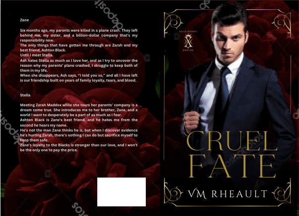
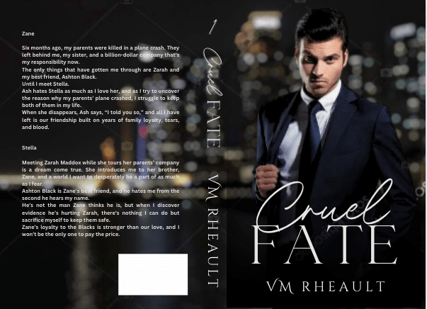
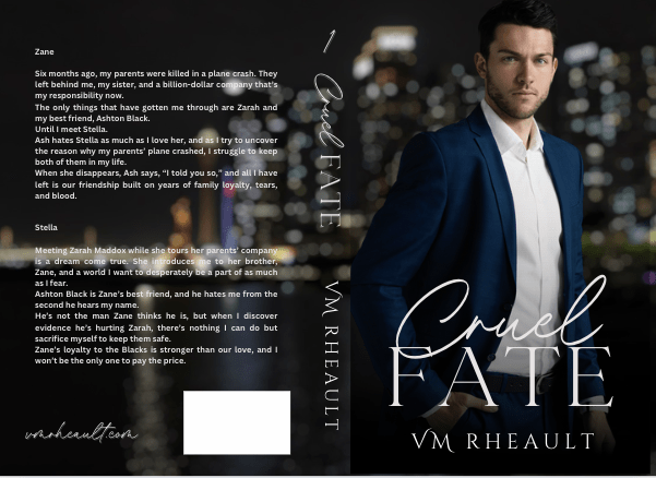
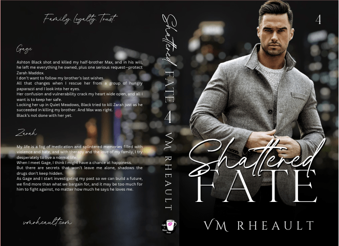
For the screenshots, I used Melody Loomis’s cover for her book, Thrill of the Chase. I designed the cover, so I already had access to the PDF and she gave me her permission to use it.
Here you go:
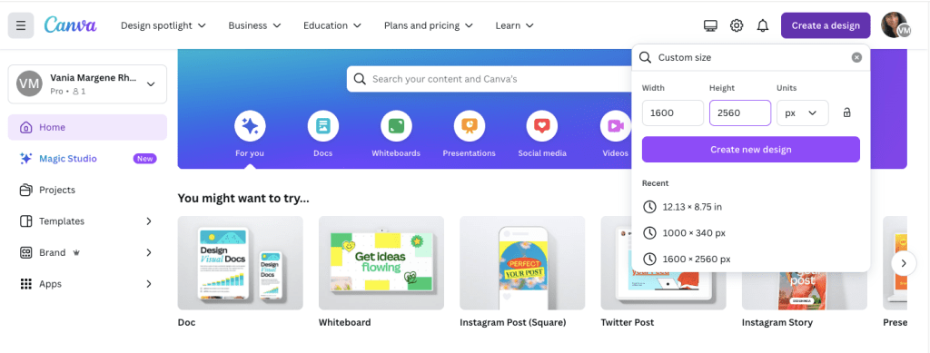
Click on Create a Design. KDP’s guidelines for an ebook cover are 1600 x 2560 pixels. Click on Create a Design and click on Custom Size. Enter in the pixels, like this.
Click Create New Design.
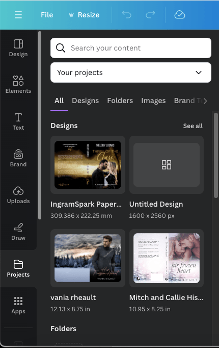
Next, you can either upload your book’s PDF or check your Projects folder. It will already be there unless you’re doing an ebook cover for someone else. The first time I uploaded a PDF I was really confused and kept thinking I was doing something wrong. So either way, your Projects folder is where you’ll find the PDF. I’m using Melody’s Draft2Digital cover, and it’s at the top because I uploaded it for this post.
Click on it so it’s laying on your empty canvas.
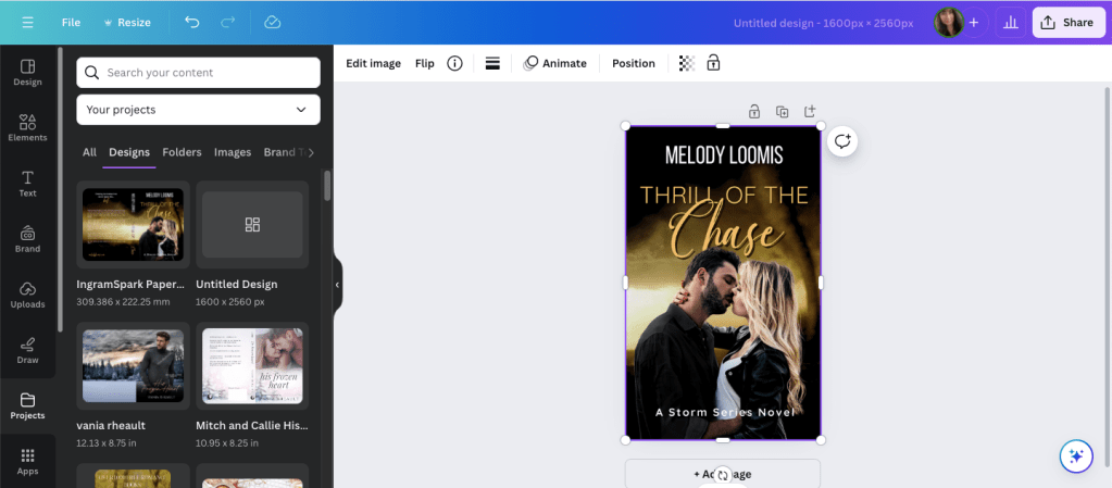
Click the cover to select it, if it isn’t already, and crop off the back cover and the spine.
Now grab a corner and enlarge it. At this point, just play with it until it fits the canvas how you want it. It won’t fit 100% and you’ll lose just a tiny bit on the sides, but it’s so little you won’t notice.
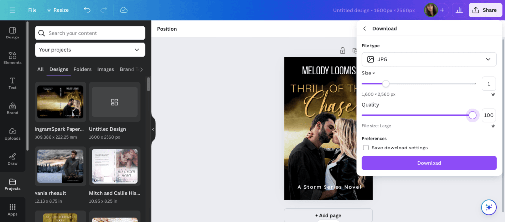
Click Share and Download.
Choose JPG because KDP won’t accept a PNG. If you have Pro, scoot the quality up 100.
Save it in a place and under name you’ll remember.
It will save in the correct size and DPI and you won’t have to do anything else to it.
That’s it. I should have written this out a long time ago, but I never thought to. Anyway, it’s simple enough to do and I should have been doing it this way from the beginning. After that reader posted his or her question, it did get me to thinking about it, and now I’ll never use GIMP to make ebook covers again.
If you have any questions, drop them in the comments below, and I’ll answer them to the best of my ability.
I don’t have much to update you on this week. I’m slowly making my way through my King’s Crossing proofs and I’m in the middle of book two right now. I’m not finding much, a word that should have been deleted here, a word that should have been added there. Like many authors, some of what I mark I’ll decide to leave alone, and that’s usually the hint I need to realize that after proofing these, there isn’t going to be anything left to change or to make better. I recommend everyone reads their proofs because it’s amazing what you’ll find when your book is printed out, and actually, ordering a proof is a cheaper than printing it out at your local Office Max.
Anyway, so that’s all I have for my author update.
As far as my Monday Musings are concerned, I want to defend all my Canva book cover blog posts. There are opinions circulating on Threads that pretty much say it’s not safe to use a cover made in Canva because Amazon won’t accept them if they ask for proof of copyright. This isn’t correct and I do not want any baby authors to get scared or bummed out they can’t use Canva to create their covers. The truth is, KDP/Amazon doesn’t care how you made your cover. You can use Canva, BookBrush, Photoshop, Affinity Photo, InDesign, GIMP, or even Word. What they care about is where you got the stock photos that you used to create your cover. Canva Pro gives you access to hundreds of thousands of stock photos, and you can use them, for anything but book covers because if KDP asks you if you have the licensing rights to use the photos, they won’t accept Canva’s. That’s it. That’s all it is.
When you buy a stock photo, you’re not buying the copyright of that photo. you’re buying the licensing, or the permission, to use it. The photographer and the model, through a model release, say it’s okay for you to use the photo on your book, and that’s the documentation that KDP wants. Canva doesn’t give you the proper permission to use their stock photos, not in a way that Amazon wants, anyway. So, whenever I talk about Canva, I always say you should buy your photos from places like DepositPhotos, Shutterstock, Dreamstime, or 123rf. You can browse Canvas stock and find the source and purchase it directly. Sometimes the source is Getty, and we all know most of us can’t afford that. For that reason, I never practice book covers using their stock because I might fall in love with something I can’t use.
The same goes for places like Unsplash, Pexels, and Pixabay. Those places are fine if you’re using stock for blog posts and aesthetics, but for an actual cover where you’re going to be making money from your book, you should buy your stock photos.
The standard licensing is fine–the extended license of a photo is primarily if you’re going to use the photo on something you’re going to sell, like a coffee mug. The standard license is fine for a mug if you’re going to make one for a giveaway, or something else like bookmarks, but if you’re going to sell those coffee mugs and bookmarks at a book table at a convention, then you need the extended license, which is a lot more expensive. That’s why I don’t make swag. It’s expensive and I don’t have a readership that would pay. If you want to make bookmarks or business cards, or even post cards, the standard license is fine–knock yourself out. VistaPrint is a good option.
Another reason someone said it’s not safe to use Canva book covers is because someone could copy it and you can’t do anything about it because you can’t copyright what you make in Canva. The thing is, anyone can copy a book cover, and it doesn’t matter where you make your cover. The reason most authors don’t have their book covers copied, even if they’re gorgeous, is because you’re just asking for trouble if you do. There’s no faster way to get blackballed in the author/writer community than copying someone else’s work. Now, can the author you copied sue you for that? Sure. They might start off sending you a cease and desist email first, ask you to change your cover, counting on that to scare you enough, and if you’re baby author who got swept up in loving a cover, or you bought one from a designer and you didn’t know she “borrowed” the design, then a cease and desist letter would probably be enough. But the threat to sue, I don’t want to say is empty, but a lot of authors don’t have the money to take you to court. So, it doesn’t matter where your made your cover, anyone at any time can copy it.
When you’re a romance author, we do get into some shaky and shady territory. We use the same models, a lot, even the same backgrounds, a lot, and when that happens, sometimes vibes are the same. I think most of us authors understand that and we just shrug and say, “It happens.” I even blogged about it, and you can read it here: https://vaniamargene.com/2023/08/14/romance-covers-finding-the-right-stock-photo/
I’m not a copyright lawyer, and when I talk about stock photos and book covers, that’s all my knowledge pertains to. Canva is used by people who are not authors, and when someone uses their elements to make logos and social media graphics geared toward selling products, I have read those logos and social media graphics don’t belong to that company. Maybe that’s true. I have no idea. I don’t work for a company that asks me to make social media graphics, so I don’t have to know the legalities of it.
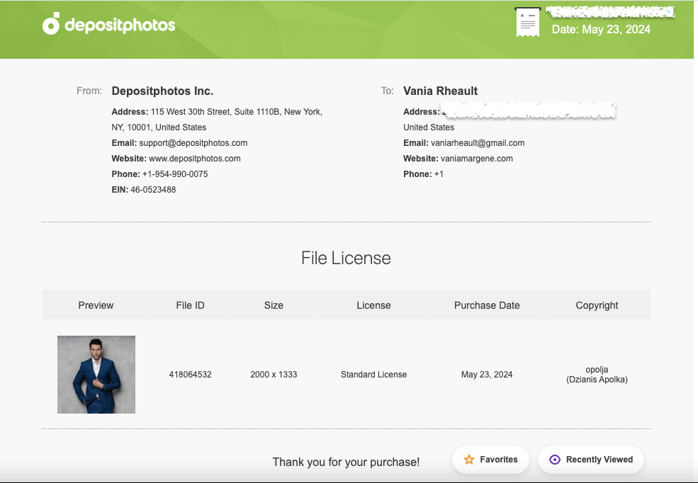
When I make a cover in Canva, sometimes I do use a Canva element, like a gradient or a glow star, but I use DepositPhotos for everything else. When Amazon asked me for licensing information for the 3rd book in my rockstar trilogy, I took screenshots of the download information of the background photo, the model’s photo, and my profile information. I had other things on my cover (a small piano vector indicating what instrument the guy in the third book played) but I didn’t give them that, or the font information. If you’re ever asked, give them as little information as possible because right off the bat you’re dealing with a bot that randomly picked you and you don’t want to muddy the water with information they don’t care about. Keep it polite, give them the stock photo information, and if you don’t have it, they’ll tell you to change your cover. If that’s something you have to do, be smarter and buy your licensing agreements the way you should (or never use that cover designer again). (Here’s a blog post I wrote about scammy cover designers–https://vaniamargene.com/2024/04/22/author-update-and-vetting-your-book-cover-designer/)
I hate when “important” information is passed around on a platform like Threads. There’s no way you can include all the information you need in a post so you don’t confuse people. And if you do see blanket statements like, “Don’t use Canva to make your book covers because it’s not safe,” I always suggest you look up who’s saying it. A lot of times it’s going to be someone who benefits from your fear, like, you guessed it, a book cover designer who is going to be out money because you’re making your own covers.
I saw that once last year. A book cover designer in a book cover Facebook group was trying to go after GetCovers because they were “copying” book covers. After a lot of back and forth and nasty comments, even between her and the GetCovers owner, or whoever he happened to be, what it boiled down to was she was a book cover designer who was angry they could charge so little and she felt it was eating at her potential client base. It’s the same for editors, too. Anyone who says you can’t publish without paying an expensive editor is probably an expensive editor who wants to guilt you into paying their prices.
I’ve turned so jaded lately I just always assume people are looking out for themselves first, most, and always, so always, before you get scared, do your research.
Thousands of authors use Canva to do their covers. Some use it properly, purchasing stock photos from reputable sources like DepositPhotos, some take chance and use Pixabay or Unsplash, thinking that their “free for commercial use” agreement is enough, some use Canva stock and hope for the best. If you’re going to use Canva because it’s easy and user-friendly, then you’re not doing anything others aren’t doing. I know that shouldn’t be much of a consolation, but you’re hardly breaking the law. Even if I make a cover for someone else and they’ve downloaded their photos, I download them too so I have the licensing agreement under my profile in my downloads. And what I would send KDP, or what I have sent, looks like this:
This is the purchase proof for the model who will be on the third book of my King’s Crossing series.
That way the author I’m helping can say I made their cover, and I can turn around and give her the screenshots she needs to prove I paid for the licensing agreement.
I have said in the past that your books are your business, and it really doesn’t feel true until KDP smacks you with a proof of licensing for a stock photo.
Anyway, that’s all I really wanted to say. Like almost everything, if you mess up, it’s the operator, not the machine.
Have a good week, everyone! I’m going back to proofing.
I love talking about book covers, especially it terms of making them for yourself. It’s a creative process, and nothing will make you happier than when elements click into place and your covers–that you made!!–turn into something you’re proud to show off. And I don’t even mean for marketing purposes. You’re just so happy this thing you made looks so beautiful, you want to show it to everyone.
It’s not easy. There’s a lot to consider, and I like talking about my book cover process because I rarely make a cover that ends up on the book during my first try. The only time I can honestly say that is for Rescue Me, but all my other books I’ve either published and changed after the fact, or they’ve gone through many changes before they ended up on the final cover.
If you make you own covers, I don’t want you to be discouraged if it takes you a long time to get it just right. There are so many things you have to think about, like spice level, if you want elements or people, and if you go with people, if they’ll be half-naked, finding those models, and the font for your author name and title. All that on top of what skills you may or may not have. You may even go as far as ordering a proof, not liking how it looks in print, and changing your mind like I did.
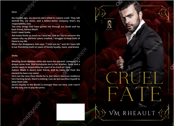
I had covers for these before. I made proofs and had my friend beta read them, before they were ready to be honest, but she still gave me good feedback. I hadn’t written and published all that I had, hadn’t settled on any kind of author brand for my pen name. I was going with a dark look–the black and white and gold that is still popular on billionaire romances today–but I didn’t like them anymore and decided to redo them. Luckily, I buy the AppSumo DepositPhotos deal and changing the background and the models didn’t cost me much.
The first is the model/concept for books 1-3, and the second model/concept for books 4-6. The model on the second set looked more like what I was going for when I thought of the character, but he looks a lot like Eddie on Twisted Lullabies and I didn’t want to use him again if that was the case. DepositPhotos, I’m guessing, using face recognition software to lump models together, and sometimes it weeds out models that aren’t who you’re looking for and sometimes it doesn’t. There are times I can’t tell and don’t want to use the same model by mistake. They probably would have been okay, but I didn’t want to settle like I did with the first set of models on my Lost & Found trilogy so I moved on.
One thing you’ll hear a lot is that you should look at other covers in your genre, and that’s true. You should. But there’s also the caveat that you should look, but not copy, which can be tempting to do if you love an author’s cover and it’s something simple you can do yourself. You have to remember the publishing world is very small and there’s a 100% chance if you copy an author’s unique style, (and I don’t mean a headshot with the title over his chest that I’m finding on AI covers these days) she’s gonna find out about it.
Practice is vital no matter what kind of skill you’re trying to build and perfect, but have integrity and courteousness when practicing and packaging your book and don’t use what you make. Keep YOUR brand in mind, and something just right will come out of your experiments that will fit your books and the brand you’re pushing out into the world.
There was a book cover that I loved that incorporated flowers around the edges. What I made was just too much like hers, and I scrapped the idea. I wanted to keep the flower element though, and made this:
Cover made using Canva elements, model from DepositPhotos
I really liked this too, but somewhere along the line I started having issues with him. The characters in my series are younger than they usually are. These books are four and a half years old, the first I wrote using 1st person POV and in later books I settled on older characters. So, he was good age-wise, but he didn’t give off the tall billionaire vibe I was wanting, so I kept searching and found him.
I thought he was okay, didn’t see him around much on other covers. But there was something about him I didn’t like, and there’s a shadow on his shirt leftover from his photo shoot I wasn’t able to get rid of. He came in different poses, and I wanted to like him, so I gave him another shot but I decided to dump the flower, and I went back to my cityscapes.
He blended well, but there was something about his face, and in the end, I didn’t go with him.
At that point, I was trying different backgrounds, thinking about veering away from the single guy and doing couples instead. I was researching dark romance, billionaire romance, romantic suspense. Romantic suspense usually had a couple, but I needed to keep my brand in mind. I haven’t exactly found my readership yet, and I didn’t want to deviate too far away from what my author brand looks like I give my readers. I have noticed more couples coming back into style, the couple on top, the title in the middle and some landscape photo at the bottom. I gather those are more contemporary romance titles, small town maybe, like my series under my full name.
I liked the blurred cityscape. I liked the colors and that it was part of my overall author aesthetic. It’s time-consuming to find a background and models that work together without much or any manipulation and if I wouldn’t have found another male model I liked, I wouldn’t have kept it. I couldn’t have kept it, so it’s good to remain flexible, too. You can play with filters, black and white, whatever you need to find the look you’re going for. Canva makes that easy, at least. A click of the mouse here, and the click of the undo button there if you don’t like it.
If you have a background you like, you can make the “template” and just pop your models in it to see how they do. I liked this concept, and then found him:
both background and model found on DepositPhotos
I really liked this guy and knew I wouldn’t need to look more. He fit how I pictured Zane–not too young, not to old. He didn’t look short, just the right amount of scruff. I wish he was wearing a tie, too, but beggars can’t be choosers, especially since I had played around with these covers for a while by then.
Of course, you start to doubt if what you have is good enough. You start scrolling through book covers again, checking out backgrounds, wondering if the one you chose is edgy enough. This series has a lot of romantic suspense elements in it, and I thought maybe I should try to capture that with a grittier background.
I tried this one, as red is supposed to indicate danger:
But I realized that though this background might have worked for the first set of books, I still had to make the model match for the second set, and he didn’t go so well. Though I’ve seen him around a lot, and even played around with him when I was doing my Christmas novel last year, I decided to go with this guy since he blended well into the city background I liked.
I got the proofs and they look good. There are a few tweaks I’ll need to make but there always are. Overall, I like them, and I’m happy with the choices I made.
They’re hazy because my phone’s lense was diry 😛
I don’t have another series planned for a long time, and getting these done was a relief. I probably won’t even talk about covers for while because the only cover left on my plate right now is a simple one for a standalone I’m editing that I’ll publish after this series comes out. I’ve already got the guy picked out, actually, and have a concept in mind for how I want the title to look. If I do talk about it, it won’t be until next year.
Anyway, that’s all I have for this post. The creative process can take time, so I would start looking for models and playing when you’re maybe, halfway through writing your book? That way, when you’re closing in on the end, you’ll have an idea of what you need and you won’t panic. The beta reading and editing process can take time too, but you can always use that time to firm up your cover and write your blurb. It seems a lot with writing and publishing is hurry up and wait, but you don’t want to hurry at your book’s expense. I found out the hard way you only have one launch. Make the most of it and have everything set in advance.
The amount of information out there is insane, right? You don’t know who to believe, what to believe, if anything is true, and I’m not talking about what’s on social media right now with regards to COVID, but with indie publishing. There are scammers out there, people who want to make a buck off of your inexperience. These people aren’t nice, and you’ll run into them time and time again joining FB groups and Twitter people tweeting their “services” such as they are.
But when you get up into the bigger indies, the ones who are making a bit of money and they turn to the non-fiction, or entrepreneurial side of things, you do expect them to know what they’re talking about.
I’ve mentioned Nick Stephenson on the blog before, incidentally when I was blogging about book covers not that long ago. Because I love all things book covers, when I got an email (yeah, I’m signed up to his newsletter) saying he could make a book cover in 10 minutes using BookBrush, I was intrigued.
I already know I won’t ever use BookBrush, I prefer Canva, and they’re cheaper. I know BookBrush is specifically created for authors and Canva is meant for anyone who needs to make a quick graphic design. I like Canva, know how it works, and I’ve loaded quite a few fonts in my kit over the past couple of years. I don’t think I’ll change anytime soon.
Anyway, so I settled in to watch it, and you can watch it, too.
I had a hard time with the video, and not only because it’s basically one big BookBrush commercial with a probable affiliate link included that he failed to mention was an affiliate link. I could be wrong, but why take the time to make a video and not include a link where he could make a bit of money if his watchers decided to try it out?
So, I watched it, and didn’t really like the cover he came up with at the end and here’s why:
He advocated using Unsplash for photos, and anyone who does book covers knows that using free photos is a no-no. Especially with people in them. Websites like Pexels, Unsplash, and Pixabay do not collect model releases and these websites do not vet photos. There are things in these photos that are not for commercial use. I went to Unsplash and typed in tennis shoes. There were several photos of generic shoes, but there were also some photos that came up with Nike (the swoosh is a dead giveaway) and Adidas. To a newbie wanting to make a book cover about say, running or a personal journey or something, they might think a nice looking photo with a pair of Nike shoes would be okay because they found it on a free-for-commercial-use website. Do the same search on Deposit Photos and not one pair of Nikes shows up at all, or any logo for that matter.
He chose Romance and that is a very nuanced genre. The couple he picked had all their clothes on, and in romance (read: reader) circles, that would indicate the book to be sweet and or clean. Heat levels are depicted by the amount of skin showing on a cover, and that’s something Nick didn’t mention in the video.
He didn’t do a full wrap. I admit his way could be okay for a short story or a reader magnet that may not need the level of quality a book cover would need to promote sales. Reader magnets are supposed to bring signups to your newsletter though, and I wouldn’t imagine anyone signing up for a newsletter if the draw is going to be a short story with a crappy cover. So while you may not want to fork over $100.00 for a premade for a short story or novella that won’t go on sale, eventually your newsletter subscribers are going to be your bread and butter, and you need to treat your fans with the respect they deserve.
Not all the fonts on that website are for commercial use. Only the fonts with the green dollar tag are. The other problem I had with the font is that it’s not very romancy. Yes, I get he was trying to make a point in that he could make an ebook cover in 10 minutes, and he did. But font is a big deal when it comes to covers and this one, even though it’s free, just doesn’t work.
I don’t mean to pick on him, and I did make a comment on his YouTube video, so don’t think I’m ragging on him behind his back. My comment isn’t as long as what I wrote out for you here, but enough that maybe I did slap him down a little bit. I don’t mind calling out people who aren’t being entirely on the up and up. Passing out bad information is bad, no matter who is doing or how cute his accent is. I know us American ladies are a sucker for a cute accent, but don’t let him talk you into using free photos. It’s just bad news.
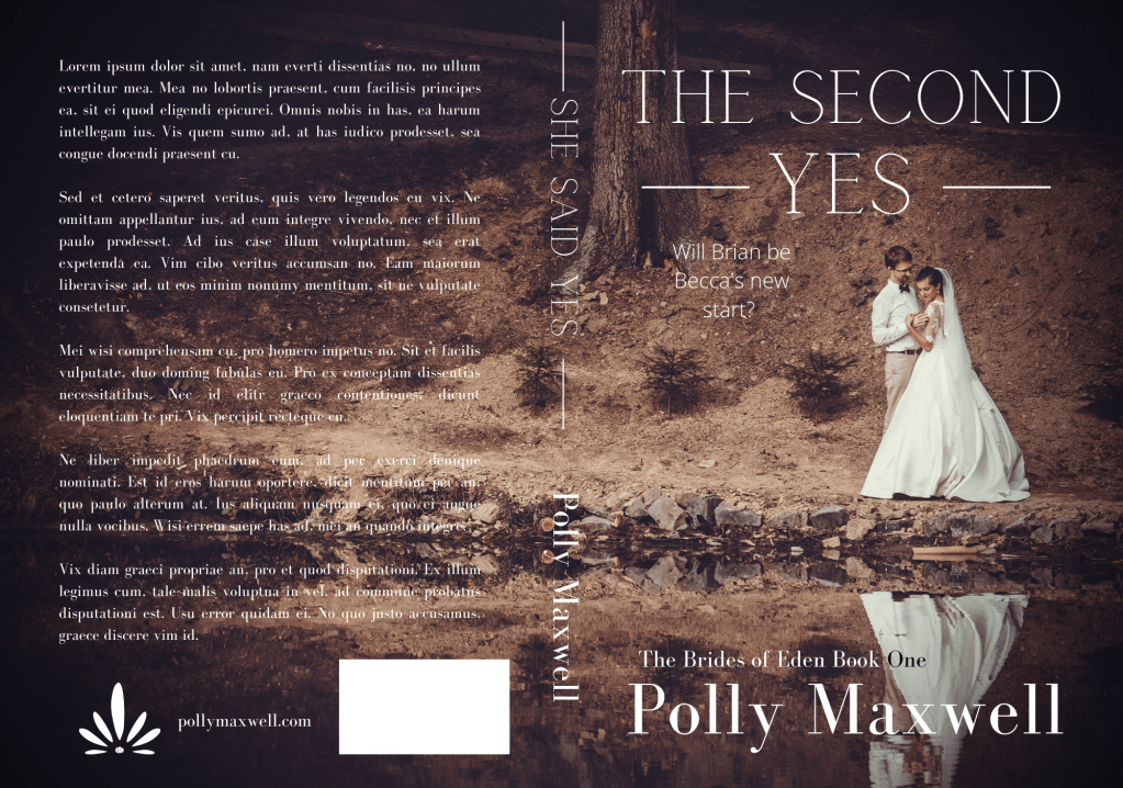
Here’s my version of a sweet wedding book cover:
Stock photo taken from Deposit Photos. Title font, Calgary. Author font, Bodoni FLF Cover created in Canva
With the photo I chose and the title, maybe it’s gearing more toward Women’s Fiction than sweet Contemporary Romance, but it just proves my point: you need to take a bit of time to think about your cover and put some effort into choosing the stock photo, font, and overall design.
I know he was trying to prove his own point: that using BookBrush is an easy tool and you don’t have to pay out hundreds of dollars for a simple cover by a designer. And that’s true, kind of. Someone asked in one of my FB groups what is the best software to make a book cover with, and lots of people chimed in with Photoshop, Canva, Affinity Photo, GIMP, the usual suspects. I told him I use a mixture of Canva and GIMP but I said it doesn’t matter what software you use. If you haven’t developed and eye for what looks good, you’ll always make crap.
If you’ve followed my blog for any amount of time, you guys know I love talking about book covers. I especially love talking about scammers trying to rip you off by slapping a pretty font over a free photo from PIxabay and charging you $50.00 for something you can do yourself in Canva for free. I recently called out a “designer” for doing exactly that, and the icing on the cake was another member of the FB group posted her cover with the same exact photo and said she, too, had been taken for a ride. The universe was on my side that day! I would post a screenshot, but the original poster took it down a couple minutes after. Hopefully in embarrassment with her tail tucked between her legs!
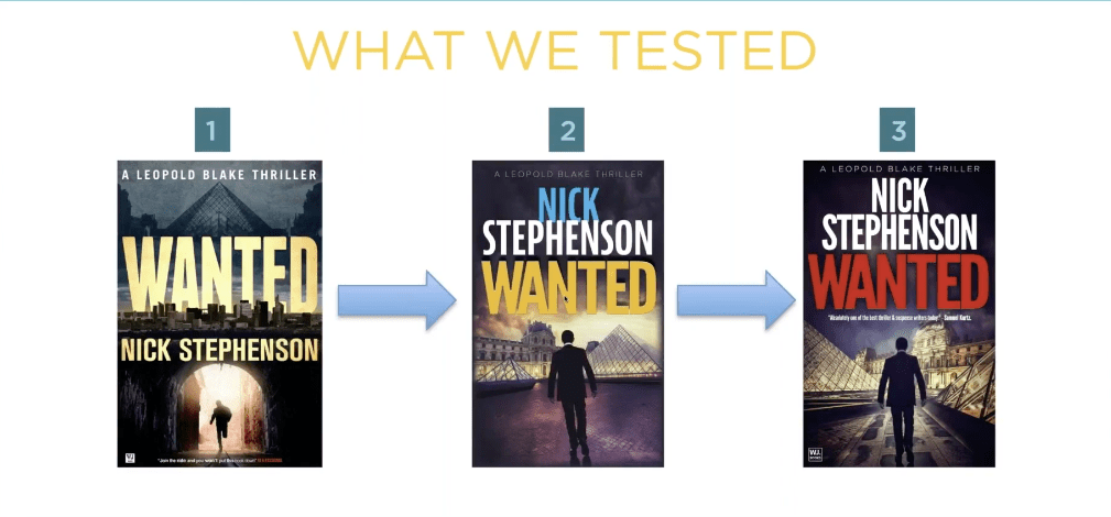
I know I can’t save the world, and if I tried, I wouldn’t have enough time to write. I do like talking about covers though and what draws readers to buy our books. I’m watching a replay of a webinar with Nick Stephenson, and like any webinar talking about sales, he goes briefly goes over a book cover case study with one of his own books.
Taken from Nick’s free webinar
What he said is that the first cover wasn’t doing a good job. So they tried book cover number two, and eventually number three. Number three had the highest click-through and he explained in the next slide why:
Taken from Nick’s free webinar
Apparently, the red title that is associated with thrillers helped, along with the placing the elements that draw the eyes toward the center of the book. I like the first cover though, and I wonder how it would have done had he just changed the butter yellow font color to the dark red that works with thrillers. I think the guy running through the tunnel draws the eye to the center of the book just as well as the silhouette on the third cover. What do you think?
But it just goes to show that even a perfectly good cover may not be doing its job.
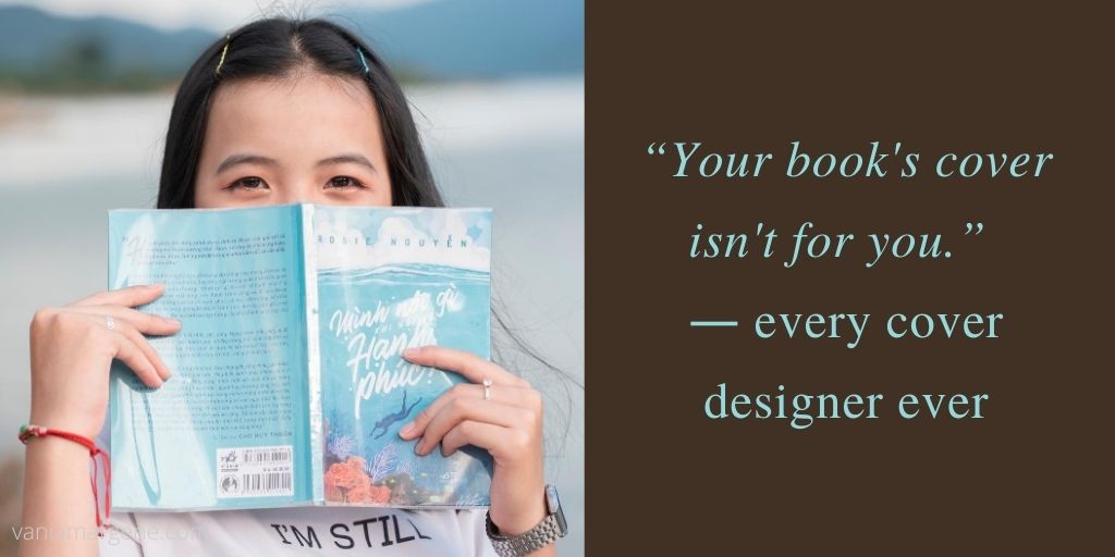
Anyway, in the FB group I’m in, there was a thread about cover pet peeves, and I thought it was a silly thread because this is something that authors seem to forget. Your book’s cover isn’t for you.
Just like most people agree that reviews aren’t for the author, they’re for readers finding their next book, covers, also, are only for readers. If you get too precious about your cover, or you’re too attached, or you let pride stand in the way of sales, what are you trying to prove? And to who?
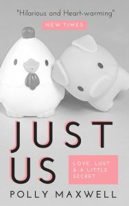
names protected to hide the . . .
Listen, if I have to find a picture of a pig and a chicken falling in love to sell my book, then that’s what I’ll put on my cover. I didn’t write my book so it would sink to the bottom of the charts because I cared more about my likes than what will sell my book.
Stock photo provided by Canva. Template provided by Canva.
Genres have cover expectations, and unless you have a solid audience already in place, you need a cover that will sell books. I’m not sure why authors have such a hard time understanding this. I know some of it is cash. Especially if you pay out and you can’t afford to swap. I mean, I’ve heard of that happening, and it’s too bad. But you’re not going to make anything off a book that has a cover on it that isn’t appealing to readers.
Authors can make fun of man-chest covers, or the boring couple with the script font on the front, or all the thriller covers that look the same (girl in red jacket running away from the camera in the fog), or all the Urban Fantasy with the tough girl holding a fireball, but in doing so it just closes their minds to the possibility that being the same as other books might not be a bad thing. And why make things harder than they need to be? Discoverability is difficult!
That thread just really boggled my mind like so many indie decisions do, I guess.
I want my books to sell. That means genre specific tropes, cover to market, good blurb, correct categories and keywords, a nice look inside without typos.
Readers have a lot of choices these days, over 8 million to be exact. Why purposely give them a reason to keep scrolling?
Okay, I think I’m done musing and I’m going to bed. One day I’ll probably get kicked out of all my Facebook groups, but I just can’t help it. I just shake my head at the authors who want to do it their way then end up crying because they don’t sell books.
Can you ever really have your cake and eat it too?
Let me know, because I don’t care enough to try.
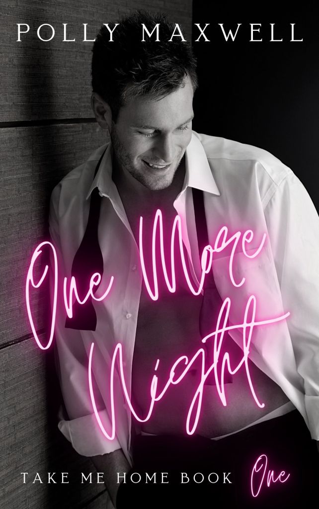
Man chest? Yes please. 🙂 Stock photo provided by Canva. Font provided by Canva. Cover design by yours truly.
The first thing I did is redo the cover. It went from this:
To this:
I would say that’s an improvement. I don’t have the proof yet, and I suppose writing a blog post about the cover without the proof seems to be a bit too forward thinking, but that’s okay. I can post it when I get it. I know the title doesn’t seem to be centered, but uploading it into KDP Print proved to be one over-correction after another. The title may very well be too much to the left, but what’s what the proof is for.
At any rate, covers can go through a lot of revisions and just all around bad ideas before an epiphany is realized and you think of what you wanted to do all along, or you stumble upon the perfect couple at 2am when you shouldn’t have been awake anyway.
The first cover I came up with looked like this:
No one liked it. I put it on the Indie Book Cover FB group for feedback and while no one had anything BAD to say, no one liked it, either, and everyone agreed to take out A NOVEL at the bottom. I think I came up with a nice tagline to put in its place.
It left me a bit stymied because it has a grittier feel than what I had before, and gritty and kind of mean, more alpha, bad boy, asshole was what I was going for.
But I’m glad I posted it and listened to the feedback because one poster said she bought a premade using the same guy. She even gave me the name of the site. It’s a closed group, so out of respect I won’t post the cover, but I’ll give you the website and you can take a peek yourself if you want to see the cover she bought.
I played around with it some, putting into play some of the advice I received from the group; doing something different with the tint, but overall, I guess I felt it wasn’t doing what I wanted it to do after all, I gave up for a little while.
That wasn’t even all that bad . . . but that’s okay. Trying out new things until you stumble upon something else that could be better is part of the creative process.
Going through DepositPhotos one day I came across this couple:
A lot of what goes through my head when I look at photos is, what is the steam level? That was one of the things I was aiming to up on this cover: fully clothed models weren’t depicting what my books were about. Where can I put my the title? Where can I put my name? With my limited skills, what can I do to it to make it stand out? This is important because my skills are LIMITED. I can only do so much in GIMP, and I need to know if the picture is decent as is, and if it’s not, what needs to change? A cluttered background? Can I get rid of that zooming in? The color? How real are the models. Do they look too model-y, or too human? A nice medium is what I shoot for. I probably looked at this couple while looking for others and I passed them by. Until almost a fully-formed cover with these two popped into my head, and I was able to create almost a perfect cover in half a hour.
I used what little skills I have in GIMP to fade the top and the bottom and using a few tips I learned from my friend Aila’s blog post about Canva, I was able to make the rest there.
Next week I’ll take you through how I rewrote the blurb and my process for doing it!
Plus, on Monday, I’m doing an author interview with my friend, Tom, whom I met at the Sell More Books Show Summit! His debut book will be live Monday, and I’m so happy to be part of his launch! Look for an awesome interview with him, and a $25 Amazon ecard giveaway, too!
Thanks for reading, and I hope you’re enjoying your week! I haven’t made much progress on my 3rd book in my series, as these days off this week just have flown by (plus the weather is gorgeous and I’ve been spending time outside!) but I still plan to have it done by the weekend. 12-15,000 words left. We will see! Wish me luck. 🙂
Publishing your own books isn’t easy. After you write it and pay to have it edited, or self-edit the best you can, you still have to format the insides, write front and back matter, write the blurb, and design the cover. And after you’ve managed to do that, you still have to submit it, and if you’ve got it wrong–well.
It’s enough to make you pull your hair out. I’ve been working on Summer Secrets since last August. I’m not kidding. It’s when I opened the file and started with that first sentence. It feels like forever, though some writer friends kindly remind me that they’ve been writing their current WIPs for years. I feel for them, I really do, because there’s nothing I want more than to push these books into the world and never look back.
But alas, I cannot because CreateSpace, to borrow the words of my friend Brickley, is a temperamental hag, and what I’m doing isn’t good enough for her.
Don’t get me wrong, that’s a good thing. It’s a great thing because of course I want to publish my best work, and I want it to look its best, too. But I’m beginning to lose hope that I’ll ever be able to publish a book without some issues. Well, this is only my second try, and some things have changed since I published 1700 last year, so I should cut myself some slack. Publishing will always be a learning curve, and yep, I’m learning.
First off is my font. CreateSpace didn’t like the font I laboriously searched for. It’s not embeddable. That doesn’t mean I can’t use it (always look for a site that says their fonts are free for commercial use or pay because my first choice was $35.00, and let’s face it, publishing a book costs enough as it is), but CreateSpace gave me warnings up the wahoo. Interestingly enough, in the email I received saying my cover had been rejected, they mentioned my interior file was fine. The email and the interior viewer said two different things, so the only thing I can do is wait for the proof.
My cover was rejected?!
You caught that, huh? Yeah, let me tell you it was a surprise. I knew I had the measurements for the page set up just right. I triple-checked the numbers. The only thing I could think of when they said I didn’t leave room for bleed, (though I know I did because my measurements were spot-on with what they said they needed) was that my font on the cover was too close to the edges. I can’t show you because I’m not revealing my cover yet, but I fixed it, lowering my font size and bringing in the margins on the blurb. I did the same thing to my title and my name. I’m hoping this fixes it. If it doesn’t, I’m going to have to call.
That’s great, you say, but paperbacks don’t sell, the cover looks too complicated, and I don’t want to do that right now; I would just prefer to publish on Kindle and be done with it. What do I need for a cover then?
If you’re not interested in doing CreateSpace, then you’ll need to do the cover, yes, and it will just be the front, or rather, the picture customers will see on Amazon. You’ll still need to write the blurb for the product information, but you won’t have to worry about it being put on the back of a paperback.
Open a Word document, make a text box of your chosen trim size, being 5×8, 6×9, whatever. I advise you to do it this way in case you decide down the road to offer a paperback after all, then all you will need to add is the spine and back cover and adjust the page layout (remember all that math . . . yeah . . . ).
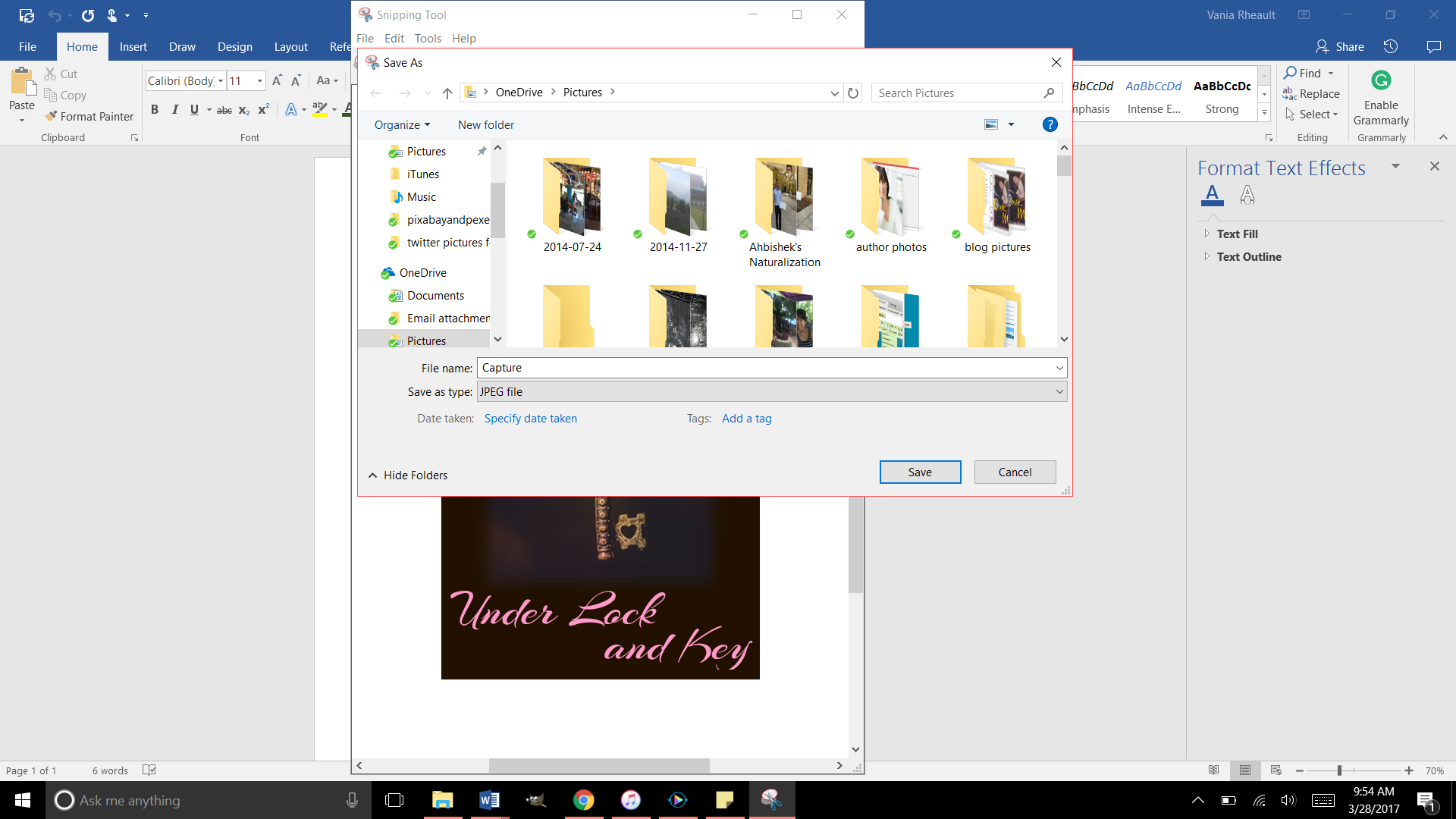
When you’re done, saving it in a photo format can be a bit tricky, however, if you’re doing it in Word because there’s no option to save as a jpeg, jpg, or a tiff file, the only files being accepted by Kindle Direct Publishing (KDP). They don’t take a PDF like CS does.
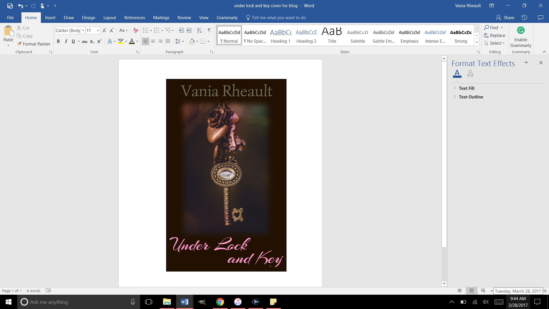
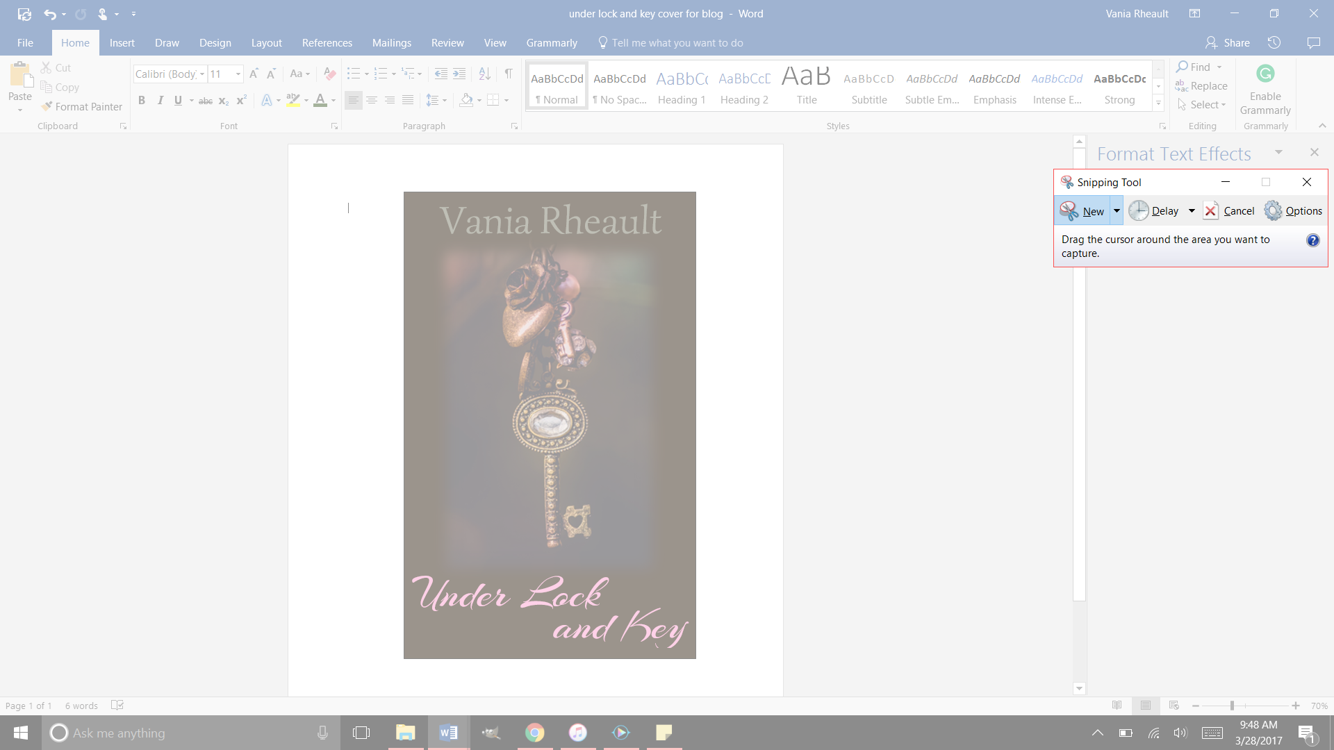
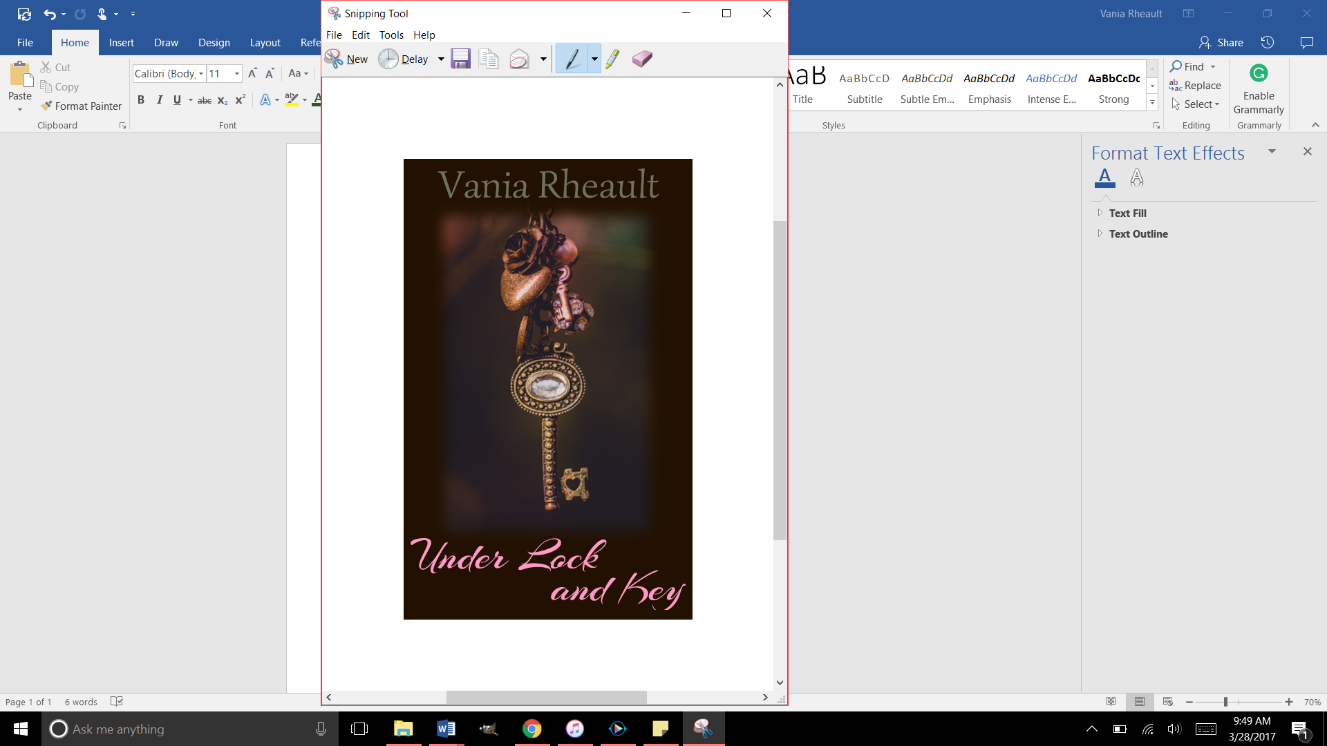
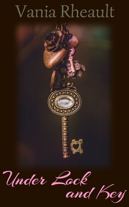
What I did when I made the cover for Under Lock and Key, was after I made the cover, I used the Snipping Tool and “snipped it” and saved it as a jpeg. After I did that, I ran it through GIMP and made sure it was 300 dpi. Always make sure your images are 300 dpi or dots per inch, so your picture is clear online.
Cover basics are the same for Kindle: you want your cover to look pleasing, your name and title clear as a small thumbprint for a potential reader to see.
I made a quick one for my e-reader story using a photo I here found so I didn’t have to pay money for a blog post.
This is a screen shot of the cover I made in Word. There is a lot wrong with it. The title isn’t legible that small in that font, and my name is too dark to be seen. But I’ll leave it this way since this is only an example. Plus the bottom of the Y is cut off (it seems like I like doing that) so you would want to adjust that text box. 😛
Now use the Snipping Tool:
And be as precise as you can. If you get some of the white in there, you can crop it out with GIMP when you check it for dpi:
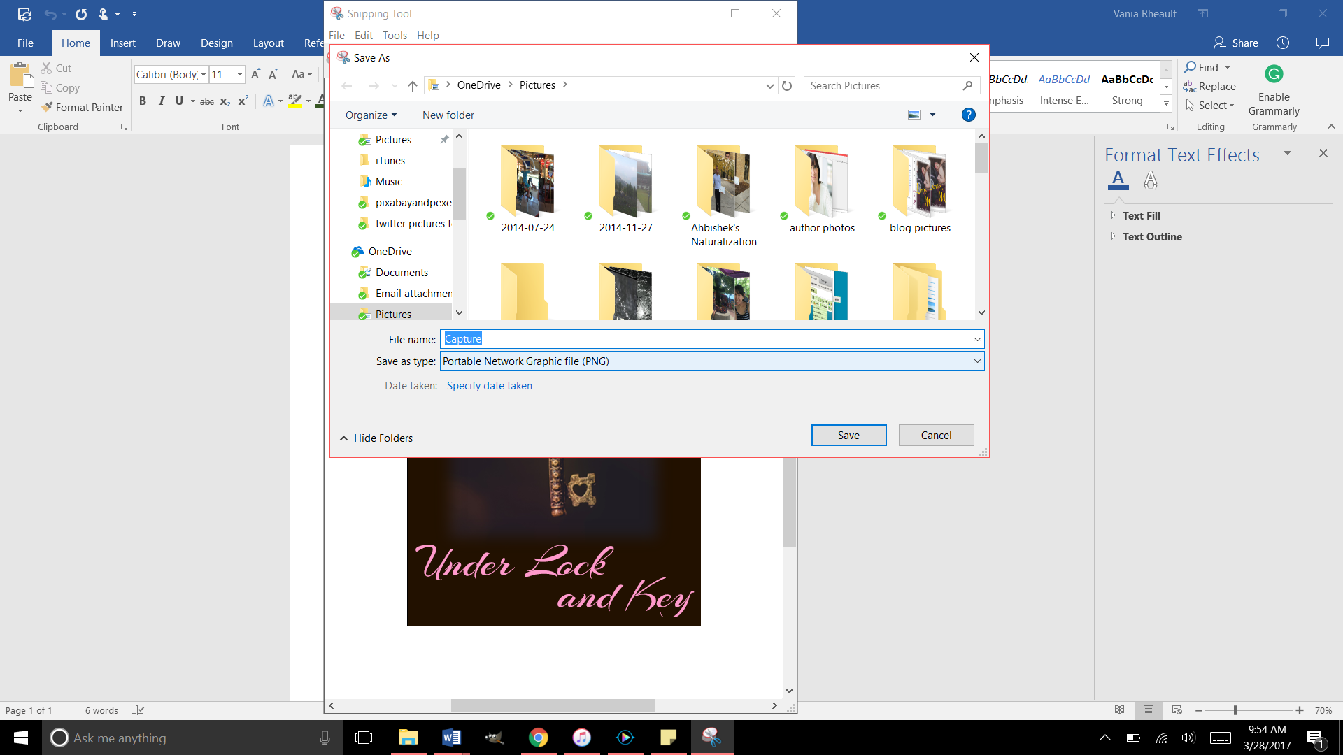
Save it as a JPEG file in the Save As Type:
Right now it’s going to save as a PNG, so you need to change it to JPEG using the down arrow on the right:
That will save it in the file you need. Now you can upload it into GIMP and crop it if you need to, if you accidently snipped some white, and make sure it’s 300 dpi. That’s all you need to do for a cover for your Kindle:
Make it in Word
Snip It
Save it as a JPEG
Run it through GIMP.
Export it under the Save AS so the change in dpi sticks
My picture was only 72 dpi, so I changed it to 300. I exported it to save the changes and this is it:
And that’s all you need. It’s a lot less involved than doing a book cover, and there are a lot of authors who only offer an e-reader option for this reason. Under Lock and Key is a short story, so I didn’t do a paperback for it. But I like paperbacks, and I will probably always offer them to my readers if I can. It might be an expense because I do purchase my own ISBN numbers, but it’s a personal choice.
You can make your cover as simple or as involved as you want. You can buy a template, hire an artist, whatever you choose to do.
When you offer both paperback and Kindle, the thumbnail that shows up is for your Kindle. It’s easy to make a new cover, for the Kindle, but if you’re going to do that you have to decide if you’re going to change the cover in CreateSpace. You don’t to make your readers angry thinking they’re going to get your new cover but they get a completely different one in paperback because you didn’t change it in CreateSpace. I like to keep all my things the same. When I redid the cover for 1700, I changed both. I think it’s courteous that way. I don’t want my readers not to trust me for any reason.
I think that’s it for Kindle Covers. I only need to tell you how to format your Kindle file, and that’s up next!
I started this publishing series eight months ago. Sorry about that. But in that time I’ve published a book (two novellas together), wrote 150,000 more words (in the form of 6 novellas that will be published together), and fixed 1700’s typos inside and the cover. I have also started fixing my 2015 NaNo project just so I can say it’s done and move on.
When I started this series, it was my intention to tell you how to publish a quality paperback cheaply and easily. I think in this recap you’ll see I did that. Even now, I am so tired of hearing that you need to pay for this, pay for that, to publish a quality book.
Indie publishing went from, “It’s not a real way to publish” to “It is a real way if you pay for everything.” No one can afford to pay for the ISBN number, the editing, the formatting, the file conversions. And believe me, there are people who will do it all for you. For a price. But the sad part is if you are willing to take a few minutes (okay, hours), read a few books, you don’t need to pay for anything.
Let the recap of eight months begin.
You wrote a book! Congratulations. Let it sit for a few weeks, even a few months, write something else, read it again. Have a few people read it. Ask them to look for plot holes, flat characters, scenes that don’t move the story along. If you use Word, download Grammarly. It’s a decent checker for things I miss or wouldn’t think to look for. Buy the Hemingway App for more help ($20.00 is a decent investment). Use anything you can get your hands on to make your work as clear and as typo-free as possible.
Grab a trad-pubbed book and copy the front and back matter. You need the copyright page, the acknowledgments. The title page. Dedication page. The author page. You’re in charge of all it.
Get your author picture taken. I want to see you sitting in a cafe with a cup of coffee in your hands, smiling. Because you just wrote a book, and you’re going to publish it, and you are proud of it, and you’re going to own it, dammit! Have your best friend take it and buy her a cup of coffee for her trouble.
Buy your ISBN or don’t. At the beginning, I leaned toward buying your own, protect your work and all that. But if you’re not sure what your publishing plan is, (like one a year, if that) take the free one CreateSpace gives you. No harm done.
Choose the size of your book. If you’re writing smut you’re not going to be able to choose the smut-sized trim sold in Walmart. But choose the size you want, the color (cream or white) pages you want.
Based on that, download the free template from CreateSpace so you can format the inside of your book. CreateSpace wants you to have an easy experience, a good experience, so you keep using them. The template is easy. Download it, copy and paste your manuscript into it. You don’t need to copy the template exactly. Their template comes with a Table of Contents I do not use. Change the font if you want, maybe the size. And please make a couple different copies of your MS. If something goes horribly wrong, well, that would bad. Play around with the template before you copy and paste your MS into it. See what you can change and what will mess up if you touch it.
Make your template for your cover. If you make changes to the number of pages in your MS, you’ll need to recalculate the spine width and change the paper layout dimensions. I forgot to do that when messing around with 1700. I changed the spine text box but not the paper layout. That’s probably why I had some of my spine color wrapped on my front cover.
Write your blurb. Maybe you already did this. Have one of your beta readers read it, make sure it sounds good. I gave you some resources how to write a good one. It takes a little bit of help, though, so don’t be afraid to ask for it.
I wrote about your cover a lot. Remember, if you don’t like the thought of doing your own cover, don’t. Use the CreateSpace Cover Creator, or buy a cover that’s already done. Hire someone. This series was to help you do it as cheaply as possible. People *do* judge a book by its cover, so if this is something you don’t want to tackle, I don’t blame you. There’s a lot of choices out there.
CS takes a PDF of your cover (in the Save As option on Word, PDF is a choice). Submit that, submit your interior, and you’re done. They say 24 hours, but it only takes them 12 to get back to you and tell you if it’s approved or not. Remember the flattening warning you’re going to get. That’s okay. Order the proof, check it over. When I got my second proof for 1700 I read it like I was reading anyone and looked for typos. Spend some time on it, because the proof is exactly what people will be getting when they order it. It takes about 5-10 days to get the proof in the mail. If you want your paperback and the Kindle to be live at the same time, don’t go through the Kindle stuff until your paperback is ready to go. Kindle only takes 5 hours to approve your files. You can have them live on the same day. I had trouble with CS so my Kindle version was live for a couple weeks before my paperback was available. That’s up to you and how you want to do it.
And that’s it. I recommend Chris McMullen’s book and you can find it here. He explains a lot of the technical stuff with the template and he goes into Word a lot more than I do. There’s a lot of tutorials and YouTube videos out there. When I started eight months ago, I didn’t know as much as I do now. Indie publishing is a continual learning process because things change. I’ve learned to read only things that were written in 2016 or even more recently because old information may not help.
If you need any more help, drop me a question. I’m sure you can Google the answer probably faster than I can answer it, but I’ll be going through this whole thing in a couple more months when Summer Secrets is ready to be published. I’ve come a long way with doing covers in Word, and I’m confident that with the patience I’ve learned, the tricks I’ve taught myself playing with the CS interior template, and the tutorials I’ve watched about picture manipulation, the process will go smoothly. And I hope yours does too.
At the beginning of this publishing series, I promised you could make a nice cover with a picture and some words. I got a little fancy with the cover we just went over, and if you’re reading this all the way through and got discouraged, I apologize. I’ll show you how to make a nice cover now, just a picture and some words. That’s it. I promise.
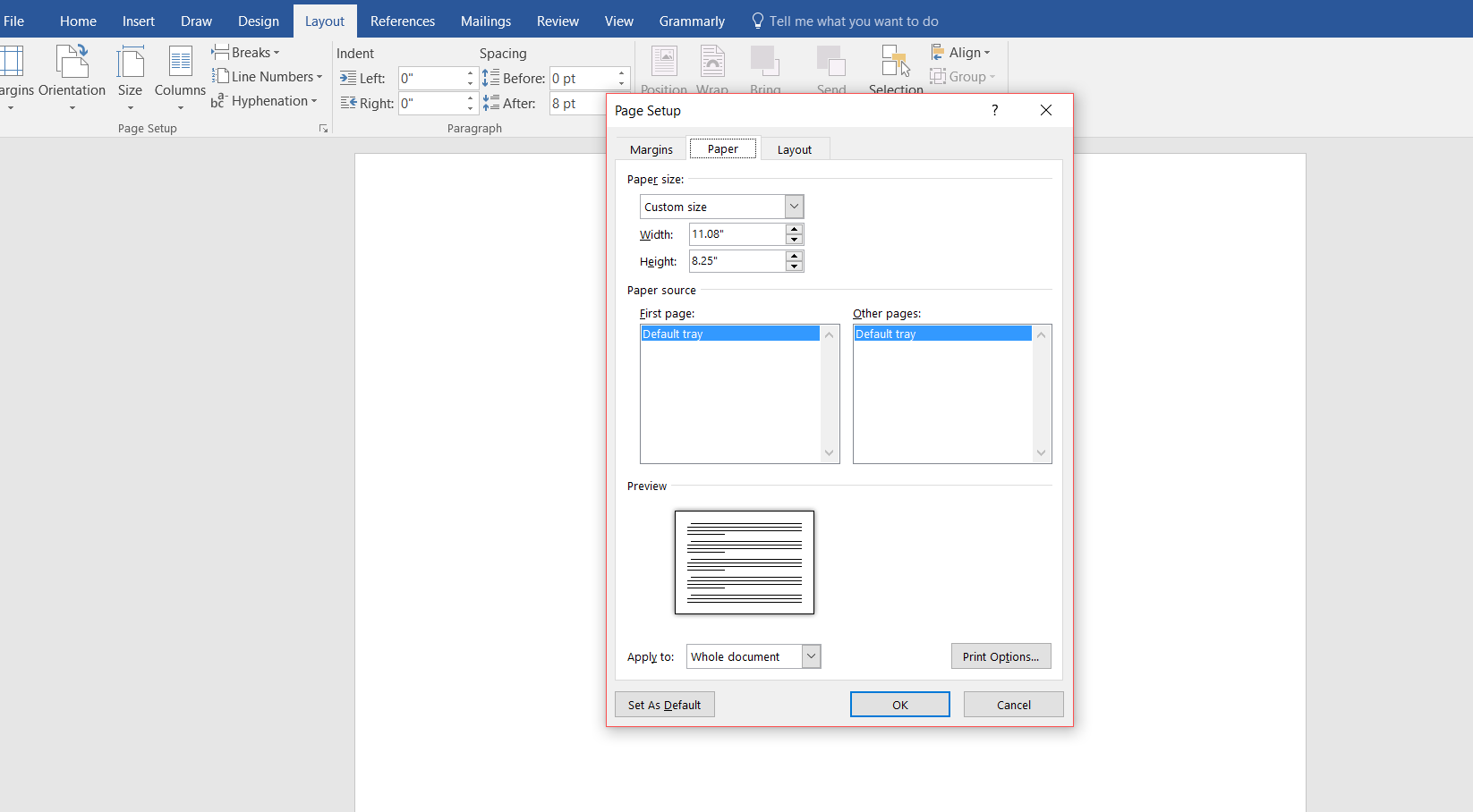
Start out with a new Word document. Go back to the formula for the paper set up. If your book is going to be 5×8 with cream paper, your page set up calculations will be:
Inches: 5 + 5 + spine + .25 (bleed) = what you need.
A 334-page book with cream pages will have a spine of .835 inches. (334 x 0.0025).
5 + 5 + .835 + .25 = 11.085
Height is always easier because you’re not doubling anything. So the height for the page set up would be 8 inches plus .25 for bleed.
8 + .25 = 8.25
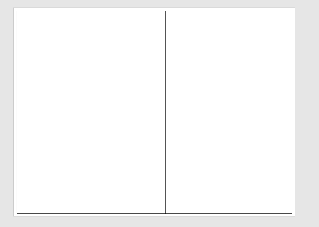
The paper layout will look like this:
Word rounded down, and I’m not sure how that affects our calculations. I would guess it’s insignificant or Word wouldn’t do it.
Follow the rest of the directions in the blog post where I typed out the list of steps.
You’ll have your handy template that looks like this:
This template is for a 5×8 trim size with cream colored pages. Number of pages, 334. (A nice, long book. :)) (FYI, You’ll always have an even number of pages because a page has two sides.)
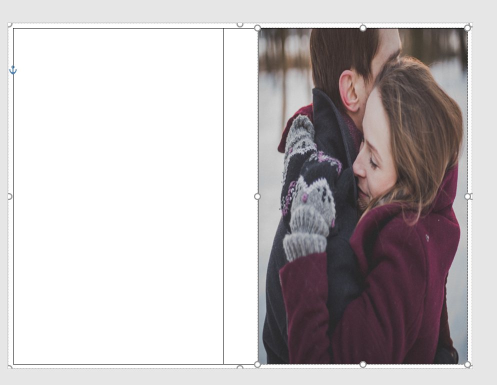
The problem with the picture I like is that it’s square, not rectangle, so when I put it into the template, it stretches. Stretchy is not the same as stabby; sometimes stabby can be a good thing.
If you don’t mind she looks a bit stretched out or you swear you can’t tell, that’s your prerogative. I’m sure down the road it will bother you, so you might as well do it right the first time. I guess I don’t need to tell you, to avoid this you can always find a rectangle picture. There are plenty out there and CanStock will even filter square pictures out in your searches.
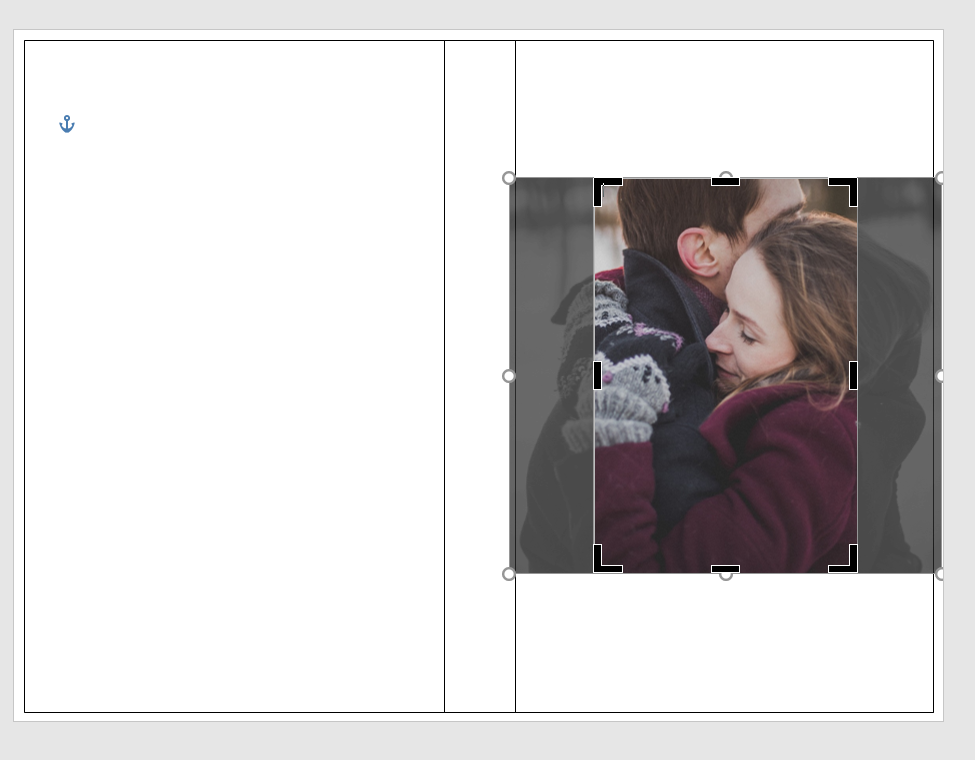
Using the Crop feature, I cropped it using the Aspect Ratio, portrait 2:3.
Fix the dimensions of the picture so it fits into the 5×8 box.
It brought them closer, but that’s okay.
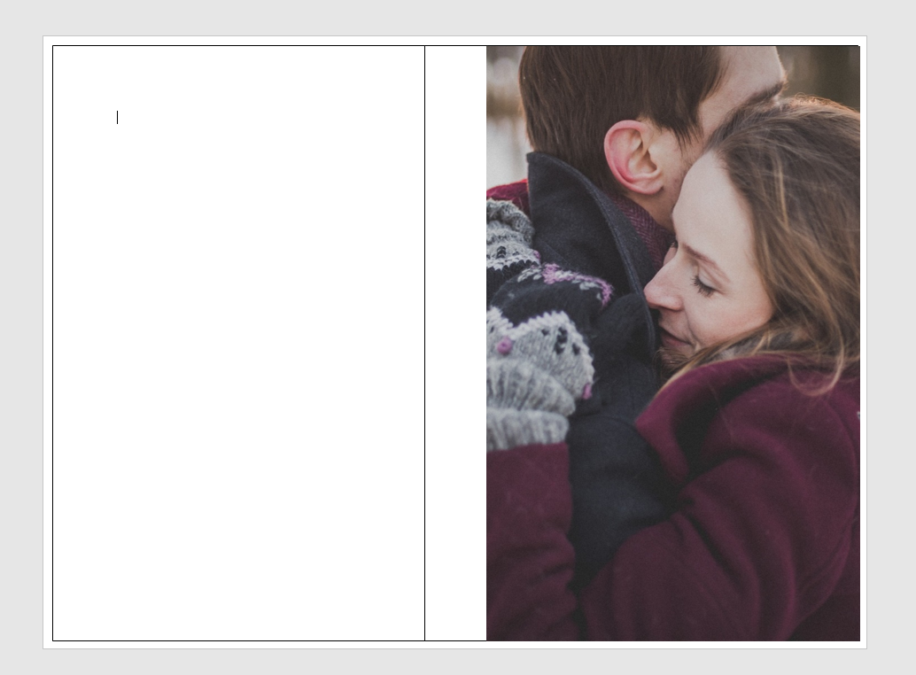
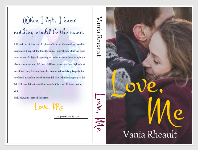
So this is what I have so far:
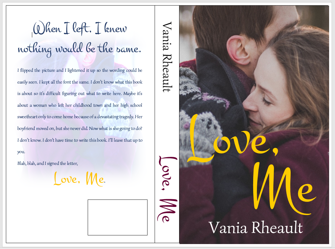
I downloaded a new font. I used the same picture on the back, but flipped it and lightened it. I did forget to mention in the last post that you probably want to put the price above the ISBN box. That way if you do happen to have a book sale of some kind, you can have the price on there, and if you put it on discount, customers can see that it is.
If you think the cover picture is too bold for the white spine and the back cover, you can lighten up the cover edges a bit like this:
You can do what you want with the blank space by the ISBN box. Maybe your author picture, maybe your imprint picture. Whatever. But I did what I promised you from the beginning, I gave you a lovely cover with just one picture, no fancy picture effects you need to learn how to do. Oh, wait, take all the lines off. I swear, there is always something.
And don’t worry about the cursor. That will go away when you save it as a PDF to submit it to CS. Also, remember not to freak out if this is all you have and you want the Kindle cover too. CS will offer it to you, and you can download it.
I think this is it for covers. I’ll post a recap of everything I’ve talked about then I’ll tell you how to format your file for Kindle.