
If you’ve followed my blog for any amount of time, you guys know I love talking about book covers. I especially love talking about scammers trying to rip you off by slapping a pretty font over a free photo from PIxabay and charging you $50.00 for something you can do yourself in Canva for free. I recently called out a “designer” for doing exactly that, and the icing on the cake was another member of the FB group posted her cover with the same exact photo and said she, too, had been taken for a ride. The universe was on my side that day! I would post a screenshot, but the original poster took it down a couple minutes after. Hopefully in embarrassment with her tail tucked between her legs!
I know I can’t save the world, and if I tried, I wouldn’t have enough time to write. I do like talking about covers though and what draws readers to buy our books. I’m watching a replay of a webinar with Nick Stephenson, and like any webinar talking about sales, he goes briefly goes over a book cover case study with one of his own books.
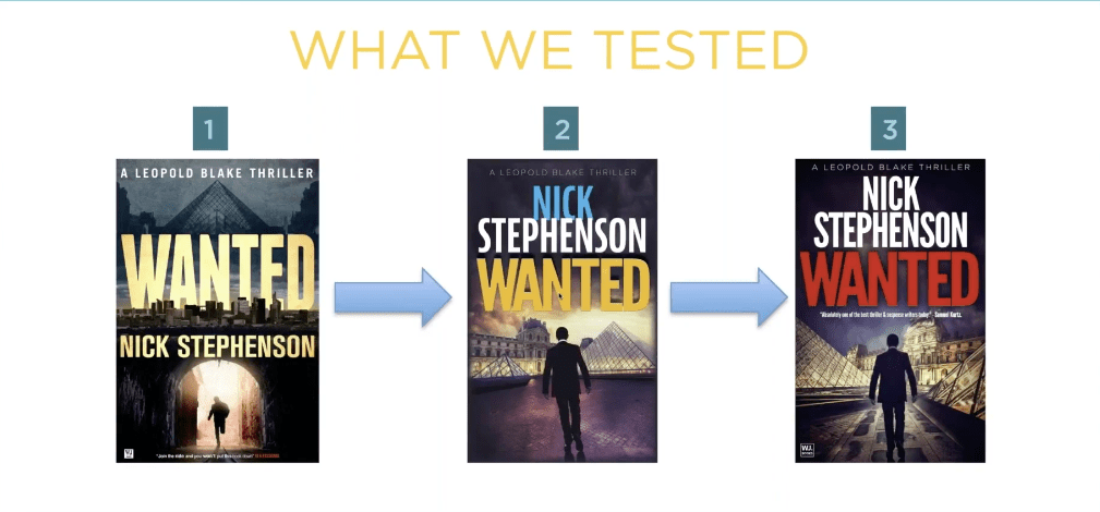
What he said is that the first cover wasn’t doing a good job. So they tried book cover number two, and eventually number three. Number three had the highest click-through and he explained in the next slide why:
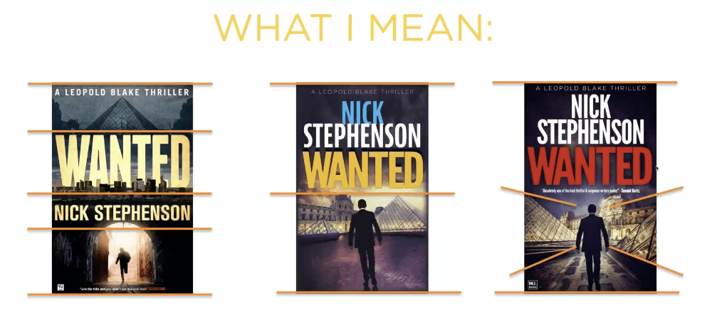
Apparently, the red title that is associated with thrillers helped, along with the placing the elements that draw the eyes toward the center of the book. I like the first cover though, and I wonder how it would have done had he just changed the butter yellow font color to the dark red that works with thrillers. I think the guy running through the tunnel draws the eye to the center of the book just as well as the silhouette on the third cover. What do you think?
But it just goes to show that even a perfectly good cover may not be doing its job.
If you want to learn more about what Nick is doing, you can check his website here. And if you want to watch any of his YouTube videos, you can check out his channel here.
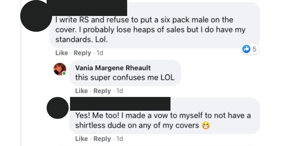
Anyway, in the FB group I’m in, there was a thread about cover pet peeves, and I thought it was a silly thread because this is something that authors seem to forget. Your book’s cover isn’t for you.

Just like most people agree that reviews aren’t for the author, they’re for readers finding their next book, covers, also, are only for readers. If you get too precious about your cover, or you’re too attached, or you let pride stand in the way of sales, what are you trying to prove? And to who?
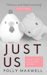
Listen, if I have to find a picture of a pig and a chicken falling in love to sell my book, then that’s what I’ll put on my cover. I didn’t write my book so it would sink to the bottom of the charts because I cared more about my likes than what will sell my book.
Genres have cover expectations, and unless you have a solid audience already in place, you need a cover that will sell books. I’m not sure why authors have such a hard time understanding this. I know some of it is cash. Especially if you pay out and you can’t afford to swap. I mean, I’ve heard of that happening, and it’s too bad. But you’re not going to make anything off a book that has a cover on it that isn’t appealing to readers.
Authors can make fun of man-chest covers, or the boring couple with the script font on the front, or all the thriller covers that look the same (girl in red jacket running away from the camera in the fog), or all the Urban Fantasy with the tough girl holding a fireball, but in doing so it just closes their minds to the possibility that being the same as other books might not be a bad thing. And why make things harder than they need to be? Discoverability is difficult!
That thread just really boggled my mind like so many indie decisions do, I guess.
I want my books to sell. That means genre specific tropes, cover to market, good blurb, correct categories and keywords, a nice look inside without typos.
Readers have a lot of choices these days, over 8 million to be exact. Why purposely give them a reason to keep scrolling?
Okay, I think I’m done musing and I’m going to bed. One day I’ll probably get kicked out of all my Facebook groups, but I just can’t help it. I just shake my head at the authors who want to do it their way then end up crying because they don’t sell books.
Can you ever really have your cake and eat it too?
Let me know, because I don’t care enough to try.

Discover more from Vania Margene Rheault
Subscribe to get the latest posts sent to your email.


Despite what people say, we do judge a book by it’s cover. So I finally decided to redesign mine.
Nick Stephenson’s webinars are quite informative. I wonder if he makes more selling his services than he does with his books?
LikeLiked by 1 person
Took look at his books on Amazon. He just published something in February of this year, but hadn’t published fiction since 2016. So maybe he is putting more time into the non-fiction part of his career. I don’t think that’s uncommon–I asked Bryan Cohen once if he was ever going to write fiction again and he said for now he didn’t have time. I’ve redone all my covers. Sometimes it helped, sometimes it didn’t (mostly because of genre and a few other things I’m trying to rectify this year). I hope your new cover works for you!
LikeLiked by 1 person