Just a note about book covers and not believing everything you hear.

The amount of information out there is insane, right? You don’t know who to believe, what to believe, if anything is true, and I’m not talking about what’s on social media right now with regards to COVID, but with indie publishing. There are scammers out there, people who want to make a buck off of your inexperience. These people aren’t nice, and you’ll run into them time and time again joining FB groups and Twitter people tweeting their “services” such as they are.

But when you get up into the bigger indies, the ones who are making a bit of money and they turn to the non-fiction, or entrepreneurial side of things, you do expect them to know what they’re talking about.

I’ve mentioned Nick Stephenson on the blog before, incidentally when I was blogging about book covers not that long ago. Because I love all things book covers, when I got an email (yeah, I’m signed up to his newsletter) saying he could make a book cover in 10 minutes using BookBrush, I was intrigued.

I already know I won’t ever use BookBrush, I prefer Canva, and they’re cheaper. I know BookBrush is specifically created for authors and Canva is meant for anyone who needs to make a quick graphic design. I like Canva, know how it works, and I’ve loaded quite a few fonts in my kit over the past couple of years. I don’t think I’ll change anytime soon.

Anyway, so I settled in to watch it, and you can watch it, too.

I had a hard time with the video, and not only because it’s basically one big BookBrush commercial with a probable affiliate link included that he failed to mention was an affiliate link. I could be wrong, but why take the time to make a video and not include a link where he could make a bit of money if his watchers decided to try it out?

So, I watched it, and didn’t really like the cover he came up with at the end and here’s why:

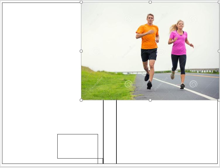
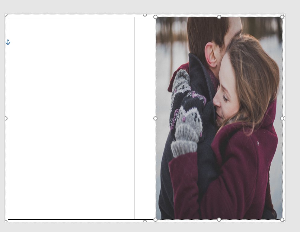
  1. He advocated using Unsplash for photos, and anyone who does book covers knows that using free photos is a no-no. Especially with people in them. Websites like Pexels, Unsplash, and Pixabay do not collect model releases and these websites do not vet photos. There are things in these photos that are not for commercial use. I went to Unsplash and typed in tennis shoes. There were several photos of generic shoes, but there were also some photos that came up with Nike (the swoosh is a dead giveaway) and Adidas. To a newbie wanting to make a book cover about say, running or a personal journey or something, they might think a nice looking photo with a pair of Nike shoes would be okay because they found it on a free-for-commercial-use website. Do the same search on Deposit Photos and not one pair of Nikes shows up at all, or any logo for that matter.
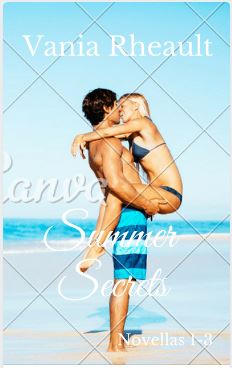
  2. He chose Romance and that is a very nuanced genre. The couple he picked had all their clothes on, and in romance (read: reader) circles, that would indicate the book to be sweet and or clean. Heat levels are depicted by the amount of skin showing on a cover, and that’s something Nick didn’t mention in the video.
  3. He didn’t do a full wrap. I admit his way could be okay for a short story or a reader magnet that may not need the level of quality a book cover would need to promote sales. Reader magnets are supposed to bring signups to your newsletter though, and I wouldn’t imagine anyone signing up for a newsletter if the draw is going to be a short story with a crappy cover. So while you may not want to fork over $100.00 for a premade for a short story or novella that won’t go on sale, eventually your newsletter subscribers are going to be your bread and butter, and you need to treat your fans with the respect they deserve.
  4. Not all fonts are free for commercial use. I don’t know if the font he picked is included in BookBrush or if it’s free for commercial use. I looked at the site I commonly go to for free for commercial use stuff, and it is featured there.

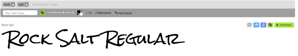
Not all the fonts on that website are for commercial use. Only the fonts with the green dollar tag are. The other problem I had with the font is that it’s not very romancy. Yes, I get he was trying to make a point in that he could make an ebook cover in 10 minutes, and he did. But font is a big deal when it comes to covers and this one, even though it’s free, just doesn’t work.

I don’t mean to pick on him, and I did make a comment on his YouTube video, so don’t think I’m ragging on him behind his back. My comment isn’t as long as what I wrote out for you here, but enough that maybe I did slap him down a little bit. I don’t mind calling out people who aren’t being entirely on the up and up. Passing out bad information is bad, no matter who is doing or how cute his accent is. I know us American ladies are a sucker for a cute accent, but don’t let him talk you into using free photos. It’s just bad news.

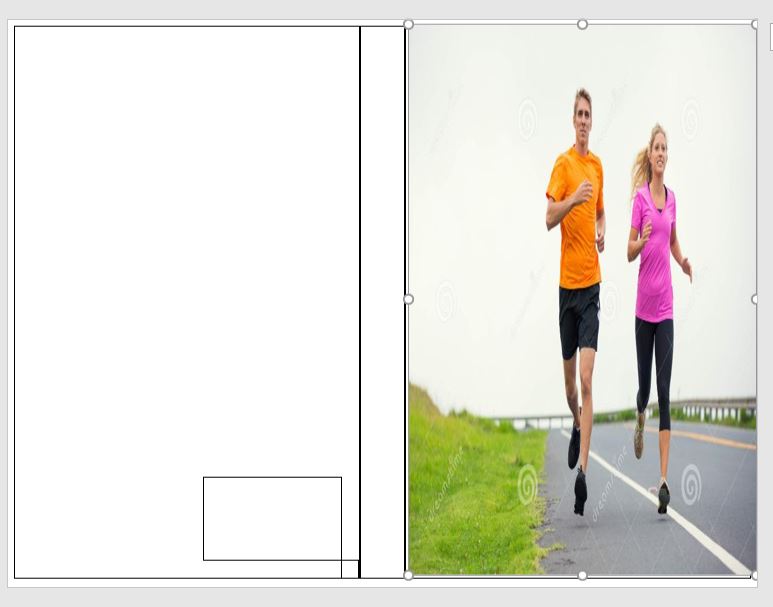
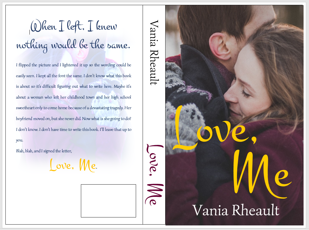
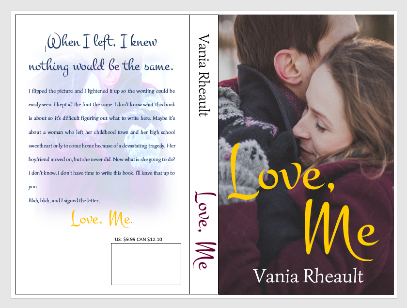
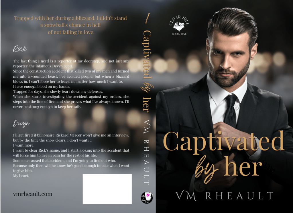
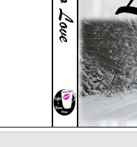
Here’s my version of a sweet wedding book cover:

Stock photo taken from Deposit Photos. Title font, Calgary. Author font, Bodoni FLF Cover created in Canva

And it’s easy to see if it will make a good cover by plugging it into the 3d cover mock up creator by Derek Murphy:

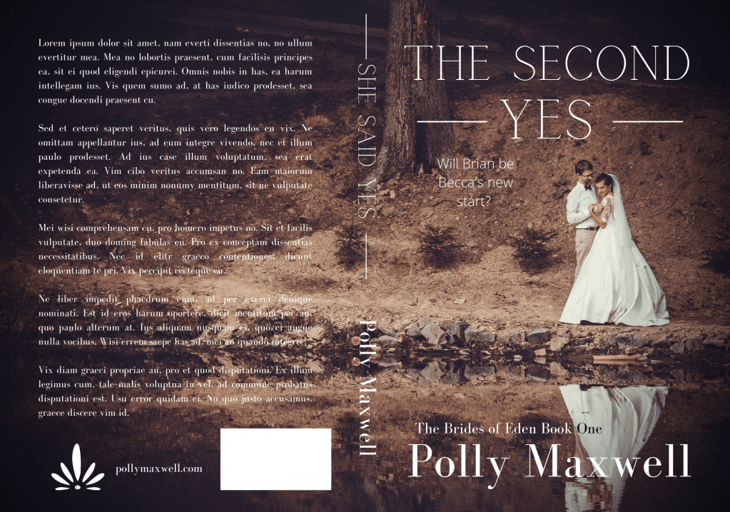
With the photo I chose and the title, maybe it’s gearing more toward Women’s Fiction than sweet Contemporary Romance, but it just proves my point: you need to take a bit of time to think about your cover and put some effort into choosing the stock photo, font, and overall design.

I know he was trying to prove his own point: that using BookBrush is an easy tool and you don’t have to pay out hundreds of dollars for a simple cover by a designer. And that’s true, kind of. Someone asked in one of my FB groups what is the best software to make a book cover with, and lots of people chimed in with Photoshop, Canva, Affinity Photo, GIMP, the usual suspects. I told him I use a mixture of Canva and GIMP but I said it doesn’t matter what software you use. If you haven’t developed and eye for what looks good, you’ll always make crap.

If the shoe fits, don’t step in it.

Until next time!


CreateSpace Recap

I started this publishing series eight months ago. Sorry about that. But in that time I’ve published a book (two novellas together), wrote 150,000 more words (in the form of 6 novellas that will be published together), and fixed 1700’s typos inside and the cover. I have also started fixing my 2015 NaNo project just so I can say it’s done and move on.

When I started this series, it was my intention to tell you how to publish a quality paperback cheaply and easily.  I think in this recap you’ll see I did that. Even now, I am so tired of hearing that you need to pay for this, pay for that, to publish a quality book.

Indie publishing went from, “It’s not a real way to publish” to “It is a real way if you pay for everything.” No one can afford to pay for the ISBN number, the editing, the formatting, the file conversions. And believe me, there are people who will do it all for you. For a price. But the sad part is if you are willing to take a few minutes (okay, hours), read a few books,  you don’t need to pay for anything.

Let the recap of eight months begin.

  1. You wrote a book! Congratulations. Let it sit for a few weeks, even a few months, write something else, read it again. Have a few people read it. Ask them to look for plot holes, flat characters, scenes that don’t move the story along. If you use Word, download Grammarly. It’s a decent checker for things I miss or wouldn’t think to look for. Buy the Hemingway App for more help ($20.00 is a decent investment). Use anything you can get your hands on to make your work as clear and as typo-free as possible.
  2. Grab a trad-pubbed book and copy the front and back matter. You need the copyright page, the acknowledgments. The title page. Dedication page. The author page. You’re in charge of all it.
  3. Get your author picture taken. I want to see you sitting in a cafe with a cup of coffee in your hands, smiling. Because you just wrote a book, and you’re going to publish it, and you are proud of it, and you’re going to own it, dammit! Have your best friend take it and buy her a cup of coffee for her trouble.
  4. Buy your ISBN or don’t. At the beginning, I leaned toward buying your own, protect your work and all that. But if you’re not sure what your publishing plan is, (like one a year, if that) take the free one CreateSpace gives you. No harm done.
  5. Choose the size of your book. If you’re writing smut you’re not going to be able to choose the smut-sized trim sold in Walmart. But choose the size you want, the color (cream or white) pages you want.
  6. Based on that, download the free template from CreateSpace so you can format the inside of your book. CreateSpace wants you to have an easy experience, a good experience, so you keep using them. The template is easy. Download it, copy and paste your manuscript into it. You don’t need to copy the template exactly. Their template comes with a Table of Contents I do not use. Change the font if you want, maybe the size. And please make a couple different copies of your MS. If something goes horribly wrong, well, that would bad. Play around with the template before you copy and paste your MS into it. See what you can change and what will mess up if you touch it.
  7. Make your template for your cover. If you make changes to the number of pages in your MS, you’ll need to recalculate the spine width and change the paper layout dimensions. I forgot to do that when messing around with 1700. I changed the spine text box but not the paper layout. That’s probably why I had some of my spine color wrapped on my front cover.
  8. Write your blurb. Maybe you already did this. Have one of your beta readers read it, make sure it sounds good. I gave you some resources how to write a good one. It takes a little bit of help, though, so don’t be afraid to ask for it.
  9. I wrote about your cover a lot. Remember, if you don’t like the thought of doing your own cover, don’t. Use the CreateSpace Cover Creator, or buy a cover that’s already done. Hire someone. This series was to help you do it as cheaply as possible. People *do* judge a book by its cover, so if this is something you don’t want to tackle, I don’t blame you. There’s a lot of choices out there.
  10. CS  takes a PDF of your cover (in the Save As option on Word, PDF is a choice). Submit that, submit your interior, and you’re done. They say 24 hours, but it only takes them 12 to get back to you and tell you if it’s approved or not. Remember the flattening warning you’re going to get. That’s okay. Order the proof, check it over. When I got my second proof for 1700 I read it like I was reading anyone and looked for typos. Spend some time on it, because the proof is exactly what people will be getting when they order it. It takes about 5-10 days to get the proof in the mail. If you want your paperback and the Kindle to be live at the same time, don’t go through the Kindle stuff until your paperback is ready to go. Kindle only takes 5 hours to approve your files. You can have them live on the same day. I had trouble with CS so my Kindle version was live for a couple weeks before my paperback was available. That’s up to you and how you want to do it.


And that’s it. I recommend Chris McMullen’s book and you can find it here. He explains a lot of the technical stuff with the template and he goes into Word a lot more than I do. There’s a lot of tutorials and YouTube videos out there. When I started eight months ago, I didn’t know as much as I do now. Indie publishing is a continual learning process because things change. I’ve learned to read only things that were written in 2016 or even more recently because old information may not help.

If you need any more help, drop me a question. I’m sure you can Google the answer probably faster than I can answer it, but I’ll be going through this whole thing in a couple more months when Summer Secrets is ready to be published. I’ve come a long way with doing covers in Word, and I’m confident that with the patience I’ve learned, the tricks I’ve taught myself playing with the CS interior template, and the tutorials I’ve watched about picture manipulation, the process will go smoothly. And I hope yours does too.


Congratulation-Banners-black-small-1

Promises, Promises

At the beginning of this publishing series, I promised you could make a nice cover with a picture and some words. I got a little fancy with the cover we just went over, and if you’re reading this all the way through and got discouraged, I apologize. I’ll show you how to make a nice cover now, just a picture and some words. That’s it. I promise.

Start out with a new Word document. Go back to the formula for the paper set up. If your book is going to be 5×8 with cream paper, your page set up calculations will be:

Inches: 5 + 5 + spine + .25 (bleed) = what you need.

A 334-page book with cream pages will have a spine of .835 inches. (334 x 0.0025).

5 + 5 + .835 + .25 = 11.085

Height is always easier because you’re not doubling anything. So the height for the page set up would be 8 inches plus .25 for bleed.

8 + .25 = 8.25

The paper layout will look like this:

paper layout

Word rounded down, and I’m not sure how that affects our calculations. I would guess it’s insignificant or Word wouldn’t do it.

Follow the rest of the directions in the blog post where I typed out the list of steps.

You’ll have your handy template that looks like this:

blog cover template

This template is for a 5×8 trim size with cream colored pages. Number of pages, 334. (A nice, long book. :)) (FYI, You’ll always have an even number of pages because a page has two sides.)

The problem with the picture I like is that it’s square, not rectangle, so when I put it into the template, it stretches. Stretchy is not the same as stabby; sometimes stabby can be a good thing.

stretchy

If you don’t mind she looks a bit stretched out or you swear you can’t tell, that’s your prerogative. I’m sure down the road it will bother you, so you might as well do it right the first time. I guess I don’t need to tell you, to avoid this you can always find a rectangle picture. There are plenty out there and CanStock will even filter square pictures out in your searches.

Using the Crop feature, I cropped it using the Aspect Ratio, portrait 2:3.

crop

Fix the dimensions of the picture so it fits into the 5×8 box.

crop1

It brought them closer, but that’s okay.

So this is what I have so far:

back cover done1

I downloaded a new font. I used the same picture on the back, but flipped it and lightened it. I did forget to mention in the last post that you probably want to put the price above the ISBN box. That way if you do happen to have a book sale of some kind, you can have the price on there, and if you put it on discount, customers can see that it is.

back cover done2

If you think the cover picture is too bold for the white spine and the back cover,  you can lighten up the cover edges a bit like this:

back cover done3

You can do what you want with the blank space by the ISBN box. Maybe your author picture, maybe your imprint picture. Whatever. But I did what I promised you from the beginning, I gave you a lovely cover with just one picture, no fancy picture effects you need to learn how to do. Oh, wait, take all the lines off. I swear, there is always something.

back cover done4

And don’t worry about the cursor. That will go away when you save it as a PDF to submit it to CS. Also, remember not to freak out if this is all you have and you want the Kindle cover too. CS will offer it to you, and you can download it.

I think this is it for covers. I’ll post a recap of everything I’ve talked about then I’ll tell you how to format your file for Kindle.

Thanks for reading!


Writing a Blurb for Your Back Cover

I’m putting this blog post into the archives. It’s over two years old, and I have done updated posts on blurbs with newer resources. You can check out how I wrote the blurb for one of my recent books All of Nothing, here. Please let me know if you have any questions, and I’ll be happy to point you in the right direction! 9/15/19  VR


I think I might have touched on this previously in one of my other posts at the beginning of this publishing series. Your blurb goes on the back of your paperback and is used for the “what your book is about” description at Amazon, Barnes and Noble, Smashwords, etc. So you want it to sound good to make your potential customer an actual reader. Blurbs kinda suck because you want to give your customer enough to draw them in and want to keep reading, but you can’t give so much away that after they are done reading it, they don’t need to read the book anymore. I can’t tell you how to write your blurb, but I’ll use this blog post to point you in the right direction.

I’d never heard of Libbie Hawker until I read this book by David Neth. David wrote that Libbie Hawker did a great vlog on how to write a blurb, and I watched her YouTube video. She makes some fantastic points, and you can watch it here (part one) and here (part two). YouTube made other suggestions, but I didn’t watch them, but you can watch them if you’d like.

When I needed help writing the blurb for 1700,  I Googled “how to write a blurb,” and I used the first article that came up. I liked the example from Girl on a Train and tried to write my blurb based on that article. You can find it here.

One thing I didn’t consider was something I read in this book by Judith Briles that said the top of your back cover is prime real estate, and you should put some kind of a question or statement on the top in really huge letters. That was a cool idea, and I might do it for my next book. The Hunger Games did it:

back cover

But then, of course, you can argue against the whole thing, as my friend Joshua did in his blog post, stating that back blurbs are for bookstores. Yes, Debbie Downer, my book probably won’t make it into a bookstore, but I like putting a blurb on the back, so I will. You have to write one anyway, so might as well copy and paste it on there. But it does make for a nice, clean back cover. (Sigh.)

entropy

It’s a yummy book, and you can find it here and read the blurb too if you’d like.

I did read this book (yeah, I read a lot, lucky for you!) and they wrote a section about writing blurbs too. I found it to be very helpful but nothing Libby didn’t cover in her vlog.

Anyway, so there are some resources on how to write your blurb.

Next time I’ll write about the back cover and then recap what I’ve gone over so far. After that, I’ll tell you how to format your e-reader file for Kindle so you can load it into Kindle Direct Publishing. After that, I don’t know what I’ll  write about, though something is bound to come up, huh?

Thanks for reading! Talk later!

Your Book’s Spine

There’s not much you have to do with your spine. Remember, if you are publishing a novella, after formatting, your manuscript must be 100 pages or more. This is where the 5×8 trim size (the smallest size CreateSpace has to offer) comes in handy. You can also maybe bump up the font size in your manuscript if spine text is that important to you. But don’t go too big, you’re not publishing a Large Print edition.

Let’s look at the cover and template again:

blog-spineee

You kind of want the front cover, the spine, and the back cover to blend together. We don’t have a lot of colors to work with here, so I would probably leave the spine white and use the same fonts I used on the cover and keep them black.

title-1 
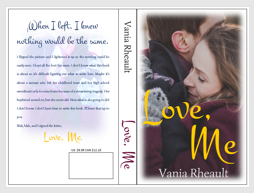
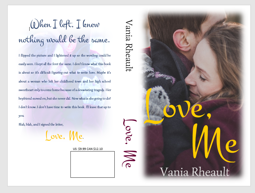
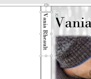
Draw a text box in the text box. Don’t make it bigger than you need; smaller text boxes are easier to work with.

Experiment with the font and the size. You can manually enter in the font size and work with the numbers even if the font size is not available in the drop down selection.  You can see here that my name is not centered on the spine, but I chose the biggest font size that would fit.
title-2Move the text box so your name is centered on the spine:

The text box overlap doesn’t matter, we’ll fix that. The most important thing is that the letters are clear and big and as centered as you can make them. If your hand is shaky, or your mouse is temperamental, use your direction keys on your keyboard to move the box around.

title-3

Take off the edges by making sure the text box is selected and selecting No Outline in the Shape Outline option in the Shape Styles menu.

The white box is still visible on the cover so you need to select Shape Fill and select No Fill to make the box clear. This option is above the Shape Outline option we used to make the lines disappear.

shape-outline

You can see my name isn’t centered, it’s a little high, but the text box is gone. Move the text box around so you can center your name the best you can. CreateSpace won’t fix any issues you have. On my first attempt on The Corner of 1700, the bottom of the C was missing because I didn’t adjust the text box when I made the font bigger. Anyway, move the text box.

title-4-not-centered

That looks pretty damn near perfect.  There’s no rule that says your name has to go on the top and the title on the bottom. Do what you want, just make sure the text is in the right direction. Take a look at traditionally published books and do you the best you can. Fiddle with the colors if you want, play with font and size.

title-5-centered

Do the same with the title.

spine-1

I use an imprint and like to put it on my spine. Insert a text box.

imprint-spine

Use the Shape Fill to insert the picture, then use the No Shape Outline to get rid of the text box lines.
imprint-spine-2

You’ll get a warning from CreateSpace if this image isn’t 300 dpi. Mine printed fine at the 79 dpi because it’s so small, but you might as well make sure it’s 300 dpi in GIMP in case you want to use it anywhere else.

So far, this is what we have. It looks pretty good, and I think the title and author name are centered and as big as I can make them. If your book is thicker, you could even put the couple’s picture at the top; I’ve seen that done before, and I’m sure you have too. But the thinner the book the less room you have. That isn’t an excuse to plump up your book for no reason. CreateSpace charges you for printing costs, which means a higher price for your book the thicker it is.

cover-and-spine

We’ll look at the back cover next. I think you’ll find the worst part about the back cover is writing the blurb!

Until next time, keep experimenting!

Book Cover Templates

Book cover templates are not such a terrible option if you tried to make your own cover and either couldn’t get what was in your head onto a Word doc, or you don’t have the time or energy to figure it all out.

There are template websites out there that sell them and also lots of places to buy already-made covers. You just put your own info into the template and you’re all done–similar to the CS Cover Creator.

While I was looking around some of these sites I noticed a few things:

  1. Some templates only fit certain book sizes, so make sure the cover that you think will perfectly fit your story and title will also accommodate the size of the book you were planning on. This is especially important if you’re paperbacking a novella. The smaller trim size will make more pages, creating a thicker book.
  2. Some sites sell you the cover and that’s it. Make sure that you are buying a template that also includes the spine and back, otherwise, it will be your responsibility to match font and colors to create the spine and back cover. This isn’t so important if you are going digital (e-reader) only, but maybe down the road you decide to create a paperback as well, you’ll need to submit all of it.
  3. Sometimes you can copy it for free. Study the picture, the background, the placement of title, where your name will go. How fancy is the back?  If you found the picture at Dreamstime could you copy it and save yourself a couple bucks? It’s worth trying to find the picture at least before you buy the template. You can do this for any book cover as well. Look up the top selling books in your genre. Make a list of the things they have in common and see what you can come up with. If anything, this will give you an idea of what you’re looking for in a template.
  4. Maybe a template is cheaper. I made a pretty one on Canva, and the picture was a dollar. I found the same picture on Canstockphoto, but since I buy them singly there and don’t subscribe, itcanva 
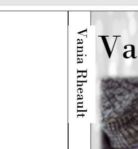
would have cost me 8 dollars. Canva is front cover only, so either way I would still have to do the spine and back cover myself. And if I use Canva, I would need to figure out the font so I could use the same on the back cover.

All I did was Google “book cover templates” and came up with a few choices.

Cover Design Studio looked nice, and they have some pretty covers. Make sure you scroll all the way down to the bottom of the page of a template you like and look for Additional Information. It will tell you the trim size available, etc. In the pricing, they have a couple of options, and one is CS plus Kindle. That sucks because if you upload to CS first, they send you the file for the Kindle cover, it even says so in the file name:

kindle-cover

There’s The Corner of 1700’s Kindle picture of the cover CS sent me for when I put my book in KDP (Kindle Direct Publishing). So that website is making you pay for something you don’t need. Otherwise, you can buy the Kindle version and make the spine and back cover yourself.

Joanna Penn on her blog post listed DIY Book Covers as a resource. I didn’t check them out but that could be something to look into as well.

Otherwise, Google “Premade Book Covers” and that will give you a bigger selection of finds. But, as always, make sure you ask about the spine and back cover. They may charge you extra for those.

Hopefully, you can use them for inspiration. I found this one on Cover Design Studio:

cover-design-studio

Something about it called to me. I don’t know if was the sparkles, or what. But I liked it and wanted to replicate it. I couldn’t find the picture, but I found something . . . not similar, but something else I liked, and I made this:

blog-demo-cover

It’s not exactly what Cover Design Studio made, but I like mine. Maybe you can find something that can help you put down what you like too. And I always have to add the disclaimer to make sure you can use it commercially, and in the copyright page of your book, credit the photo to the website and artist who made your picture available. You bought it, but it’s the polite thing to do. I stole this picture off Pinterest so I wouldn’t be able to use it for a real cover. Hopefully, I could find it elsewhere, but this book hasn’t been written, so it’s not terribly important.

Happy browsing!


Book Cover, Try 4

I have to admit, I had a moment last night after my last post where I thought maybe I shouldn’t be blogging about this. Because let’s be honest, my first few attempts at doing a book cover didn’t go so well, and they didn’t prove I should be the one to tell you what to do. But I did try again this afternoon, and with a little patience, I am proud of what I came up with:

blog-book-cover-post

I’m actually going to keep this one around because I do think I’ll end up using it. I love how all the colors blend together. The woman looks like my female MC, the guy is cute (some of those guys in the stock photos are NOT all that cute, LOL), and it looks more like a traditionally published book cover would look. I wish maybe the path would have had some people running on it–that would have tied in the title to the story a little better, but that’s okay. I tried to look for one, had even thought through all my searches that I had found one but didn’t bookmark it. I’ll look for it some more.

Anyway, how I did it was I started with a “base” of a texture that I found off Pixabay. I searched blue dots, and found something I liked:

blue-dots

But I realized the colors were too bright, so in the picture tools, I made them grey and white which meshed with the people better. I still needed text boxes to put the couple, the trees, and then the title and my name. I fiddled around with the placement of all three until I was satisfied. I don’t know if a person can be 100% satisfied. It’s rather like reading your work over and over again and noting all the things that you would change.

I don’t mind posting my struggles on here because I want you to know that 1) I don’t know what I’m doing, but I still don’t have to pay someone to help me, which, maybe it shouldn’t be, but is a huge pride thing for me, and 2) NEVER publish your first attempt. I went from this:

blog-post-1

To this:  blog-book-cover-post

And the difference is incredible. I didn’t ask for any extra help, I didn’t look on any blogs for extra tips (though I strongly encourage you to do whatever you need to do to create a pleasing cover). It was just me, some stubbornness, and some impatience, or patience, however you want to look at it.

I know I said this story takes place in the fall, and it does. It goes from October until February, so using a winter theme for the cover is okay. I could easily go with an autumn theme too, but the cover you end up with can vary greatly with the photos you find and can pay for.

I’ve been doing a little digging around with templates, so now that I’m satisfied, I’ll write about those next. I promise.

Thanks for reading!

Book Cover 3: Another Try

I couldn’t get it out of my head that I had a sucky cover for Running to Love. I can’t let things go, and I wanted to try again. I went through a few combinations of photos, thought more about what the book was about, and realized, again, what I realized with 1700–you can’t put your whole book on the cover.

Running to Love has certain elements: both of the characters run, hence the name. It takes place in the fall. They fall in love. They are outside a lot . . . running. Okay, you get the idea. I tried the “running” aspect of the book and it didn’t go that well, I just couldn’t find pictures that would work, or my level of expertise is such that I couldn’t make them work. So I tried the “in love” part and the “fall/autumn” part, and this is what I came up with:

blog-cover-2

It entirely misses the “running” aspect, but we’ve got the love part in there. I would need to be more careful with the photo since I just realized that woman is a brunette and my main female character is a blonde.

But this is quite an improvement over the others that I posted before. In fact, I looked up contemporary romance covers and found something similar on the covers of Bella Andre’s books, and at wits’ end, copied hers. Which, if you are running out of ideas and are going to pull your hair out at any minute, isn’t a bad idea. Especially since Bella Andre is a best-selling author, she, or her team, obviously know what they are doing. Why not learn from the best?

The only thing I could think of to do at this point, if I didn’t like this well enough, would be to maybe think of a different title. The title of the book, what the book is about, and the cover, all go together. I can’t change what the book is about, that would be silly, but I could do more to make the cover and title mesh.

Another idea I just had was to add something to the back that would depict the story was about running, say a pair of tennis shoes, or a couple running down an autumn trail. You don’t want to spend a lot of money on pictures, and on Can Stock, the photos for this cover would have cost 14 dollars. But you do have options.

Anyway, besides having to scrap the top photo because the coloring of the woman is wrong, I would maybe go with this. Perhaps I would make the bottom photo a bit smaller, make the top photo a bit bigger. Maybe make the title pop more. Play with the fonts because these are standard in Word, and maybe you want something more original.

I’m glad I can calm down now. This was bugging me because I knew I could do better. Now that I have a better feel for what I want, I’ll have better luck tinkering with it.

Okay, I’ll do cover templates another time.

Thanks for reading!

Book Cover part 2 of Infinity (because really, you could do this forever)

Probably I’m not going to go into too much more of the front cover. It’s all personal taste anyway and a lot of trial and and error. I couldn’t resist trying again, and this is what I came up with:

blog-post-1

I used a gradient for the background, I searched Pixabay it and luckily came up with the colors that I needed. I softened the photo again and added the text boxes for the title and my name. I did a separate text box for Running to and Love because the Love was spaced too far below Running for it to look good. I’m not 100% sure I would use this either, in fact, I would maybe look for a different photo. But anyway, the gradient looks nice. Play around with the fonts and sizes. Maybe add a tag line.

The how-to blog post from Joanna Penn that I referenced in my last blog post uses textures as a background filler. I tried to look for something similar here, but I couldn’t come up with anything except the color. But I only used one photo instead of mashing up three or four like she does, so that didn’t help.

Here is a list of websites I use for pictures and textures:

PIxabay

Pexels

CanStockPhoto

Dreamstime

Various

Gratisography

Textures

Textures

You’ll have to double check what the terms and conditions are of the photos and textures on these sites, but I think they are okay. Dreamstime looks like it might be a bit spendy, but even if you publish one book a year, shelling out a little bit of money isn’t too much of a big deal, especially since you’re doing the design yourself.

Maybe I’ll try one more time with a different picture. Remember, if this seems like a crap idea, you can still use the CS Cover Creator. After messing around with a cover for hours and hours it might not seem like a bad idea after a while.

Oh, hey, my next blog post will be about cover templates. I’ll look into it for ya.


Until next time!

Front Cover

Creating a book cover can be intimidating, and if I didn’t dish out for my ISBN numbers, I might very well hire this out. Though there is some sort of satisfaction of having done the front cover and back cover and everything in between on your own. But the ultimate goal is selling books, and people WILL judge a book by its cover, no matter what people say. If you can do a great (or even semi-decent) cover on your own, do it! Practice makes perfect, and as you can see from my two covers of 1700, you learn a little something new every day.

In keeping with the theme from previous posts, I’ll make the front cover for Running to Love. This can’t be a Word tutorial, I can only show you what I do with the pictures, so if you really don’t know anything about Word, I suggest you find a different way to make your covers. I don’t know all that Word can do either, and I find a new trick every time I go in and play around.

We’ll need to start with the template: Remember the spine is dependent on the number of pages in your book. If you have added pages or edited some more and taken some away, you’ll need to calculate the spine width again.
end-template

Choosing the photo is the most important and frustrating part. There are so many choices!

I found this one:

blog-running-to-love-photo

I didn’t pay for it, so it still has the watermarks on it. I liked the colors because I can use them for font or background color to tie it all in.

One of the frustrating things is getting it to fit. See, the picture is wider than the template. I had a hard time with figuring this out, and the thing I do is crop it so that it is as wide as the text box. If you don’t, this is what happens: click on the placement menu (the rainbow thing on the right side of the picture) and choose “in front of text” to move it around.

running-to-love-blog

running-to-love-blog-2

But moving it doesn’t help much, and neither does manipulating it to fit because it distorts the image:

running-to-love-blog-3

They are all stretchy, and this is what I did to my first cover couple. Sadness.  My son equated this with trying to fit a square peg into a round hole, and it looks terrible. I use the Snipping Tool to crop it and actually make it the same shape as the template:

running-to-love-4

running-to-love-5

That looks better, but it’s boring. Maybe we don’t have the right picture, and you would have to decide if you like it enough. Liking pictures online and liking what they would look like on the cover of a book are completely different. I’m going to play around and see what happens.

running-to-love-6

I don’t like the title, I don’t think it’s using the space the way it could. But I like the color theme I have going and it could easily keep going on to the spine and the back cover. How I did it was I had to put three text boxes in the template text box. One at the top which I filled with her shirt color then I softened the edges, the middle text box for the picture, and the bottom text box for the color which I filled with his shirt color and I also softened the edges. Choose no outline for the text boxes so the boxes don’t show up.

I did something to the title font, which I do not care for, and I do not think it would print well either. I like the rest, though, so let’s play around with the title.

running-to-love-7

That really isn’t too bad. I like how the colors blend together. If the spine is thick enough, I may split the picture in two and have her on the spine and him on the back cover. You can flip the pictures so they are mirror images of themselves, so they aren’t exactly the same.

In terms of changing the photo, I used the criss-cross etching in the photo effects and I softened the edges. Both of those options show up under Picture Tools when the text box containing the photo is selected. It looks a little cheesy, I’ll give you that, but you’re not going to get the same kind of covers you’re going to find at the bookstore. CreateSpace won’t emboss the title or your name, and you can’t get the cheap cardboard feel. Which is good for quality, bad for making your book stand out as an indie.

I do need to watch out though since I used the soft edges technique for 1700 and I don’t want all my books to look the same. Joanna Penn from @thecreativepenn has some great ideas when it comes to book covers, and I’ll leave you with the link to her blog post here.

I’ll post a little more about front covers soon, and maybe have another go at the front. I wouldn’t publish Running to Love with that cover, but you’ll go through a few covers before you hit the right combination of fonts, effects, and pictures. There’s no shame in trying–it’s the only way you’ll see what you like and what you don’t.

Talk soon!