
At the beginning of this publishing series, I promised you could make a nice cover with a picture and some words. I got a little fancy with the cover we just went over, and if you’re reading this all the way through and got discouraged, I apologize. I’ll show you how to make a nice cover now, just a picture and some words. That’s it. I promise.
Start out with a new Word document. Go back to the formula for the paper set up. If your book is going to be 5×8 with cream paper, your page set up calculations will be:
Inches: 5 + 5 + spine + .25 (bleed) = what you need.
A 334-page book with cream pages will have a spine of .835 inches. (334 x 0.0025).
5 + 5 + .835 + .25 = 11.085
Height is always easier because you’re not doubling anything. So the height for the page set up would be 8 inches plus .25 for bleed.
8 + .25 = 8.25
The paper layout will look like this:

Word rounded down, and I’m not sure how that affects our calculations. I would guess it’s insignificant or Word wouldn’t do it.
Follow the rest of the directions in the blog post where I typed out the list of steps.
You’ll have your handy template that looks like this:
This template is for a 5×8 trim size with cream colored pages. Number of pages, 334. (A nice, long book. :)) (FYI, You’ll always have an even number of pages because a page has two sides.)
The problem with the picture I like is that it’s square, not rectangle, so when I put it into the template, it stretches. Stretchy is not the same as stabby; sometimes stabby can be a good thing.
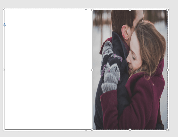
If you don’t mind she looks a bit stretched out or you swear you can’t tell, that’s your prerogative. I’m sure down the road it will bother you, so you might as well do it right the first time. I guess I don’t need to tell you, to avoid this you can always find a rectangle picture. There are plenty out there and CanStock will even filter square pictures out in your searches.
Using the Crop feature, I cropped it using the Aspect Ratio, portrait 2:3.
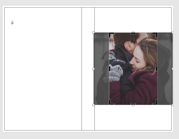
Fix the dimensions of the picture so it fits into the 5×8 box.
It brought them closer, but that’s okay.
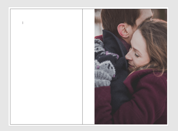
So this is what I have so far:

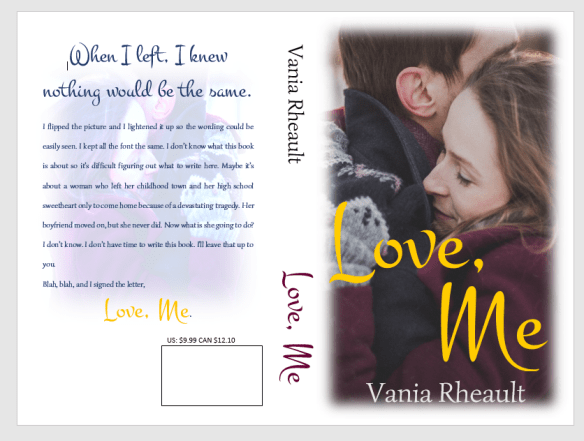
I downloaded a new font. I used the same picture on the back, but flipped it and lightened it. I did forget to mention in the last post that you probably want to put the price above the ISBN box. That way if you do happen to have a book sale of some kind, you can have the price on there, and if you put it on discount, customers can see that it is.
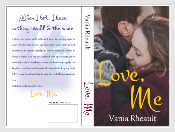
If you think the cover picture is too bold for the white spine and the back cover, you can lighten up the cover edges a bit like this:
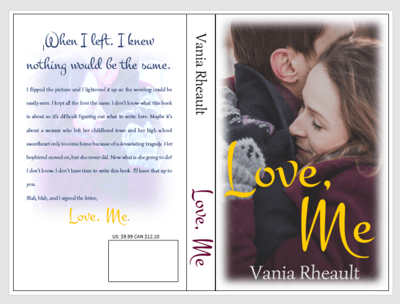
You can do what you want with the blank space by the ISBN box. Maybe your author picture, maybe your imprint picture. Whatever. But I did what I promised you from the beginning, I gave you a lovely cover with just one picture, no fancy picture effects you need to learn how to do. Oh, wait, take all the lines off. I swear, there is always something.
And don’t worry about the cursor. That will go away when you save it as a PDF to submit it to CS. Also, remember not to freak out if this is all you have and you want the Kindle cover too. CS will offer it to you, and you can download it.
I think this is it for covers. I’ll post a recap of everything I’ve talked about then I’ll tell you how to format your file for Kindle.
Thanks for reading!
Discover more from Vania Margene Rheault
Subscribe to get the latest posts sent to your email.

