CreateSpace Recap

I started this publishing series eight months ago. Sorry about that. But in that time I’ve published a book (two novellas together), wrote 150,000 more words (in the form of 6 novellas that will be published together), and fixed 1700’s typos inside and the cover. I have also started fixing my 2015 NaNo project just so I can say it’s done and move on.

When I started this series, it was my intention to tell you how to publish a quality paperback cheaply and easily.  I think in this recap you’ll see I did that. Even now, I am so tired of hearing that you need to pay for this, pay for that, to publish a quality book.

Indie publishing went from, “It’s not a real way to publish” to “It is a real way if you pay for everything.” No one can afford to pay for the ISBN number, the editing, the formatting, the file conversions. And believe me, there are people who will do it all for you. For a price. But the sad part is if you are willing to take a few minutes (okay, hours), read a few books,  you don’t need to pay for anything.

Let the recap of eight months begin.

  1. You wrote a book! Congratulations. Let it sit for a few weeks, even a few months, write something else, read it again. Have a few people read it. Ask them to look for plot holes, flat characters, scenes that don’t move the story along. If you use Word, download Grammarly. It’s a decent checker for things I miss or wouldn’t think to look for. Buy the Hemingway App for more help ($20.00 is a decent investment). Use anything you can get your hands on to make your work as clear and as typo-free as possible.
  2. Grab a trad-pubbed book and copy the front and back matter. You need the copyright page, the acknowledgments. The title page. Dedication page. The author page. You’re in charge of all it.
  3. Get your author picture taken. I want to see you sitting in a cafe with a cup of coffee in your hands, smiling. Because you just wrote a book, and you’re going to publish it, and you are proud of it, and you’re going to own it, dammit! Have your best friend take it and buy her a cup of coffee for her trouble.
  4. Buy your ISBN or don’t. At the beginning, I leaned toward buying your own, protect your work and all that. But if you’re not sure what your publishing plan is, (like one a year, if that) take the free one CreateSpace gives you. No harm done.
  5. Choose the size of your book. If you’re writing smut you’re not going to be able to choose the smut-sized trim sold in Walmart. But choose the size you want, the color (cream or white) pages you want.
  6. Based on that, download the free template from CreateSpace so you can format the inside of your book. CreateSpace wants you to have an easy experience, a good experience, so you keep using them. The template is easy. Download it, copy and paste your manuscript into it. You don’t need to copy the template exactly. Their template comes with a Table of Contents I do not use. Change the font if you want, maybe the size. And please make a couple different copies of your MS. If something goes horribly wrong, well, that would bad. Play around with the template before you copy and paste your MS into it. See what you can change and what will mess up if you touch it.
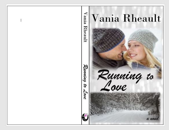
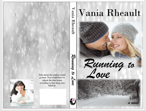
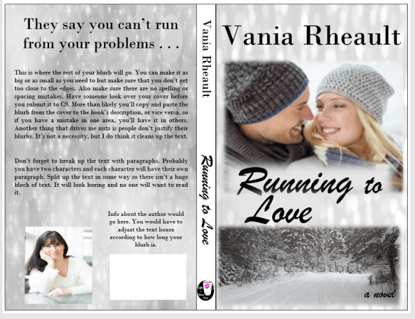
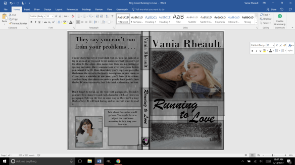
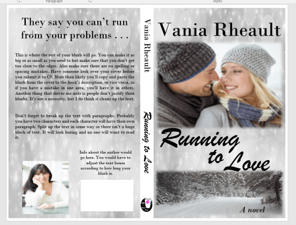
  7. Make your template for your cover. If you make changes to the number of pages in your MS, you’ll need to recalculate the spine width and change the paper layout dimensions. I forgot to do that when messing around with 1700. I changed the spine text box but not the paper layout. That’s probably why I had some of my spine color wrapped on my front cover.
  8. Write your blurb. Maybe you already did this. Have one of your beta readers read it, make sure it sounds good. I gave you some resources how to write a good one. It takes a little bit of help, though, so don’t be afraid to ask for it.
  9. I wrote about your cover a lot. Remember, if you don’t like the thought of doing your own cover, don’t. Use the CreateSpace Cover Creator, or buy a cover that’s already done. Hire someone. This series was to help you do it as cheaply as possible. People *do* judge a book by its cover, so if this is something you don’t want to tackle, I don’t blame you. There’s a lot of choices out there.
  10. CS  takes a PDF of your cover (in the Save As option on Word, PDF is a choice). Submit that, submit your interior, and you’re done. They say 24 hours, but it only takes them 12 to get back to you and tell you if it’s approved or not. Remember the flattening warning you’re going to get. That’s okay. Order the proof, check it over. When I got my second proof for 1700 I read it like I was reading anyone and looked for typos. Spend some time on it, because the proof is exactly what people will be getting when they order it. It takes about 5-10 days to get the proof in the mail. If you want your paperback and the Kindle to be live at the same time, don’t go through the Kindle stuff until your paperback is ready to go. Kindle only takes 5 hours to approve your files. You can have them live on the same day. I had trouble with CS so my Kindle version was live for a couple weeks before my paperback was available. That’s up to you and how you want to do it.


And that’s it. I recommend Chris McMullen’s book and you can find it here. He explains a lot of the technical stuff with the template and he goes into Word a lot more than I do. There’s a lot of tutorials and YouTube videos out there. When I started eight months ago, I didn’t know as much as I do now. Indie publishing is a continual learning process because things change. I’ve learned to read only things that were written in 2016 or even more recently because old information may not help.

If you need any more help, drop me a question. I’m sure you can Google the answer probably faster than I can answer it, but I’ll be going through this whole thing in a couple more months when Summer Secrets is ready to be published. I’ve come a long way with doing covers in Word, and I’m confident that with the patience I’ve learned, the tricks I’ve taught myself playing with the CS interior template, and the tutorials I’ve watched about picture manipulation, the process will go smoothly. And I hope yours does too.


Congratulation-Banners-black-small-1

Promises, Promises

At the beginning of this publishing series, I promised you could make a nice cover with a picture and some words. I got a little fancy with the cover we just went over, and if you’re reading this all the way through and got discouraged, I apologize. I’ll show you how to make a nice cover now, just a picture and some words. That’s it. I promise.

Start out with a new Word document. Go back to the formula for the paper set up. If your book is going to be 5×8 with cream paper, your page set up calculations will be:

Inches: 5 + 5 + spine + .25 (bleed) = what you need.

A 334-page book with cream pages will have a spine of .835 inches. (334 x 0.0025).

5 + 5 + .835 + .25 = 11.085

Height is always easier because you’re not doubling anything. So the height for the page set up would be 8 inches plus .25 for bleed.

8 + .25 = 8.25

The paper layout will look like this:

paper layout

Word rounded down, and I’m not sure how that affects our calculations. I would guess it’s insignificant or Word wouldn’t do it.

Follow the rest of the directions in the blog post where I typed out the list of steps.

You’ll have your handy template that looks like this:

blog cover template

This template is for a 5×8 trim size with cream colored pages. Number of pages, 334. (A nice, long book. :)) (FYI, You’ll always have an even number of pages because a page has two sides.)

The problem with the picture I like is that it’s square, not rectangle, so when I put it into the template, it stretches. Stretchy is not the same as stabby; sometimes stabby can be a good thing.

stretchy

If you don’t mind she looks a bit stretched out or you swear you can’t tell, that’s your prerogative. I’m sure down the road it will bother you, so you might as well do it right the first time. I guess I don’t need to tell you, to avoid this you can always find a rectangle picture. There are plenty out there and CanStock will even filter square pictures out in your searches.

Using the Crop feature, I cropped it using the Aspect Ratio, portrait 2:3.

crop

Fix the dimensions of the picture so it fits into the 5×8 box.

crop1

It brought them closer, but that’s okay.

So this is what I have so far:

back cover done1

I downloaded a new font. I used the same picture on the back, but flipped it and lightened it. I did forget to mention in the last post that you probably want to put the price above the ISBN box. That way if you do happen to have a book sale of some kind, you can have the price on there, and if you put it on discount, customers can see that it is.

back cover done2

If you think the cover picture is too bold for the white spine and the back cover,  you can lighten up the cover edges a bit like this:

back cover done3

You can do what you want with the blank space by the ISBN box. Maybe your author picture, maybe your imprint picture. Whatever. But I did what I promised you from the beginning, I gave you a lovely cover with just one picture, no fancy picture effects you need to learn how to do. Oh, wait, take all the lines off. I swear, there is always something.

back cover done4

And don’t worry about the cursor. That will go away when you save it as a PDF to submit it to CS. Also, remember not to freak out if this is all you have and you want the Kindle cover too. CS will offer it to you, and you can download it.

I think this is it for covers. I’ll post a recap of everything I’ve talked about then I’ll tell you how to format your file for Kindle.

Thanks for reading!


Your Book’s Back Cover

I’m sick today, so I’m going to cover your back cover rather than try to edit. Hopefully, this is a bit easier than looking for typos and fixing head-hopping. One can hope.

Where did we leave off? Oh, here:

cover-and-spine

So what we have here is a decent cover, plain spine. Ultimately, you want your back cover to blend in with what you’ve already got. Despite what Mr. Smith says, people,  at some point, will be holding your book in their hands. Maybe you can get your book into an indie bookstore, or you can sweet talk Barnes and Noble into hosting a book signing. Even if you’re just going to give your book away on GoodReads, it’s important to take a bit of time on your back cover.

blog back cover

Is this the right picture? I don’t know.  I’m sick and I’ve changed laptops as well. Anyway, so it might not be the exact picture (downloaded from Pixabay), but it will work. You are never cemented into what you’ve got going on. You can change your mind anytime, so if you come across a picture you like more, by all means, use it. What we’re going to do with it will make it work, even if it isn’t the exact same thing. You’ll probably want everything to mesh, though, so at this point, since I don’t have the other picture I used I would have to redo the cover. Not a bad thing, but ugh. Anyway. Let’s put the ISBN box back where it needs to be so we know how much room we have to work with.

isbn box
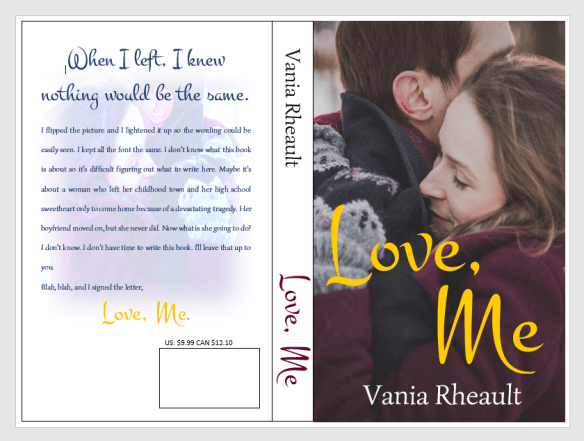
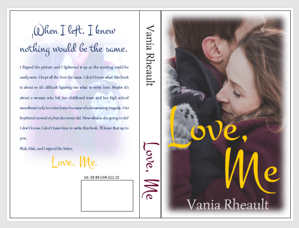
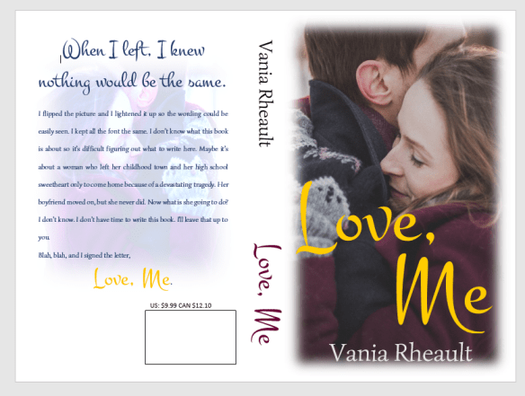
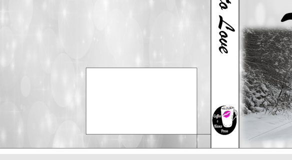
The little box is to make sure you know where your ISBN box belongs. You can take off the outlines for both, and take off the Fill for the little box.

isbn box 2

There.  So, some people put their author photo and a small bio on the back. Lots of trad-pubbed books do that, so if you want to go through the trouble, you are welcome to. I didn’t for 1700. For curiosity’s sake, let’s try.

cover photo on back

That looks alright. You would need to adjust the picture and the boxes to how you like them. You can’t move your ISBN box. It’s where CS wants it to be. Also, remember you can’t get too close to the edge of the cover; you don’t want anything to accidently be chopped off in the bleed. All I did was create text boxes and used Fill With Picture for the author photo and took off the outline for both. I chose No Fill for the wording because the black looks fine on the silver.

All that’s left is the blurb, and if you were interested in some kind of large tag line, put that on there as well. I will because I like the idea of it.

back cover 1

I had to use another text box, and I just took out the Fill and Outline. If you tried to type in the big text box that is used for the back cover outline, the text will actually disappear under the photo and you won’t be able to see it. I also don’t want my cover to be a hodge-podge of font, so I’m going to stick with the fonts I used on the cover and the spine.

back cover blurb

That pretty much sums up the back cover. You might think the spine looks boring now, but your book won’t be spread out like this and I don’t think the full white spine will scream at you then as it does now. You could always fill in the spine text box with the grey and white light picture we used on both covers, and if you didn’t like it you could always get rid of it.  A book’s cover is a huge experiment and it takes a lot of tries before you get to something you like.

In fact, being the perfectionist I am, I don’t like guessing if I used the same photo on the front and back so I’m going to change it.

back cover done

I used the same font, pictures, and no, I hadn’t used the same grey and white light picture, so it’s the same now. I used three different text boxes for the title font so I could move the words around. I used a smaller font for the “TO” and I stuck to the same two fonts for all the words on the front cover, spine, and back cover to lend consistency to the entire book.

2017-03-14 (1)

This is a cute little pic of all the text boxes we used to create the cover. These are why you’ll get the error message in the CS email when you submit your cover. In Word, there’s no way to flatten these. CS will do it for you and that’s not a big deal. In GIMP, if you create your cover in that software, there is a way to do it. Being I’ll only make two, maybe three covers a year (if I’m lucky) I’m not going to bother. You’ll also get the same message for the interior if you happen to have any pictures on the inside like scene spacers, or if you have your author photo in the back as well. Maybe you’ll have pictures of your other books, that will also cause CS to give you the error message. That is one of the few things CS will fix for you, so as long as you know the cause of the error, you don’t need to worry about it. The important thing is you like your proof when it comes back.

There is one more thing I’m going to have to you do; I never had a problem with 1700, but I’ve heard others have. Delete the outside text box lines. I’ve heard they show up. They didn’t on mine but better to be safe than sorry.

no outlines

There. All the lines for the spine and cover are gone. You have a gorgeous cover, and it was free (besides paying for the pictures, anyway). All it takes is a little time and patience. It’s fun to mess around, but if you get discouraged, look for a tutorial and learn what you want to do with your pictures. I’m hoping you crank out more than one or two a year, but if you can’t, that means you have plenty of time to learn photo manipulation to get what you want.

I gotta go blow my nose, so I’ll chat with you later!

Congrats on a great cover!

Before You Publish: Part 1

You have your manuscript ready, it’s been read by your best friend, your mother’s bridge partner, the hot UPS guy. It’s hopefully as error free as you’re going to get it, and hell, by now you’re probably so sick of looking at it, you don’t give a crap if it is or isn’t.  Okay,  you care, but you’re not going to read it again to find them. Maybe.

There are a couple things you need before you publish, so you might as well gather them together now, or be forced to pause in the middle of publishing, and that won’t be any fun.

I had my author photo taken a couple months ago. It’s why I’m in a sweater when my book was released in July. Oh, here it is. My brother-in-law took it and he did a pretty good job. ThisGood Author Picture.jpg 
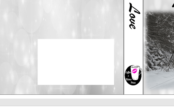
was taken in the breezeway of our local library. There was great lighting and the tables were for their little cafe.  Anyway, so you want to do that, because you’ll need it for your book and your author pages on Amazon, Goodreads, Facebook, and wherever else you want to splash your pretty face!  (I’ve read it’s good to keep your picture the same on all social media so your fans can find you. My picture is the same on Goodreads, Amazon, and my Facebook Author page. It’s different on Twitter and my personal Facebook account, though the picture for those two sites is the same as well.)

You’ll need a blurb (AKA a teaser) for the back of your book and to use as the description on Goodreads and CreateSpace/Kindle, or any other sites you’re going to sell your book. I’ve heard this is the hardest thing to write, and I had the help of a few people I trusted to give me their opinions as I wrote it. I also used this website which helped a lot. It gives you a formula and explains all the elements of a good blurb.

Write a copyright page. I took the traditionally published book I was reading at the time and copied it, just changing the information to reflect my own book.

Write your acknowledgments.  I miraculously kept mine down to one page.

Write your dedication to your family, friends, and the cat who kept getting in your face while you were trying to type the book you’re going to publish.

That’s all I’ll go into for now. Next, I’ll talk about imprints and ISBN numbers. I kinda wanted to write about it tonight, but @JewelELeonard  warned me to keep my posts short so by the end, you’re not staring at your laptop glassy-eyed with drool dripping out of your mouth.

Goodnight!