
I’m sick today, so I’m going to cover your back cover rather than try to edit. Hopefully, this is a bit easier than looking for typos and fixing head-hopping. One can hope.
Where did we leave off? Oh, here:

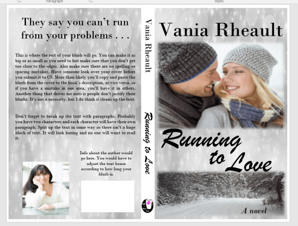
So what we have here is a decent cover, plain spine. Ultimately, you want your back cover to blend in with what you’ve already got. Despite what Mr. Smith says, people, at some point, will be holding your book in their hands. Maybe you can get your book into an indie bookstore, or you can sweet talk Barnes and Noble into hosting a book signing. Even if you’re just going to give your book away on GoodReads, it’s important to take a bit of time on your back cover.

Is this the right picture? I don’t know. I’m sick and I’ve changed laptops as well. Anyway, so it might not be the exact picture (downloaded from Pixabay), but it will work. You are never cemented into what you’ve got going on. You can change your mind anytime, so if you come across a picture you like more, by all means, use it. What we’re going to do with it will make it work, even if it isn’t the exact same thing. You’ll probably want everything to mesh, though, so at this point, since I don’t have the other picture I used I would have to redo the cover. Not a bad thing, but ugh. Anyway. Let’s put the ISBN box back where it needs to be so we know how much room we have to work with.
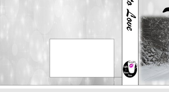 The little box is to make sure you know where your ISBN box belongs. You can take off the outlines for both, and take off the Fill for the little box.
There. So, some people put their author photo and a small bio on the back. Lots of trad-pubbed books do that, so if you want to go through the trouble, you are welcome to. I didn’t for 1700. For curiosity’s sake, let’s try.

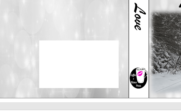
That looks alright. You would need to adjust the picture and the boxes to how you like them. You can’t move your ISBN box. It’s where CS wants it to be. Also, remember you can’t get too close to the edge of the cover; you don’t want anything to accidently be chopped off in the bleed. All I did was create text boxes and used Fill With Picture for the author photo and took off the outline for both. I chose No Fill for the wording because the black looks fine on the silver.
All that’s left is the blurb, and if you were interested in some kind of large tag line, put that on there as well. I will because I like the idea of it.

I had to use another text box, and I just took out the Fill and Outline. If you tried to type in the big text box that is used for the back cover outline, the text will actually disappear under the photo and you won’t be able to see it. I also don’t want my cover to be a hodge-podge of font, so I’m going to stick with the fonts I used on the cover and the spine.
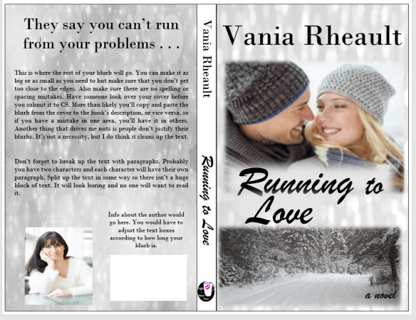
That pretty much sums up the back cover. You might think the spine looks boring now, but your book won’t be spread out like this and I don’t think the full white spine will scream at you then as it does now. You could always fill in the spine text box with the grey and white light picture we used on both covers, and if you didn’t like it you could always get rid of it. A book’s cover is a huge experiment and it takes a lot of tries before you get to something you like.
In fact, being the perfectionist I am, I don’t like guessing if I used the same photo on the front and back so I’m going to change it.

I used the same font, pictures, and no, I hadn’t used the same grey and white light picture, so it’s the same now. I used three different text boxes for the title font so I could move the words around. I used a smaller font for the “TO” and I stuck to the same two fonts for all the words on the front cover, spine, and back cover to lend consistency to the entire book.
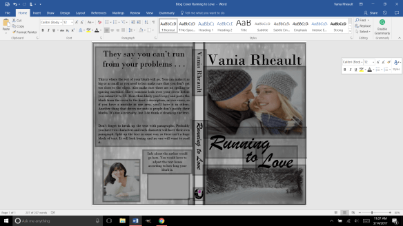
This is a cute little pic of all the text boxes we used to create the cover. These are why you’ll get the error message in the CS email when you submit your cover. In Word, there’s no way to flatten these. CS will do it for you and that’s not a big deal. In GIMP, if you create your cover in that software, there is a way to do it. Being I’ll only make two, maybe three covers a year (if I’m lucky) I’m not going to bother. You’ll also get the same message for the interior if you happen to have any pictures on the inside like scene spacers, or if you have your author photo in the back as well. Maybe you’ll have pictures of your other books, that will also cause CS to give you the error message. That is one of the few things CS will fix for you, so as long as you know the cause of the error, you don’t need to worry about it. The important thing is you like your proof when it comes back.
There is one more thing I’m going to have to you do; I never had a problem with 1700, but I’ve heard others have. Delete the outside text box lines. I’ve heard they show up. They didn’t on mine but better to be safe than sorry.
There. All the lines for the spine and cover are gone. You have a gorgeous cover, and it was free (besides paying for the pictures, anyway). All it takes is a little time and patience. It’s fun to mess around, but if you get discouraged, look for a tutorial and learn what you want to do with your pictures. I’m hoping you crank out more than one or two a year, but if you can’t, that means you have plenty of time to learn photo manipulation to get what you want.
I gotta go blow my nose, so I’ll chat with you later!
Congrats on a great cover!
Discover more from Vania Margene Rheault
Subscribe to get the latest posts sent to your email.

