
Creating a book cover can be intimidating, and if I didn’t dish out for my ISBN numbers, I might very well hire this out. Though there is some sort of satisfaction of having done the front cover and back cover and everything in between on your own. But the ultimate goal is selling books, and people WILL judge a book by its cover, no matter what people say. If you can do a great (or even semi-decent) cover on your own, do it! Practice makes perfect, and as you can see from my two covers of 1700, you learn a little something new every day.
In keeping with the theme from previous posts, I’ll make the front cover for Running to Love. This can’t be a Word tutorial, I can only show you what I do with the pictures, so if you really don’t know anything about Word, I suggest you find a different way to make your covers. I don’t know all that Word can do either, and I find a new trick every time I go in and play around.
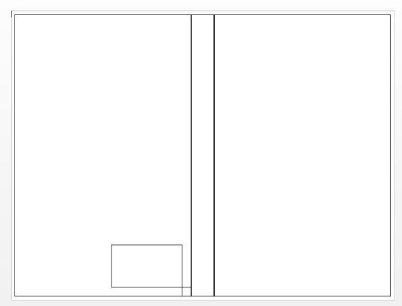
We’ll need to start with the template: Remember the spine is dependent on the number of pages in your book. If you have added pages or edited some more and taken some away, you’ll need to calculate the spine width again.
Choosing the photo is the most important and frustrating part. There are so many choices!
I found this one:

I didn’t pay for it, so it still has the watermarks on it. I liked the colors because I can use them for font or background color to tie it all in.
One of the frustrating things is getting it to fit. See, the picture is wider than the template. I had a hard time with figuring this out, and the thing I do is crop it so that it is as wide as the text box. If you don’t, this is what happens: click on the placement menu (the rainbow thing on the right side of the picture) and choose “in front of text” to move it around.
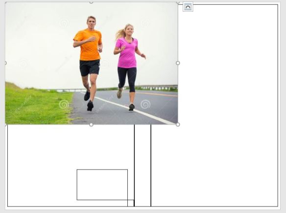

But moving it doesn’t help much, and neither does manipulating it to fit because it distorts the image:
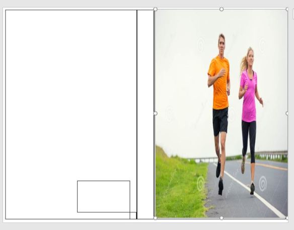
They are all stretchy, and this is what I did to my first cover couple. Sadness. My son equated this with trying to fit a square peg into a round hole, and it looks terrible. I use the Snipping Tool to crop it and actually make it the same shape as the template:


That looks better, but it’s boring. Maybe we don’t have the right picture, and you would have to decide if you like it enough. Liking pictures online and liking what they would look like on the cover of a book are completely different. I’m going to play around and see what happens.
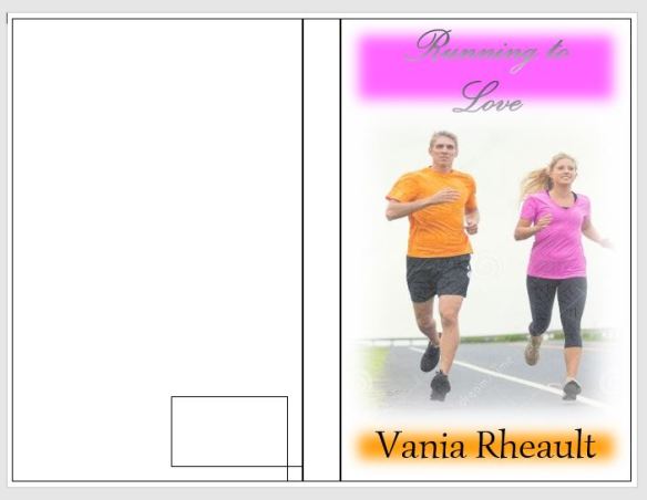
I don’t like the title, I don’t think it’s using the space the way it could. But I like the color theme I have going and it could easily keep going on to the spine and the back cover. How I did it was I had to put three text boxes in the template text box. One at the top which I filled with her shirt color then I softened the edges, the middle text box for the picture, and the bottom text box for the color which I filled with his shirt color and I also softened the edges. Choose no outline for the text boxes so the boxes don’t show up.
I did something to the title font, which I do not care for, and I do not think it would print well either. I like the rest, though, so let’s play around with the title.
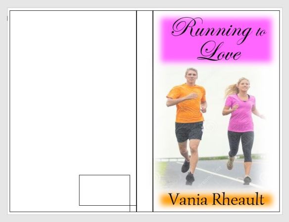
That really isn’t too bad. I like how the colors blend together. If the spine is thick enough, I may split the picture in two and have her on the spine and him on the back cover. You can flip the pictures so they are mirror images of themselves, so they aren’t exactly the same.
In terms of changing the photo, I used the criss-cross etching in the photo effects and I softened the edges. Both of those options show up under Picture Tools when the text box containing the photo is selected. It looks a little cheesy, I’ll give you that, but you’re not going to get the same kind of covers you’re going to find at the bookstore. CreateSpace won’t emboss the title or your name, and you can’t get the cheap cardboard feel. Which is good for quality, bad for making your book stand out as an indie.
I do need to watch out though since I used the soft edges technique for 1700 and I don’t want all my books to look the same. Joanna Penn from @thecreativepenn has some great ideas when it comes to book covers, and I’ll leave you with the link to her blog post here.
I’ll post a little more about front covers soon, and maybe have another go at the front. I wouldn’t publish Running to Love with that cover, but you’ll go through a few covers before you hit the right combination of fonts, effects, and pictures. There’s no shame in trying–it’s the only way you’ll see what you like and what you don’t.
Talk soon!
Discover more from Vania Margene Rheault
Subscribe to get the latest posts sent to your email.

