I was going to blog about something different today, and I even had the post written and scheduled. It had to do with writing billionaire romance in the current political climate, but I don’t have the heart to post it. We had a chance to do something great, to make positive change, and we blew it. We chose hate and violence, and we will pay for that for the next four years, and possibly beyond. All I can hope is that the Democrats who did win state by state will slow him down and block him as much as possible. Maybe he’ll be too busy golfing to cause all the damage he says he’s going to cause.
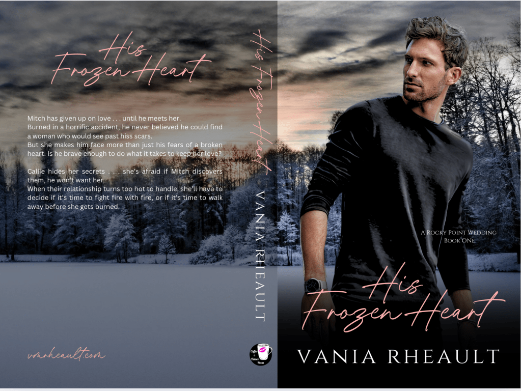
I know lots of people didn’t get much done last week, and it’s understandable. I’ve always used my writing to hide from reality (or, more accurately, my health issues), and this week was no exception. I was able to finish editing my Rocky Point Wedding series, finish the covers, and order the proofs. I’m going to read them over to look for mistakes and make sure the changes I made make sense. I had a lot of timeline discrepancies because the first three books overlap and I didn’t keep track of my characters and what they were doing. Then I fluffed up some scenes, took out some things to streamline the prose, and I’ll just read them over quick before I approve them. I’m also interested in how the covers are going to print. When I chose the background stock photo, I knew I’d have trouble with the spine and back cover, so we’ll see if my “fix” looks good or if I need to try something else. On screen I think it looks okay and I tried really hard to match up the grey blocks and black gradients with the spine lines but printing isn’t always accurate, so we’ll see what happens.
I ended up using the same ISBNs for the books, which I probably shouldn’t have done since these will have new covers and substantial changes to the insides. On the other hand, unpublishing the old ones so I can publish new ones seemed to be a waste of ISBNs, especially since before I revamped them I wasn’t selling (m)any anyway. I put in the copyright pages that these were re-edited and re-released but I don’t know if it was necessary or will do any good. I have quite a few of the first book floating around out there due to free promos I’ve done in the past, but I don’t think it will make a difference to ask KDP to push out the new version to the readers who have the old version on their Kindles. I’ve heard of authors doing that, but I have never tried. If they don’t give me a hard time and just let me update, I think I’ll be happy with that and leave the rest alone. I don’t like messing with KDP, and I’m relieved that so far the preorders for my King’s Crossing series are still okay, that Amazon hasn’t arbitrarily canceled them. So, whether using the same ISBNs was the right call or not, I don’t know, but no one is really policing these changes, so I guess there’s no harm in it.
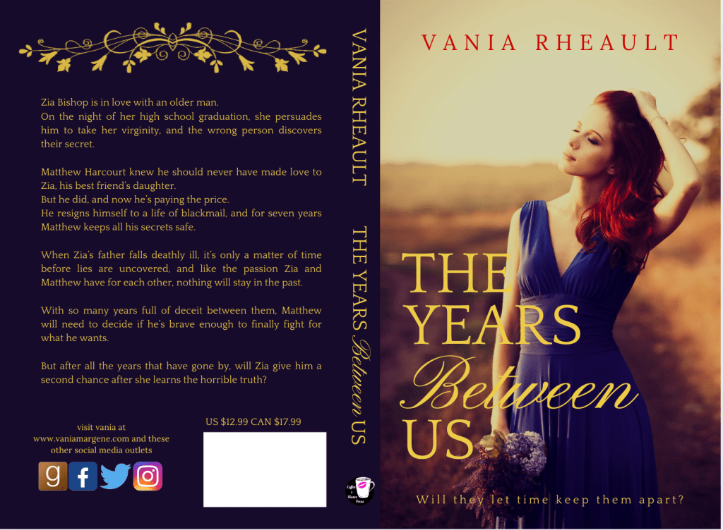
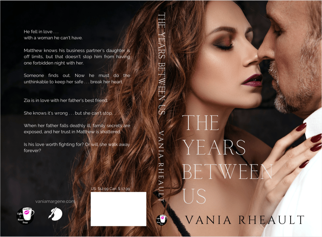
I’m going to do some more cleaning up of my third person books. While I’m waiting for my proofs to come back, I started re-editing The Years Between Us, an age-gap standalone. I’m halfway through the first chapter and haven’t found anything too bad, I just like to echo words and hadn’t caught on to it yet. No matter what Stephen King says, the thesaurus is your friend. I updated the back matter too, deleting people out of my Acknowledgements page that no longer had a place there, updated my Also By page, and a few other odds and ends. I’ve started directing all my readers to my vmrheault.com website and eventually I’ll take books off this one. It makes sense to turn my author website into my real author site and just use this site to blog. I’m having fun reading this book though, since I haven’t for many years. It has the same kind of tone Rescue Me does, and it’s funny that all my books have the same style, even between 3rd person past and 1st person present. I guess that’s why they say a reader falls in love with your voice. I won’t be changing the cover for this book–I think it looks fine how it is, and being that it’s age-gap, I doubt I’d be able to find a couple that fits as well as the one I found a few years ago. I know a couple years back I wrote a blog post on the differences, but I can’t find it now. For curiosity, this was the old one when I first published, then changed to the second when I couldn’t sell books. Very different vibe from the blurb.
I unpublished the two Large Print books I was able to publish before Amazon started blocking them due to duplicate content. I want to offer the same versions of all my books, so I unpublished the Hardcover versions of Captivated by Her, Addicted to Her, and Rescue Me. Hardcovers don’t sell and I wasn’t going to bother publishing more. Because they’re a mess and didn’t sell anyway, I also unpublished my two ebook boxset compilations–my Tower City series and my Rocky Point Wedding series. That sounds like a lot of unpublishing, but I mainly wanted to clean up my editions. The ISBNs will always be attached to those versions and they might even stay on my Amazon product pages, but from here on, I’m only going to offer the Kindle version and a plain paperback.
I was also going to unpublish the first three books I published (1700 Hamilton and my Summer Secrets series) but that would require updating back matter of books I’m not going to re-edit and I don’t want to do that. I was even going to unpublish my first trilogy, but then I remembered I wrote a bonus novella that sounds better than the original trilogy and closed out the story nicely, so even if they’re not well-written, I’d be taking down at least a quarter of a million words. I guess there’s no harm in keeping them up, but they aren’t my best work and I’ll never promote them in any way.
I probably should have done this stuff a long time ago, but I wasn’t feeling well and during the pandemic when everything was just kind of shitty, I wasn’t really thinking about it. I was more focused on building my pen name and writing books for that. Now that my King’s Crossing series is slowly releasing, I have a bit of free time, though not much if I don’t want my conveyor belt of content to slow down. I like knowing I have books scheduled–it takes the pressure off to write quickly.
That’s what I’m doing until the end of the year, and I have to remember what I do on KDP I have to do on IngramSpark. I updated the interior of All of Nothing after I re-edited it a few weeks ago, and I’ll have no choice but to replace both the interior and cover files for my Rocky Point series. Even though it’s going to cost a good $200.00, there’s just too much discrepancy for them to share the same ISBNs but look so different on other retailers. I used to get free revisions with my Alliance of Independent Authors membership, but now I noticed that instead of five or six free revisions you only get one. When I re-edited and re-covered my Lost and Found trilogy, I had enough revision codes I only had to pay $25.00. Unfortunately, that seems not to be the case anymore, but I’m tenacious and I’ll see what I can find when it’s time to do it.
I’d like to start 2025 with a clean slate, putting my 3rd person stuff behind me and looking forward to the future and building my 1st person pen name. I just felt like my 3rd person stuff was unfinished somehow. This won’t make that feeling entirely go away, but I can push them aside knowing that they’re better than they were before. I know for sure that my Rocky Point series sounds 100% better and I don’t consider the time I spent on them a waste, even if it will be an expensive hassle to swap out their files on Ingram. (It was actually fun to see how far my writing has come.) I might even stop putting books on there. There’s no real benefit, but it’s easy because I do my own formatting and covers. All it costs is a bit of time.
That’s about all I have this week. I’m busy doing what I want to do. I’m not going to worry about sales or page reads anymore. Those numbers have been dismal since summer and I honestly don’t know what to do. I feel like I’m doing all I can, and I need to find the fun in writing again. I’m proud of my books and what I’m doing for the indie community with this blog, beta reading, formatting, and editing for others. Sometimes I forget about what matters most, but it gets easier as I feel better. I have more gratitude for the small things and maybe getting my 3rd person stuff situated feels like a bigger project than I really wanted to tackle right now, but it will be a relief when it’s all done.
I said this was a massive update only because it felt massive. I never thought I would unpublish anything, and pushing unpublish made my stomach quiver. It’s nice because KDP keeps your title there and if I ever wanted to publish those things again, I can, but I think I’ll stick with my decision to keep my books in KU, offer the Kindle version, and price my paperbacks as cheaply as I can. There are discrepancies with some of my prices too, like my series versus standalones. I just price whatever I feel like pricing which doesn’t look very professional, but that’s something I”ll have to look into another time.
For the rest of this week I’ll be re-editing The Years Between Us and diving into proofing my wedding series proofs. I’m on track to get those done by December so I can promote them for Christmas. I think that may be my last hurrah I’m going to give my 3rd person stuff.
2025 is meant for new things. I’m going to leave behind the people who have hurt me, focus on marketing my King’s Crossing series, and plan my next releases. Now that I have a diagnosis, I’m feeling better than I have in a long time and I can leave those four years behind me.
I hope 2025 can be the start of something new for you too, despite the election outcome. We’ve dealt with him before, and we’ll do it again.
Take care of yourselves, and I’ll catch up with you you next week!
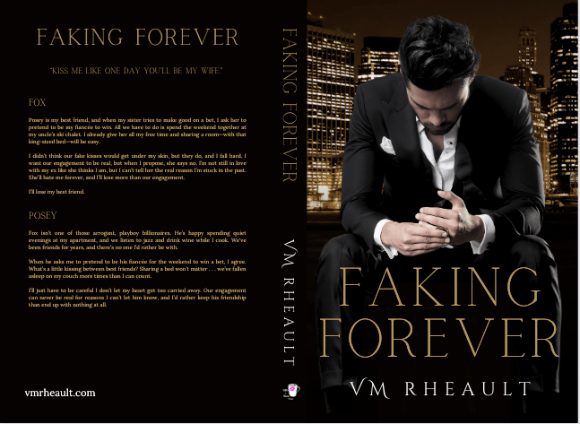
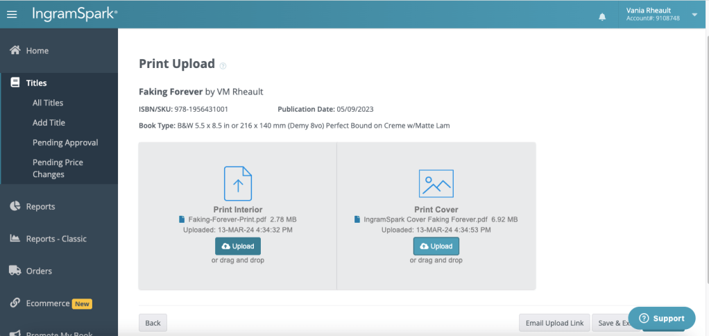
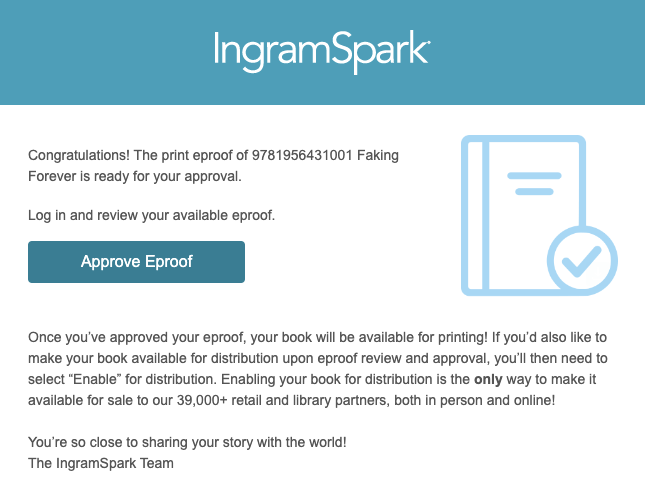
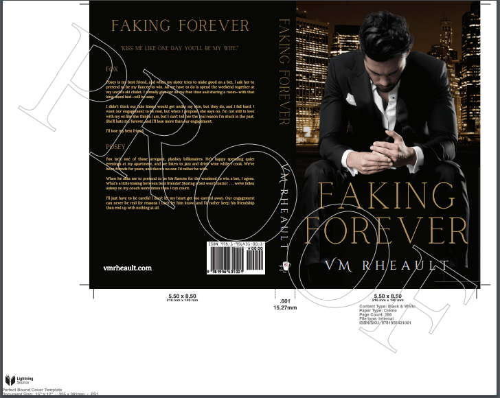
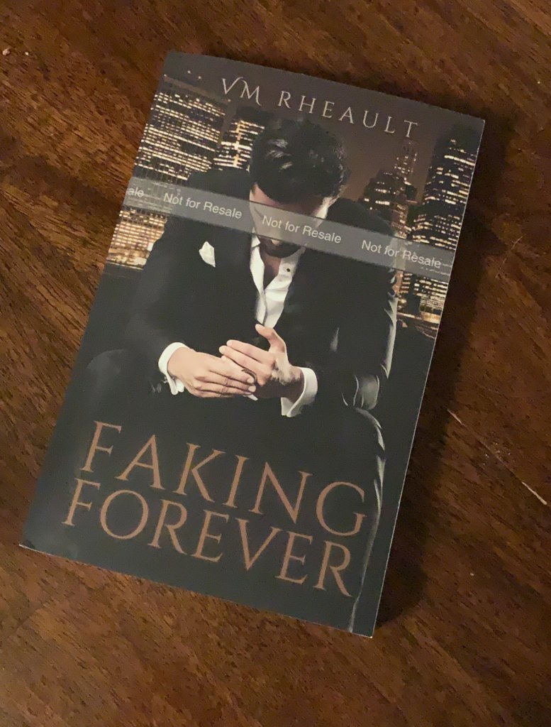
I’ve heard from more than one person that they are kind of intimidated by IS, usually because they’ve heard horror stories of other people using it, or more accurately, trying to use it. Honestly, yeah, the platform can be a bit glitchy, but it’s nothing so scary that I would stop putting my books on it. I realized Faking Forever isn’t up on IngramSpark, though I did publish it last summer, I think, so I can use that title as a tutorial. I’ll screenshot my process and hopefully it will take some of the mystery out of the platform.
There are a couple of things I want to tell you before we get started, and these really aren’t anything I would expect a new author to know.
The first is ISBNs. You need one of your own to publish on IngramSpark IF you are also going to publish separately on KDP, and you should publish direct whenever you can. Amazon won’t take an ISBN issued by IngramSpark, and the same is true vice versa. If you’re in the States and buy from Bowker, you can use the same ISBN both places.
Second. Now, some people have said that you CAN’T use the same ISBN both places because either one place or the other will tell you the ISBN is already in use and you can’t use it. I get around this by publishing to KDP first using an ISBN I buy from Bowker, and then I wait for a couple of months for that ISBN to “click in.” Then when I publish on IngramSpark, they’ll skip Amazon because my book is already listed there. I don’t know where I heard this from, but I have done it this way for over 10 books and I have never gotten an error from either platform saying my ISBN is in use. You’ll have to decide if you want to wait those couple of months. Paperback sales aren’t a big deal to me so I don’t mind having my paperbacks only on Amazon for a while if it’s going to make the process smoother. Long story short: your paperback book should only have one ISBN attached to it.
In the first point, I said go direct whenever you can, and you should do that for a few reasons. The first is that Amazon doesn’t play well with others, so if you use IngramSpark to distribute to Amazon, Amazon can (and will) mark your book out of stock, which is a pain to fix. I would rather be writing my next book than policing my buy-page. Another is an author was complaining because she let IngramSpark distribute to Amazon, and she lost her buy-button, which means she’s not the primary choice for the sale. That’s bad because it looks like you’re not the seller. You can’t stop third-party sellers from buying your book and reselling it, but you always want to be the primary seller. The last point is you don’t want to pay IngramSpark to distribute and then pay Amazon for selling it. There is very little by way of royalties as it is, so just cut out the middleman and publish to KDP directly.
One last thing–your cover will be different than the one you use to upload to KDP. IngramSpark uses a different weight of paper which makes the spines thinner. If you use something like Canva, this is easy–just duplicate your KDP cover, download the IngramSpark template, and adjust spine text size and re-center your title and author name on the front cover. I go over this in my full paperback wrap tutorial. Those will need to be adjusted because due to the thinner spine, your front cover is “bigger” if that makes sense. If you’re using a cover designer, they should already know this, and if they don’t… [insert grimacing emoji here].
Draft2Digital uses IngramSpark’s POD to print. I helped a friend not long ago and one tip I learned is that D2D doesn’t like the barcode box on the back of a paperback cover, and you can, in fact, skip putting the white box on all three platforms. They’ll add the barcode for you, or use a barcode generator like Dave Chesson’s and add it yourself. But that was a handy tip we learned, and if you don’t want to supply your own barcode, leave the white box off completely and let them add it for you… unless you want Barnes and Noble to carry your book. Then you have to embed the price into your barcode. If you do that, you can’t change the price of your book unless you change the barcode too. IngramSpark wants the price on your cover to match what you’re selling your book for. If you want/need to increase the price, keep that in mind. I have stopped putting the price on my books and let both KDP and IngramSpark supply my barcodes. Much easier that way, but I don’t care about Barnes and Noble stocking my book, either. That’s a choice you’re going to have to make.
Here is the cover to Faking Forever that I’m going to be using:
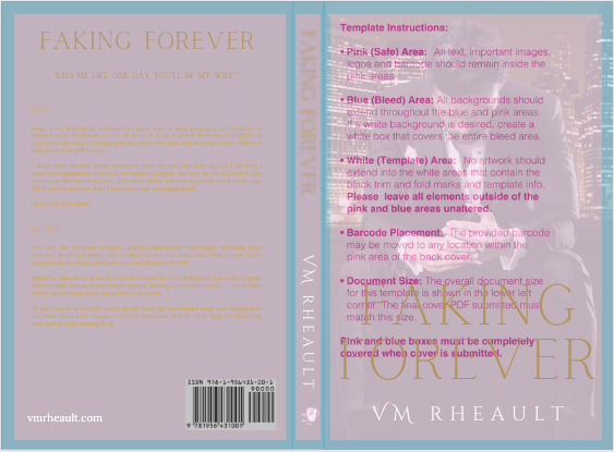
And if you’re curious, this is how it looks with the IS template on top of it:
You’ll notice that the template has a barcode already included, but I never use it. It’s too big of a pain to cut it out and add it to the cover. I build over it and call it a day.
Once you have your formatted interior file, your cover sorted, and you know what you’re going to do with your ISBN and where and when you’re going to publish your book, you’re ready to upload to IngramSpark.
The first thing you have to do is create an account if you don’t have one. Go to www.ingramspark.com and click create account. It’s been a very long time since I’ve done that, but it’s more than just being able to upload your book. You have to have your banking information ready so you can have your royalties deposited and any fees deducted. If I remember correctly, they may ask you for a tax ID number or an EIN but I don’t have an LLC and just used my SSN. I’m in the States, so I don’t know how it works in other countries. I’m not going to give business advice, so beyond showing you how to upload your book, all the other choices that you have to make you’ll need to research on your own.
Once you’ve created an account, your home screen should look like this:
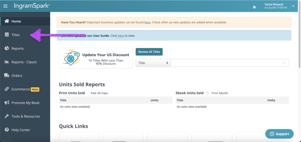
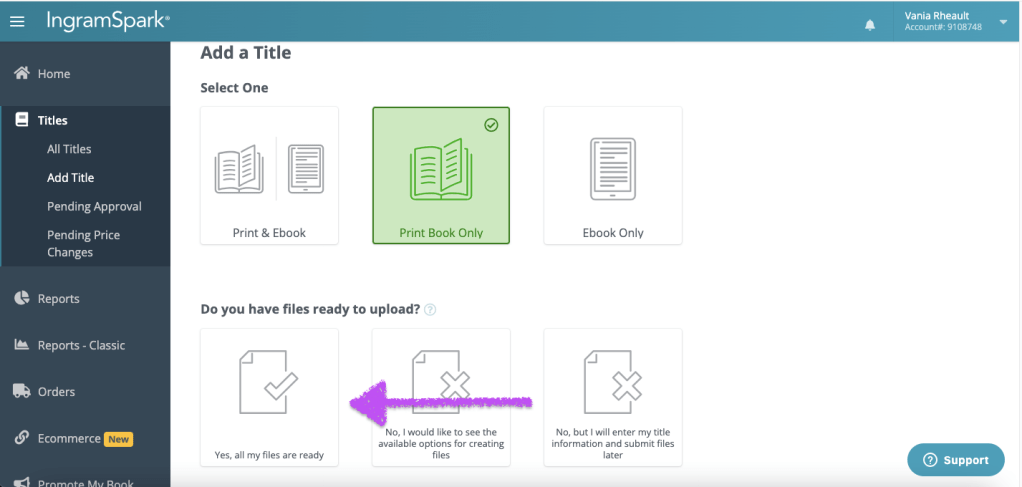
Click on Titles on the left hand side in the menu.
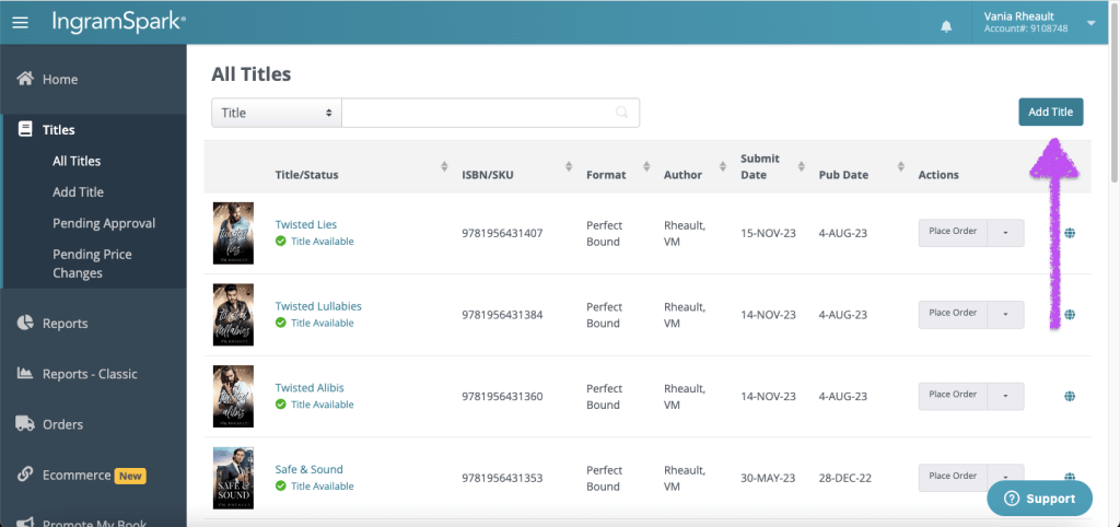
Then click on Add Title.
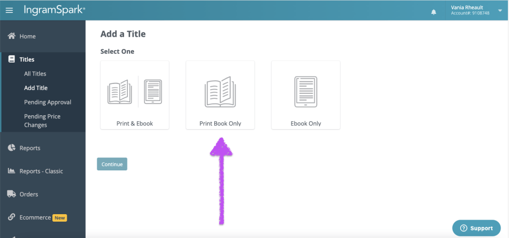
Some people use IngramSpark to distribute their ebooks and their print books. I wouldn’t use them for ebooks–if you’re going wide, Draft2Digital is probably the better choice, and as always, with print and ebooks, go direct whenever you can. You’ll always earn more royalties. Click whichever one you want, but for this blog post I clicked on Print Book Only.
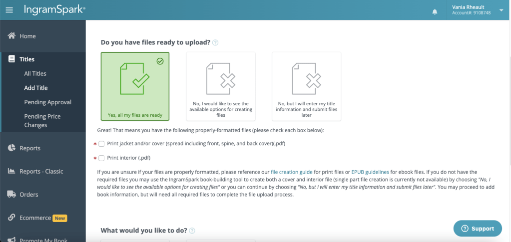
Are all your files ready? You’ll need your interior and your cover that was adjusted/made using the IngramSpark template. But you’ll also need your ISBN, your blurb, and your categories and keywords. If you’re ready, Click Yes, all my files are ready.
They really wanna make sure you have what you need, so click the boxes that confirm you have your paperback cover wrap and your formatted interior file.
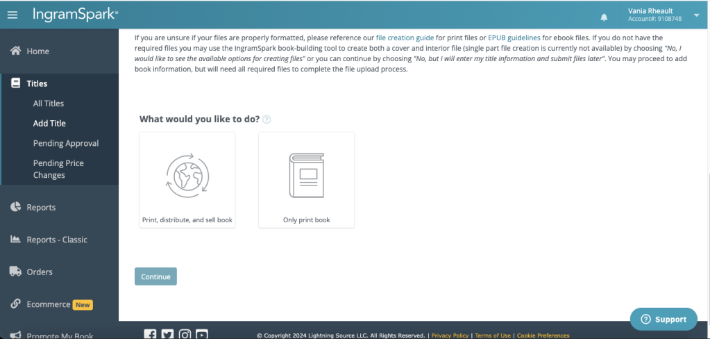
Then click on what you want to do. I do want to print, distribute, and sell my book. Click it to highlight it and then press Continue.
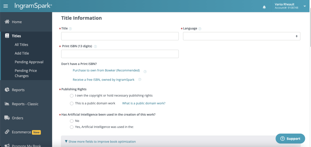
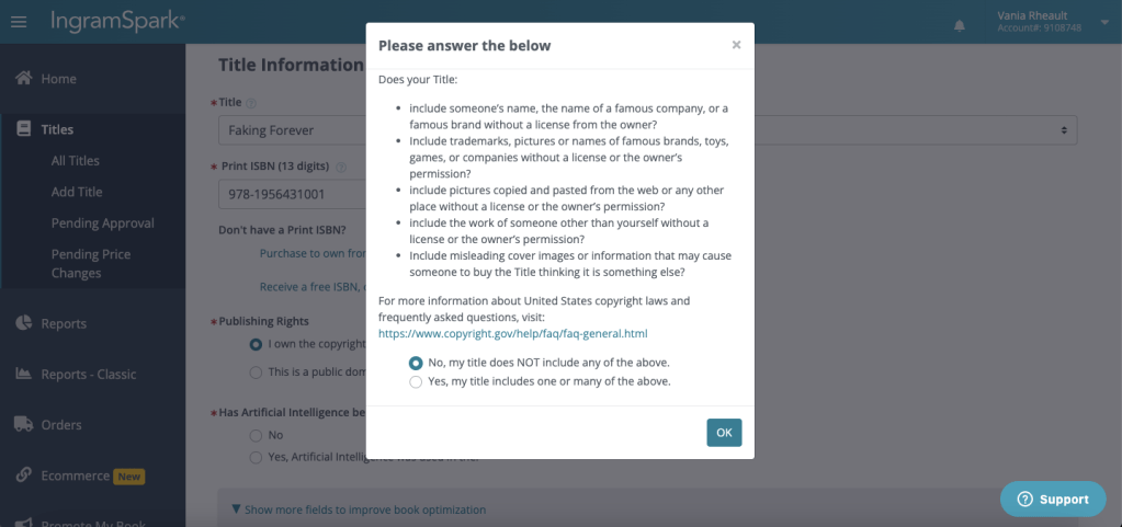
This is where you start filling out your book’s information. Put in your title, the language, which for me is always English, add your ISBN number or take the free one. Click that you own your copyright, and that you’re not trying to publish public domain work. When you click that you own your copyright, a warning box pops up:
They started adding this box a couple of years ago, and if you click Yes, that your book includes names of famous people or brands, IngramSpark won’t let you publish. I don’t know why they implemented this because we all know it’s okay to say your characters ate lunch at Dairy Queen, or that your male character’s favorite brand of shoes is Nike. It’s pretty much understood that as long as you’re not saying anything derogatory about a brand, it’s fine to mention them. My characters, for whatever reason, love Apple products, and they’re always using their iPhones. So, I’m not saying to lie, but I am saying that if you check the box that you do mention McDonald’s or that your characters go shopping at Walmart, IngramSpark will tell you to amend your book and resubmit. I’ll let you make the choice. I don’t remember what Faking Forever has in it. My characters live in a fake Minnesota city and I think for the most part everything I mentioned brand-wise was made up. But, you do you, and I’ll do me, and for the sake of this blogpost, I’m going to click No and keep going.
The last question in this section is about AI, and I never use it. I do my own covers using stock that’s not AI generated, and I write my own books. If you use AI in any way, you’ll have to fill out what they ask. I’m not even going to bother to click on Yes and find out what they want. I’ll never use AI and don’t care.
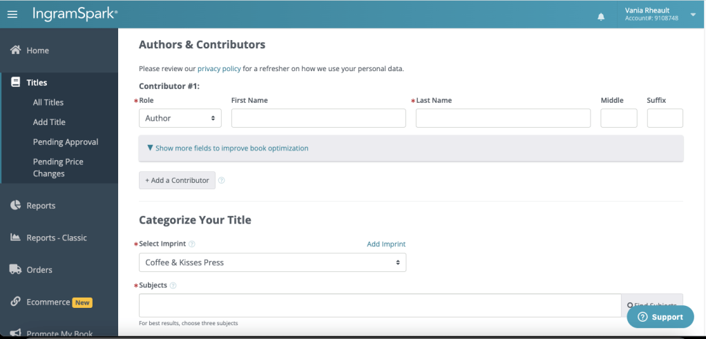
In this next section, you fill out your author name. I don’t have any other contributors, like maybe if you were a children’s author and needed to list an illustrator.
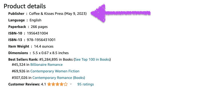
You’ll also see here that my imprint, Coffee & Kisses Press popped up. That’s because when you buy ISBNs from Bowker, you’re able to create an imprint for yourself. Back when I first started publishing, I created my imprint, and my ex-fiancé and my son designed the logo for it. I’ve been publishing under Coffee & Kisses Press for years and years but I don’t have any plans to publish anyone else at this time. I help a lot of people but never for money or a share of their royalties. Jane Friedman has a good article about creating your own imprint if you’re interested in the pros and cons. https://janefriedman.com/why-self-publishing-authors-should-consider-establishing-their-own-imprint/ Also when you create your own imprint, your imprint will be the publisher on Amazon and other product pages. Here is the information on Amazon for Faking Forever:
My ranking is bad. I guess I better up my marketing game.
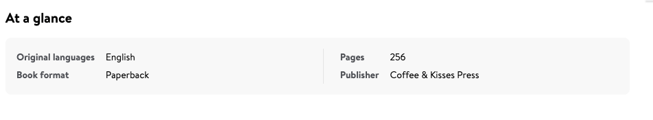
This is my product information for Rescue Me on Walmart.com.
You can read and research all day about imprints, but I’ll stop there and continue on.
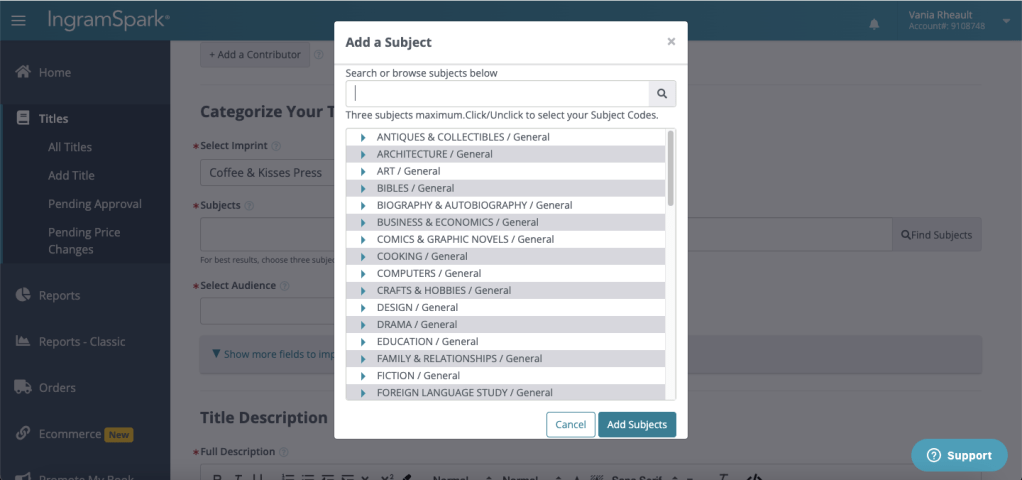
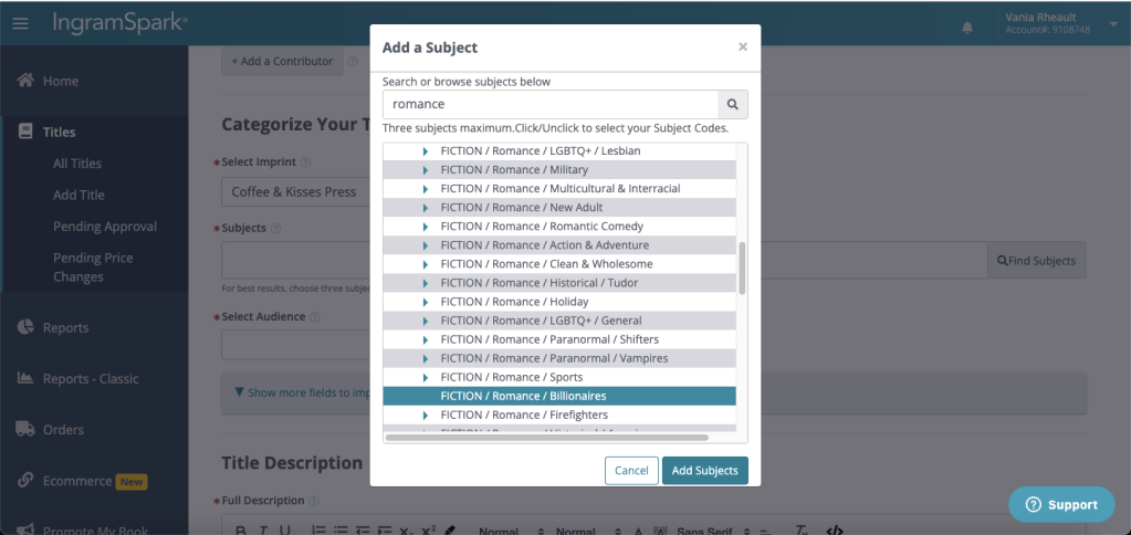
Subjects are your categories. Mine are usually Contemporary Romance and Billionaire, but they have a Rockstar category too, which I used when I published my last trilogy. Click on Find Subjects and search for your category/genre. I recommend using the search bar and typing in what you want. If you only scroll, sometimes you can miss what you’re looking for.
Click and highlight what you want and click Add Subjects.
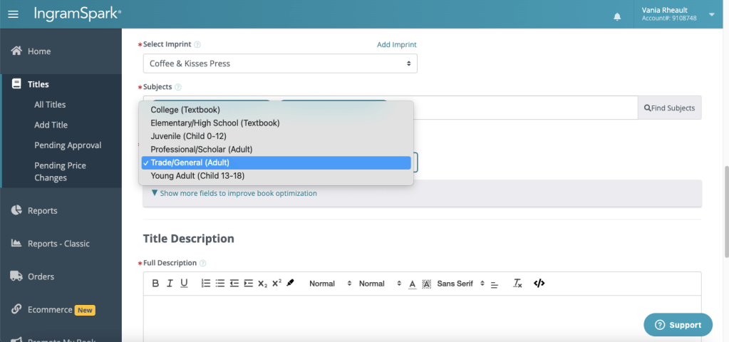
Select Audience is next, and if you’re writing genre fiction for adults, that’s Trade/Adult General.
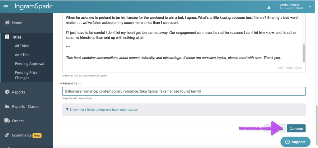
The next field is where your blurb goes. I usually just copy and paste it from my Amazon product page.
The keywords are similar to the seven fields on KDP you fill out when you publish on Amazon. The ones I fill out on KDP are a little different because I add KU/ Kindle Unlimited to some of the fields for discoverability, and you don’t need that for paperbacks on IngramSpark. When you’re done, scroll down and click Continue.
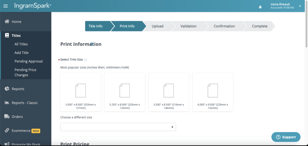
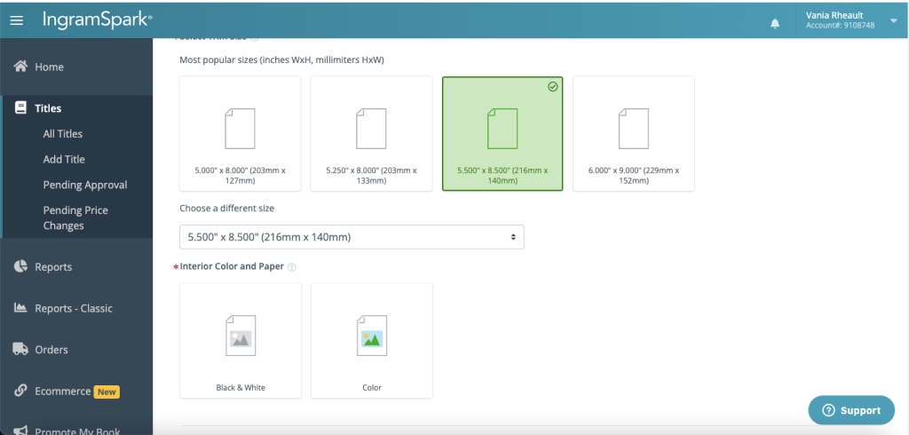
The next section is Print Information. You should already know the trim size of your book since you have your formatted interior file and your cover. If you’ve already published on KDP, all this information should match what you put on that platform. Things like trim size and color of the pages are attached to your ISBN, so make the same selections you did on KDP.
Colored pages are only for things like cookbooks or children’s books. There’s a higher cost to printing color, and I was even seeing some talk the other day that IngramSpark is going to start charging you more if your book has black pages. Beautifully formatted books are having a moment, but all that ink… even if you’re printing in black and white it’s going to cost you money. I don’t get too crazy with my interiors. I’m just not excited about paperbacks in general, so the last thing I really care about is black pages that have white text. As I’ve said, that’s your personal choice, but everything costs so be prepared to up your price to have even the slightest royalty per book.
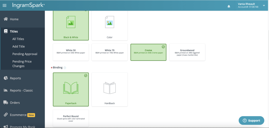
This is part of what can trip up some authors who upload their books. I chose black and white pages, and cream because I also print my fiction books on cream paper. I don’t know if Amazon gives you a choice to print on Groundwood, but if you can’t over there, you can’t here because remember, the color of your pages is attached to the ISBN and you can’t change unless you unpublish.
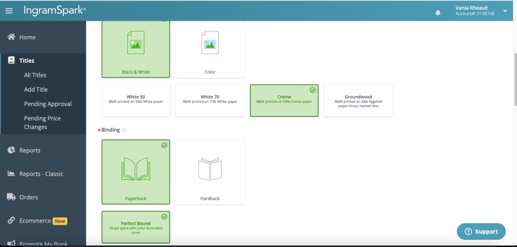
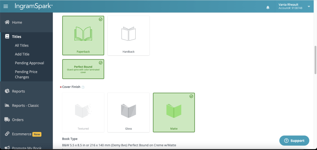
I chose paperback here, but do you see the Perfect Bound option? Even if it’s the only option there, you still have to click on it and turn it green. Some authors get tripped up by that, so be sure to click on it.
I always choose a matte cover. I’ve seen glossy covers that peel and I don’t like them. Covers can be changed and upon a quick Google search I’m confident to say that if you want to change from glossy to matte or vice versa, you can as the type of cover isn’t attached to the ISBN.
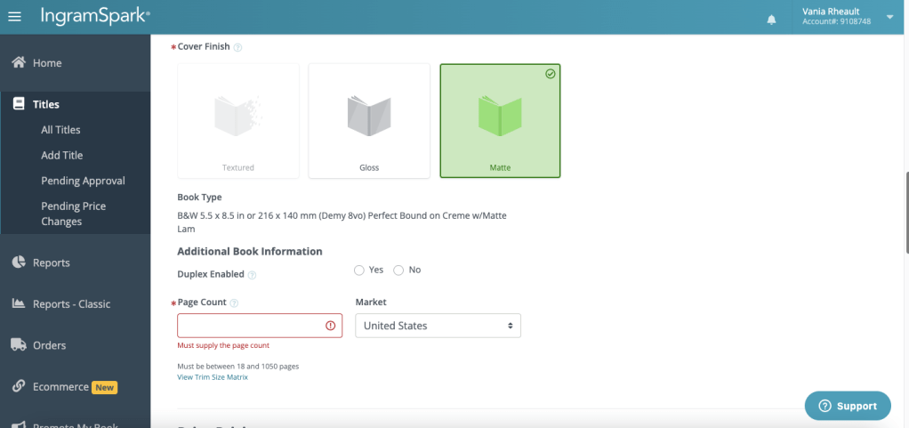
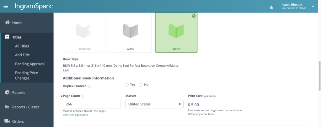
I don’t know what Duplex Enabled means, and since there’s not an asterisk by it, I’ll skip it. Number of pages–you can look at your interior file (you should already know this because either you or your cover designer needed this information) or I snag mine off my Amazon product page.
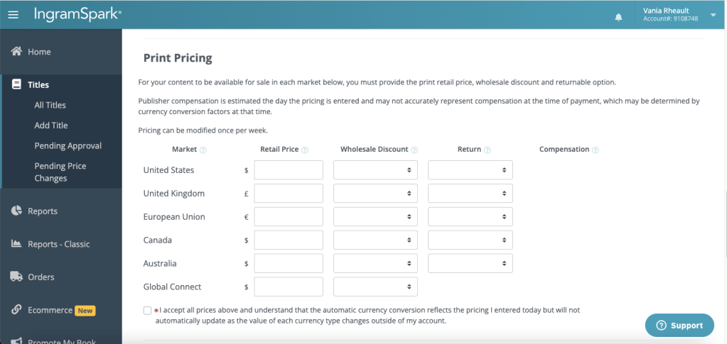
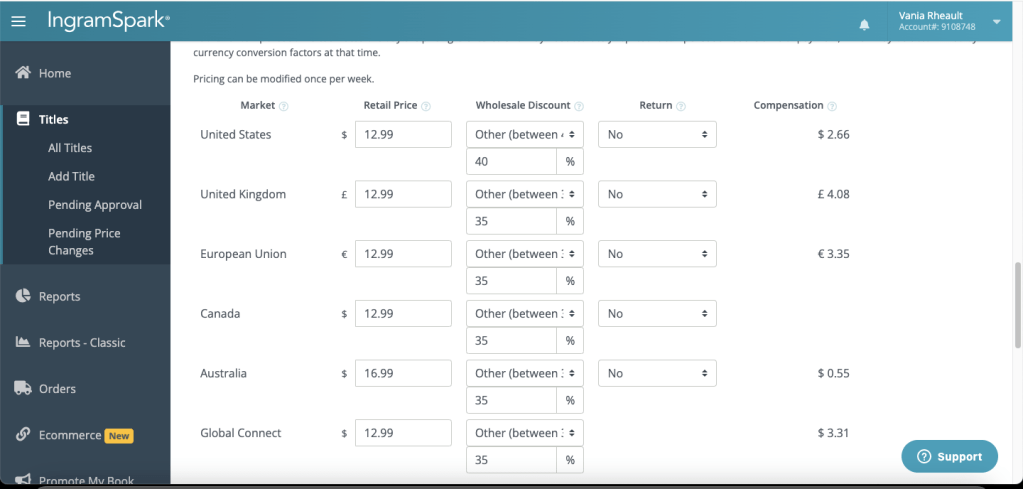
Print pricing is next, and there’s a lot to say on topic, but on the same token, nothing at all. What you choose for pricing, discounts, and if you’re going to allow returns is going to be a personal choice based on what you want for your business and how much you want to make per copy per sale.
I don’t offer paperbacks to make money, and I don’t even print through IngramSpark to be in bookstores. Honestly, I have no idea why I print through IngramSpark. Faking Forever is $12.99, and I do a 35-40% discount and I don’t allow returns. That’s what I do, but you’ll have to research for yourself. I choose a 35% in the countries I can because that’s what Robin Cutler (who created the indie side of IngramSpark many years ago) recommended, and I never stopped. Here are my fields filled out. You can see I dropped Australia’s price as low as I could. Actually, I could have made one cent if I chose to sell my book for $15.99 instead of $16.99. Book prices there are crazy, and I’m happy for the .55 if it means someone there can afford to buy my book.
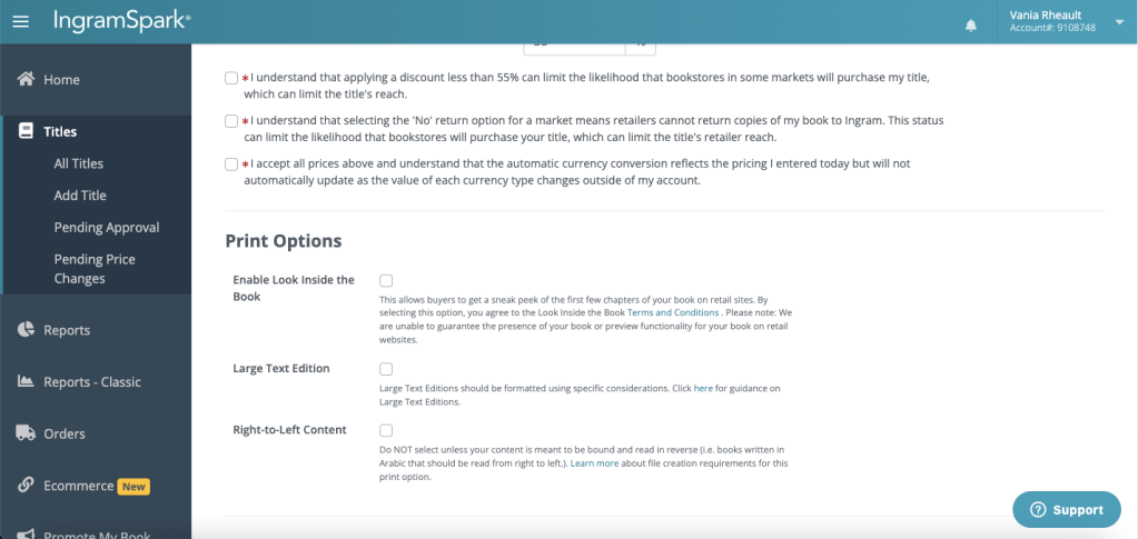
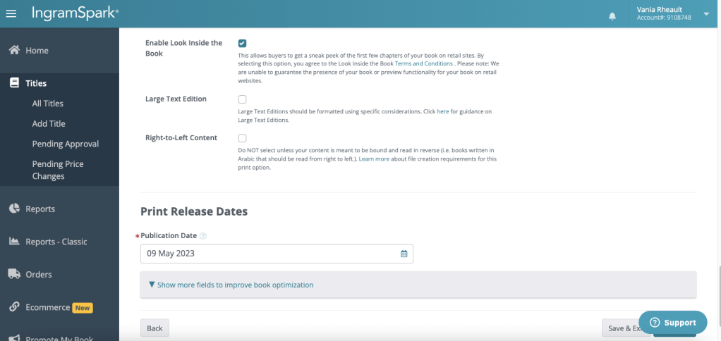
Go ahead and click that you agree on all the little asterisks and then go down to Printing Options. For those options, I only click on the Enable Look Inside feature. I figure since a reader can read 10% of your book on Amazon, I might as well give readers the same opportunity elsewhere. You can do large print, but KDP blocked my attempts as duplicate content so the only way I would do Large Print now is if I printed only to sell off my website. I would like to, some day, but I won’t be doing it any time soon. The right-to-left content is self-explanatory, so skip that, too.
The last on this page is the Print Release Date. If you waited, this could have been a few months ago, so if you don’t remember, grab the date off your product page on Amazon.
When you’re done filling all that out, click Continue. It’s hidden here by the Support icon.
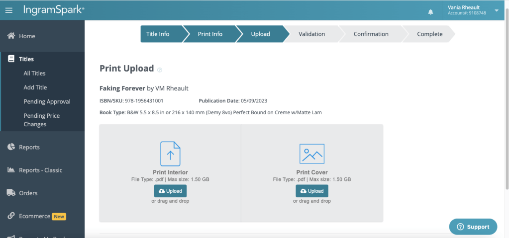
This is where you upload your files. You can either Drag and Drop, or Upload. This is also where the glitches happen, and we can see if IngramSpark is going to give me a hard time today. I don’t have a preference either way, drag and drop vs. uploading, and I’ve done it both ways.
It looks like today they decided to be glitch-free, and you can see the dates and times of the uploads. I know from experience that if it doesn’t show dates and times, your files haven’t uploaded properly. You can try logging out and logging back in (save and exit first), clearing your cookies/cache, trying a different browser (Chrome vs. Safari, for example) or using an incognito window. I’ve tried all of those when IngramSpark has been a bear to work with and usually one of those will push the process along. I almost wish IngramSpark would have given me a hard time so you could see what it’s like, but then again, I shouldn’t be asking for trouble.
The email upload link at the bottom is for a cover designer or your formatter if they have your files. You don’t want to give them access to your whole account since you put your banking information into your profile, so use the email link if you had help putting your book together. Click Continue (that’s hidden under the Support icon).
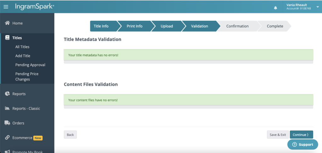
The next page verifies your information. This can actually take a few minutes, so don’t panic if it makes you wait.
Click Continue.
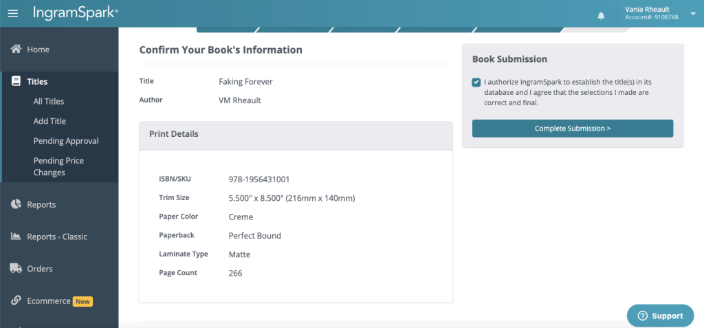
Confirm your book’s information and click the little square in the upper right.
Then you want to click on Complete Submission. This will also make you wait for a couple of seconds.
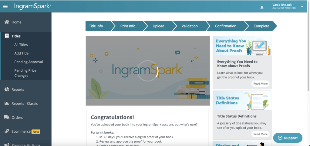
I haven’t submitted to IngramSpark for a bit, so this congratulations screen is new to me. Once you’ve submitted your book, they’ll email you as to whether you need to fix anything or if the eproof they send you can be approved. Because I always publish on KDP first and put my books through a rigorous proofing-the-proof process, I don’t order a physical proof through IngramSpark. Once the eproof (PDF) comes, I might scroll through it just to check out the cover, but honestly, I just approve it and move on.
There aren’t many times I submit a book where I don’t have to fix the cover in some way. Sometimes I don’t make the text on the spine small enough, or I don’t move the title and author name over, or whatever. If I’m dealing with a gradient, sometimes I don’t have it moved over enough so that’s flush with the spine. They’ll tell you in the email they send you what needs to be fixed, and then you just do what they say and resubmit the file. I’ll probably look over the eproof when I get it just to be sure I didn’t screw up somehow because I was distracted writing this blog post while I was filling everything out and submitting.
But that’s really all you need to do to publish with IngramSpark. The ISBN stuff is a hassle, and waiting for a couple of months after you publish to KDP first is annoying, but I use my ISBN both places and have never had an issue so I’m not going to fix what isn’t broken.
I hope this post was helpful and waylaid some of the fear. Like anything once you do it, the easier it becomes.
I wrote out this post long enough in advance that IngramSpark approved my files and they sent me an email saying I can approve the proof. This took about three days.
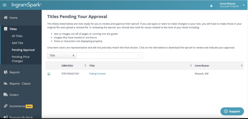
On Threads, someone was saying they were waiting weeks, but what can happen is you don’t get an email and your title needs to be fixed somehow. I’ll show you where you go to see the actual status of your book if you don’t get an email after a week of waiting.
Once you get your email, click Approve EProof.
IngramSpark will make you log in, so do that.
They’ll direct you to this screen:
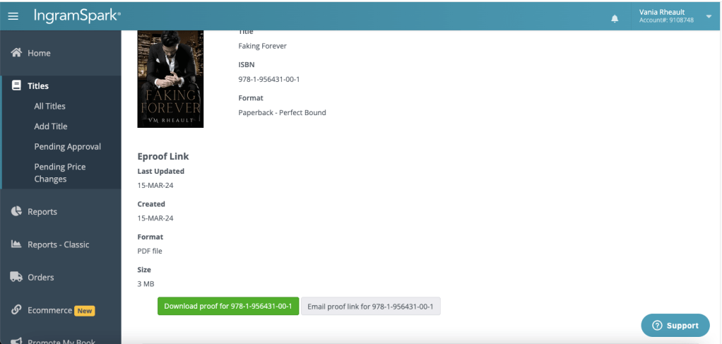
Click on the title of your book.
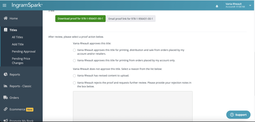
Scroll down until you see the green bar that says Download Proof for your ISBN.
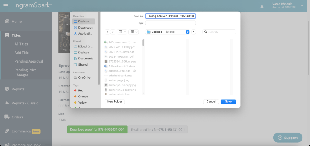
I save it using the title so I can find it later if I want it.
Open it up, and you’ll see they sent you the entire book. This certainly doesn’t take the place of looking at a paperback copy of a KDP proof, and if you do want to order a paperback proof, you should. I never do, and before I published this book to KDP, I think I ordered a proof about four times. IngramSpark’s printing isn’t that much different, and if it passed the IngramSpark submission process, then I know it will be okay.
You can also see here that they did add the barcode for me, and they placed it where KDP puts theirs.
I scrolled through, and I notice I could have updated my Also By in the back of my book. I think fixing that and resubmitting will be too much hassle, and I’ll let it slide.
Once you know you’re happy with the proof, scroll down the page more.
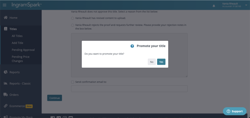
This where you approve or your title. If you decide to make changes, click the appropriate selection. I clicked the first because my book is okay to distribute. Scroll down more and click Continue.
They’ll ask you if you want to promote your book. There’s a fee there, and I think the last I clicked it was $250.00. Apparently they’ll promote your book in the bookseller’s catalogue, and I did this for All of Nothing and didn’t see any ROI. But like all business decisions, it’s up to you. I’m going to click No.
When you click No, you’ll be sent this this screen:
But in my experience, processing doesn’t take long–at least, not on the dashboard part of it. It can take a few days for your book to start popping up in the marketplaces. Since (again) I don’t care about that stuff, I don’t look, so don’t quote me on how long it takes.
If you click on Titles on the left, you can see that Faking Forever is already available.
Titles and Titles Pending is also where you can look to find out your book’s status if you’re waiting for an email after you’ve submitted your book. A while back I resubmitted covers for my duet, and I messed up Addicted to Her. I didn’t get an email saying that I needed to fix anything, but I didn’t get an email saying that my book was ready for approval, either. If you’ve been waiting for email after submission and it didn’t land in your spam, always go to your dashboard and check on the title in question. That will give you the most up-to-date information. If your cover needs tweaking, it will tell you there. There are always ways around waiting–information is usually available if you know where to look.
Part of the reason I don’t order an author copy first is because I never see the option. I have no idea where to click to find a proof before publication. I must miss it every time, but for the life of me, I never see it. But, like I said, I’ve already seen a KDP proof a million times, so I’m okay not ordering one from IngramSpark. If you really want to see the quality, you can order an author copy for yourself, but I’m hearing IS has the same problems as KDP. Their printers are overworked and underpaid, and covers can be messed up, or your cover may be right, but there’s a completely different book inside. Some boxes have a mix of books–one erotica author, I think on Threads, said she got a box full of Bibles. All can I really think when it comes to this kind of thing is that the indie publishing industry is bursting, and POD–machines and workers–can’t keep up. So, if you’re ordering stock for an event, do it months and months in advance, not only to give the printers time to print and shippers time to ship, but also to give yourself enough time to reorder if your shipment’s damaged in any way. I know you have to be super organized to plan that far ahead, but it will save you a lot of headaches in the long run, I promise you that.
Since I was able to walk you through the approval process too, I think that concludes the IngramSpark tutorial. I hope it was helpful, and as always, there are no affiliate links in this post.
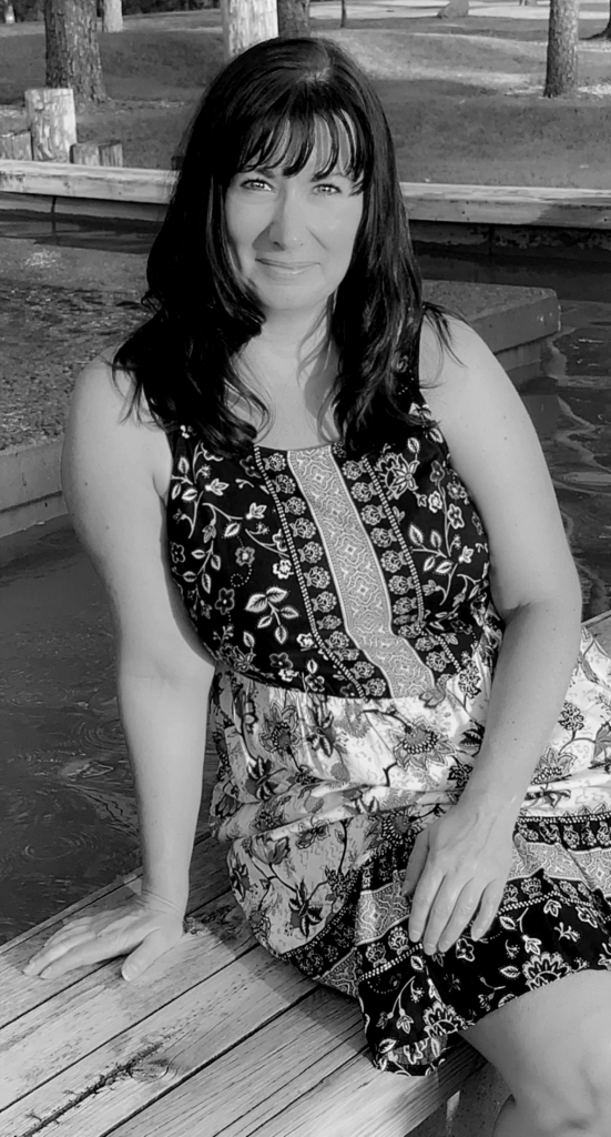
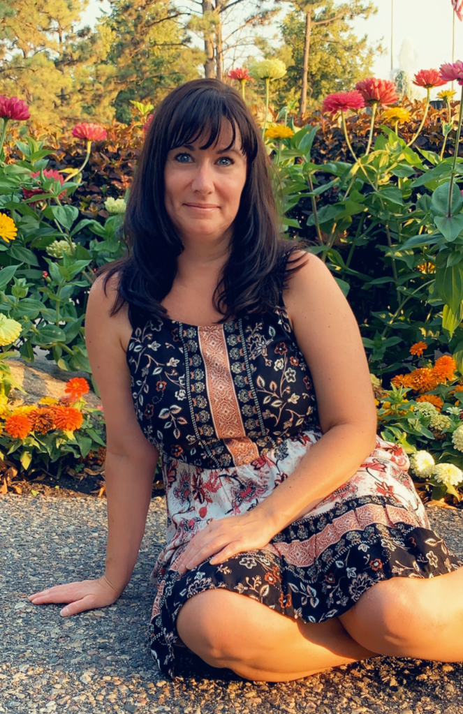
Happy Monday! I don’t share many pics of myself, but this one was taken at the hotel in Minneapolis while we were decompressing after a day of shopping at the Mall of America. I literally have bedhead, haha. I hope the Thanksgiving weekend treated all of you to good food, fun family times, and some quiet relaxation for yourselves before the frenzied weeks of Christmas kick in.
Despite how busy my November has been, I’ve been able to get a few things done. My Lost & Found trilogy has been reedited and the covers have been updated (that was a lot of work and I’m glad it’s over). I haven’t taken the time to run ads to it yet, so I don’t have any data to share as to how the covers made a difference in sales. People actually have to know of a novel’s existence before they can buy it and right now the only way I do that is with ads. I can share now more on social media because I’m proud of the covers and before I didn’t really want anyone to see them. It’s difficult to market a book you’re not proud of and at least now I know the covers are the best they can be.
Ad cost over the next four weeks during the holiday season won’t be that great, and I won’t start any new ads until after the holidays. Everyone is going to be running ads to their products. I’ll keep the ads I have now going (keeping an eye on the cost-per-click), but I’ve heard CPC goes up around this time of year, and I don’t need to contribute to that.
I was a little curious as to how my rockstars were doing read-through wise, so I did some math to calculate. I’m not going to say how much they’ve made since their release (and with the numbers I share, please don’t try. So much varies with KU and sales, not to mention countries). I struggle between wanting to help fledging authors feel better about lower sales and showing my readers all that I have talked about and implemented over the years really did help me find readers and level up without flashing numbers. When you write a nonfiction blog it’s important you know what you’re doing, or at least if you’re going to experiment you’re honest that you’re experimenting and willing to share the results, but you can’t say “do this” without proof it works. No one would listen to me if I did that, and my blog would be worthless and meaningless. I’m not one of those smarmy marketing gurus that lands in your inbox, and I’m not trying to sell anything, but I do give advice and it is nice without taking screenshots of my KDP sales dashboard to be able to prove that my advice has a little weight behind it.
So, I took a few minutes to look up my stats. Twisted Alibis, in total, has sold 252 books. That’s with KENP page reads turned into full “books,” ebooks, and print sales. Twisted Lullabies has sold a total of 147 books, and that is with all the formats. Twisted Lies has sold 119 books, and that includes all the formats. I did the math and if you divide Twisted Lullabies’ sales (147) by Twisted Alibis’ sales (252) you get 58.3%. That means 58.3% of readers who read book one of my trilogy went on to read book two. I did more math and calculated that 80.9% of readers who read book two went on to read book three (119 divided by 147), and I was really really happy with those numbers. Especially since I’ve been told book two’s characters were hard to connect with and it wasn’t a classic, “boy meets girl, they fall in love, they break up, get back together, and get married” kind of romance. It’s not, really, but I believe there is room for all different types of tropes and stories and characters. I’m glad book two, despite the negative feedback, is enough for people to go on to book three, and I really hope book three nails the ending and gives my readers the closure they deserve after investing time to read 300,000 of my words. If you want to read more about read-through, how to calculate it, and why it’s important, you can read an article here by Mallory Cooper for Kindlepreneur.
What’s next for me? Right now I’m pleasure-reading/editing book two of my duet. I fell into a weird cadence overusing “while” “before” “after” and “when.” I don’t know why, and I don’t know how, unless I read a book while writing those that did the same thing. I don’t particularly like it, and there was one paragraph where I used five “whens” and it sounded like crap. I love the stories, though, so I’m pleasure-reading as much as I am fixing the sentences. It’s not a huge, anxiety-inducing priority to edit these books as my trilogy was, so I’m taking my time and still doing other non-writing things while I’m doing that. Mostly that has to do with the trip I was on for my daughter’s birthday, Thanksgiving I cooked for, and this week, tree-trimming and celebrating my birthday. I also want to spend more time on social media promoting my Christmas novel (I have five weeks to push it until no one cares), and I’ll do that while casually finishing reading book two and replacing all those files once it’s done. It’s not a big deal, and editing those books gives me a chance to update my Also By pages–I’ve written a lot more books since publishing my duet.
Otherwise I don’t have much else. I was going to take December off, but you all know me and I couldn’t take time off my books without feeling listless and, let’s face it, sad. I wouldn’t have much else to do, but I am going to read while I get my series ready because I want to start my research and plan/plot what I’m going to write next. I can’t write what I want if I don’t read and make notes of tropes and reader expectations (skipping from billionaire to rockstars to mafia), and honestly, some of these I picked up on TikTok and I want to know if they deserve all the hype. But, one thing at a time, and I want to delve into my series first, see how much work they need. I haven’t read them in a long time, and now that I’m aware of my writing tics and my new favorite garbage words, I can edit them with a fresh eye and publish them knowing I did the best I could. I need to take a deep breath and go slowly. We’re looking at a half a million words and that won’t be easy, even if they are, by my guess, 75% ready to be published. I’ve been talking about these for so long, many of you probably think they’re a myth and they aren’t really written at all. They are very real, and it will be a relief to get them polished and on preorder. I’ve held them back long enough.
Oh, and I did manage change out my Lost & Found trilogy files on IngramSpark, and I put my rockstars on there, too. I don’t use expanded distribution on KDP, preferring to use Ingram on the off chance I’m asked to do a signing and they want to order their own stock rather than me bringing in author copies. I always thought it was tacky anyway, asking bookstores to sell Amazon copies when Amazon is a bookstore’s biggest competitor. Have a little class and use Ingram for their distribution. I do both. Amazon doesn’t play well with others, so I publish there first, wait for the books and ISBN to “settle” for a few months (three or four), and then when Ingram publishes, they skip Amazon because my books are already there. It’s a system that has worked for me for 20 books, and if it’s not broken, I’m not going to try to fix it or do something else. I only messed up one of the six covers I submitted, and that by far is my best record yet. I must be getting used to how picky they are. Also, I recouped my Alli membership fee. One of the benefits of being a member is free IS file replacement. You can upload new titles for free, but if you make changes to existing books (I think it’s more than 60 days after publication) you still have to pay the fee for file replacement. That’s $25 for the interior and $25 for the cover ($50 for both). Being that I replaced both for all three books, my membership paid for itself and then some. Membership is $119 dollars and replacing all my files in my billionaire trilogy would have cost me $150. That alone was worth it, but I like being a member for peace of mind. You never know when you’re going to need an advocate to reach out to Amazon on your behalf. Anyway, so I was glad to get that done, and now my rockstar paperbacks are available everywhere. I don’t sell many, like I said, it’s mostly in case I’m ever invited to a book signing and they want to order their own copies. I do a 40% wholesale discount and don’t allow returns. I’ve heard some horror stories about dealing with IS, but I have never had an issue with getting hit with a huge return bill. There’s a first time for everything, so read up on what is best practice and make decisions for yourself and what’s good for your book business.
That’s all I have for this week. I hope you all have a fantastic one!
There has been a lot going on in the past couple of weeks, and now that I’m done with my trilogy (!) I can poke my head out of my writing cave and weigh in! Most of it’s been happening over at Amazon, but when aren’t they making huge waves over little changes that leave all of us authors rolling around on the floor in a temper tantrum?
The first big thing was they raised the price of Kindle Unlimited. It used to be $9.99 a month and they raised it to $11.99 USD. I’m not sure why that gave every author I know a heart attack. Two dollars is nothing, especially since in the email they sent all their subscribers, they said their catalogue has grown to over four million titles.
Since the launch of Kindle Unlimited in 2014, we have grown our eBook catalog from 600,000 titles to over 4 million titles today, introduced digital magazine subscriptions, and improved selection quality across genres. Kindle Unlimited members have unparalleled access to read as much as they want from a rich catalog of eBooks, audiobooks, magazines and comics. We continue to invest in making Kindle Unlimited even more valuable for members.
Taken from my Amazon Email
Guys, readers aren’t going to care. As a reader who uses KU, I don’t care. Have you priced ebooks lately? Anyone? These days your KU subscription fee will pay for two, mmmaaaayyybbbbeeee three ebooks, if they’re priced low enough. Everyone’s prices are rising, and KU for a reader is still a great deal. If you’ve been considering pulling your books out of Kindle Select because of this small price change, I would tell you to take a step back and breathe. You all are going to make a major business decision over two dollars a month? (And I’m especially staring at the people who are paying Musk $11.00/month to tweet.) I hope not. But if you are going to go wide, publish with Kobo directly and enroll your books in Kobo Plus. They don’t require the exclusivity Kindle Select does, and if you’re considering signing up as a reader to save money, understand that their catalogue isn’t nearly as large.
Evaluate for yourself if keeping your books enrolled in Kindle Select is the right thing for you and your business. Don’t blindly follow what people are doing on Twitter and in your author groups. A lot of the reaction is due to the fact that AMAZON made this change. Authors love to hate Amazon, always accusing them of undercutting and cheating us. They added value and upped their prices–like any company does. Like Canva is going to do with all their new toys. I’m waiting for the email to come from them too. It’s what happens.
Another nasty surprise we woke up to is Kindle Direct Publishing raising their printing costs. This caused a lot of anger and resentment too, but someone I trust analyzed how much that means for indie authors, and the fact is, KDP upped printing costs by .15 a paperback. You need to take a look at your business and decide if freaking out over .15 is a wise business decision. I don’t sell many paperbacks. It’s not where my focus is. I market to KU subscribers. Any time I run an FB ad or mention my book on Twitter or anywhere else, I say it’s available in Kindle Unlimited. That is where my readers are. That might not be true for everyone. Authors who write poetry, kids books, and middle grade focus on paperbacks, and if you’re buying author copies in bulk, you can always print through IngramSpark. I think again, people are angry because this is Amazon, but you have to take a look at the industry as a whole. For some reason, I follow a lot of agents, and when they are telling querying writers to adhere to a certain word count because printing is expensive and it’s easier for them to sell shorter books, then it’s an industry problem, not an Amazon problem. Amazon is part of the publishing business, and the publishing industry is global. We are caught in the middle of the pandemic aftermath, and it seems a lot of people forget that. Are you upset about fifteen cents? I’ll give you the quarter I found between my couch cushions.
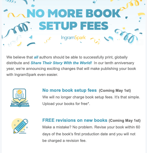
IngramSpark is dropping their publishing and revision fees this month. That was actually a very nice surprise, and I will be taking advantage of it as I haven’t put my trilogy on IS yet. (I abhor busywork and adjusting the KDP cover template to the IS template is a boring pain the butt.)
I wondered how they were going to recoup that loss, and they too, are going to be charging more. I can’t remember where I got this screenshot, but I shared with my friend Sami-Jo when we were talking about IS dropping their fees:
So while the free title set up and the free revisions are a good thing, they are going to make up that loss, and it will fall to us. I’ve never paid a fee; I’ve belonged to a group like IBPA or ALLi who includes codes as member benefits, or just waited until they had a promotion and used their promo days (a good time was always in December for their NaNoWriMo promo.) Amazon isn’t doing anything everyone else isn’t doing, so please breathe and conduct your book business accordingly.
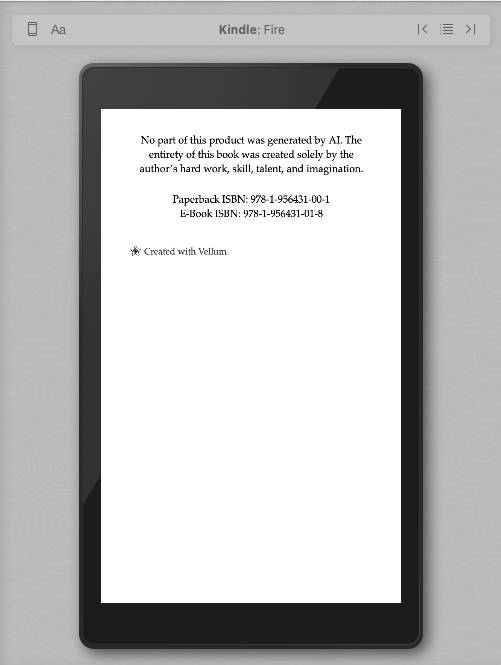
So much talk about AI I’m going to scream. I’m never going to use AI to write my books.I’ve played with Chat-GPTand while it’s fun to chat with Al and bounce ideas off him from time to time, the last thing I’m going to do is give him a prompt and copy and paste it into a book that has my name on it that i’m going to sell. If other authors want to do that, that’s their choice, name, and reputation. My books come from my heart, and I pour a lot of blood, sweat, tears, and wine into my fiction. (Not so much the wine anymore. I’ve stopped drinking hoping to drop a few pounds this summer.) I enjoy writing. I love creating characters and putting them through a lot of crap before giving them their HEAs. Why would I outsource that? I get not everyone feels the same, and that’s fine, but I have started to include a disclosure on the copyright page of my books, and I did it with my newest release Faking Forever, which was out last week.
My copyright page is absurdly long because I give credit to everyone living and dead who in any way shape or form helped me with my books. Just kidding, but I add all the contributors for my stock images and chapter headers with DepositPhotos plus I give credit to my son and ex-fiancé for helping me with the imprint logo. And maybe one day I’ll update that too so I don’t have his name in my books anymore. Anyway, maybe no one reads copyright pages, but I like knowing that I’ve added it. I’m not going to write my books using it, but I can look at both sides and understand that there can be a place for it. Authors are going to have to do what they’ve always had to do: write good books and find a readership. I don’t think AI is going to disrupt this any more than COVID did when everyone was staying home and writing and publishing books because they didn’t have anything better to do. Publish good books, publish consistently, buy promos and invest in an ad platform. Start a newsletter and reach out to your readers. Let them get to know you as a person, and they’ll respond and connect with that.
Probably more went on, but this is going to be it for me this week, as far as commentary goes, anyway. While I “take a break” I’m going to re-edit The Years Between Us and reformat it using one of the newer styles that came with a Vellum upgrade. Depending on how I feel after that I would like to tackle my small town series and give them a facelift (especially covers because not being able to run Amazon ads is especially annoying), but I also want to stay on track with my rockstar trilogy to have that ready to rapid release by the end of August. There is always something to do!
It might be surprising to hear that your book’s back cover doesn’t have to be ugly. In fact, you can put as much time into the back that you do the front, and while your back cover may not get the love your front cover does, when a reader flips your paperback over, it’s a nice surprise to reveal a pretty back cover that they could potentially love just as much as the front.
Some authors may not put forth much effort or thought into their back cover as they are focused on ebook sales, and that’s something I think about too, since my books are in KU. No one cares about the back cover of a paperback they aren’t going to buy, and more than likely, if you’re in KU and catering to whale readers (let’s say, romance), unless you really knock their socks off, may not even remember your name once they’re done skimming, reading your book. I mean, that’s fine–I get page reads whether a reader devours and savors every word or they skim for the sex. But you know when a reader shells out POD prices for a paperback that they love you and your books, so why not reward them with something extra special? I don’t mean tucking a 20 between the pages, though that could be something fun to do at some point.
Here are some tips on how to make your book cover shine:
Don’t choose a solid color (and if you do, expect to add some embellishment or it will look plain [see below]). This is difficult if the image you choose for your front is vertical and not horizontal. This is what was tripping me up when I was doing my most recent trilogy. For the first round of model picks, they were all vertical and didn’t share a similar background that would make a pretty wrap. It’s especially disheartening when you’re doing more than one book and you need to keep their covers similar. Most, if not all, of my covers use a horizontal image so the back cover is taken care of. I would recommend finding a horizontal photo that can be used for the back, spine, and front. If that’s not possible, or you have your heart set on a stock photo that’s vertical, you can use up all that blank space with your blurb, your author photo and bio, maybe an author logo, and the book’s title. My book, All of Nothing, used a vertical photo for the front cover, but I was lucky and turned it black and white and was able to use a black color for the back.
The blurb sucks (don’t read it LOL) and I would move the placement of my author bio to the right of the picture, but my blurb fills the space because I spaced it out. Now I usually add the title of the book to the back as well, but this book is four years old and revamping the back cover isn’t on the my list of priorities at the moment (especially since the paperback is with IngramSpark and I would have to pay $29 dollars to replace the file), though looking at how plain it is, I suppose it could be.
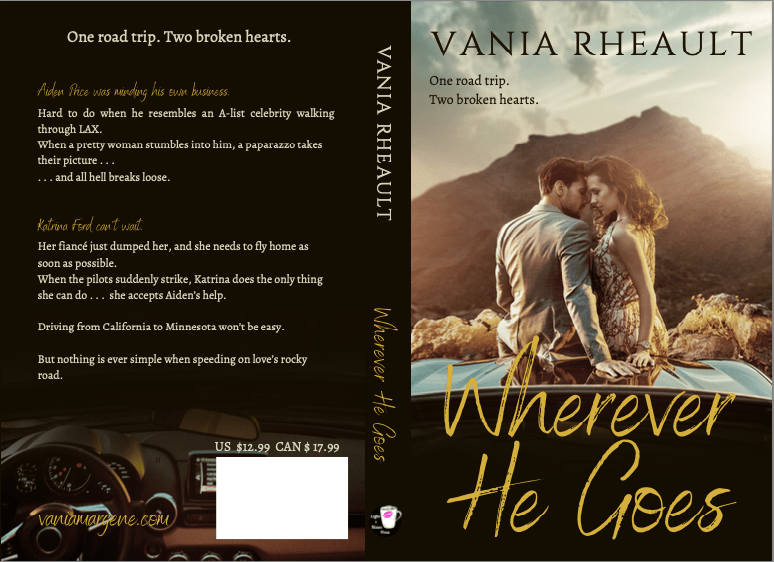
If you add an author picture, add your bio. There’s no point in having your author photo on the back of your book if you don’t want to add a couple lines of bio to it. It will just be a floating head if you don’t. It’s not hard to say, Vania Rheault loves winter and lives with her two cats in Minnesota. When she’s not writing, she’s sleeping, and you can find her at vaniamargene.com. So many people agonize over what to put, but just think of two or three things that everyone knows about you. It doesn’t have to be interesting or insightful. If you balk at that, skip the photo. I also have an author photo and a longer bio in the backs of all my books. I remember when I was creating the back cover of All of Nothing I knew I needed to take up space, and one of my other standalones I wrote around that same time (Wherever he Goes) was easier to put together, though it had a vertical photo for its front cover too.)
You can tell I was working on my photo manipulation skills here, fading out the bottom for the title on the front and using the bottom of the photo for the blurb on the back. This is the original photo:
courtesy of depositphotos.com
I still love everything about this book and consider it one of my biggest achievements though it sells like crap. Meaning, I haven’t sold a copy since July of this year. Which is more recent than I expected, to be honest.
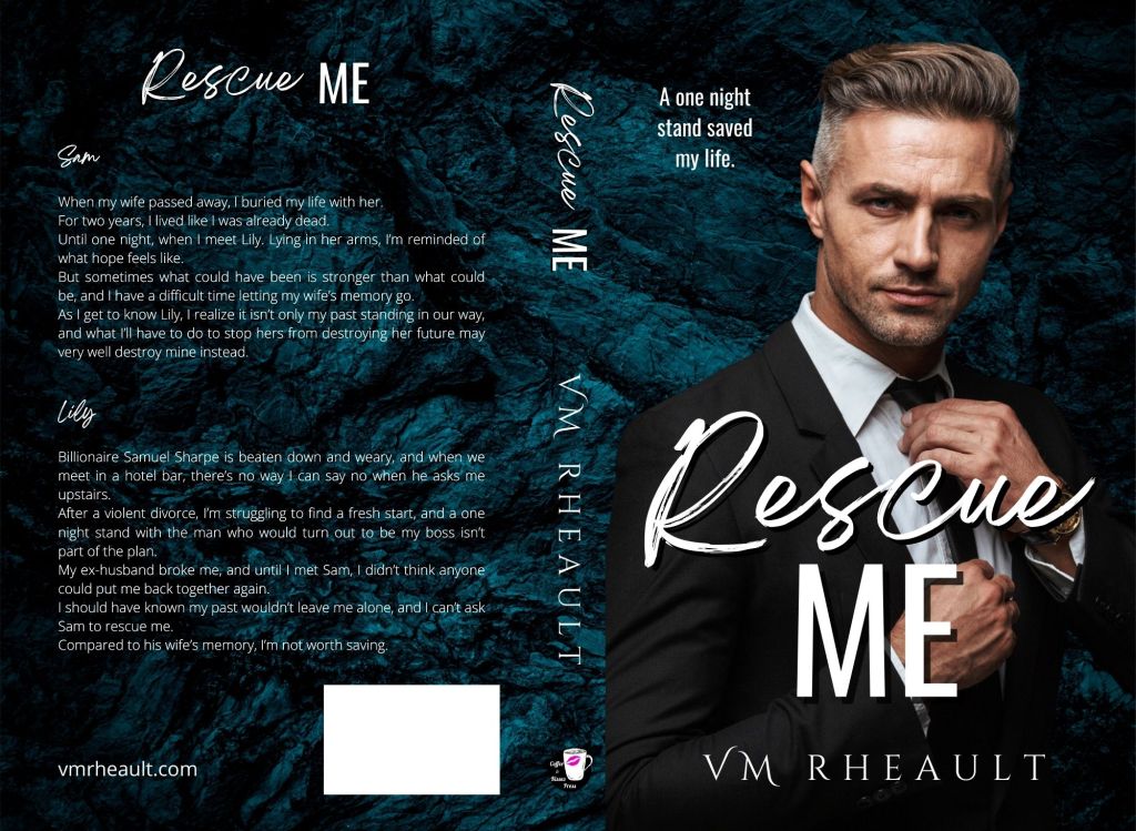
Have fun with how your blurb looks! This might not be too big of a deal in person if you’re focused on digital sales, but if you ever do a book signing or a convention, the first thing a potential reader is going to do is flip your book over to read the blurb. If your blurb is a big block of text, no one is going to want to read that. As Bryan Cohen likes to say, confused shoppers don’t buy. Don’t intimidate them. Space out your blurb like the ones above, and keep your blurb down to 200 words or less. If you want tips on how to write one, look here. https://www.masterclass.com/articles/how-to-write-a-back-cover-blurb-that-sells (This is actually good advice for your book’s product page on Amazon, too. Make the most of the blurb formatter KDP has so generously updated when you publish your book.) I don’t have any examples from my own books for this–dual POV takes up a lot of room if you want both sides for the blurb–some authors give both, some stick with the male, some stick with the female. I am trying something else out for my new trilogy that I’ll be publishing in January–columns for the POVs instead of long paragraphs. This is how my blurb for dual POV looks for Rescue Me, the book I just released:
For their names, I used the same font as the title, and really, it’s a pretty plain back cover, all things considered. And these are the columns I’m going to try for the trilogy:
I’m especially proud of the ombre coloring of the text, and I’m excited to get these proofs. These are the prettiest book covers I’ve done in a long time, and though they may not be 100% billionaire, I’m hoping they convey the genre well enough they garner good sales. I won’t know until I release them, but I searched for “hotter” guys than what I put on my duet, so I hope it makes a difference.
Tell readers how to find you. I have always referred to the bottom left-hand corner of a book’s back cover as the crap corner. It looks weird blank, and over the years I have changed what I put there. I used to have my social media icons there, now I mostly stick to my website. It still looks bare, but it’s better that nothing. At one point I created a logo to put there for my new pen name, but the cover looks clearer without it (in my opinion) and I always use the same font as the front cover.
The back of your book doesn’t have to be dull–and maybe it shouldn’t be. If you ever hope to go to an author signing or convention, or simply want to give your book away, it’s fun to have the back cover look just as pretty as the front. It tells your reader that you care about the final product of your book. If you want more ideas on back covers, here are a couple of articles I found on the subject.
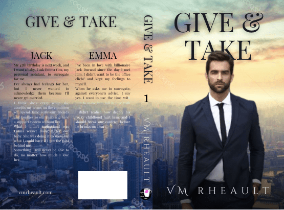
A couple more tips before I wrap up: You don’t need to make your font huge. It’s tempting since you have all that space back there, but you don’t need the astronauts in space to be able to read it. Your back cover really will look funny once you hold your book in your hands, so add what you can to the back and keep your font size to a minimum. The font size for the columns on Give & Take is 10.6 in Playfair Display and you don’t need anything bigger than that. Then two, if you publish through IngramSpark, they force you to match the price on the back with your list price, so you can’t suddenly decide to raise or lower your price without having to change the cover as well. I found that to be a huge PITA, so I stopped adding my prices to the back. If I were just publishing through KDP, maybe I would still since it looks professional to have the price back there (but I never buy the barcodes so I don’t have the price embedded into it anyway) but it’s not a big loss for the hassle it saves me.
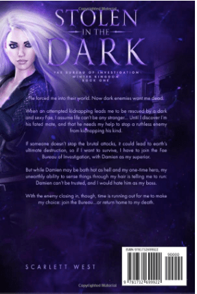
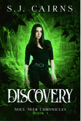
Book covers from my friends that I like. All images taken from Amazon.com and these are not affiliate links.
I wish I had more to write about this week, but the problem is, I just haven’t been into listening to podcasts or reading the non-fiction books that have accumulated in my TBR pile. If it’s not happening on Twitter then I probably don’t know much about it which is sad, but the state of my life at the moment.
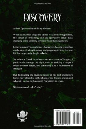
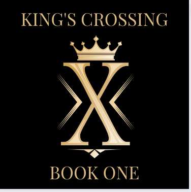
King’s Crossing I’m knee deep editing my King’s Crossing series and it’s slow going because all the “takes” and “makes” I thought I managed to get rid of before I formatted them and ordered the proofs. Well, I didn’t do as good as job as I thought. I probably got tired, and I can’t blame myself because holy God, there are a lot. If I didn’t have that to worry about, I think these books would actually sound pretty good. No typos, at least, still getting rid of some repetitive words, but after editing the first two books of my trilogy, I can definitely tell these are the first books I wrote writing in first person. I fell into a bad rhythm and editing it out, even after several passes, has been a lot of work. Still, seeing them in book form has been very helpful, and I’m confident after this final pass, they will be good enough to publish. I’m only on book two, and there are a lot of sentences I marked that I have to rewrite, but the story is good. The consistency (so far) is solid, and I’m very happy with that. I’m also happy with the logo I created using a DepositPhotos vector I found:
Made with a vector from DepositPhotos in Canva
The “Book One” changes obviously, but after several failed attempts to create a logo with an X myself, I was so happy to have stumbled upon an X with a crown already made. I seriously love it!
Booksprout I went ahead and put Rescue Me on Booksprout. I did it over Labor Day weekend, which probably wasn’t the best time, but so far I’ve given away 24 out of the 25 copies they make available. The paperback is already on Amazon, no sales, of course, but that’s okay. I’ll put the ebook up on October 1 like I planned and hope there will be a few reviews when I do. I’ll offer a few copies to my newsletter, though last month I had 7 people unsubscribe. I don’t know yet if they are good subscribers or not. From what I’ve heard, the open rate is decent (40%) but I ran a giveaway and only one person entered. After hosting giveaways on here with little participation, that’s actually not surprising, but it’s too bad because it’s a really great prize! What I need to do is think about running my ad on Facebook again for my reader magnet and see if I can’t get some more subscribers, and also look into Bookfunnel promos since I’m already paying for that. If you want a copy of Rescue Me, a one-night stand, steamy billionaire romance with an HEA, then grab a copy. It’s offered through Bookfunnel and I limited it to the first 20 people who download. You don’t have to give me your email. https://dl.bookfunnel.com/z92k8x1a92. Here’s the blurb. I got a little help from S. J. Cairns, and I think it sounds pretty good:
Sam When my wife passed away, I buried my life with her. For two years, I lived like I was already dead. Until one night, when I meet Lily. Lying in her arms, I’m reminded of what hope feels like. But sometimes what could have been is stronger than what could be, and I have a difficult time letting my wife’s memory go. As I get to know Lily, I realize it isn’t only my past standing in our way, and what I’ll have to do to stop hers from destroying her future may very well destroy mine instead.
Lily Billionaire Samuel Sharpe is beaten down and weary, and when we meet in a hotel bar, there’s no way I can say no when he asks me upstairs. After a violent divorce, I’m struggling to find a fresh start, and a one night stand with the man who would turn out to be my boss isn’t part of the plan. My ex-husband broke me, and until I met Sam, I didn’t think anyone could put me back together again. I should have known my past wouldn’t leave me alone, and I can’t ask Sam to rescue me. Compared to his wife’s memory, I’m not worth saving.
Hardbacks With some persuading, I created hardcover versions for the two books in my duet. It didn’t take that long, and with some help from JP Garland, I was able to position the elements on the cover correctly, as the template is a bit different. I’ll write about it in full when I get my proof copies so I can post a picture. I placed the order today and it said they won’t come until the beginning of October, but I won’t forget.
IngramSpark I approved my duet paperbacks on IngramSpark this morning. It took a little back and forth on the second book with the cover as they kept saying my spine was wrapping onto the front, but when I adjusted it, it still wasn’t correct. I overcorrected then they said my spine was too narrow, but that seemed to knock me out of a loop and when I moved my elements back to where they were before, the cover was accepted. I don’t use the Expanded Distribution option on KDP as I feel IngramSpark is more professional if I want to have my books in bookstores or if one day I ever drudge up the courage to ask the indie bookstore in downtown Fargo to carry my books. I’m always amused when authors bring in their author copies from Amazon, like they don’t understand that Amazon is every bookstore’s competitor and booksellers really don’t want the KDP POD stamp in the backs of the books they’re selling. It’s just proof to me that indies need to keep an eye on their own business and do things the professional way so they look like they know what they’re doing. Publishing is a business, after all, and booksellers don’t have to waste time with an indie who isn’t professional. There are plenty of authors who are.
That really is about all. Since my mind is a one-way track, I’ll be focusing on proofing the proofs of my series. I won’t be able to think about anything else until that’s done, but with as quickly as it’s going, I should be able to have them finished by the middle of October. Entering in the fixes takes longer than reading the proofs because for some reason, seeing a sentence that needs to be rewritten…i can’t wrap my mind around writing it in a different way. It’s just roadblock I need to overcome because of course there’s a different way to rewrite a sentence. There’s a million different ways to rewrite a sentence. After that’s completed, I will put all my attention on my trilogy because I want to get those out in January, and I have to still finalize covers and write my blurbs. With all that going on, I’m itching to get back to writing, but depending on how all the above goes, I may not be writing new material until next year. It’s just how my mind works. I’ve decided to go with it instead of fighting it. Besides, I like getting one project done and moving to the next. I feel more productive than having three or four things going on at once.
I hope you all have a good week! There’s not much of 2022 left. Do you have any goals you want to reach before then?
I write a lot about covers but the fact is, formatting your paperback book’s interior is probably the most frustrating part of publishing your book. While there are tools out there to help, even super awesome tools such as Vellum that will format your book almost perfectly with just a few clicks, there are things that can trip you up.
I ordered a paperback the other day and it was double spaced. I usually look at the interior of a paperback on Amazon before I buy because I have said many times on this blog that I don’t read books that aren’t formatted properly, but this was a friend’s book and I purchased it out of faith. Like some readers who won’t buy books if the cover is bad, I don’t like buying books that are double spaced or not fully justified. They look bad and poor formatting pulls me out a story before I even start reading.
Here are my top two reasons to format properly:
Professionalism Indies lament constantly about how difficult it is to get into bookstores and libraries. Part of the problem is their books don’t look professional. This goes beyond a bad cover. When a manager for an indie bookstore flips through your book, it needs to look like a book inside. Librarians also will be reluctant to spend their funds on books that do not look professional. Barnes and Noble won’t stock your book if it won’t fit in with the other books on their shelves. Your book takes up space–they want products that will sell. Not to mention, the product they stock reflects their reputation.
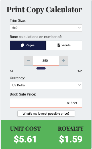
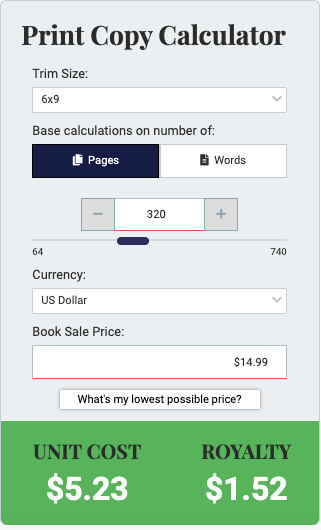
Cost KDP and IngramSpark charges you for paper. You either eat that cost as a publisher or your make your readers eat it by charging for extra paper. When your book is double spaced and/or your gutters and margins are too wide or even if your indents are deeper than they need to be (.50 as opposed to .25) it all wastes space. Draft2Digital tweeted a calculator not that long ago, and we can run the numbers. Say you have a book with a 6×9 trim size, it’s 350 pages double spaced and wide margins. You price your book at $15.99 USD. This is what you get:
Your author copies will cost you $5.61 and you make $1.59 per book. But what if you formatted it with single spaces and narrowed the margins? Say you can decrease your pages by 30. This is what you get:
Your author copy price goes down to $5.23 and your royalty goes up to $1.97. If you wanted to price your book cheaper to give your readers a break, you could price your book at $14.99 and this is what happens:
Your royalty goes down to $1.52, but you’re saving your reader a dollar because you aren’t charging them for paper. I don’t know how many pages you would save single-spacing a manuscript, but saving paper will always be cost effective and kinder to trees. Plus, shipping cost goes down because your books aren’t so unnecessarily heavy.
I admit, I don’t do fancy formatting. I use Vellum and it’s fast and easy, but I’m also using version 2.6.7 when they’re on 3.3. They’re always adding bells whistles, but honestly, I just don’t care. There is something to be said for a fancy paperback though, and I do get tempted to play when I see books like Sienna Frost’s Obsidian. Here are some pictures of her paperback interior that I stole from this tweet. (With her permission. The ebook is on sale for .99 from today until August 28th, 2022.)
You don’t have to go all out like Sienna did, if that’s not your thing. I put my time elsewhere, but maybe one day I’ll create collector’s editions of some of my books. For now, I use plain vectors from DepositPhotos as chapter header images, like the wine and beer glasses from Rescue Me as they met in a bar. Beer for his chapters and wine for hers.
The IBPA lists the publishing standards that are needed for a book to be considered professionally published. You can download the list, but sometimes it’s easier to pull a book off your shelf and just look at it. Look a what the copyright page consists of, what that publisher and author used in the front and back matter. In all the excitement of putting out our books, sometimes we forget what a real book looks like and it helps to have the real thing as an example. The guidelines are a big help, though, a checklist of sorts, and you can find them here. https://www.ibpa-online.org/page/standards-checklist-download
It’s all fine and good to have a list and know what you’re supposed to do, but having the means and the tools is something else entirely. I was lucky and my ex-fiancé bought me a MacBook Air and Vellum. I knew I would be formatting a lot of books, and between my own books and the books I’ve formatted for friends, I’ve saved a lot of money, despite how much a Mac can cost.
Since this blog is all about how to do things professionally but on a shoestring budget, here are some free or cheap ways to format your books:
Word Word is crude tool for formatting these days, but there are ways to make it work for you. KDP offers templates that you can use–simply delete their sample content and copy and paste your own into it. This is how I used to format my books before I had Vellum. Download the template with the placeholder text–all the margins, gutters, and front and back matter are in place. You do have to have a little knowledge of Word as I doubt you’ll have the same number of chapters as the template, but it’s better than starting from scratch. My friend Joe Garland has tutorials on YouTube that can help you, and Dave Chesson from Kindlepreneur also just blogged about formatting in Word. He offers templates as well, so you could give them a try.
Atticus Dave Chesson’s baby, Atticus, is a low cost answer to Vellum, available for both PC and Macs. I’ve heard reports it’s glitchy, but their customer service is very helpful. You can check it out here. At 147.00 and a 30 day money back guarantee, there’s not a lot of risk trying it out. https://www.atticus.io/
Reedsy Reedsy offers a free formatting tool. I tried it once a while ago, and there’s a small learning curve. Sometimes people just have a knack for learning new things and some people don’t. I don’t remember liking it all that much, but that doesn’t mean you won’t. Free to use and the files are eligible to be uploaded anywhere.
Network Unfortunately, sometimes you just have to network. In some of my groups on Facebook there have been times an author has displayed frustration to the point of tears and there is always a kind soul who will help out. I’ve done covers for people when their ads aren’t working because of their covers, and I’ve edited and formatted for people too. The only problem with asking for a favor is that the file isn’t yours and any changes you make will make you feel guilty for asking. If you can find a way to format yourself, having control can be priceless. Anne Wheeler does book formatting using Vellum. She said I could post with her permission. Reach out to her if you have a book that needs simple formatting without a super short turnaround time. Carol Beth Anderson also does formatting using Vellum for $50.00/book. You can contact her as well. Nicole Scarano offers book formatting using Vellum. Unlike me, she updates hers and offers premium formatting. Join her Facebook group if you’re interested in learning more. (These women are friends of mine, but i haven’t used their services. My recommendation is not an endorsement and they are not affiliate links.)
The fact is, booksellers won’t take your book for their stock if it’s not formatted properly, libraries won’t want your book in their stacks, and readers won’t want to read. It’s not that difficult to properly format your interiors. It’s not being snobby to want the books you buy to look like books, because if an author doesn’t care about doing it properly, I shouldn’t care about reading it. I’m not going to make allowances and exceptions for an author who should know better, and neither do booksellers. There’s a tweet I responded to by my friend Anne I mentioned above, about the stigma self-publishing still faces, and there doesn’t have to be. (Though I know for a fact her books are beautiful!)
This blog post was updated on June 4th, 2025 to reflect Canva’s recent glow-up and I used a new cover as I didn’t end up using the cover I demonstrated with in the previous post.
Quick note: I use Canva Pro, and some of the features I talk about are not available in their free plan. Before Canva added those features, I taught myself a few things in GIMP, a free version of Photoshop. (Find it here: https://www.gimp.org/downloads/) It will be up to you to learn the things you don’t know. And as always, there are no affiliate links in this post.
Because of the changes KDP made to their template generator and the updates Canva added to their software, the blog post I wrote a few years ago now on how to use Canva to create a full wrap paperback cover is basically obsolete. The good news is KDP took away the need to do any math, and I think that will make a lot of people happy. Oh, and the CMYK vs. RGB issue if you want to publish on IngramSpark is gone as well, since Canva (on the Pro Plan) added the option to download your PDF in either.
While there are some things that still pertain to doing your cover in Canva such as making sure your stock photos are 300 dpi so your cover isn’t pixelated, there is a lot that has changed, too, so let’s dive in.
Before you start, you’ll want to make sure you have a formatted manuscript. This includes all your front matter and back matter, your dedication page, acknowledgments, about the author, etc. If you do it yourself with Word, Vellum or Atticus, InDesign or other, you can make changes whenever you want (and you probably will). KDP gives you a 10 page grace, so don’t go crazy. If you hire out, you’ll need the total number of pages of the formatted manuscript that you’ll upload into KDP or IngramSpark and the trim size you’ve chosen for your book.
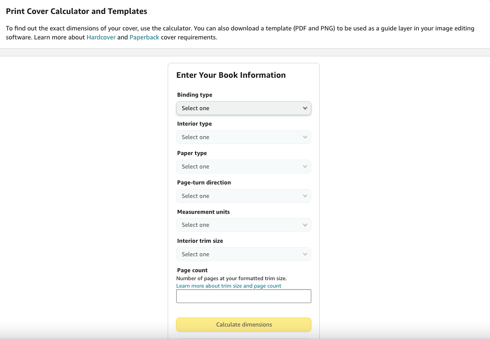
Once you have that, you can download the cover template that will show you the bleed areas to stay away from when creating your cover. Go to https://kdp.amazon.com/cover-calculator and enter in all the information they want.
1. Paperback or hardback That’s your choice, and the the instructions on how to do the cover are the same. I’ve made hardcover editions and after a while took them down. They didn’t sell and it didn’t seem worth it to keep them on my product page. Going forward, I won’t offer hardcovers–to me, they aren’t worth the time or expense of the ISBN number.
2. Because you’re not creating a coffee table book or a cook book that requires colored pages (those projects are beyond the scope of this blog post) choose a black and white interior.
3. Cream pages for fiction, white for non-fiction is usually the norm. Your page color is attached to your ISBN number, so you can’t change your mind after you publish.
4. Page turn direction is left to right.
5. I choose inches.
6. Choose your trim size. Trim size is also attached to your ISBN so you can’t change the size of your book unless you republish. If you have a very long book, you may want to go with 6×9 due to printing costs in KDP, especially since not long ago they said they needed to increase their prices. Look at what other authors in your genre are doing. Amazon makes it easy to find the product information of any paperback book. I used to go with 5×8, but under my new pen name I’m going with 5.5×8.5 for all my books. You’ll need to tell your interior formatter which size you’re going with as well.
7. Enter the page count. This determines the thickness of your spine. (Press Enter if the yellow button doesn’t light up.)
8. Click Calculate Dimensions.
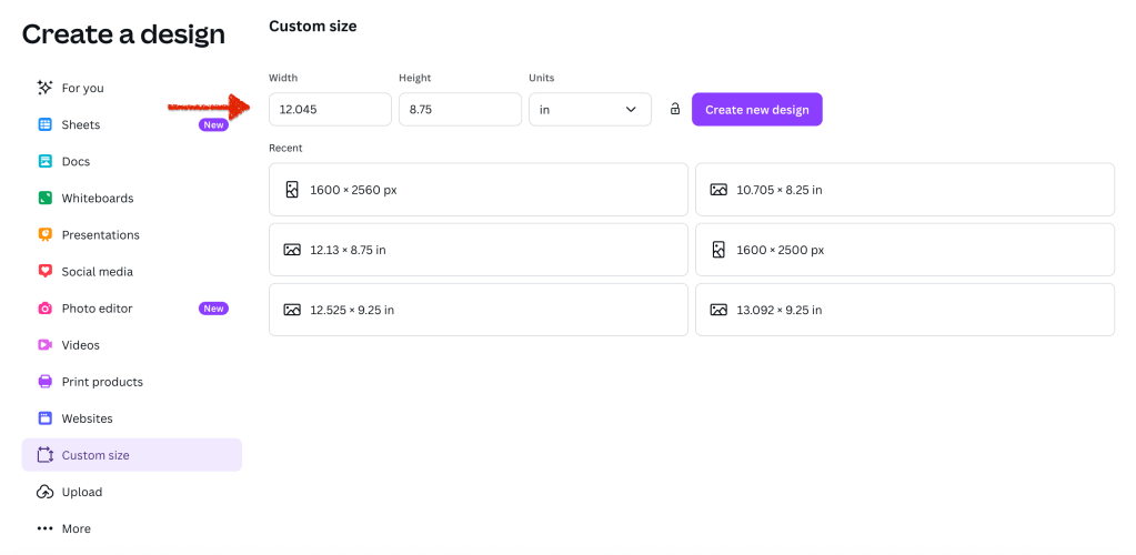
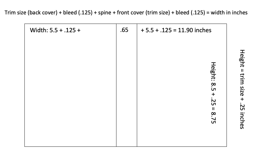
With the new way KDP offers you the template, all you need for the canvas size in Canva are the numbers for the full cover. The width is 12.045 and the height is 8.75. Before, you used to have to do the math (adding the front and back covers and spine and bleed) to figure out this number, but not anymore.
Click download template on the lower left. It will come in a ZIP file. Open the file and save the PNG under a name you’ll remember so you can find it to upload it into Canva.
The template will have all the information you entered into the template creator and will remind you of the canvas size: 12.045 (width) x 8.75 (height).
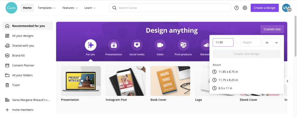
In Canva, on the home page, you’ll want click Create and choose Custom Size:
There, you’ll enter in the numbers that the KDP template gave you:
Click Create New Design.
When you do that, you will have the exact sized canvas you need to fit the template you downloaded.
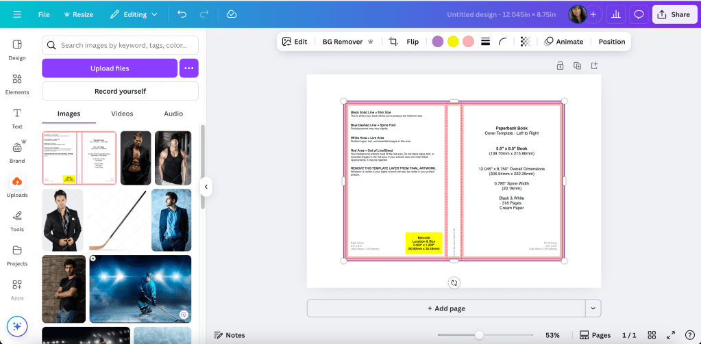
Upload the PNG of the template and add it to the canvas.
Adjust it like you would any picture or element you use in Canva.
And really, it’s that easy. No more math. No more guessing the canvas size. This is the template for a standalone I’m releasing later this year. I’m using a 5.5×8.5 trim size, the pages of the book are 318 and I print on cream paper.
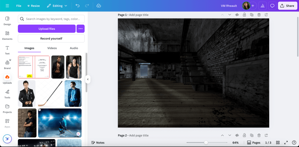
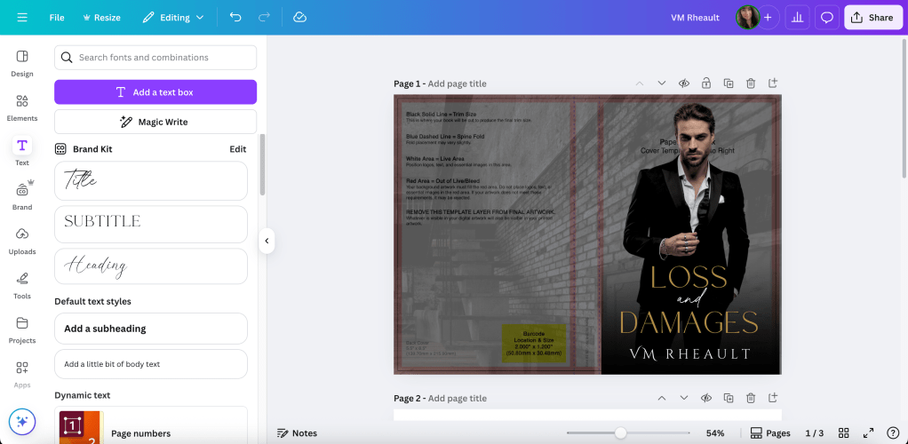
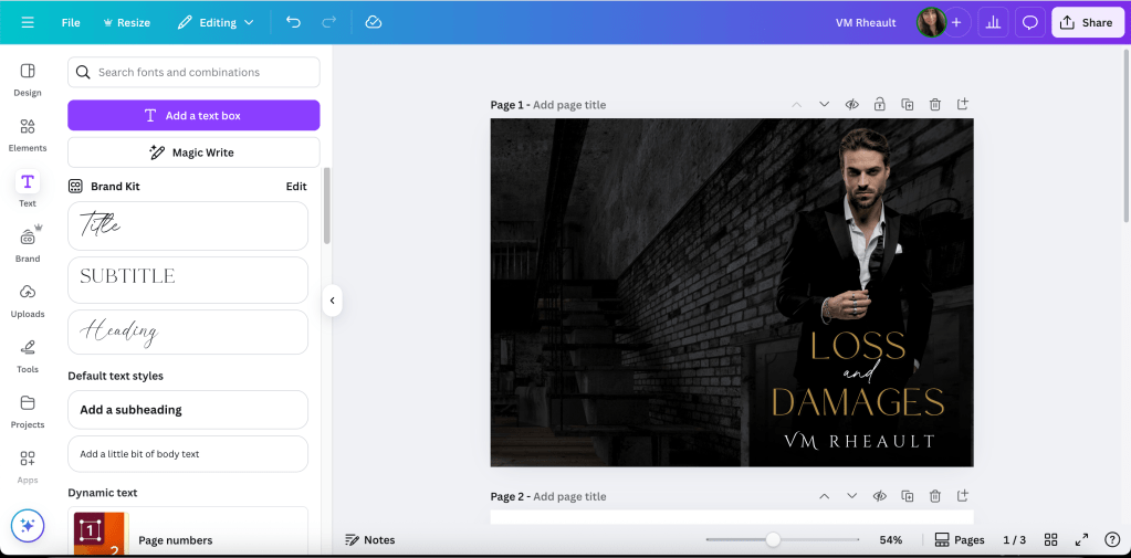
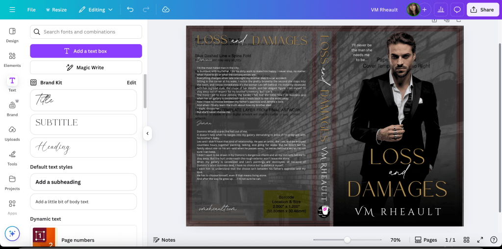
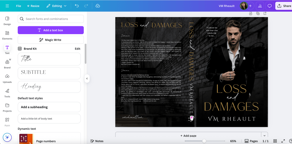
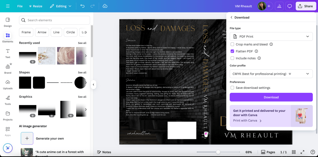
In my other blog post, I took you through the steps on how to use the template, and I can do that here. I’ll use the cover for my September 2025 release, Loss and Damages.
The stock photo I used is very zoomed in and cropped. I added the original stock photo so you can see that you can manipulate a stock photo to twist it to suit your needs.
Original:
This image is zoomed in so I only get the brick wall.
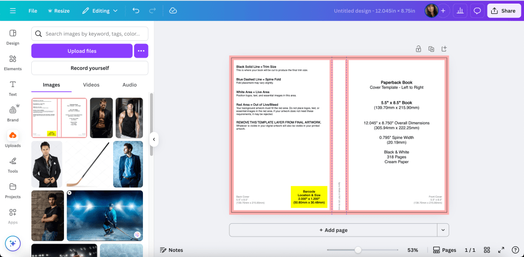
Using the transparency, you can see the bleed lines I’ll need to stay away from when adding text. It’s why I build on top of the template, but you can always guess, and then using transparency, put the template on top of your finished cover and see if you stayed away. That’s a lot of adjusting if you’re not used to making covers, especially text sizing on the spine, but you’ll do what works for you.
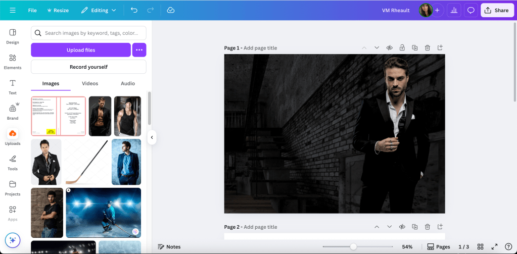
Next I darken the image and add the guy. I pay for Pro, so I’m not sure what features are available in the free plan but I think the background remover is worth the price alone. DepositPhotos, where I buy all my stock, also has added a background remover, and if you have a “busy” photo, sometimes it makes a difference if you use both.
I removed his background and played with the brightness and contrast until I like how he looks against the new background. I also used Magic Edit to change the little part of his white shirt to black because it interfered with the placement of the title. Whatever your views of AI are, assisted or generative, it will be up to you if you want to use those tools or not. If you don’t want to use Magic Edit, you can use GIMP and the Clone tool to cover up anything you don’t want showing. Canva is limited, even using their tools, and I still use GIMP on some book covers as well. Especially on people’s heads because the background remover doesn’t always remove the background mixed in with pieces of hair.
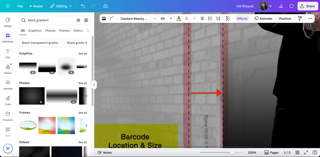
I like how he looks now, but I need something that would make the title font and my author name pop and cover up the sliver of brick wall between his legs. So I found a black gradient element and put it at the bottom. (You’ll need to rotate this one so the solid part is at the bottom of the cover.)
Now I have space for the title and my author name. Canva Pro offers a lot of font options, too, and while I try to buy my own just for my own peace of mind, sometimes I do use theirs, but I always give attribution on my copyright page at the front of my books.
This is why I build on top of the template. So I can see where to place the text so it’s a safe distance from the bleed marks.
The font I’m using is Brown Carolina Sans for LOSS and DAMAGES and Candara Beauty Script Regular for the AND in the middle. When I rebranded for this pen name I decided on Cinzel Decorative for my author name. (Editing tip: If the font isn’t looking the way you want, check the kerning under the advanced formatting tab when the text is selected.)
I would also use the transparency option on the gradient so you can see where your name is in relation to the bleed line. You can see I adjusted his size and the black gradient covers up where his legs are cut off.
When you add a gradient or you’re not using the same stock photo for the back and front, you want to be aware of the line between the spine and front cover. If you don’t line up your elements exactly right, they can bleed over or leave a gap between the spine and front cover.
How it looks so far:
When you’re doing the spine text, you can zoom in to see the bleed lines clearly.
Print on Demand is iffy at best, and I’m cutting it close with AND. I’ll make that a bit smaller to give the printers some wiggle room. There’s always someone online complaining their spine text isn’t centered, but I’ve given up worrying about it. It’s nothing you can control. Just give the printer enough space to mess up so your text doesn’t bleed onto the back or front cover.
Add your name and imprint to the spine if you want and then do the blurb or whatever else you’re going to put on the back cover. I’ve only added my author photo with my bio one time. You can skip putting the barcode white box on the back. KDP will add it for you if you leave that space blank.
Keeping the transparency low on the background lets you see that the text for the blurb isn’t too close to the edges.
You’ll want to tweak it, but when you change the transparency to zero you can see how it will look when all the pieces are in place.
In the bottom left of the back cover, I call that the crap corner. I’ve always had a hard time figuring out what to put there because there’s not a lot of room for anything, and with the barcode in place, the corner just looks empty. I’ve started putting my author website there for lack of anything better and I think it works okay. Like I said, I leave the barcode box blank. Both KDP and IngramSpark will add it if you don’t buy or make your own barcode. Dave Chesson of Kindlepreneur has a free barcode creator if you want to create your own barcode. You can find it here. Barcode Creator. (Okay, I lied. I added it so you can see what it looks like. Search elements for square. You can adjust the size and color. Use transparency to fit it over the yellow box on the template.)
One of the updates that surprised me was when Canva added the choice (for Pro Plan) to download in RBG or CMYK. IngramSpark prefers the CMYK and KDP, I don’t think, cares. I’ve always uploaded an RBG because that’s all Canva has offered in the past. Flatten your PDF.
This takes some of the worry off using IngramSpark because I hated seeing their error messages even though I knew what I was doing was okay. My covers always came out fine (POD mistakes aside) so I never worried about it either way, but it’s nice to have the choice.
You can use this cover for IngramSpark, too, but make the text on the spine smaller. Their spines are narrower because of the kind of paper they use. IngramSpark also has a cover template generator, and if you want to make sure you’re in the bleed lines, you can download it and lay it on top your cover. Using your transparency, you can adjust the font and then delete it when you’re done. (I linked to the Lightning Source template generator because the one from IngramSpark was taking too long to be emailed. They are the same template though. It just seems that Lightning Source’s website is more dependable.)
As you can see, I would want to adjust the title on the spine because it’s narrower than KDP’s template. Adjust the text on the entire cover so it’s still centered (there isn’t much difference but you’d probably notice when you print them), and you’re done with covers for both templates and platforms. Labeling them helps me not to mix them up.
**If you are going to print and/or distribute through Draft2Digital, they use IngramSpark’s POD machines so use the IS version of your cover. Also, leave off the barcode square. I did a few covers for a friend who uses them and they do not want the white box. They’ll kick the cover back to you.
Here’s what the finished product looks like. The cover looks a hazy, but that’s because I took a picture in a sunlit room and my phone’s camera was dirty. I don’t think the colors need adjusting in real life, but I can move the black gradient to the left though, closer to the spine. Other than that, I think it looks pretty good.
I think I covered everything there is to know with the updates. If you have a cover from a designer and you need to resize it, entering the numbers and generating your own template into Canva is easy. (Get their permission first.) Another update Canva Pro added is you’re able to upload PDFs, not just PNGs, JPGs, and JPEGs. Sometimes I do that to make the ebook cover. I blogged about how to do that, and you can read it here. https://vaniamargene.com/2024/09/09/how-to-turn-your-books-cover-full-wrap-pdf-into-an-ebook-cover/
Atticus is a new interior formatting software created by Dave Chesson and his team at Kindlepreneur. Atticus is available for all computers, not only for Mac like Vellum is. You can find Atticus here. If you have a Mac and want to play with Vellum, you can try it for free. They’ll charge you only if you want to generate files. Find Vellum here. If you don’t have the cash for either, but still want to do it yourself, KDP also supplies interior templates with bleeds and gutters and front matter in place. Download the template with sample content. Delete theirs and copy and past your own into the template. You can find info about the interior templates here. (That is actually how I formatted my books before I bought Vellum.)
Developing your eye takes time and practice. Looking at Canva templates and the top 100 in your genre on Amazon can teach you a lot. You can look up Canva Templates here. I also look at premade covers for inspiration.
I wanted to put this at the top of the blog post, because if you don’t read anything else, at least read this. There’s apparently a wave of scammers out there who are claiming books through ACX, hiring narrators for books that aren’t theirs, and trying to make some royalties off the audiobook. Even if you don’t plan to make an audiobook (I’m not–I can’t afford anything like that right now) I’ve read in various author FB groups that you should go on ACX and claim your books so no one else can. I did last night–it took me about twenty minutes. Here is how you do it:
Go to acx.com and create an account. It’s just your KDP/Amazon credentials.
After you create an account, select ADD YOUR TITLE in the upper right hand corner.
Then you can search for your books under your author name or by book title. ACX was glitching for me last night and when I tried to select a title under my author name, it wouldn’t let me, but it would let me select the title if I searched by title and author name.
Click this is my book. On the next page, even if you have absolutely no plans to make an audiobook of this novel, click I’m looking for someone to narrate or produce my audiobook. Don’t worry about this part of it–it’s not locking you into anything.
On the next page, scroll down to the bottom and click the User Agreement box and click Agree and Continue.
After that, your book is claimed and there is no other steps you need to take. If you have other books, click Add Your Title at the upper right corner of the screen and start the process over again. If you have successfully claimed a book, the option to claim it will be gone, otherwise you didn’t claim it correctly and you’ll have to do it again.
And that’s it. With box sets and single books, it took me a little bit, plus the website was glitching on me and it took a while to claim them all. I don’t have any plans to make audiobooks, and claiming them isn’t a sure-fire way to keep scammers from trying to make a few bucks off your books, but at least it’s a start. I found this out last night scrolling through my FB author groups. Indie publishing is rife with scammers, and it’s better to protect yourself–another reason to make sure you have copyright proof of your books available! I love Amazon and think they have given us some wonderful opportunities, but they are not perfect, nor is any business, and you can’t count on others to protect your work. Thanks to Julie C. Gilbert and her instructions on her website that walked me through the process.
With that out of the way….
Hello! It’s been a while since I’ve had a catch-up post because all I’ve been doing is writing, writing, writing, but I have slowly been working toward getting my pen name set up. I created a website that isn’t live yet because I’m waiting to get a couple of my books and blurbs ready to post, and I had my sister take a few author photos of me at the local park not long ago. I know some people don’t want to reveal who they really are, but in these days of ghostwriting, AI, and scammers trying to make a buck off Amazon, one way you can stick out is be your real self on social media. People connect with people. It’s another reason I picked my initials with my real last name instead of a completely different name to write under. I will always be me on social media: all my grumpiness, attitude, helpfulness and cheerfulness. I could never be someone else and I would never try. That said, I’m happy we were able to take a few that I like, and even though the sun was setting and it made me look orange, they came out well. I think black and white makes me look classy (and gets rid of the orange!). Here are a few. I like the black and white for the headshot, and for the back matter I’m going to use the full body shot with the flowers in the background.
Some photos in the nearby park, and one in the hallway of my apartment complex.
With that out of the way, I was able to order my proof for Faking Forever, but I’m going to wait a few days before proofing it. I’m trying to streamline my publishing process so I don’t have to go back and redo anything. I’m going to make a patient effort to do everything at one time. The cover for KDP, ebook and full wrap/the paperback cover for IngramSpark/the Large Print edition for KDP. If I want to go one step further, I could offer the Large Print edition on IngramSpark, too, it would just take an extra few minutes to create the cover for it. It is time consuming to be the one to do all of it yourself, and I wish there was a better free way. For now I’m a one-person show and if I want it done, I’ll just have to make the time. Here’s a picture of the proof. I think it turned out really nice, and I can’t wait to figure out my publishing schedule and put it up!
There are some tweaks I’m going to have to make, but otherwise I think it turned out great! If you want to know the process I went through to create it, let me know, and I’ll blog about it. I don’t want you all to get sick of my cover posts!
I’m relieved to finally be making some progress in regards to publishing, though I haven’t made much headway with my newsletter (meaning, no signups!). Without a reader magnet, I don’t have anywhere to put the link up that will draw in readers. I’m part of writer Twitter and I haven’t tweeted out my newsletter link there, the same as Instagram. That’s the biggest problem I see indies have–they align themselves with other writers, and then they wonder why they don’t sell books. You may sell a handful here and there to your writer friends, but it isn’t going to be enough to make a career. I don’t promo on Twitter and it’s going to be the same for my newsletter. So, I’m going to have to offer a reader magnet, and it could be the ugly duckling trope I’d written expressly for that purpose after all, or this new one I’m writing that I should be done with toward the middle of next month. It makes more sense for the ugly duckling book to be my reader magnet because it’s finished and pretty much ready to go and I could start building my list for my releases that much sooner, or I could just depend on organic signups and put my link the back matter of my books and not give away a reader magnet at all. It’s tempting to do that, but building my list will take more time.
The problem is i haven’t published for so long and I’m writing books that I’m not sure are any good, (and no one really does until strangers read and review, so I know that’s not my insecurities.) that it’s frozen me in place. I don’t want to building my list and I don’t want to release my books. Except, you have to take a chance if you want a career. I mean, I know exactly why people only promo on Twitter. They don’t want to run ads or buy promos. Twitter is safe. Selling to your friends is safe. It’s scary to put your work out there and present it to strangers to buy and review. It’s easy to hide behind the obscurity of Twitter and say, “This is the best I can do” when you know deep down you could be doing more. I’m at that place now, where it would be easy for me to launch my books with no plan but a pinned tweet and say, “this is the best I can do”, but I don’t want to cheat myself out of the chance to make something with my writing. So. I need a reader magnet, and I need to stop hiding behind the guise I’m writing. There’s no point in writing to keep it all on my computer.
In other (personal) news, my midwife said my infection is gone! I had an appointment at the beginning of the month hoping to discuss other treatments and she said the tests indicate it’s gone. I’m not sure what that means for me as I still don’t feel 100% right, though I admit I feel better than I have since I found out I had my infection way back in March. I’ll keep taking my probiotics and vitamin C and giving my body time to take care of itself. It will be really nice not to have to think about it anymore, and a negative test result is a good start.
I suppose that’s it for now. Monday I’m going to talk a little about Facebook Ads. I’ve got some resources to share with you, so I hope you check back.
I’ve come across this question a lot these days, mostly I think because a lot of authors use Canva for their ebook covers and graphics for promos. Some bloggers have compared Canva to Book Brush, and while Book Brush can do many things Canva can’t, I feel that Canva is more versatile and I prefer to use it over Book Brush. Especially since Book Brush is more expensive and if you already pay for Canva Pro, you’re not looking to plop down another $146 (for their popular package) a year on another program.
I’ve never made a full wrap in Book Brush, though it is a feature they have available in their paid plans. I made my first paperback wrap in Canva not even knowing if it was possible. It was the old cover for Wherever He Goes and it was a complete experiment applying what I knew from making covers in Word before I knew Canva existed. I ordered a proof not knowing what to expect, but the cover came out beautifully, and since then I’ve done all my wraps in Canva and for a couple other authors too.
These days if there is trouble with a cover, it’s probably a KDP Print glitch. Their POD printers are overworked and underpaid just like all of us these days and I’ve heard reports of covers not printing well, interiors that are crooked, pages falling out of the binding, and even text of other books inside yours. That is a KDP Print problem, not a Canva problem. The only issue I’ve ever encountered doing a paperback wrap in Canva is that IngramSpark requires a CMYK color file while Canva saves in RGB as does GIMP. IngramSpark will still accept your file, but they warn you the coloring in the cover might be off. If this is truly a concern of yours, don’t use Canva for a full wrap. Learn PhotoShop or hire out. I publish with IngramSpark and in a blog post from a couple years ago, I compared the books from IngramSpark and KDP Print. While everyone insists IngramSpark prints with better quality, I did not find that to bethe case, and Canva had nothing to do with it.
That being said, there are a couple things you need to know before you do a full wrap in Canva.
Your stock photo must be in 300 dpi. I buy my photos from Deposit Photos, and lately when I download a photo, the image size is huge but the dpi is only 72. You have to fix this or your cover will come out pixelated and you won’t know why. You can download GIMP for free and use the SCALE IMAGE (under Image in the menu) to fix this, or if you already have Photoshop, adjust the dpi and save. That is the photo version you want to upload into Canva.
This is the screenshot from a photo I used to make a mock cover the other day. You can see that the dpi is only 72. And if you take a look at the width and height, sometimes that is too huge for Canva to accept and they’ll ask you to fix the size. The width and the height doesn’t matter so much, and you can change the width to a lower number. This is a horizontal photo and I chose 3000 for the width. Press Enter and it will automatically resize the height. With the DPI set to 300, export it as a jpg or png, it doesn’t matter, Canva accepts both. (If I’ve lost you on this step, you’ll have to do your own digging. I rarely use GIMP and this post is by no means a tutorial on how to use it, because yeah, I don’t know how to do very much.)
You have to have your interior already formatted for paperback. That includes the front and back matter, the font you chose, gutters and margins and all the rest. Unless you want to play, it’s helpful if this is the final version of your paperback interior. It’s already been through betas and your editor. It should be ready to publish. If it’s not, you can experiment with your cover for practice, but you need the final number of pages for your spine’s width. KDP Print gives you ten pages of wiggle room. That’s not much and more often than not, they’ll make you resize your cover using an updated template.
Choose the trim size you want and page color you want. I see this question all the time in the FB groups, and most say it doesn’t matter. It doesn’t matter. Though if you’re concerned with printing costs, the more pages you have–250+–the larger the trim size you want (6×9 is best) because more pages means higher printing cost. My novels run anywhere between 70k to 90k and the only thing that I use as a yardstick is this: My series books are 5×8. My standalones are 5.5×8.5. I don’t know why I do this, but it’s a system I’ve fallen into. If you write epic fantasy and your books are 400 pages, choose the 6×9.
This is one of Lindsay Buroker’s epic fantasies. Amazon makes it easy for you to check out what other authors in your genre are doing. You can see that this book is 528 printed pages and she chose a 6×9 trim size. Her spine is 1.32 inches. It’s a thick book. When you publish and set your prices, KDP Print will offer you a royalty calculator and you can price your book based on the royalties you’ll make when you sell a paperback. Price too high and you won’t get many takers. Price too low and you won’t make anything on the sale. Try to find a happy medium and fit in with what other authors in your genre are doing.
As for the color, I always choose cream for fiction. Seems the standard is cream for fiction, white for nonfiction. There may be exceptions, but that’s what I go with.
When you have the number of pages from the formatted file, know your trim size and page color, you can Google KDP paperback templates.
This is only for paperback. As of this writing, they are rolling out a hardcover option. It’s in beta right now, but offering a hardcover is what you’ll need to decide based on your business goals. I write romance and I focus my marketing on readers in Kindle Unlimited. A hardcover edition of my book doesn’t interest me, and if I ever wasted the time to create one, it would be for vanity purposes only.
Download the template. It will come in a ZIP file. Open it up and save the PNG as a name you’ll be able to find later. You can’t upload a PDF into Canva, only download, so the PNG is the one you’ll want.
Now it’s time to do some math.
When you want to do a full wrap in Canva, you need to know the canvas size. This is where I think a lot of people get tripped up. How do you figure out the size of the canvas so your template will fit? Your canvas size has to be the size of your book’s trim, plus spine width, plus the bleed. These numbers will change based on the trim size you choose for your books and the spine size. You won’t be able to use the same canvas size over and over unless you choose the same trim size AND your book is the same number of pages every time. That’s going to be highly unlikely, so it’s best just to realize you’re going to need to learn how to do the math.
We’ll start with the template:
The template will tell you how wide your spine is. You need this for the math. There is another way to figure out spine if you don’t download the template first, but this is the easiest way so no use giving you more math.
Then this is how you figure out the size of the canvas:
For the width of the canvas: The width of the back cover plus bleed, plus spine, plus the width of the front cover plus bleed.
If we use the template above as an example, the template is 5.5 x 8.5. This is what we add together:
That is the inch width you put into the custom dimensions box in Canva. The default is pixels, you’ll need to change it to inches.
If you need to see it in a different way, I made this for a friend:
The height of the book is 8.5 + the bleed .25 = 8.75. This is the number you put into the height box in the custom dimensions.
Hit enter or click on Create New Design and you have the canvas for a 5.5x 8.5 sized book with a .65 spine. It might not look like much, but now you can upload the PNG of your template and put that into the canvas.
It will take a little moving around, but keep as much orange as possible because that’s your bleed line. Anything on the orange or beyond has a chance of getting cut off in printing. The spine guidelines keep your text from bring printed on the front or back covers. Make sure the template covers the entire canvas.
You might have noticed I didn’t tell you your template needs to be at 300 dpi, and it doesn’t. You’ll be building your cover on top of this template and you won’t see it at all when your book is printed.
When I say that you’ll be building your cover on top of this, I mean you’ll be putting the stock photo and all the text on top of the template. What you use for your front cover and the back cover is going to be up to you. Some authors use a horizontal photo like the woman on the dock above and use it to create a full wrap from the one photo, like this:
Woman in white dress sitting alone on the pier. Back view (purchased from Deposit Photos)
You can see I flipped her and used a filter, but I used the whole photo for a full cover wrap. I built it on top of the template using the transparency feature and it looks like this:
Using the bleed lines, you can put the font where it needs to go. It’s not perfect–the author name isn’t centered and can come down more. When you’re done with the bleed lines, change the transparency of the photo back to 0 and this is what you’ll download. Download the file in print-ready PDF for your KDP dashboard when you upload your files for publishing.
Lots of people say they don’t know what to put on the back of their covers. The sky is the limit, really, from just the blurb to reviews of the book to your author photo. I’ve only done my author photo once, and that was for the back of All of Nothing:
The only thing I would caution you on is you don’t need to make the blurb font huge. It was one of my mistakes first starting out. And if you don’t want to put a white box for the bar code, you don’t have to. KDP Print will add it when they print your cover. Google for more full wrap ideas.
For the woman on the dock, I blew up the part of the water giving the back cover a grainy texture that matched the photo but some authors like the full photo wrap. It keeps them from. having to worry about getting the bleed lines on the spine perfect for printing. POD printing isn’t an exact science anyway, so chances are even if your PDF is perfect, the spine will be a little off. No matter how centered my title and author name are, almost 100% of the time they won’t be centered on the spine when you order a copy. Now that I’ve done it both ways, I think I prefer the full photo wrap.
I added a white gradient (that you can find in Canva) to the bottom to white out the dock a little bit making Penny’s name more readable. When it comes to cover design you know your own abilities. I’ve often said I’m lucky I write romance and can find a cute couple and slap some text over them and call it good. It’s not that simple, obviously, but if I wrote in epic fantasy, or even thriller, I would have to hire out. I’m not interested in learning beyond what I know. I’m a writer, not a graphic designer.
Developing an eye for book covers takes time and a lot of practice. Sometimes what you think looks good on the screen won’t translate well to a printed cover at all and you’ll be back to the drawing board. If you’re tackling book covers for the first time, you may be investing in some proof copies just to see how your work looks printed. If your business model makes paperbacks important, then you’ll put a lot of time into learning how to make your paperbacks look amazing. Like I said before, my business model centers around KU readers and it’s more important to make sure my cover grabs attention at thumbnail size and indicates to readers the second they look at it what genre it is.
It might seem like I skimmed over the most important part: the math. We can do another book with a different trim size just for practice.
This is the template the first book in my Rocky Point Wedding series. The trim is 5×8 and the spine is .70 inches. If we do the math for the Canva canvas it would look like this:
5.0 (back cover) + .125 (bleed) + .70 (spine) + 5.0 (front cover) + .125 (bleed) = 10.95. That is the width you would need to put into the custom box.
The height would be 8.0 (cover) + .25 (bleed) = 8.25. That is the height you would put into the custom dimensions box.
This is the cover I did for the first book in the series:
I did most of it in Canva, though I added some transparent gradient in GIMP for blending the two photos. Everything I know I taught myself, and it’s not fair i’m trying to shove four years of practicing and learning into one blog post. You’ll have to do your own experimenting.
Some odds and ends I picked up on the way:
Don’t buy a bar code. You don’t need one. KDP Print and IngramSpark will generate one for you. I buy my own ISBNs though, and that will be a choice you need to make if you’re in the States and expected to pay god-awful prices.
Don’t use free photos from Unsplash, Pixabay, Pexels, et al. Cover your butt and secure your business and use photos that you pay for from trusted sites like Shutterstock or Deposit Photos. Same with fonts. Not everything is available for commercial use. Be careful.
Use caution when choosing the models on your covers if you write romance. Amazon has gotten very picky lately, and the cover for His Frozen Heart disqualifies me from being able to run ads on Amazon Advertising to that series. Needless to say, that sucks.
You can use the same canvas size for an IngramSpark template. The one difference between an IS template and a KDP Print template is the spine for IS is narrower. The only adjustment you’ll be making is your font size for your title and author name on the spine will be smaller.
Elements (font, symbols ) can shift when you download your PDF and they will look “off” when you upload to KDP. I haven’t found a solution for this except to overcorrect, save, and re-download so the elements are in the place they are supposed to be. When you download the PDF, check the file before uploading to KDP. You’ll see if anything has shifted and you can correct it. The KDP Print previewer will show you exactly how your book cover and interior will print. If you don’t like ANYTHING in the previewer, fix it because printing won’t change it.
There are videos on how to create a full cover wrap in Canva–and you might find them helpful–but the few I’ve watched leave out important steps like making sure your photo is 300 dpi. This is going to take some trial and error. I remember being soooo nervous waiting to see if the cover for Wherever He Goes was going to look good.
I think that’s all I have. I know it seems like a lot of information, but blogs and videos won’t take the place of practice. If you have any questions, leave me a comment. I’ll answer to the best of my ability. If you’re making covers with my tips, tweet me at @V_Rheault on Twitter. I want to see what you’re doing.