
This blog post was updated on June 4th, 2025 to reflect Canva’s recent glow-up and I used a new cover as I didn’t end up using the cover I demonstrated with in the previous post.
Quick note: I use Canva Pro, and some of the features I talk about are not available in their free plan. Before Canva added those features, I taught myself a few things in GIMP, a free version of Photoshop. (Find it here: https://www.gimp.org/downloads/) It will be up to you to learn the things you don’t know. And as always, there are no affiliate links in this post.
Because of the changes KDP made to their template generator and the updates Canva added to their software, the blog post I wrote a few years ago now on how to use Canva to create a full wrap paperback cover is basically obsolete. The good news is KDP took away the need to do any math, and I think that will make a lot of people happy. Oh, and the CMYK vs. RGB issue if you want to publish on IngramSpark is gone as well, since Canva (on the Pro Plan) added the option to download your PDF in either.
While there are some things that still pertain to doing your cover in Canva such as making sure your stock photos are 300 dpi so your cover isn’t pixelated, there is a lot that has changed, too, so let’s dive in.
Before you start, you’ll want to make sure you have a formatted manuscript. This includes all your front matter and back matter, your dedication page, acknowledgments, about the author, etc. If you do it yourself with Word, Vellum or Atticus, InDesign or other, you can make changes whenever you want (and you probably will). KDP gives you a 10 page grace, so don’t go crazy. If you hire out, you’ll need the total number of pages of the formatted manuscript that you’ll upload into KDP or IngramSpark and the trim size you’ve chosen for your book.
Once you have that, you can download the cover template that will show you the bleed areas to stay away from when creating your cover. Go to https://kdp.amazon.com/cover-calculator and enter in all the information they want.
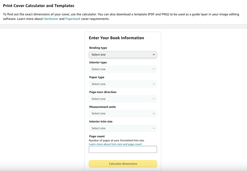
1. Paperback or hardback That’s your choice, and the the instructions on how to do the cover are the same. I’ve made hardcover editions and after a while took them down. They didn’t sell and it didn’t seem worth it to keep them on my product page. Going forward, I won’t offer hardcovers–to me, they aren’t worth the time or expense of the ISBN number.
2. Because you’re not creating a coffee table book or a cook book that requires colored pages (those projects are beyond the scope of this blog post) choose a black and white interior.
3. Cream pages for fiction, white for non-fiction is usually the norm. Your page color is attached to your ISBN number, so you can’t change your mind after you publish.
4. Page turn direction is left to right.
5. I choose inches.
6. Choose your trim size. Trim size is also attached to your ISBN so you can’t change the size of your book unless you republish. If you have a very long book, you may want to go with 6×9 due to printing costs in KDP, especially since not long ago they said they needed to increase their prices. Look at what other authors in your genre are doing. Amazon makes it easy to find the product information of any paperback book. I used to go with 5×8, but under my new pen name I’m going with 5.5×8.5 for all my books. You’ll need to tell your interior formatter which size you’re going with as well.
7. Enter the page count. This determines the thickness of your spine. (Press Enter if the yellow button doesn’t light up.)
8. Click Calculate Dimensions.

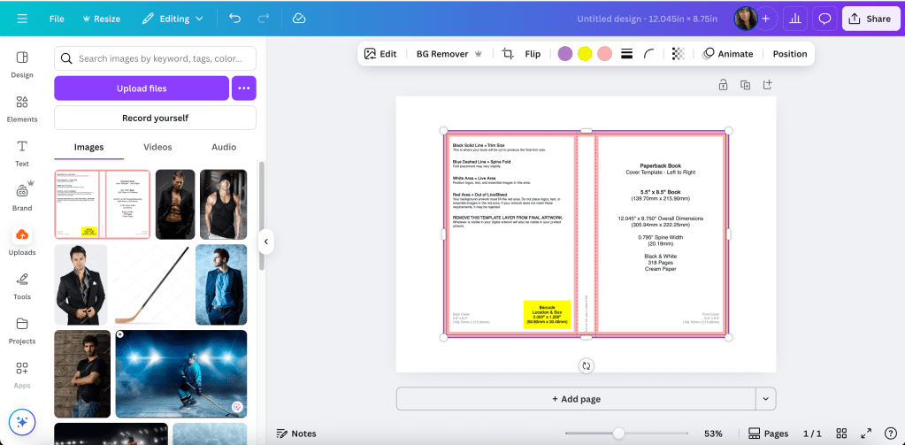
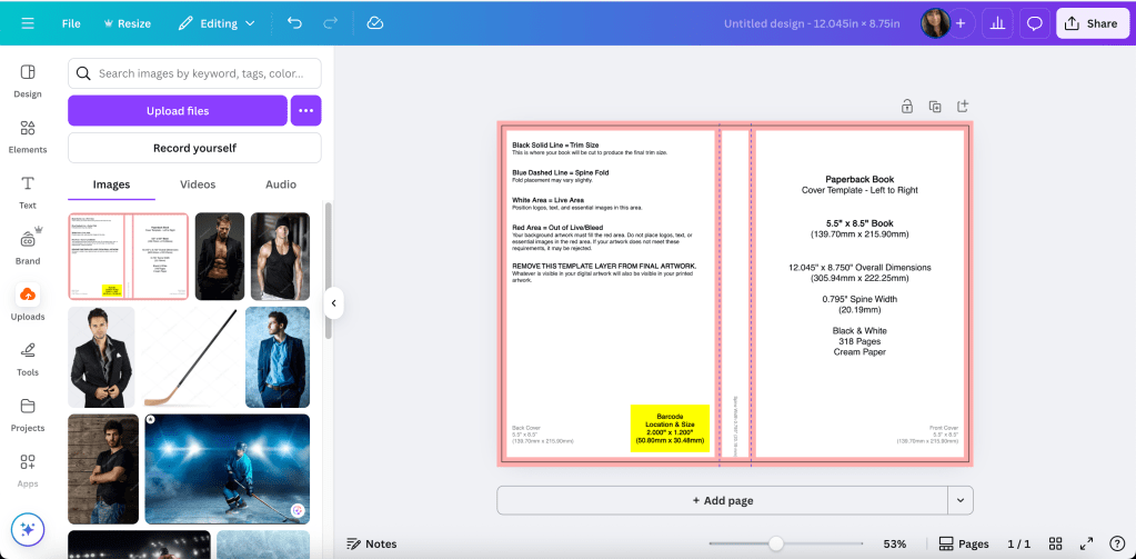
With the new way KDP offers you the template, all you need for the canvas size in Canva are the numbers for the full cover. The width is 12.045 and the height is 8.75. Before, you used to have to do the math (adding the front and back covers and spine and bleed) to figure out this number, but not anymore.
Click download template on the lower left. It will come in a ZIP file. Open the file and save the PNG under a name you’ll remember so you can find it to upload it into Canva.

The template will have all the information you entered into the template creator and will remind you of the canvas size: 12.045 (width) x 8.75 (height).
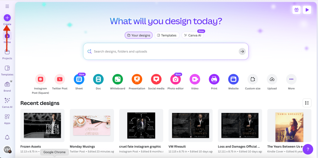
In Canva, on the home page, you’ll want click Create and choose Custom Size:

There, you’ll enter in the numbers that the KDP template gave you:
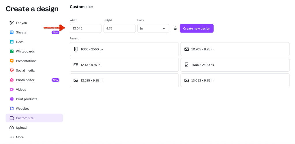
Click Create New Design.
When you do that, you will have the exact sized canvas you need to fit the template you downloaded.
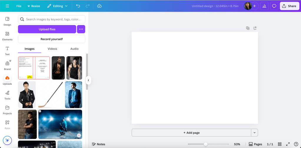
Upload the PNG of the template and add it to the canvas.
Adjust it like you would any picture or element you use in Canva.
And really, it’s that easy. No more math. No more guessing the canvas size. This is the template for a standalone I’m releasing later this year. I’m using a 5.5×8.5 trim size, the pages of the book are 318 and I print on cream paper.
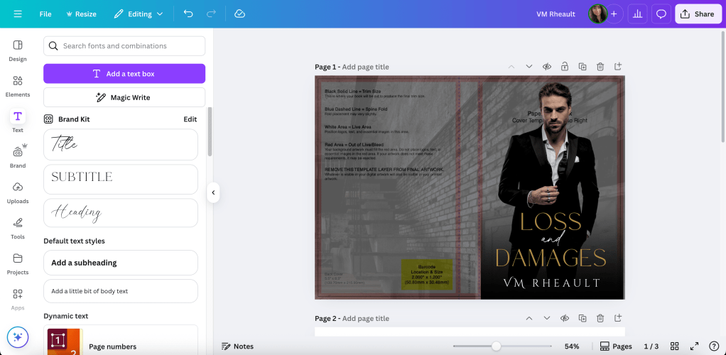
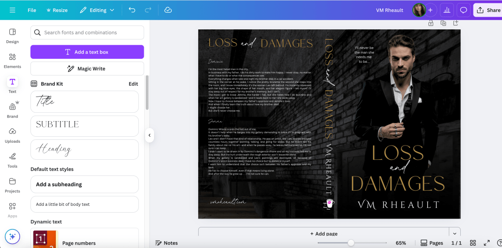
In my other blog post, I took you through the steps on how to use the template, and I can do that here. I’ll use the cover for my September 2025 release, Loss and Damages.
The stock photo I used is very zoomed in and cropped. I added the original stock photo so you can see that you can manipulate a stock photo to twist it to suit your needs.
Original:
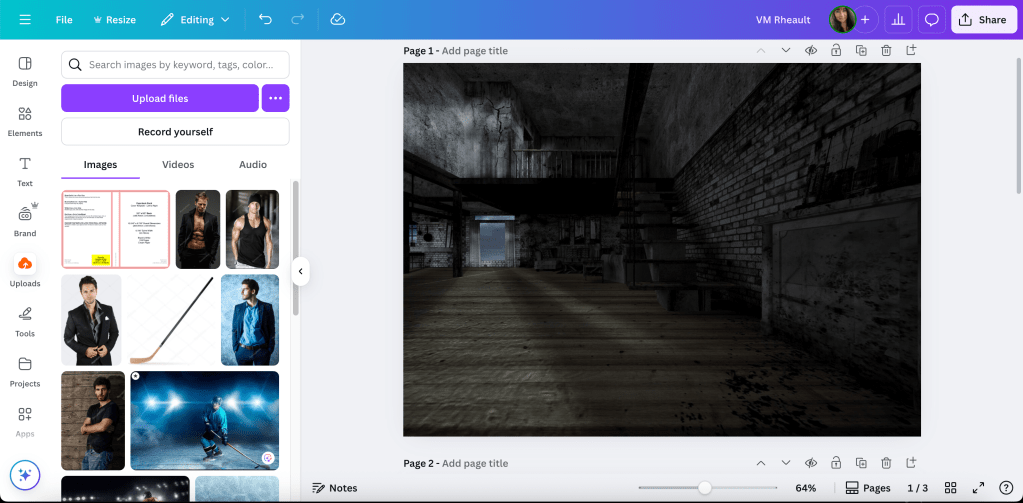
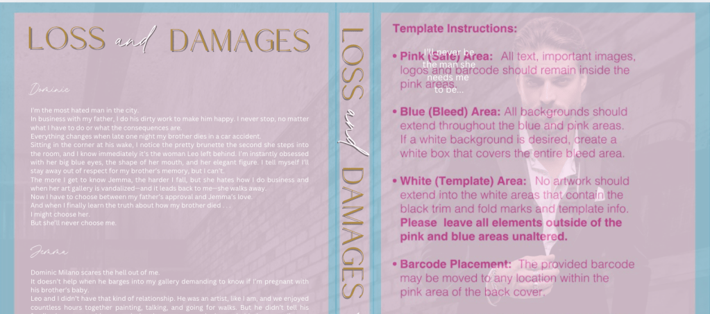
This image is zoomed in so I only get the brick wall.

Using the transparency, you can see the bleed lines I’ll need to stay away from when adding text. It’s why I build on top of the template, but you can always guess, and then using transparency, put the template on top of your finished cover and see if you stayed away. That’s a lot of adjusting if you’re not used to making covers, especially text sizing on the spine, but you’ll do what works for you.

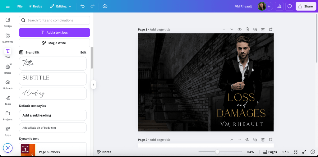
Next I darken the image and add the guy. I pay for Pro, so I’m not sure what features are available in the free plan but I think the background remover is worth the price alone. DepositPhotos, where I buy all my stock, also has added a background remover, and if you have a “busy” photo, sometimes it makes a difference if you use both.

I removed his background and played with the brightness and contrast until I like how he looks against the new background. I also used Magic Edit to change the little part of his white shirt to black because it interfered with the placement of the title. Whatever your views of AI are, assisted or generative, it will be up to you if you want to use those tools or not. If you don’t want to use Magic Edit, you can use GIMP and the Clone tool to cover up anything you don’t want showing. Canva is limited, even using their tools, and I still use GIMP on some book covers as well. Especially on people’s heads because the background remover doesn’t always remove the background mixed in with pieces of hair.
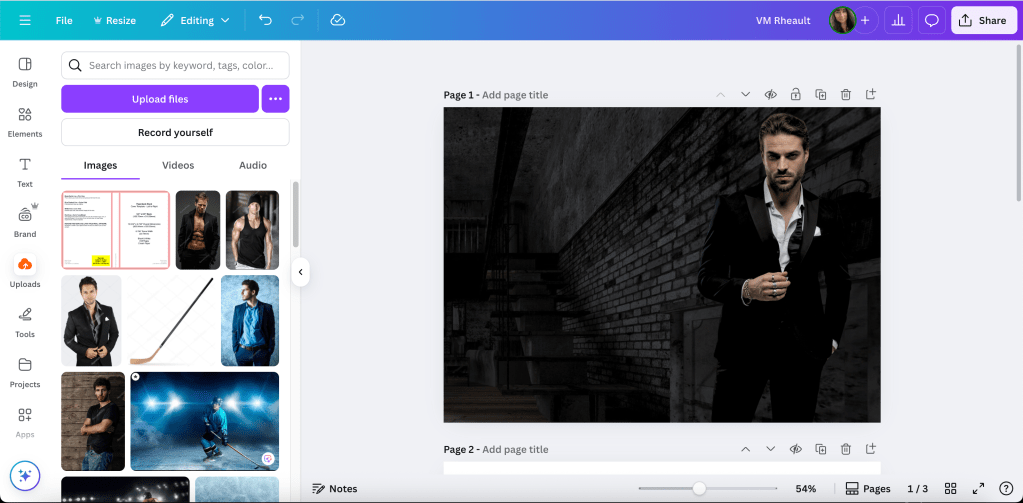
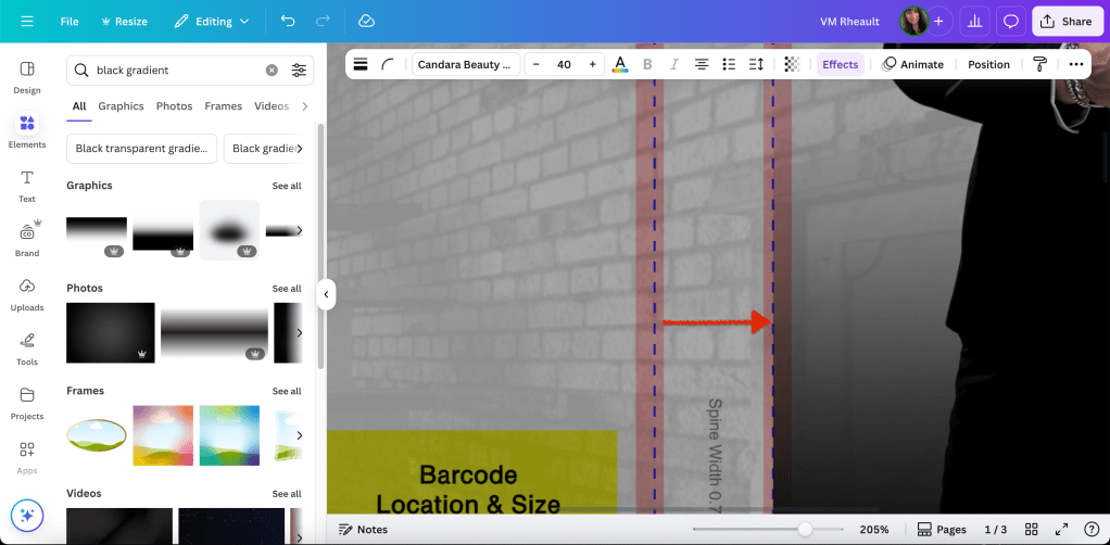
I like how he looks now, but I need something that would make the title font and my author name pop and cover up the sliver of brick wall between his legs. So I found a black gradient element and put it at the bottom. (You’ll need to rotate this one so the solid part is at the bottom of the cover.)

Now I have space for the title and my author name. Canva Pro offers a lot of font options, too, and while I try to buy my own just for my own peace of mind, sometimes I do use theirs, but I always give attribution on my copyright page at the front of my books.
This is why I build on top of the template. So I can see where to place the text so it’s a safe distance from the bleed marks.
The font I’m using is Brown Carolina Sans for LOSS and DAMAGES and Candara Beauty Script Regular for the AND in the middle. When I rebranded for this pen name I decided on Cinzel Decorative for my author name. (Editing tip: If the font isn’t looking the way you want, check the kerning under the advanced formatting tab when the text is selected.)
I would also use the transparency option on the gradient so you can see where your name is in relation to the bleed line. You can see I adjusted his size and the black gradient covers up where his legs are cut off.

When you add a gradient or you’re not using the same stock photo for the back and front, you want to be aware of the line between the spine and front cover. If you don’t line up your elements exactly right, they can bleed over or leave a gap between the spine and front cover.
How it looks so far:
When you’re doing the spine text, you can zoom in to see the bleed lines clearly.

Print on Demand is iffy at best, and I’m cutting it close with AND. I’ll make that a bit smaller to give the printers some wiggle room. There’s always someone online complaining their spine text isn’t centered, but I’ve given up worrying about it. It’s nothing you can control. Just give the printer enough space to mess up so your text doesn’t bleed onto the back or front cover.
Add your name and imprint to the spine if you want and then do the blurb or whatever else you’re going to put on the back cover. I’ve only added my author photo with my bio one time. You can skip putting the barcode white box on the back. KDP will add it for you if you leave that space blank.
Keeping the transparency low on the background lets you see that the text for the blurb isn’t too close to the edges.
You’ll want to tweak it, but when you change the transparency to zero you can see how it will look when all the pieces are in place.
In the bottom left of the back cover, I call that the crap corner. I’ve always had a hard time figuring out what to put there because there’s not a lot of room for anything, and with the barcode in place, the corner just looks empty. I’ve started putting my author website there for lack of anything better and I think it works okay. Like I said, I leave the barcode box blank. Both KDP and IngramSpark will add it if you don’t buy or make your own barcode. Dave Chesson of Kindlepreneur has a free barcode creator if you want to create your own barcode. You can find it here. Barcode Creator. (Okay, I lied. I added it so you can see what it looks like. Search elements for square. You can adjust the size and color. Use transparency to fit it over the yellow box on the template.)
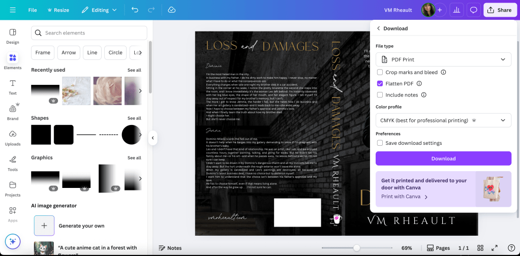
One of the updates that surprised me was when Canva added the choice (for Pro Plan) to download in RBG or CMYK. IngramSpark prefers the CMYK and KDP, I don’t think, cares. I’ve always uploaded an RBG because that’s all Canva has offered in the past. Flatten your PDF.
This takes some of the worry off using IngramSpark because I hated seeing their error messages even though I knew what I was doing was okay. My covers always came out fine (POD mistakes aside) so I never worried about it either way, but it’s nice to have the choice.
You can use this cover for IngramSpark, too, but make the text on the spine smaller. Their spines are narrower because of the kind of paper they use. IngramSpark also has a cover template generator, and if you want to make sure you’re in the bleed lines, you can download it and lay it on top your cover. Using your transparency, you can adjust the font and then delete it when you’re done. (I linked to the Lightning Source template generator because the one from IngramSpark was taking too long to be emailed. They are the same template though. It just seems that Lightning Source’s website is more dependable.)
As you can see, I would want to adjust the title on the spine because it’s narrower than KDP’s template. Adjust the text on the entire cover so it’s still centered (there isn’t much difference but you’d probably notice when you print them), and you’re done with covers for both templates and platforms. Labeling them helps me not to mix them up.
**If you are going to print and/or distribute through Draft2Digital, they use IngramSpark’s POD machines so use the IS version of your cover. Also, leave off the barcode square. I did a few covers for a friend who uses them and they do not want the white box. They’ll kick the cover back to you.

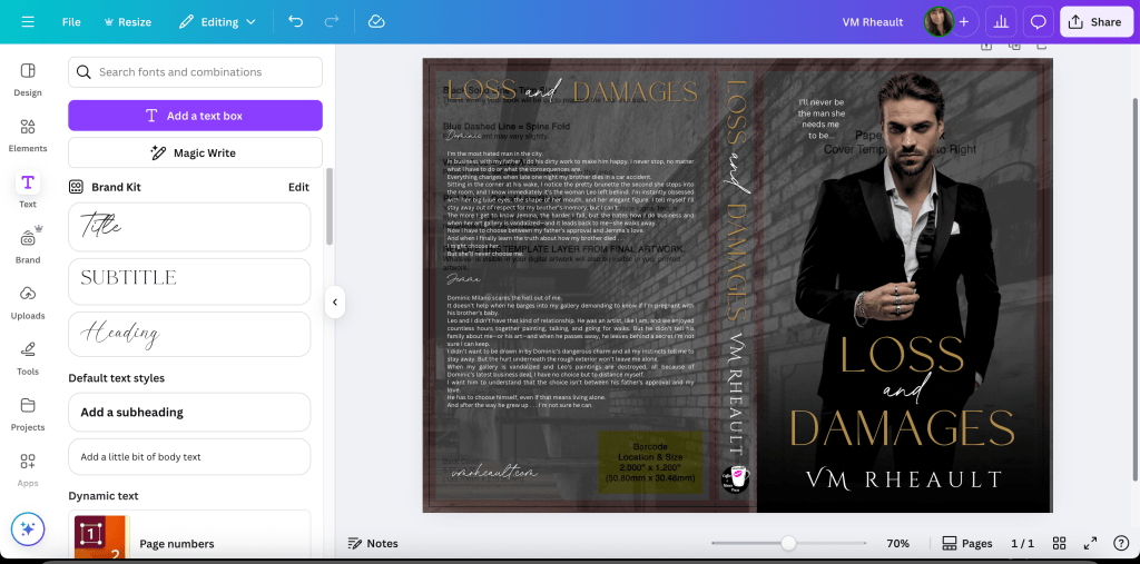
Here’s what the finished product looks like. The cover looks a hazy, but that’s because I took a picture in a sunlit room and my phone’s camera was dirty. I don’t think the colors need adjusting in real life, but I can move the black gradient to the left though, closer to the spine. Other than that, I think it looks pretty good.

I think I covered everything there is to know with the updates. If you have a cover from a designer and you need to resize it, entering the numbers and generating your own template into Canva is easy. (Get their permission first.) Another update Canva Pro added is you’re able to upload PDFs, not just PNGs, JPGs, and JPEGs. Sometimes I do that to make the ebook cover. I blogged about how to do that, and you can read it here. https://vaniamargene.com/2024/09/09/how-to-turn-your-books-cover-full-wrap-pdf-into-an-ebook-cover/
I also wrote a full IngramSpark tutorial, walking you through how to upload your book, and you can read it here: https://vaniamargene.com/2024/03/18/an-ingramspark-tutorial/
I hope the new instructions are helpful!
Let me know and thanks for reading. 🙂
Quick Resource Links:
KDP Cover Calculator/Template Generator
IngramSpark Cover Template Generator
DepositPhotos is where I buy all my stock photos for covers.
Atticus is a new interior formatting software created by Dave Chesson and his team at Kindlepreneur. Atticus is available for all computers, not only for Mac like Vellum is. You can find Atticus here. If you have a Mac and want to play with Vellum, you can try it for free. They’ll charge you only if you want to generate files. Find Vellum here. If you don’t have the cash for either, but still want to do it yourself, KDP also supplies interior templates with bleeds and gutters and front matter in place. Download the template with sample content. Delete theirs and copy and past your own into the template. You can find info about the interior templates here. (That is actually how I formatted my books before I bought Vellum.)
Canva Pro lets you upload fonts into your toolkit. I find lots of cheap fonts at Creative Fabrica, and there are some free for commercial use fonts at 1001 Fonts.
There’s a great gal in the Design Resources Hub group on FB who posts whenever Creative Fabrica has free or discounted bundles. You can join the group here.
Developing your eye takes time and practice. Looking at Canva templates and the top 100 in your genre on Amazon can teach you a lot. You can look up Canva Templates here. I also look at premade covers for inspiration.

