Words: 2543
Time to read: 13 minutes

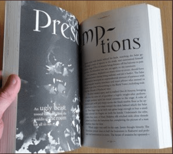
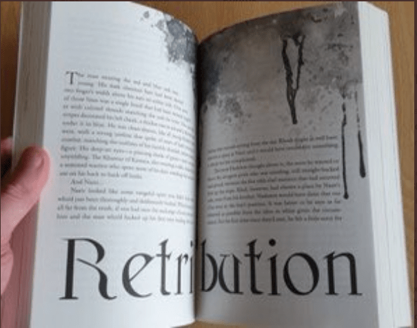
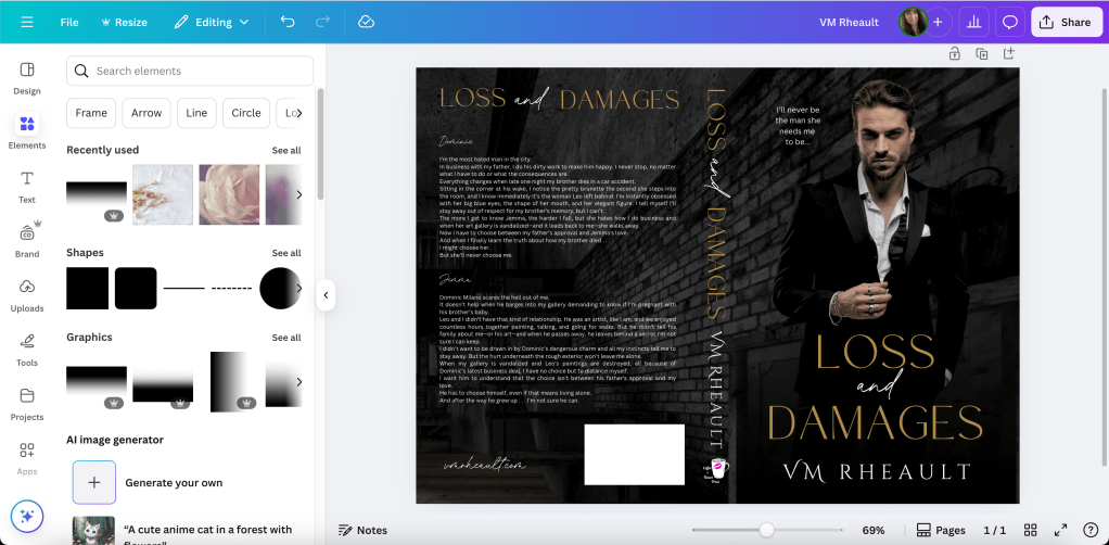
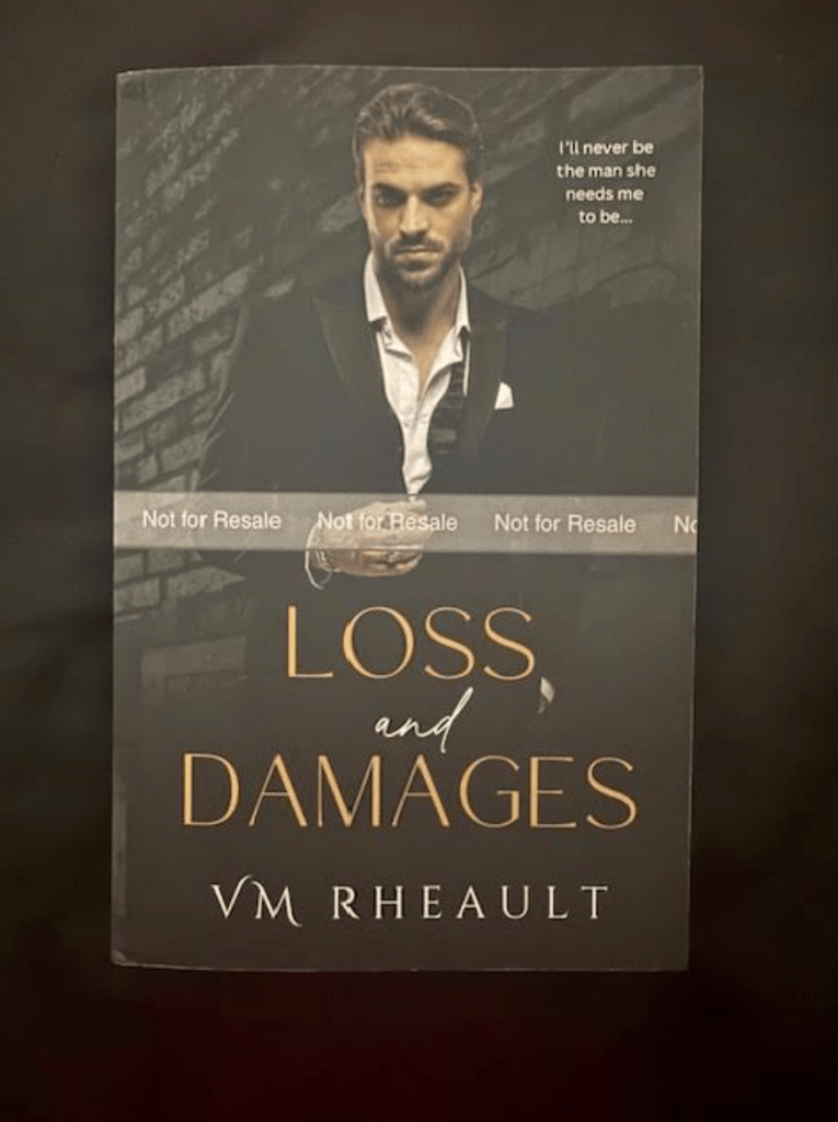
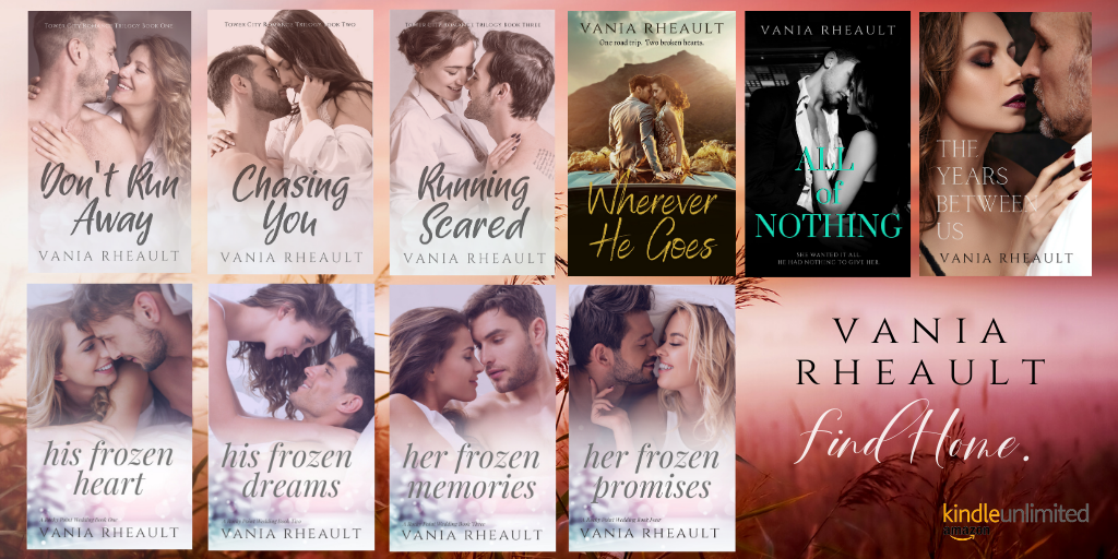
I haven’t been doing much except re-editing my Lost & Found trilogy and redoing the covers. I said in a previous blogpost that book one didn’t have the problems books two and three had, but I was mistaken. I went back and edited it more thoroughly which took time, and then I read all three of them again just to make sure I didn’t edit in any typos. My proofs come today, but I’m not reading them–okay I might spot-check them, but that’s all–I’ll page through them to look for formatting errors and make sure the back matter is how I want it, and then I need to move on. They are going to be as good as they’re going to be and I’ll have to be happy with that. I’m pleased with cover changes, and I hope that it will bump up sales. I haven’t been pushing them because I didn’t like the covers, but now I can promote them with confidence. I’ve said I don’t have imposter syndrome, but maybe I do. I’ve never been fully confident thinking my books are any good to read, but my trilogy is good, and I remembered that editing them. It’s a good story arch, and I want people to read them.
Just because I like the story, I’m reading my duet over again. Not with the express desire to edit them, though I am making changes and editing out the “when” sentence structure if I come across it. I also like “because” and with a quick sentence rewrite, I can usually edit it out. These aren’t bad–I hadn’t fallen into a writing tic while I was writing these, and I’m reading more for pleasure than to edit them. After those are done, I have a lot of admin stuff to do, and I’ll spend most, if not all of my free time in in the second half of November and all of December getting them done:
*Changing from the MailerLite Classic to the updated and newer version of MailerLite. We need to do that by February and I’ve heard stories ranging from it’s super simple to horror stories of lost email addresses. There’s a tutorial somewhere, so I need to watch it. Luckily, I don’t have anything complicated there, just one landing page and one welcome email that is sent to everyone regardless of how the sign up. It should be cut and dried, if not, dare I say, easy, but we’ll see. I’m going to set aside a whole day for it because I don’t want to stress myself out. This is a good time to redo my welcome email anyway, make it prettier, but I think I’ll have to redo the integration I have set up with Bookfunnel. I have 771 subscribers right now. I’m not running an FB ad to my freebie at the moment, so the past few subscribers I’ve managed to gain have been through the back matter of my books only. I’ll send an email letting my subscribers know that my Christmas novel is live, then I won’t send one out until I’ve moved my account over. That’s the top item on my to-do list for now.
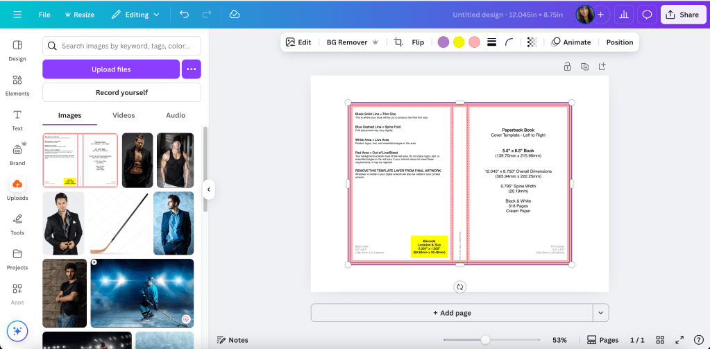
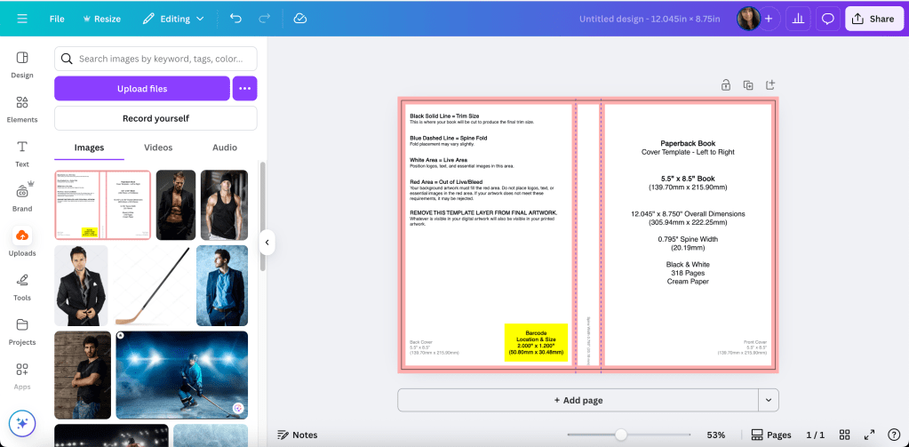
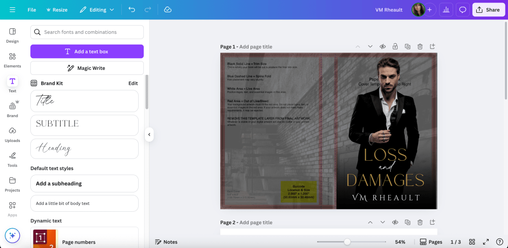
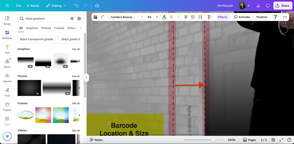
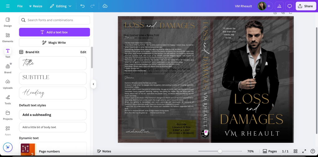
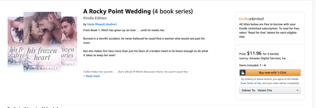
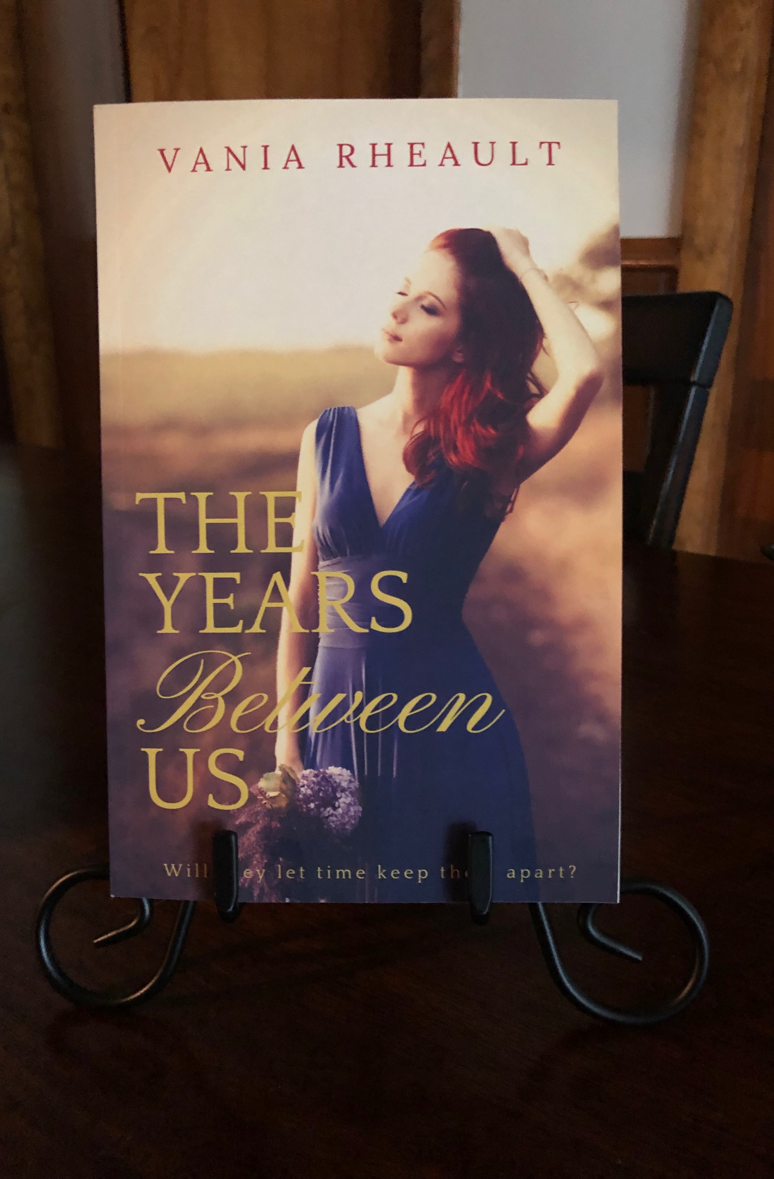
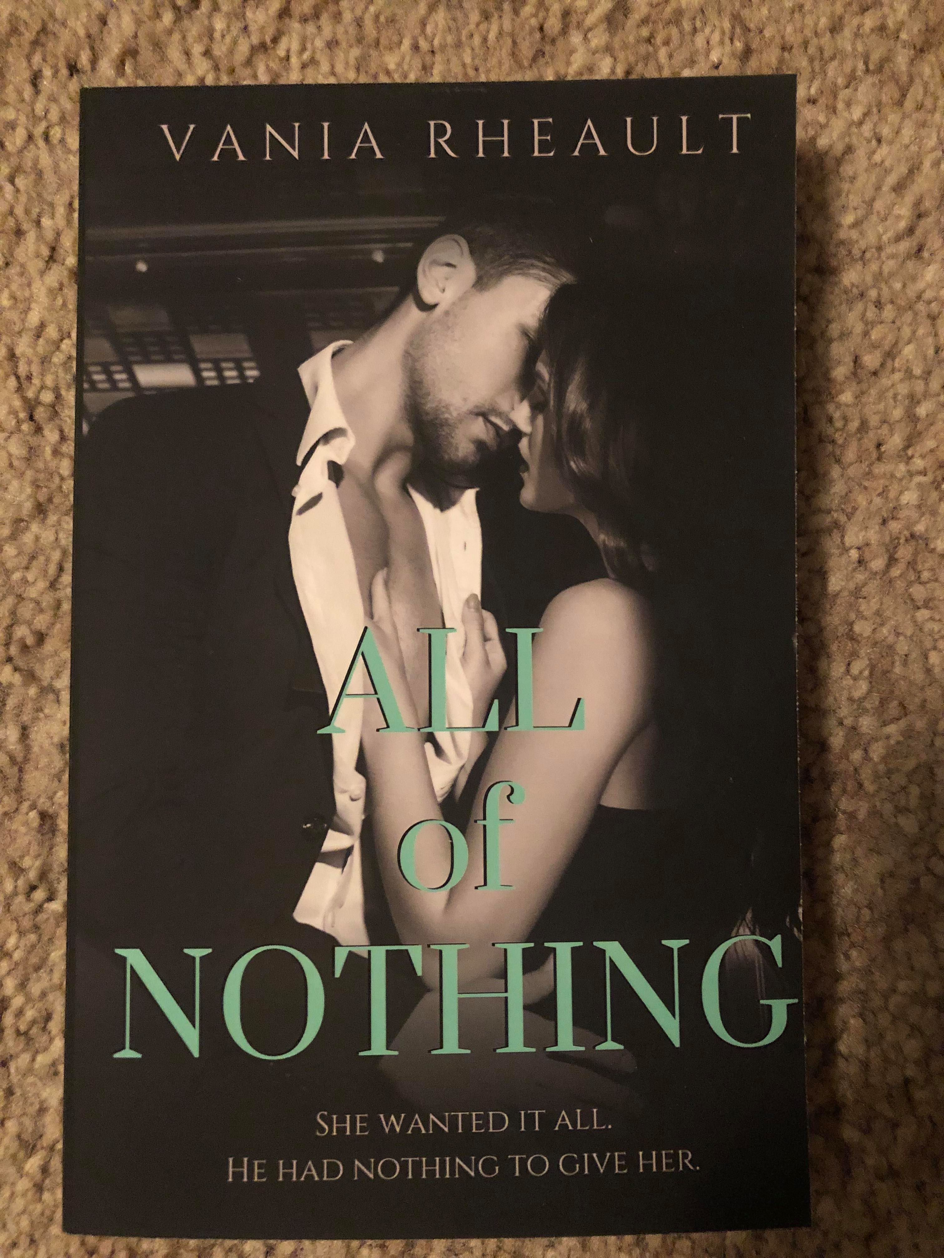
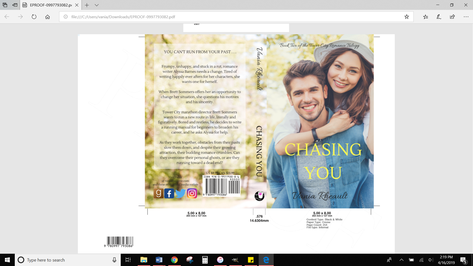
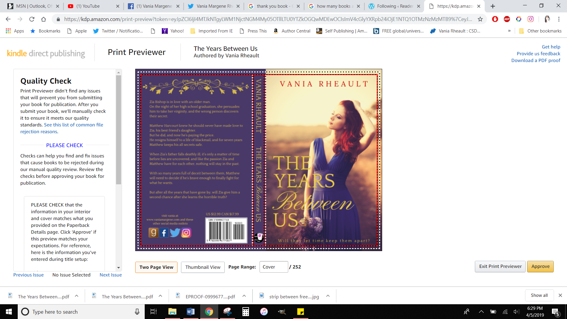
*Publish my rockstar trilogy to IngramSpark. I always let a couple of months go by between publishing on KDP and publishing on IngramSpark. I’ve heard it’s good to let them settle, and it’s what I’ve always done. I’ve never had an issue publishing to IS after KDP, so I’ll keep doing it that way. The interiors are the same, but I’ll have to tweak the covers. IS uses different paper and the spines are thinner, which means I usually have to adjust the font to avoid it lapping over to the front or back covers. I can’t do that until my trilogy is done and published with new covers. I want to put the Lost & Found covers back there pushing readers who like trilogies to buy my other one. This is a back matter page of Safe & Sound telling readers I have my rockstars available:
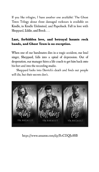
I made the graphic in Canva. One of the best things you can do is use your back matter wisely! I do the same things with all three of my standalones–if you like this standalone, I have another available, and you can find it here.
*Make hardcovers for the rest of my books. I offer hardcovers of my Cedar Hill Duet and Rescue Me. That was all the further I got with my hardcovers, but now that my books will be 100% finished, I can make hardcovers of the rest. I’ve never sold a hardcover (only a handful of Large Print I can’t offer anymore because KDP blocks them as duplicate content) but I like how the buy-page shows more than one buying option and it shows readers that I’ve invested in my book to make other versions available.
*Try to enjoy the downtime and the holidays. That list will take me more than a few days, and while I’m not writing, I’m going to try to enjoy the holidays. I have a tooth that’s going to need to come out soon (I have PTSD from a root canal gone bad and I will never subject myself to another one) but I’m going out of town from November 15-18th and I would like to have it done after I come back. There’s no good time to have an extraction, and my November is busier than it’s ever been, but having an achy tooth in my mouth ups my anxiety, and I would like it out the sooner the better.
*Plan my next books. I’m thinking of another duet, but bigger ones, 150k per book or so. I want to incorporate the underground king concept I blogged about here, with the kidnapping/psychic element that’s been knocking around in my head. To write these as well as I want, I’m going to need to read some dark mafia books. I want these dark too, but not in the sex kind of way, well, not only the sex kind of way. Drugs, crime. Violence. The vibe I was looking for when I wrote All of Nothing. I don’t have a plot yet, and I still have to put my series up, but it’s never to late to plan.
*Try to enjoy walking more. I have a lot of negative feelings associated with going for walks, and I’m trying to sever those ties. When my ex-fiancé and I would talk, I would go outside for privacy. As our relationship deteriorated, I didn’t go outside just for privacy, I would go outside because we were fighting and I needed to walk off the nervous energy (and the fear but let’s not get into that). Walking now brings back a lot of those memories and feelings. We’ve been split up for a long time, and I’m used to him not being in my life anymore. Our five years together were more tumultuous than happy and splitting up was better for both of us. Still, those feelings are still there, and I need to push them aside to enjoy walking again. I also walked to get air at the beginning of the pandemic to try to quell my anxiety. I wasn’t anxious because of COVID though I know many were. I was anxious because unbeknownst to me at the time, I picked up a box of Snuggle dryer sheets, and they were wreaking havoc on my girlie parts (more specifically, they gave me bacterial vaginosis). Three years later, I’m still having issues my gynecologist doesn’t seem to understand, and now walking brings back those feelings too–of sucking air into my lungs, trying to calm down because while those dryer sheets were screwing up my body, they were also screwing up my mind. I’m still dealing with the side effects of that unfortunate purchase, but at least I know the cause of my health issues. There’s nothing keeping me from going for a walk and enjoying what that time outdoors used to mean to me–plotting my next book, listening to music, listening to publishing podcasts, and enjoying the health benefits that come with moving your body. I’m already doing better for myself recognizing those ties, I just need to do better with making time to do something about it.
I should probably make this a different blog post, especially since I don’t know if I’ll have time to post anything next week, but I wanted to chat about some of the new features KDP has been rolling out.
The first one is KDP will allow you to schedule when your paperback goes live. This isn’t the golden ticket people think it is though. While it’s nice you can schedule a release date, that doesn’t mean it’s on preorder. The only way you can schedule a preorder of a paperback is to publish it through IngramSpark, and I really discourage you from using IS to fulfill Amazon orders. You’ll end up with a bunch of problems, that, unfortunately, will be difficult to fix with the way I’ve heard IS’s customer service is since the pandemic and Robin Cutler’s exit. I’ve also heard that you need to have your files available before you choose a date (this was in an FB group and I have no idea if it’s true or if placeholder files can be used), but that actually makes sense, because the only nice thing I can see about pre-scheduling is that you can order author copies before your book goes live, and they won’t have the ugly stripe over the front. Paperbacks aren’t a big consideration when it comes to my books–most of my sales come from KU. I like to offer paperbacks, and Vellum makes it easy to format them and make them pretty. Lots of people were excited about this new development, but they still need the 72 hours to review your book and you can’t order author copies until your book has passed that review. As far as I can see, nothing much has changed there, except you can schedule and check it off your launch list.
For more information about using IS with KDP, look here: https://www.authorimprints.com/ingramspark-pre-order-amazon-kdp/#:~:text=Pre%2Dorders%20are%20accumulated%20in,or%20before%20the%20publication%20date.
The other thing KDP is playing with now is opening up audiobook creation using AI. So far, it’s by invitation only and in the beta stages. Beta in KDP language can take years (look a how long the new reports were in beta and how long the old reports hung around) and how long it will take to open to all of us (or at all) will be something to keep an eye on.
Of course this caused an uproar in the writing and author communities. Some are really against AI anything, and some totally embrace whatever AI has to offer. I like to be in the middle–there are good and bad aspects of it, and I think if you totally brush it aside because of the bad, you can miss out on the good. I don’t like using AI art for covers, and it’s becoming prevalent with romance authors because hot men who haven’t been used to death are becoming harder and harder to find–especially for authors on a budget who can’t afford to look beyond DepositPhotos. The only problem is, I can spot these a mile a way and all the covers that use AI to generate a man standing in a suit with a blurry background behind him are starting to look the same. No matter how long or how hard I have to dig, I will always buy stock. I believe in paying the photographer and I believe in paying the model. I don’t think creating an audiobook is entirely in the same category as using art. AI in this regard, I believe, is just technology moving forward. There is already text-to-voice options on devices, and using AI in this way is just opening up accessibility for readers who want to listen to the books they consume and for authors who can’t afford to pay a narrator. I don’t like gatekeeping and telling someone they shouldn’t create an audiobook because they can’t afford it is in its own way. There could be drawbacks to using text-to-voice, and we won’t know what those are until authors start reporting back. There needs to be way to correct the voice if it pronounces something incorrectly. The voice has to sound natural, but those voices are getting better day by day. On the author side, you have to take the time to listen and edit if that option is available. You can’t just upload your book, let AI spit out an audio version and put it up. There was one woman on Twitter who was using AI to translate her books into German, but she wasn’t using someone who knew German to double-check the translation. That’s irresponsible and scary. God only knows what it was coming up with. The last thing I want is to be a laughingstock in Germany. Good luck to her, I guess.
When it becomes available, I’ll give it a try. Apple already has given its authors a chance to create audiobooks with AI, (and people were excited about that, so I don’t know why KDP is getting flack) so it will be interesting to see how this goes. Just because I try it doesn’t mean I’ll publish with it. I might not like the voice choices, or because I write dual first person POV, I may not be able to publish using a female voice for the female POV and a male voice for the male POV. I’m definitely not going to shun something before I can even experiment with it. Ethics aside, you have to think of what you want for your business. I don’t listen to audiobooks–my mind drifts too much for me to concentrate–but I’m hearing now that listening to an audiobook is experience. It’s doubtful something that KDP offers will compete, but it’s nice to have to the option.
That’s about all I have for this week. I’ll be out of town November 15-18th. We’re driving down to the Twin Cities and we’ll be going to Mall of America, looking at a few museums, and going to the zoo if the weather permits us to be outside. I may take a pass at blogging or just put up a quick post I’ll write Sunday. Things won’t be calming down much after that either–we have The Ballad of Songbirds and Snakes to watch that following Tuesday, then Thanksgiving. We’ll be at the end of the month after that, and I have my birthday to celebrate. We’re going to Napoleon and out for a fancy dinner so I’m really looking forward to that. All in all a very busy month and I think I’m going to sleep all of December.
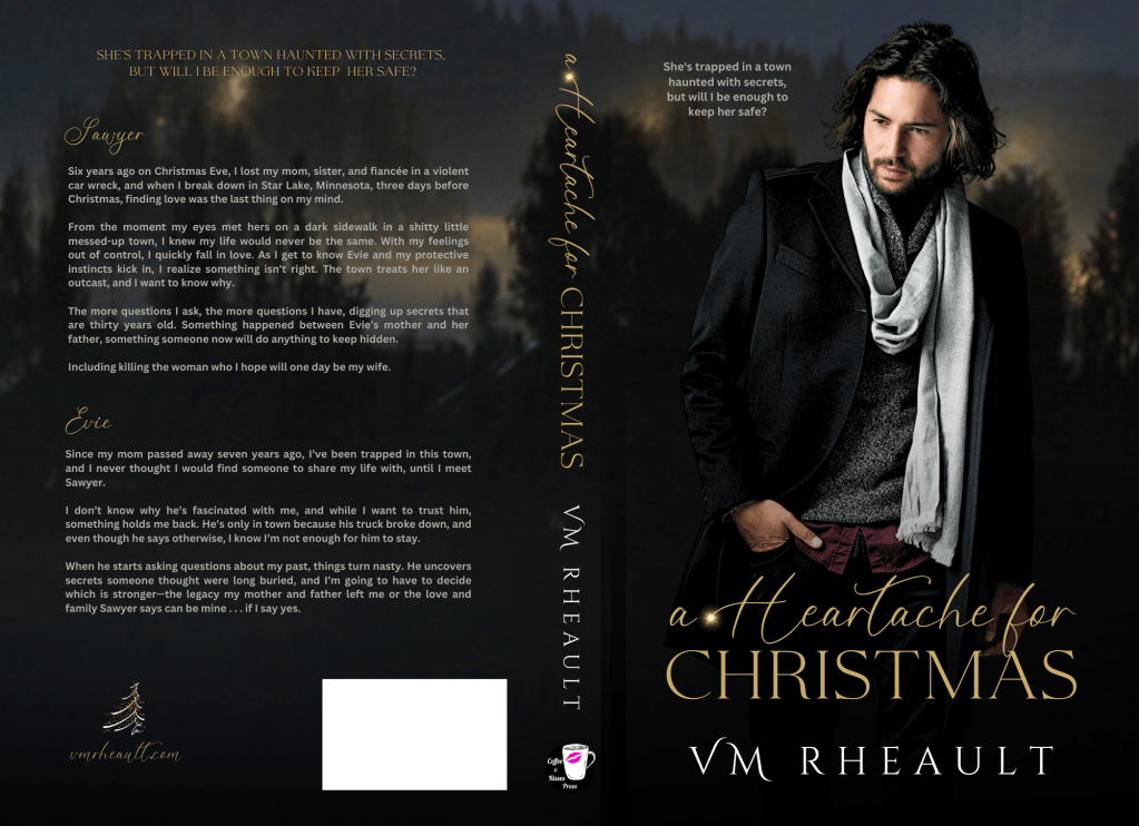
For my last piece of news, A Heartache for Christmas is available right now–it went live today! The reviews have been coming in through Booksprout, and readers are really touched by the story (and I am really really in love with the cover!). You can find it here: https://www.amazon.com/Heartache-Christmas-VM-Rheault-ebook/dp/B0CM2BLRPF/
Enjoy your week, everyone!