
I love talking about book covers, especially it terms of making them for yourself. It’s a creative process, and nothing will make you happier than when elements click into place and your covers–that you made!!–turn into something you’re proud to show off. And I don’t even mean for marketing purposes. You’re just so happy this thing you made looks so beautiful, you want to show it to everyone.
It’s not easy. There’s a lot to consider, and I like talking about my book cover process because I rarely make a cover that ends up on the book during my first try. The only time I can honestly say that is for Rescue Me, but all my other books I’ve either published and changed after the fact, or they’ve gone through many changes before they ended up on the final cover.
If you make you own covers, I don’t want you to be discouraged if it takes you a long time to get it just right. There are so many things you have to think about, like spice level, if you want elements or people, and if you go with people, if they’ll be half-naked, finding those models, and the font for your author name and title. All that on top of what skills you may or may not have. You may even go as far as ordering a proof, not liking how it looks in print, and changing your mind like I did.
I had covers for these before. I made proofs and had my friend beta read them, before they were ready to be honest, but she still gave me good feedback. I hadn’t written and published all that I had, hadn’t settled on any kind of author brand for my pen name. I was going with a dark look–the black and white and gold that is still popular on billionaire romances today–but I didn’t like them anymore and decided to redo them. Luckily, I buy the AppSumo DepositPhotos deal and changing the background and the models didn’t cost me much.
The first is the model/concept for books 1-3, and the second model/concept for books 4-6. The model on the second set looked more like what I was going for when I thought of the character, but he looks a lot like Eddie on Twisted Lullabies and I didn’t want to use him again if that was the case. DepositPhotos, I’m guessing, using face recognition software to lump models together, and sometimes it weeds out models that aren’t who you’re looking for and sometimes it doesn’t. There are times I can’t tell and don’t want to use the same model by mistake. They probably would have been okay, but I didn’t want to settle like I did with the first set of models on my Lost & Found trilogy so I moved on.
One thing you’ll hear a lot is that you should look at other covers in your genre, and that’s true. You should. But there’s also the caveat that you should look, but not copy, which can be tempting to do if you love an author’s cover and it’s something simple you can do yourself. You have to remember the publishing world is very small and there’s a 100% chance if you copy an author’s unique style, (and I don’t mean a headshot with the title over his chest that I’m finding on AI covers these days) she’s gonna find out about it.
Practice is vital no matter what kind of skill you’re trying to build and perfect, but have integrity and courteousness when practicing and packaging your book and don’t use what you make. Keep YOUR brand in mind, and something just right will come out of your experiments that will fit your books and the brand you’re pushing out into the world.
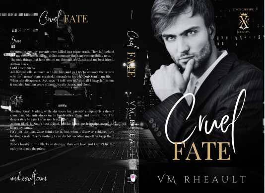
There was a book cover that I loved that incorporated flowers around the edges. What I made was just too much like hers, and I scrapped the idea. I wanted to keep the flower element though, and made this:
I really liked this too, but somewhere along the line I started having issues with him. The characters in my series are younger than they usually are. These books are four and a half years old, the first I wrote using 1st person POV and in later books I settled on older characters. So, he was good age-wise, but he didn’t give off the tall billionaire vibe I was wanting, so I kept searching and found him.
I thought he was okay, didn’t see him around much on other covers. But there was something about him I didn’t like, and there’s a shadow on his shirt leftover from his photo shoot I wasn’t able to get rid of. He came in different poses, and I wanted to like him, so I gave him another shot but I decided to dump the flower, and I went back to my cityscapes.
He blended well, but there was something about his face, and in the end, I didn’t go with him.
At that point, I was trying different backgrounds, thinking about veering away from the single guy and doing couples instead. I was researching dark romance, billionaire romance, romantic suspense. Romantic suspense usually had a couple, but I needed to keep my brand in mind. I haven’t exactly found my readership yet, and I didn’t want to deviate too far away from what my author brand looks like I give my readers. I have noticed more couples coming back into style, the couple on top, the title in the middle and some landscape photo at the bottom. I gather those are more contemporary romance titles, small town maybe, like my series under my full name.
I liked the blurred cityscape. I liked the colors and that it was part of my overall author aesthetic. It’s time-consuming to find a background and models that work together without much or any manipulation and if I wouldn’t have found another male model I liked, I wouldn’t have kept it. I couldn’t have kept it, so it’s good to remain flexible, too. You can play with filters, black and white, whatever you need to find the look you’re going for. Canva makes that easy, at least. A click of the mouse here, and the click of the undo button there if you don’t like it.
If you have a background you like, you can make the “template” and just pop your models in it to see how they do. I liked this concept, and then found him:
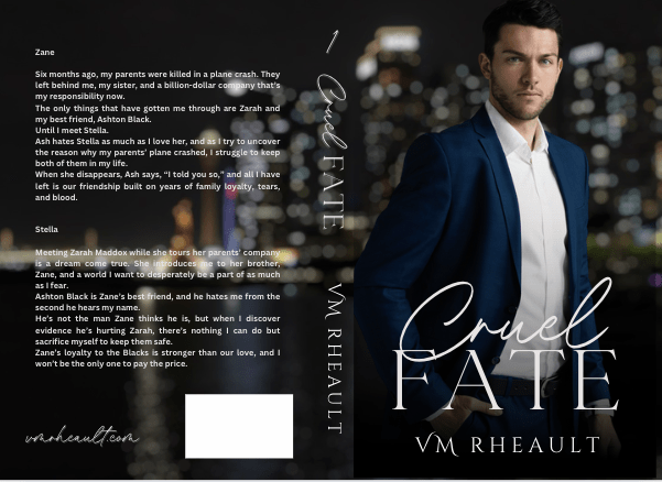
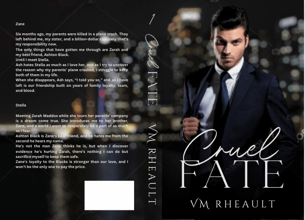
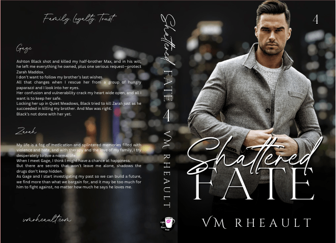
I really liked this guy and knew I wouldn’t need to look more. He fit how I pictured Zane–not too young, not to old. He didn’t look short, just the right amount of scruff. I wish he was wearing a tie, too, but beggars can’t be choosers, especially since I had played around with these covers for a while by then.
Of course, you start to doubt if what you have is good enough. You start scrolling through book covers again, checking out backgrounds, wondering if the one you chose is edgy enough. This series has a lot of romantic suspense elements in it, and I thought maybe I should try to capture that with a grittier background.
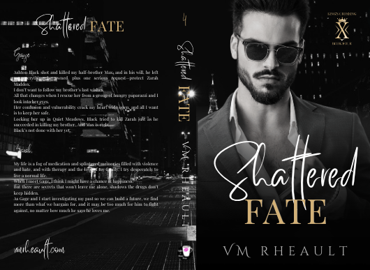
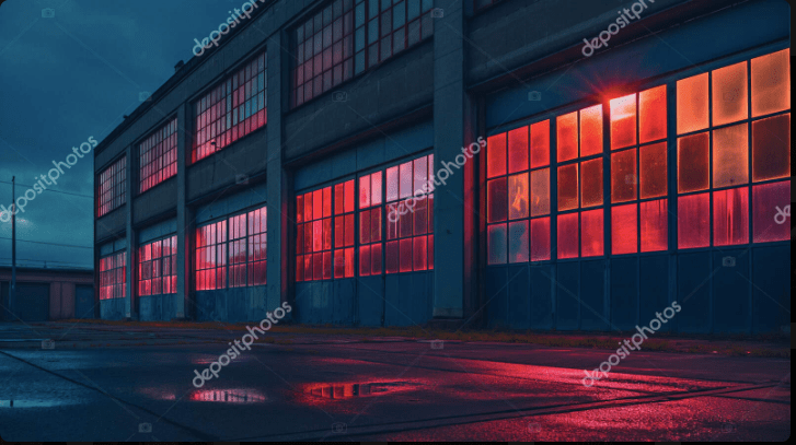
I tried this one, as red is supposed to indicate danger:

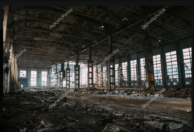
Then I tried a dark building, hoping to zoom in on the windows. I couldn’t make it work, and tried this one, and I almost went with it too.
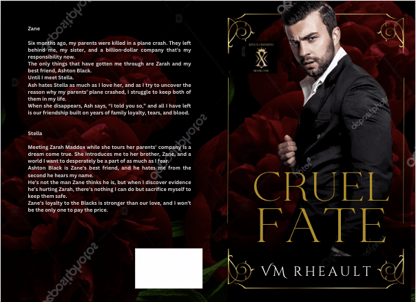
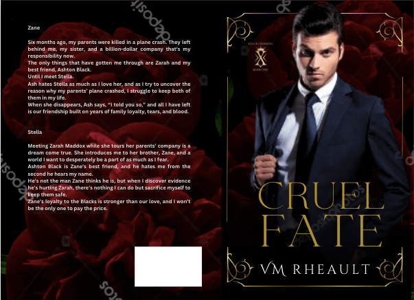
But I realized that though this background might have worked for the first set of books, I still had to make the model match for the second set, and he didn’t go so well. Though I’ve seen him around a lot, and even played around with him when I was doing my Christmas novel last year, I decided to go with this guy since he blended well into the city background I liked.
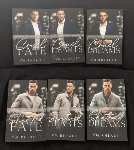
I got the proofs and they look good. There are a few tweaks I’ll need to make but there always are. Overall, I like them, and I’m happy with the choices I made.
I don’t have another series planned for a long time, and getting these done was a relief. I probably won’t even talk about covers for while because the only cover left on my plate right now is a simple one for a standalone I’m editing that I’ll publish after this series comes out. I’ve already got the guy picked out, actually, and have a concept in mind for how I want the title to look. If I do talk about it, it won’t be until next year.
Anyway, that’s all I have for this post. The creative process can take time, so I would start looking for models and playing when you’re maybe, halfway through writing your book? That way, when you’re closing in on the end, you’ll have an idea of what you need and you won’t panic. The beta reading and editing process can take time too, but you can always use that time to firm up your cover and write your blurb. It seems a lot with writing and publishing is hurry up and wait, but you don’t want to hurry at your book’s expense. I found out the hard way you only have one launch. Make the most of it and have everything set in advance.
Thanks for reading!
Discover more from Vania Margene Rheault
Subscribe to get the latest posts sent to your email.


Excellent advice. I am just starting to mess with a book cover, may I ask what kind of template you use for the spine? Thank you for an informative post.
LikeLike
Thanks for reading!
I use the KDP Cover Calculator to download a template that has the trim sizes and spine width.
https://kdp.amazon.com/cover-calculator
IngramSpark also has one if you go that way: https://myaccount.ingramspark.com/Portal/Tools/CoverTemplateGenerator
And if you’re using Canva, I have a tutorial on how to use the templates to make your cover:
I hope this helps! Good luck on your cover 🙂
LikeLiked by 2 people
Thank you so much for this help. Now off to mistake center. Have a great day!
LikeLiked by 1 person
You’re welcome, and I’m glad to help. Let me know if there’s anything else I can do.
LikeLiked by 1 person
Your tutorials are fantastic! I have learned quickly I was moving way to fast and there is so much to learn. Baby steps from here on and yes I am sure to ask again. Have a great and blessed night.
LikeLiked by 1 person
thank you so much! I hope you’re having a good weekend!
LikeLiked by 1 person