Words: 1507
Time to read: 8 minutes
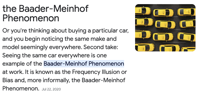
You know when you buy a new (or new to you) car? You’ve never seen it on the road before, but once you drive yours off the lot, it’s everywhere? That actually has a name and it’s called the Baader-Meinhof Phenomenon. That happened to me when I bought my Ford Escape a few years ago. I never noticed one in my life, but after I bought mine, they were everywhere. Not just the make and model, either, but the color.
I think that can happen when we look for stock photos when we create covers for our books. You’re searching for the perfect man (haha, aren’t we all) who will accurately depict what your character looks like. He’s got the vibe, the dangerous glint in his eyes, and you think, Yes! He’s the one! And like what happens in real life, maybe he’s not the one after all.
A lot of romance authors and cover designers use DepositPhotos for stock images for our covers. Not only because I’ve heard Amazon will accept their copyright contract if KDP asks you for proof you own the licensing to use the photo without argument, but because with deals like AppSumo around Black Friday and one or two other times during the year, you can get a package of 100 photos for $39.00. It’s a cost-effective way to buy images safe to use.
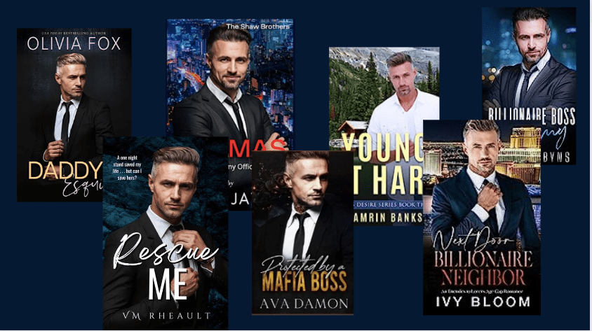
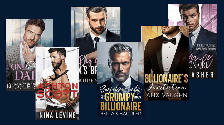
But it also limits the selection, and as more and more authors publish books, we’re going to see the same models on romance covers. I, of course, haven’t been immune to the selection (as you will see below). And I can’t even call it a meagre selection because DepositPhotos offers hundreds of thousands of photos.
But what I do wonder is if using a stock photo that’s been used a hundred times before confuses readers, lowers discoverability, and maybe, in terms of Amazon since they only use your cover photo for their ads, suppresses the ad lowering impressions and clicks.
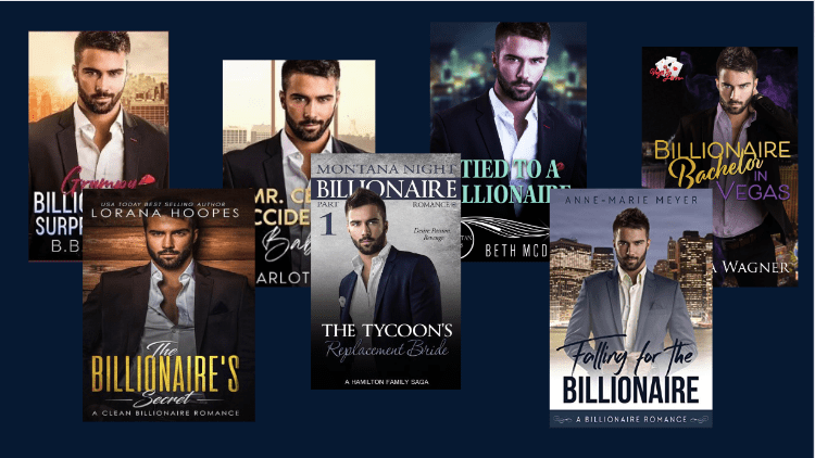
I’m not posting these book covers to shame the authors–in fact, I have used the same stock photos many do, so I’m in the same situation. The male model I used for Rescue Me is everywhere, and I honestly didn’t even know he was everywhere until after I published.
It’s even to the point where similar backgrounds are being used by some authors. I saw this one by Nicole Snow first, and now different variations are used by other authors. Maybe not all the time, but we know as trends heat up, indie publishing is quick enough to follow them before they fizzle.
You can find your own by doing a search for business city window backgrounds.

When I did my covers for my Lost & Found Trilogy, one of the reasons I took so long was because didn’t, DID NOT want to use the same models other authors and book cover designers have. I wanted to be original but still fit in–the secret sauce for selling books. Of course, that didn’t work so well. I scrolled through pages and pages and pages of men. It didn’t help I write a bit older, and the good-looking models are in their 20s and 30s. I got so frustrated I finally just closed my eyes, said whatever, and poked at my screen with the DepositPhotos website up. That’s not exactly what I did, but it felt like it. I’m still not happy with the covers, but I’m getting reads and sales. The models have been on other books, but they aren’t the best. The first guy is too smarmy, the second is fine, and the third has an odd look about him that I ignored.
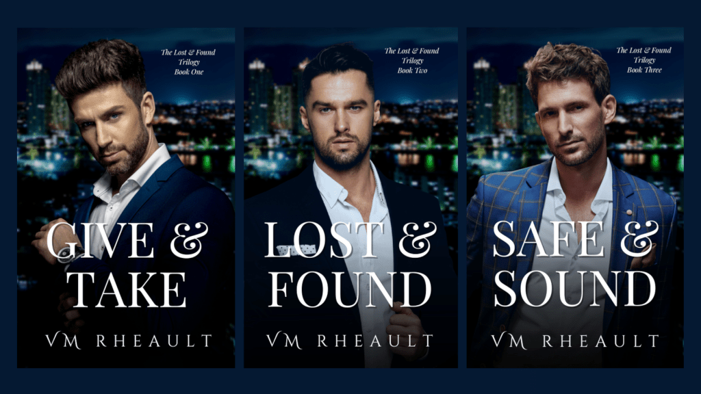
I chose a darker background because everyone at the time was going light (like the city window backgrounds above) and I wanted something different. Does it work? Probably not. I tried really hard though to get the covers, the titles, the trilogy name, and the backgrounds as tight as I could so marketing them would be easy. There is no mistake they are a trilogy, but I still think that I could do better with the models if I had time and wherewithal to hunt. Time is relative, and I do have it, at the cost of something else. Like this blog post, or my Christmas novel. It it worth it to go back? That’s where the energy part comes in, and I don’t know. Maybe if I had a different place to source photos it wouldn’t be so difficult.
My rockstar trilogy was easier, but the models have still been used before.
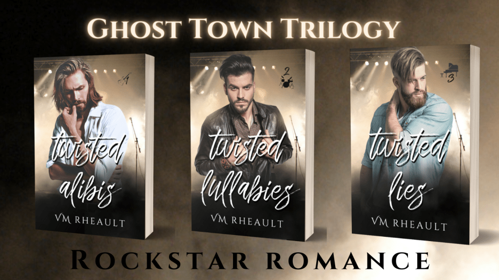
I am really really happy with these though, so the few covers I have seen with the same models don’t bother me.
When it comes to covers and models that have been used relentlessly, I don’t know if staying away from them is helpful. There’s not a lot written on the subject, and from what I can see in groups, not a lot of reader feedback, either. There was talk a couple of years ago that some authors were choosing to do the illustrated covers for something different, but that had consequences. The cutsie covers don’t depict the right level of spice in some of the steamier books and either readers don’t pick up those books because they want sexytimes, or they picked up those books because they didn’t and got a nasty surprise with the open-door sex scenes.
It’s difficult too, finding sexy guys who are dressed because Amazon ads won’t let you advertise manchest covers. That was hard because when I was doing my rockstar romances, I found several shirtless models who would have looked great. Unfortunately, I need ads to sell my books and using a model that would get me suspended wouldn’t work.
I’m not sure what the solution is, but I plan to try to stay away from the men who come up first when you search for “handsome man in a suit.” Which really is funny, because when I search for it, the first guy that comes up is the one I chose when I redid my covers for my duet.
https://depositphotos.com/stock-photos/handsome-man-in-suit.html?filter=all
You can try your best to give them a different background or flip them so they appear different, but that’s not always going to work.
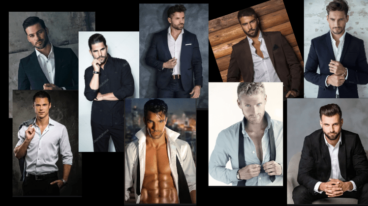
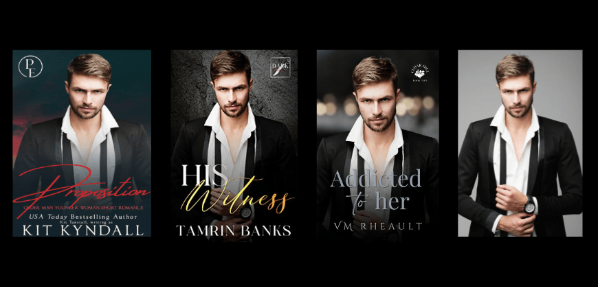
When I was looking for my man for the Christmas novel I’m going to publish in November, I was really excited to find a guy I had never seen on a cover before. My novel is kind of a romantic suspense that takes place over the Christmas holiday, and I needed someone who looks dangerous but protective. I starred him so I wouldn’t lose him and downloaded the composite the second I scrolled into him:

But, you know, nothing can be easy, and while I was scrolling Instagram, I came across this book cover on an account that posts new releases. If you’re on Instagram, you should follow them. I love looking at their new book release compilations. https://www.instagram.com/sebrero_sisters/
Anyway, so this is my working book cover, and this is the cover I saw on IG:

I like the guy and finding him on a different cover won’t deter me for keeping him. He looks different enough that I had doubts it was even him, but the tiny spot under his lower lip without any whiskers gives him away. This is the only cover I’ve seen him on so far, but now that I spotted him, that will probably change.
I like studying covers and looking out for the trends. Illustrated covers seem here to stay–I could barely find any real models on romance Christmas books when I was doing research for my own. I’m not interested in those and wouldn’t fit the story I’m writing anyway. Since I’ve done my own covers since I started publishing and probably will never stop, researching and taking note of the models and font choices is fun homework.
Are there repercussions for using the same models over and over again? I don’t know. I have noticed that there are levels of professionalism that doesn’t always coincide with sales. Some of the drabbest covers I’ve seen on Amazon have reviews in the thousands, so I wouldn’t always discount a middle-class cover. It gives me hope as I’ve often wondered if my books would sell better if my covers were more professional, but at this point, I really don’t know. That would have to be an experiment that I’m not quite ready to run. At any rate, tell me what you think! If you read romance does a recognizable model turn you off or doesn’t it matter?
Until next time!