
The creative process is messy, much like falling in love, and like relationships, sometimes you have to take two steps backward before you can take a step forward. Sometimes you rush, getting married or getting pregnant before you’re ready, publishing a book with a cover that’s only so-so, and while there are remedies for all three situations, they aren’t always pleasant.
I started thinking about my Christmas cover the second I started writing A Heartache for Christmas. I knew I was going to need time to go back and forth, and I didn’t want to make the same mistakes I did when I published my Lost & Found Trilogy. I don’t like the covers, settled on them because I didn’t know what else to do and I wanted to publish. I’ve spent the past ten months regretting the decision, and only God will know what waiting and publishing with proper covers could have done for my launch and sales.
Sometimes you can get a burst of creative juice at the zero hour, and that’s pretty much what happened to me: I created the perfect cover two days before I uploaded everything to KDP to order my proof, and that was after eight weeks of writing, several attempts at a cover, and too many hours of scrolling through men to count.
The problem was, and I see a lot of authors go through this too, is that there is so much that needs to go into your cover. You have to blend in while standing out, do what the top 100 in your genre are doing without looking like your pilfering a design, try to stay away from the guys who are hogging the covers and give some other hot dude a chance, all the while trying to stay true to your brand and the look you want to present on social media and to your readers. It doesn’t help if your design skills are lacking because that only limits what restrictions are already in place. So, when I first started thinking about my cover, I started with these ideas:
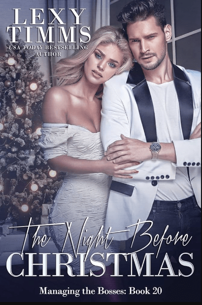
*I looked at other billionaire Christmas novels. A big concern was that this isn’t a holiday RomCom, and I didn’t want to give any readers a false impression, so an illustrated cover was out. Not to sound harsh, but there were quite a few billionaire Christmas covers out there and they just seemed cheap, like you know you’re sitting down for a B-list movie and you’re expecting the worst. My blending skills are nil, so finding a background with a model that takes little manipulation is a must. I didn’t want my man to look cut and pasted in front of a Christmas tree, nor did I want to settle for a Christmas lovers stock photo that had been used before. I scrolled a lot, not finding anything to draw inspiration from and concluded that whatever I make would be fine. There was no set billionaire holiday cover to use as a template.
*I thought a lot about my genre. The billionaire Christmas thing was only part of my book. There is also a mystery involved and a little violence (not between my H and h, though) and I definitely wanted that to come across in the cover. This wasn’t a lighthearted romp, even if it did take place over Christmas and New Year’s Day. This novel is very angsty, kind of dark (but not sex-dark, if you know what I mean) and it also takes place in a small town, which means I couldn’t use the reliable city background that I’m used to. It’s a lot to take into consideration, but I also know you can’t (and shouldn’t) cram every facet of your book onto the cover either. Choose the themes that stand out the most, and I decided on dark and the guy. That gave me a lot more room to play with but even then I still made plenty of mistakes before I came up with the right thing.
*Choosing the guy. You know from a previous blostpost that I don’t like using male models that have been on hundreds of covers before. I think in some ways it can pull your book down and make readers confused. There was an article I read somewhere, or maybe it was a discussion on FB years ago, where it was speculated whale readers don’t remember the author of the book, they only remember the book. If that’s true, the last thing you need as a romance author is for a reader to think she already read your book because the cover might resemble a different book she read. You might think this isn’t a concern and that I’m over thinking it, and maybe I am. But seeing the same five models on a fresh wave of new releases can’t do much for your book if your new release is grouped in with them. If you you missed that blogpost, you can read it here.
*Title. Choosing a title has always been a pain in my ass, or a$$ as we have to say on TikTok, much like naming my characters. I pull something out of the air and hope for the best. I wanted something with Christmas or Holiday in it, because I wrote this book specifically for a Christmas release. It takes place over Christmas in Minnesota–I don’t think you can get more holiday than that. I also didn’t want to use modified Christmas lyrics, though I did sort through some songs just to see what I could find. I asked Al for help, but nothing he came up with triggered anything. I finally settled on A Heartache for Christmas because while this book does have an HEA, there is nothing happy about this book until the end. A friend gave me a few suggestions, and I almost with with Heartache for the Holidays because I like the alliteration, or Holiday Heartache, if you wanted to shorten it up, but this isn’t a Harlequin Desire so I didn’t think I needed to be cute. I also didn’t want to cram my title full of keywords like a lot of indie romance authors are doing right now —A Grumpy Billionaire’s Christmas Gift–for example because that just seems like you’re trying too hard. That’s what the blurb is for anyway.
*Fonts suck. You can go through a million of them and nothing will work right. My go-tos when I have a hard time are Playfair Display, either in all caps (like my Lost & Found trilogy) or lowercase italicized (like my 3rd person holiday series). I also like Calgary if you need something simple yet classy (Faking Forever and my reader magnet My Biggest Mistake). I didn’t want to follow the trend of stuffing my title full of keywords, but I do like the script plus serif font duos that have been popping up. The fastest way to find a duo that goes together is to search duos on CreativeFabrica or do a Google search for font pairings. I ended up buying a font duo off CreativeFabrica for eight dollars. Canva also has some font duos, and I think I was looking in their newsletter emails because I captured some like this for future inspiration:
It helps to have the cover done so you can experiment, and finding my font duo was the last step I took, though I ended up changing the man and the background at the last minute. I kept the fonts because they still worked.
When I came up with my first cover, I decided on the guy because I had never seen him before:
This attempt didn’t stick around for very long. If you’re experimenting and come up with something you hate, that’s okay. It’s part of the creative process. You can see I went with my standby for the title font, but I struggled with how to make it look “Christmasy” — hence the bow — because that was a concern of mine at the time. The guy is younger than my MMC, and while I have never seen him on a cover before, he didn’t look right on mine, either. Canva has some great manipulation tools now. They aren’t 100% foolproof but I’ve used their magic erase with some success. This was the original picture of him:

After I decided against him, (though his drink looks really good) I thought maybe I needed to do more of the Christmas part of the story, and I looked through lots of Holiday stock photo backgrounds. Lots of trees and fireplaces, like this one:

Lexi Timms used a similar background for hers, but I don’t have the skills to do something like it (and there’s that guy again):
I mocked up a lot of half-hearted attempts at trying to figure out what worked and what didn’t, what I could do with Canva and what I couldn’t. I came up with this one, and I mentioned it in my blogpost I referenced above about book covers:
It was one of my better attempts, but I still wasn’t happy with the guy. I liked the background and I thought I lucked out because it depicted Christmas but in a dark way. If hadn’t had time to play, I might have stuck with him just because it fit my needs. I’m not even sure where I was with writing it, but I knew I had time and kept looking for a better guy.
Later I found this model and kept the background:
I actually workshopped him in the Indie Cover Facebook group, and but everyone agreed there was something missing. I still think so too and maybe if I was’t writing Billionaires, it would have worked for a simple Romantic Suspense that took place over the holidays, but I knew I needed more. They also said the font wasn’t the best, and the word placement needed work. I agreed and went back to the drawing board. (Don’t skim over this part. Feedback is important and could trigger an idea that makes all the difference.)
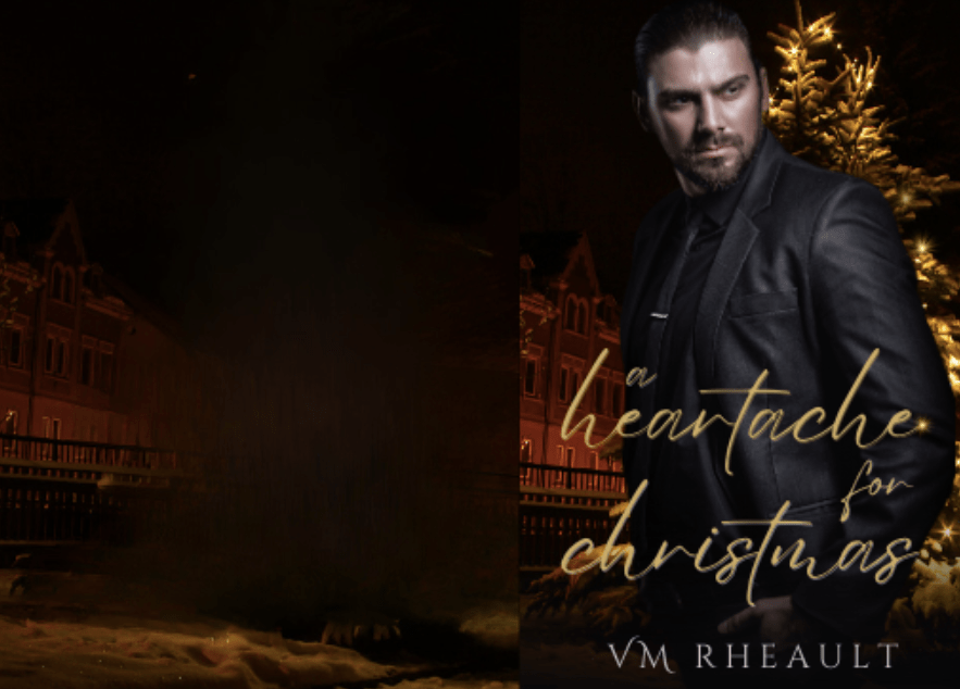
I decided I was trying to put too much emphasis on the mystery part of the novel and in my next attempt went in a completely different direction while keeping with the Christmas theme:

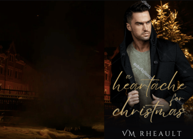
The title didn’t grab me but I did give other things a chance. I thought the guy and background was good. I like his hands and his watch, but I hated that his head was cut off, and when I put the KDP cover template on top of him I noticed that I was going to lose even more of his face:
That was when I thought I needed a new man (not the first time in my life, let’s be honest). I asked in the Book Cover Design 101 FB group I’m a part of and they offered some suggestions as to what I could do to keep the part of his face I had, but they were out of my skill set. Canva has a magic fill AI option but when I tried to build up his head using it, I got a caveman instead, and that idea went out the window. Here’s the stock photo I was trying to work with:

I almost still kept this cover though, because it was the best I had come up with by far and my time was running out. I had already finished and read through my book a couple of times by then and was almost settled on the final draft:

You can see I had almost everything in place besides the blurb I don’t write until I can’t do anything else without it. There is nothing wrong with this cover (depending on how much of his face I really would have lost, but I wouldn’t have found that out until I ordered a proof). It probably would have sold my book just fine. But there was still something pulling at me and telling me I could do better.
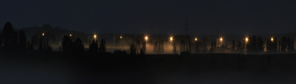
I started looking through backgrounds again on DepositPhotos. I looked up the trees, using search phrases like “dark trees” “dark Christmas” scrolling and scrolling. I found something almost by chance, (which is how most of my covers are made–by a chance find), and I favorited it right away so I wouldn’t lose it:
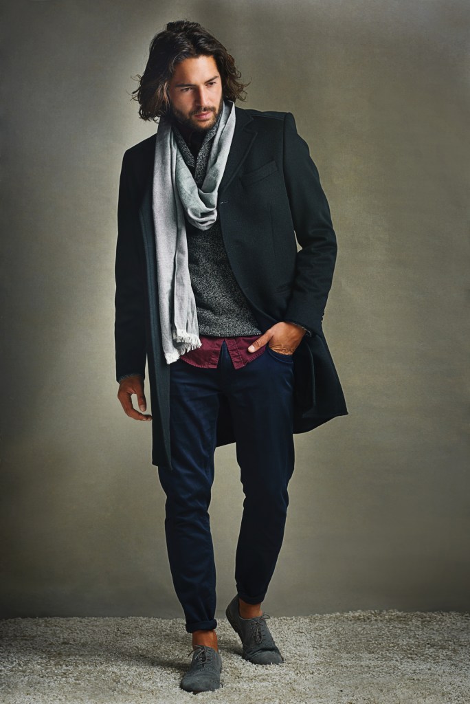
Then I started looking through all the stock photos of men I have starred over the past few weeks trying to build up a selection of models that haven’t really been used before but could still work on a cover meaning, handsome enough. I came across this guy, and after I plopped him in front of the background, everything fit together like the last handful of pieces of a jigsaw puzzle:
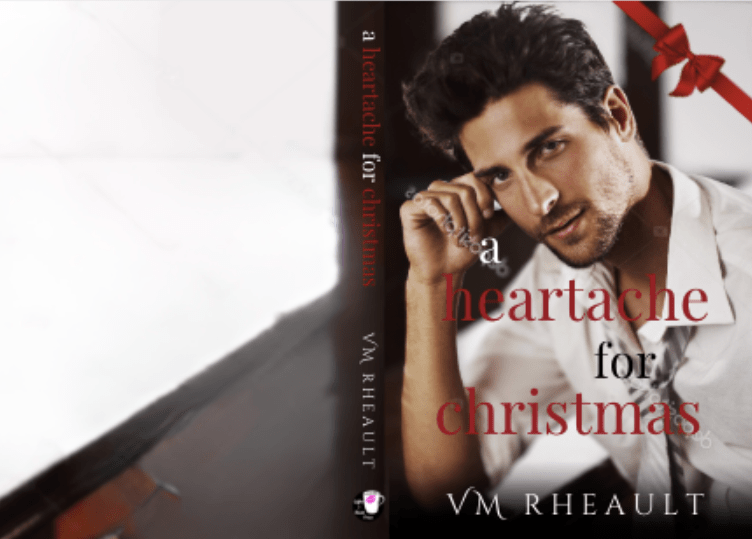
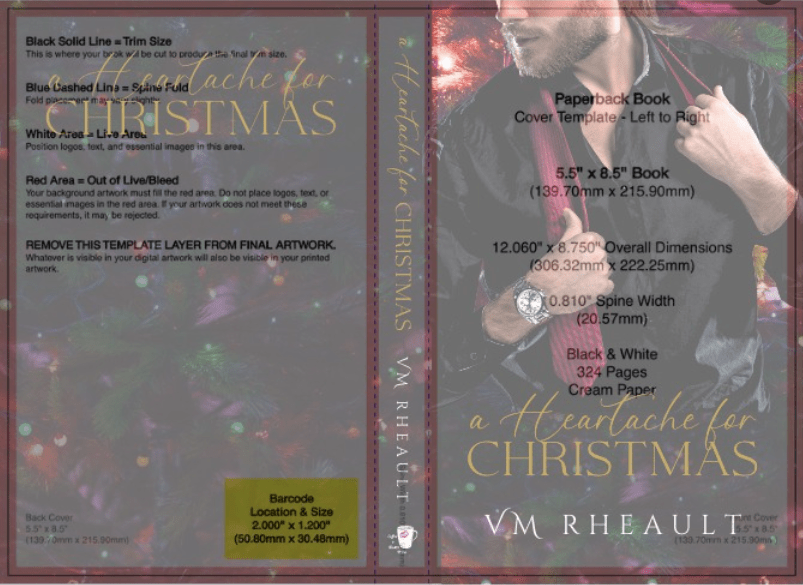
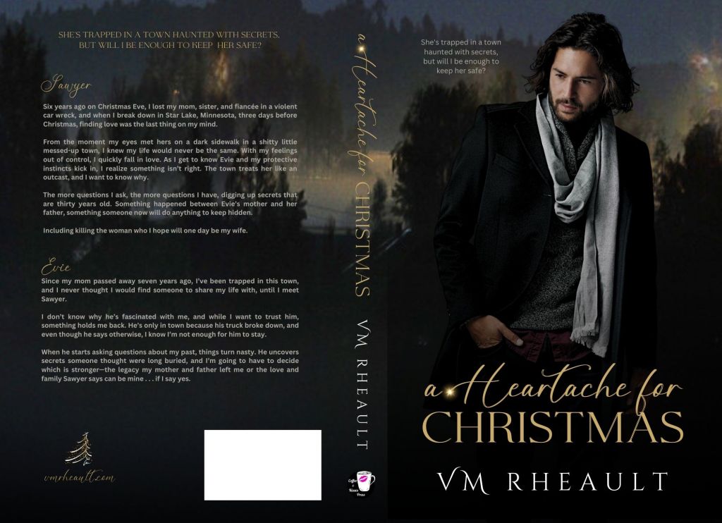
I zoomed in on the background, used Canva’s magic erase to blur out some of the lights, and with the font duo I had purchased, came up with a new cover two nights before I uploaded to KDP:
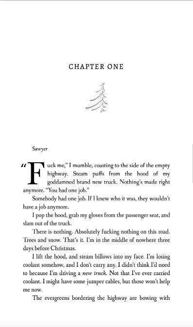
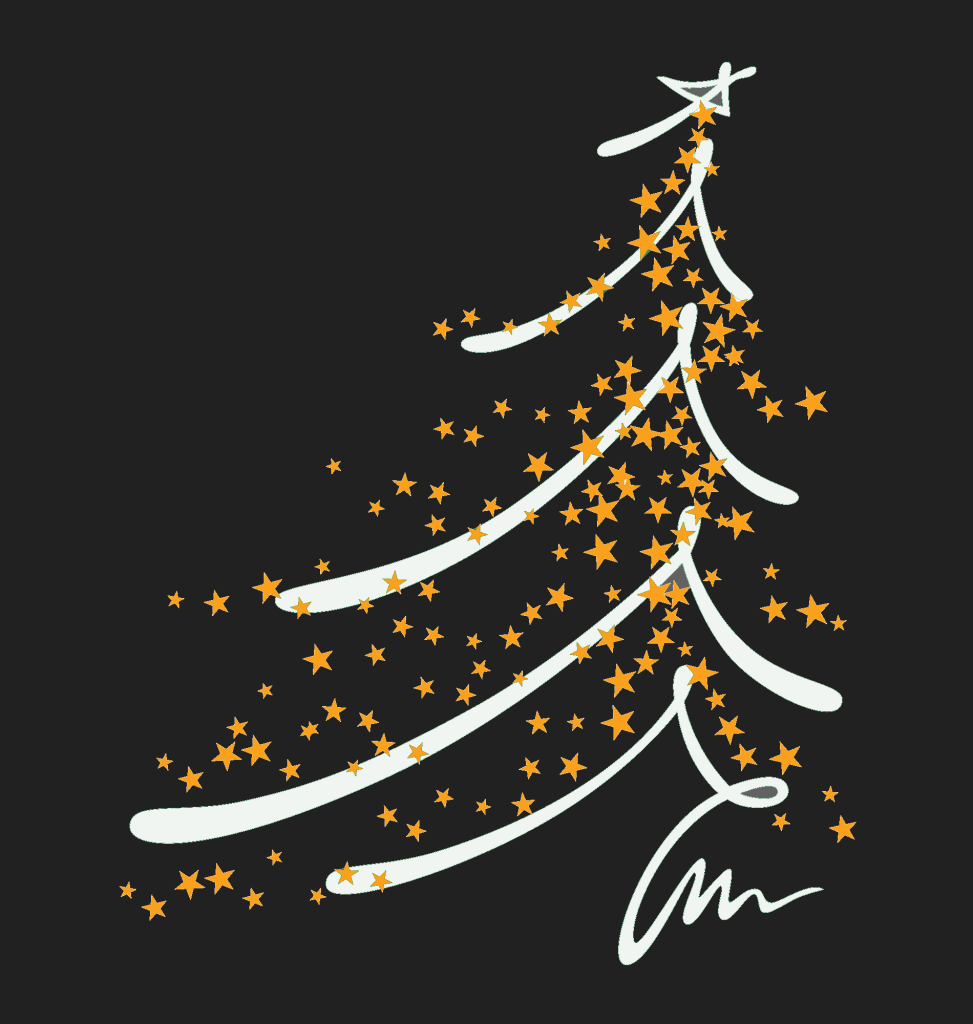
The Christmas tree vector in the corner on the back cover I used as my chapter headers:
I needed to have a little knowledge of GIMP because this is the stock photo:

I used color fill in GIMP to change the colors:
Then I placed it on the back cover.

I used the title’s script font for my author website and that was the last detail I added to the back.
Overall, I’m really pleased with how this cover came out. I haven’t seen the proof yet, but I’m hoping it’s just as pretty in real life as it is on screen.
If you want to ask me for tips, this is what I would advise you to keep in mind:
*Manipulate, Manipulate, Manipulate. (As much as you know how.) Don’t forget you can use the adjust feature in the “edit photo” tools. You can use the shadows and highlights, brightness and contrast, and black and white to adjust the colors of your photos. Zoom in and crop when you need to. Flip if you have to. Canva isn’t as flexible as Photoshop or the person who knows how to use it, but there is still a lot you can do with Canva’s tools–you just have to experiment.
*Look for similar colors between the background and your model. My cover works well because he blends in without me having to do anything to him. His black melds with the trees, and his scarf pops with the clouds/fog. Even his skin tone complements the orange lights. The colors of my text blend in–the blurb and the tagline aren’t white–they’re a light grey. Attention to detail matters.
*Don’t be afraid to try things. I went through a lot of men and a lot of backgrounds. Not everything will work, but sometimes you won’t know until you use a screenshot or download the composite photo and try. The least likely photo might be the one to make it on your cover.
*Have patience. I didn’t have patience when I created my trilogy’s covers and now I’m still paying. It takes a lot of patience to scroll through and bookmark photos you think you may want to use some day. I have over 700 photos bookmarked in my DepositPhotos account. One I “gave” to a friend because I knew it would fit her book. Put on a TV show and scroll. I have a lot of men that might one day make it onto a cover. You just never know.
*Create a steal file of inspiration. Lots of authors do this. See a cover you like, save it. You’re not necessarily going to copy it, but if you pick it apart, study the vibe, you could find elements that you could use in your own covers. That goes for fonts, too. If you like a font, save a screenshot of it. In the Book Cover Design 101 group, I bet you there will be at least one person who can identify it for you, or use a website like What the Font to get similar examples.
*Start as early as you can. All this is a process and it takes time. Like getting good at anything, you can’t expect to create the perfect cover the first time out. Also, get feedback. It hurts to be told something you made isn’t working or could be better, but you need to know that. The ultimate goal is to sell your books, not boost up your ego. (Let sales do that.)
I hope this was a helpful post. Let me know if you have any questions in the comments, and I will do my best to answer them for you!
Have a great week!

