
I’m sorry it’s been so long since my last post. I’ve been busy writing, starting a new novella series at the beginning of August and hoping to finish it this month.
I also have another reason I didn’t want to write this next blog post: I didn’t feel like I knew enough to be coaching anyone on how to make a cover. Let’s face it, the original cover to The Corner of 1700 Hamilton was a mess, and how I was ever proud of it is beyond comprehension. If you don’t remember what it looks like here:
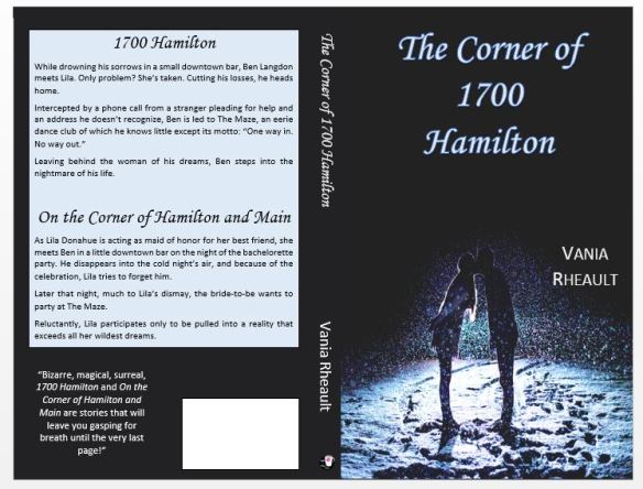
Is it the worst cover ever? No. But it’s not the best either. I hate where my name is, I dislike the picture. And what is the goofy quote on the back? No one said that to me. At the time I was going through Pixabay, I was adamant that I didn’t want to spend money on the picture (and going back to my blog on the subject you can probably tell), but when I started thinking I really needed to redo my cover and fix the formatting mistakes inside, I realized that I was going to have to find a picture. A good picture. Maybe a picture that costs a little money. Once I found a picture, things kind of fell into place for me. This is the cover I recently submitted to CreateSpace (that was accepted, squee!)
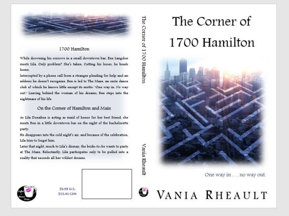
My name is better, the picture more accurately depicts what the book is about, the ghost’s quote is gone. I do have the proof back and I have to say the only little tiny mistake is my name on the spine is not 100% in line with the title. But it’s a small thing, compared to the train wreck above, I’m going to let it slide. Also, the imprint picture on the spine is a little more to the right, but I think that’s not a big deal either. Truthfully, 1700 is thin, and to fit anything on the spine and make it look good enough, is good enough for me.
Does this mean I feel more prepared to give advice, yes and no. I did get two warnings in my congratulations email. One was a warning saying my cover contained a picture that was less than 200 DPI, or dots per inch. CreateSpace wants them all at 300 dpi or there is a chance they will be printed blurry pixelated. I knew the one I purchased for my cover was 300 DPI, but I totally forgot about my imprint picture. It was only 79 DPI (I’ll tell you how to fix that later), but I fixed it so future books will won’t have that issue. (It did print fine, by the way; no harm done.)
The second warning I got from CS was a thing called transparency, that they would have to “flatten” the images and that could cause issues. When you add text boxes or layer pictures on top of each other, they “float” and in design software programs, there is a way to “flatten” all the floating images to make them one image. Rather like ironing on a decal to a shirt or jeans. Two, (or three or for or five) pictures become one. I had to look this up because I didn’t want to keep getting this error message. But I don’t know how to use any design software, (the whole reason for this blog series, really) and I will never be able to do my covers that way. I should never say never, ecause I might learn a software program or get rich enough to hire a designer, but for now, I will always do my covers in Word, and I honestly do not see a problem with letting CS do the flattening for you. You can do a search on your own for other testimonies, but with the two covers I have done, I haven’t seen an issue with them doing this. Any mistakes made have been the fault of the operator, not the machine.
So yes, I do feel a little more confident that I can tell you how to do an easy cover. I’ll end this post by telling you two things I needed. 1) I bought my picture from Can Stock Photo for $8.00. You do have to be careful when even purchasing a photo to make sure you can use it for commercial use. On this website you can, I looked up their terms of service, but if this book ever made more than $500,000 dollars, I would owe them. Not likely, but it’s always good to know. The second thing I would advise you to do is download GIMP. It is a FREE software program like Photoshop, and while it does have some nice artistic effects you can play around with for a cover photo, I use it to check DPI and to change it if necessary. That IS an issue I can control, and in the next blog post, I’ll tell you how to do it.
That’s all for now, and I hope you like the new cover!
Oh, I got the proof back, here’s how it looks:


Thanks for reading, and I hope you like the new cover as much as I do!
Discover more from Vania Margene Rheault
Subscribe to get the latest posts sent to your email.


Looks awesome! Much improved. Now all the people that have the original cover have a special collector’s item!
LikeLiked by 1 person
Thank you! It does look a lot better.
LikeLike
Don’t worry about the “transparency” warning. CreateSpace *always* says that, no matter what you do. It’s a bogus warning message. I think the maze is super cool and it fits so well with both the plot and the mood of the book.
LikeLike
Thank you! As a newbie, any warning can be a bit disconcerting. And I got the warning for the inside too, probably because I have text boxes for my imprint pic on the title page and my author picture in the back.
LikeLiked by 1 person