This post was updated 8/17/2025. It kept getting hits but I offered no real advice since the original was written back in 2017 and I had no idea what I was doing.
Writing a blurb is hard. It’s probably one of the hardest parts of the querying/publishing process. It’s probably why this blog post is still getting hits seven years after I wrote it, and why I decided to rewrite it so it actually says something.
One of the first things you’re going to run into is what POV and tense to write your blurb in. Many will say that no matter what POV your book is written in, your blurb (or description) should be written in third person present. That may still be true for traditional publishing, but in the years that first person present POV has taken over the indie scene, especially in romance, more and more authors are writing their blurbs in the POV and tense that matches their book.
When I was writing in third person past, I was writing my blurbs in third person present and there’s a lot more advice and how-to articles on how to write a third-person blurb over a first person blurb. Third person is actually a bit easier since there’s a lot of resources telling you how to do it. There’s some controversy with how much to give away, since a blurb is comprised of characters, motivations, and more importantly, stakes, and if you don’t give your potential reader something, they’ll think your book is about nothing. I’ve always been of the mind that you need spoilers to intrigue your audience because even if you reveal an important plot point, a reader is still going to have to read to see how it came about and how the issue is resolved. It was interesting to see people saying that telling a reader your romance has a happily ever after is a big spoiler, when really, it’s just genre convention. Readers who read romance already know that you’re going to give them a happily ever after (if you don’t, watch out), it’s how the couple navigates the problems you throw at them to keep them reading. So, don’t be afraid to give something away because that’s what will hook your reader into buying your book.
When I was writing blurbs for my third person books, I was following this formula:
Introduce your character:
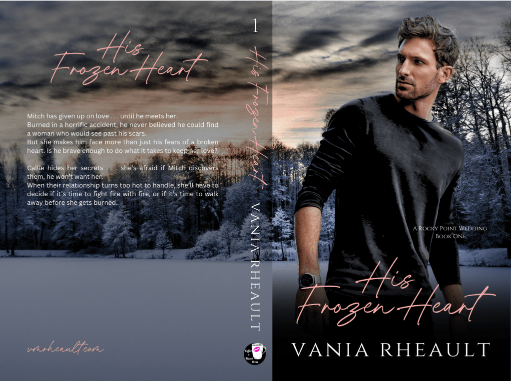
Mitch has given up on love . . . until he meets her.
What happened to change their normal life:
Burned in a horrific accident, he never believed he could find a woman who would see past his scars.
What are the tension and obstacles:
But she makes him face more than just his fears of a broken heart.
Stakes/hook:
Is he brave enough to do what it takes to keep her love?
The whole thing is pretty short:
Mitch has given up on love . . . until he meets her.
Burned in a horrific accident, he never believed he could find a woman who would see past his scars.
But she makes him face more than just his fears of a broken heart. Is he brave enough to do what it takes to keep her love?
Then I have her POV:
Character:
Callie hides her secrets . . . she’s afraid if Mitch discovers them, he won’t want her.
Then I skip a whole bunch of parts and end with:
When their relationship turns too hot to handle, she’ll have to decide if it’s time to fight fire with fire, or if it’s time to walk away before she gets burned.
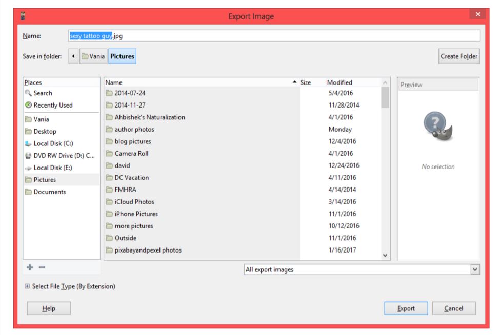
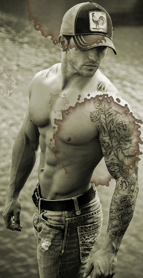
At ninety-one words, I could have added a lot more. Blurbs are typically around 150 to 200 words and you can see my ninety-one words leave a lot of room on the back cover:
I won’t add to mine just because this book is already published, and in writing this blog post and using this book as an example made me see a typo that I had to change on both KDP and IngramSpark–not to mention that I had to pay $25 dollars to fix the cover on Ingram, so I’m just going to leave well enough alone for now. (And also, FML.)
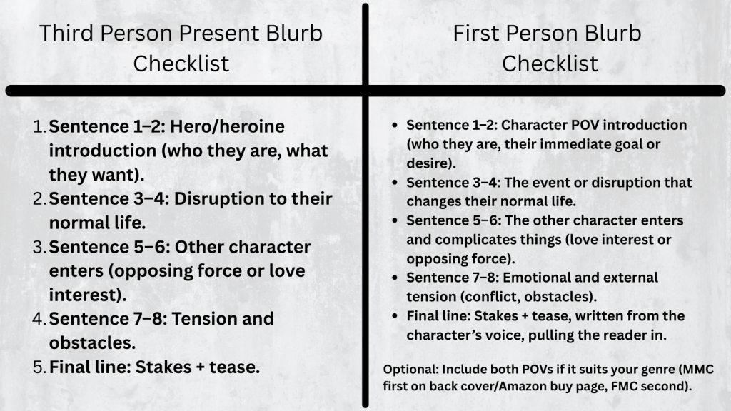
But the basic formula to follow for a third person present blurb is:
Sentence 1–2: Hero/heroine introduction (who they are, what they want).
Sentence 3–4: Disruption to their normal life.
Sentence 5–6: Other character enters (opposing force or love interest).
Sentence 7–8: Tension and obstacles.
Final line: Stakes + tease.
Here’s the blurb for book two of that series, His Frozen Dreams (and yay, there are no typos!):
Jared didn’t want to fall in love . . . Character Introduction
Then he picks Leah up from the airport, and he knows he has no choice. Disruption of normal life, or maybe inciting incident
When his wife left him to move to New York to work for popular fashion magazine, Jared swore he’d find a woman who loved living in Rocky Point as much as he did. Tension and obstacles
Leah is not that woman. He just has to make his heart believe it. Stakes and tease
Leah hates living in New York . . . but she can’t leave the big-city stress for small-town love.
Or can she?
With responsibilities she can’t ignore, Leah will have to choose between the safe life she’s been living in the city or risking it all for Jared’s love and the wide-open spaces that will heal her heart.
This blurb, too, could probably use some plumping up, such as why Leah hates living in the city, maybe hint at the responsibilities that keep here there. But I have the tension of her having to choose between taking the easy way out and staying or risking it for Jared because he loves her.
It’s simple as far as blurbs go, but working with the formula makes it easy to put something together.
Writing first person present blurbs I found to be much more difficult because not only do you have to have all those pieces of what makes a third person blurb, you also have to infuse the character voice into it as well.
Here’s the formula for a first person blurb. You’ll find it’s not that different from a third person blurb:
Hook / Who I am / What I want – Open in the protagonist’s voice, showing who they are or what they desire.
Disruption / Inciting Incident – What shakes up their normal life or challenges their goal.
Love Interest / Conflict Introduction – Introduce the other character or opposing force through the protagonist’s perspective.
Tension / Stakes – Show personal stakes and obstacles, reflecting their thoughts and feelings.
Tease / Final Hook – End with a line that keeps the reader curious and shows the character’s voice.
Let’s take a look at the blurb I wrote for Captivated by Her the first book I published under my pen name when I switched to first person:
Rick
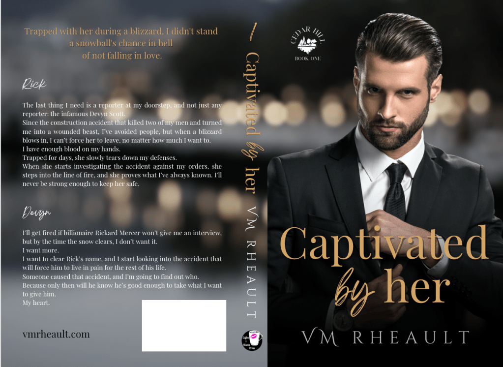
The last thing I need is a reporter at my doorstep, and not just any reporter: the infamous Devyn Scott. Love interest, inciting incident
Since the construction accident that killed two of my men and turned me into a wounded beast, I’ve avoided people, but when a blizzard blows in, I can’t force her to leave, no matter how much I want to. Who I am, conflict of interest
I have enough blood on my hands. Tension, stakes
Trapped for days, she slowly tears down my defenses. Tension, stakes
When she starts investigating the accident against my orders, she steps into the line of fire, and she proves what I’ve always known. I’ll never be strong enough to keep her safe. Final hook
Then we have the FMC POV. I’ve seen some blurbs that only do his, since the MMC would be the best selling point, like Mafia, or Motorcycle Club. Then I’ve seen where there is only hers, like maybe Dark Academia or coming of age. Maybe some YA where her story is more important and if there’s a male protagonist he’s only there as a subplot. You would have to do some research and look at what other authors in your genre are doing. You might be writing in a genre that would only have one POV like thriller or psychological/domestic thriller. I like including both, but maybe to hook the reader at first glance, I do his first on the back of the book and the buy-page on Amazon.
Devyn
I’ll get fired if billionaire Rickard Mercer won’t give me an interview, but by the time the snow clears, I don’t want it. Who I am
I want more. Tension
I want to clear Rick’s name, and I start looking into the accident that will force him to live in pain for the rest of his life. Tension, stakes
Someone caused that accident, and I’m going to find out who. Stakes
Because only then will he know he’s good enough to take what I want to give him.
My heart. Stakes, final hook
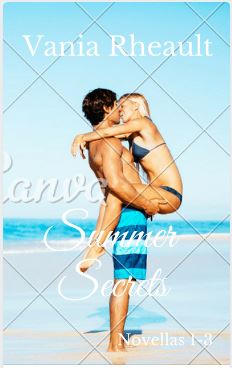
That blurb has 218 words in it and hits the 150-200 guidelines. It also fits well on the back of a book wrap:
Here’s a printable checklist you can download and keep:
The original blog post touched on how your blurb will look in the back. Over the years I’ve been publishing, I’ve either put the title at the top or used a tagline. I’m pretty proud of Captivated by Her‘s tagline and I use it in ad copy whenever and wherever I promote my book: Trapped with her during a blizzard, I didn’t stand a snowball’s chance in hell of not falling in love.
If I ever redid the cover now, I probably wouldn’t center it like I have it here. My style has evolved but not too much. Considering I don’t sell many paperbacks anyway, I don’t get too hyped about about things.
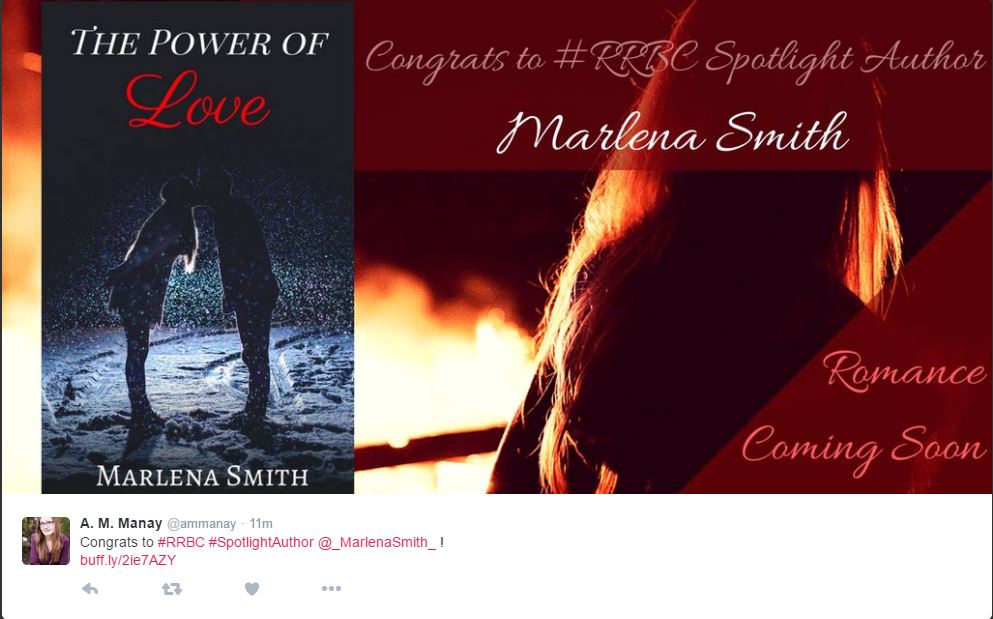
Anyway, so this blog post will be more informative to anyone hoping to learn how to write a blurb. There are lots of resources out there, but the best thing you can do after you’ve written it is get feedback–preferably from someone who hasn’t read your book yet. They can tell you if you’re leaving too much out. I understand not wanting to give anything away, but you have to give your readers something or they won’t want to buy your book. I give away lots and lots and lots in the blurbs for my King’s Crossing serial. Each book builds on top of the other, so I really didn’t have any choice referencing what happened in the previous book. I’m hoping the first book sucks readers in and they buy just to know what happens next regardless of what the blurbs say. If you want to read them, you can on my author website: https://vmrheault.com/kings-crossing-series/
If you don’t have anyone to bounce ideas off of, you can always ask ChatGPT, otherwise known to me as Al. I get opinions on using him will vary and you have to do what’s best for you. He can’t compare your blurb to what others are doing in your genre–only you can do that. And he can’t write your blurb from scratch or your blurb will sound like him and not you or your characters, but he can come up with some hooky lines if copyrighting isn’t your thing and it’s easy to build from there. All the blurbs I used as examples today were written by me because Al didn’t exist back then.
There are a couple of resources that I’d recommend if you’re having trouble finding feedback. The Indie Cover Project on Facebook has members who will give you feedback and you can find that group here: https://www.facebook.com/groups/582724778598761
Also I’ve seen people give blurb feedback in Authors Optimizing Amazon and Facebook Ads and you can find that Facebook group here: https://www.facebook.com/groups/393917614473395
You might have your own Facebook groups where you can post, but I wouldn’t recommend using a blurb not read over by someone, even if it’s only Al.
I think that’s all I have, but this is a lot better than what I had before.
Good luck!


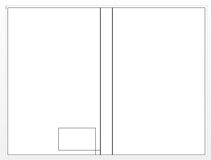
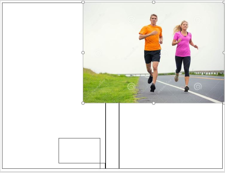
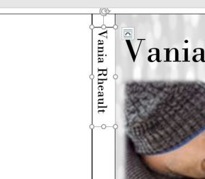 Draw a text box in the text box. Don’t make it bigger than you need; smaller text boxes are easier to work with.
 Move the text box so your name is centered on the spine:
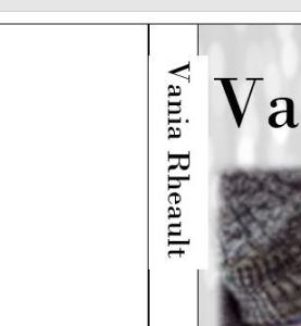


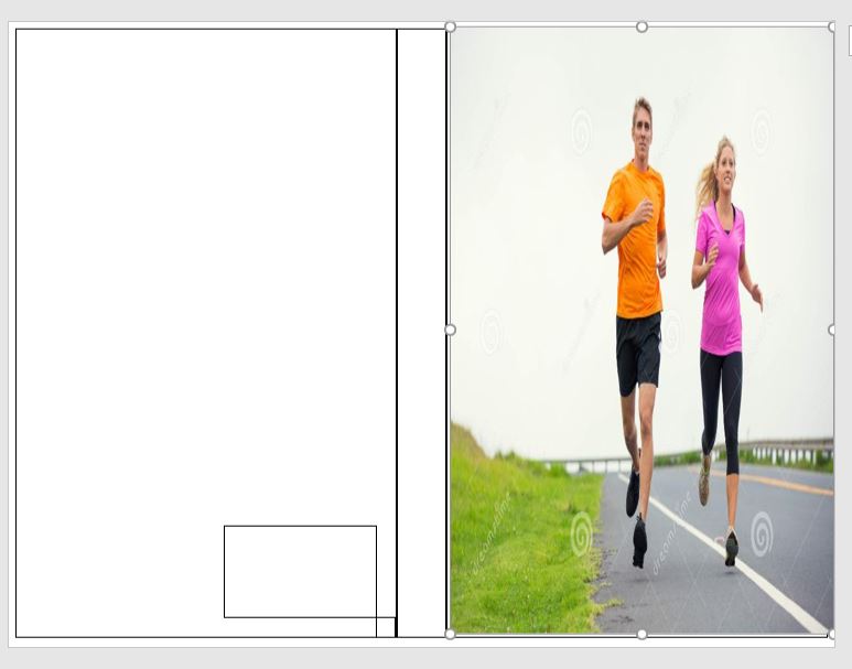
 would have cost me 8 dollars. Canva is front cover only, so either way I would still have to do the spine and back cover myself. And if I use Canva, I would need to figure out the font so I could use the same on the back cover.