How to make a quick and easy floral romance cover (with screenshots)

2,556 words
14 minutes read time

**This is a short tutorial on how to make a simple floral cover, full paperback wrap in Canva.

I have Canva Pro and use elements from that plan. I’m not sure what’s available in the free plan, but I’m hoping you can find comparable elements so you can also make your own covers if you ever want or need to. I also source my stock photos from DepositPhotos. You can use photos from wherever you want, but because they’ll be going on a book cover, I wouldn’t use free stock photos from places like Unsplash or Pexels. If KDP happen to ask you for copyright proof, they do not accept Canva’s copyright agreement if you use their stock photos, so always be safe and buy the stock photos you’re going to use on your books. Elements are fine to use as long as you’re not attempting to use one element for the entire cover. Here’s Canva’s licensing agreement FAQs if you want to look them over: https://www.canva.com/licensing-explained/ There’s a lot of incorrect information out there. Don’t be afraid to use Canva. Just be smart when you do.


I’m a broke and impatient author. And when it comes to publishing, I know many authors are just as broke and impatient as I am. Meaning they can’t afford to hire out but don’t want to wait to publish while they save. Maybe they don’t even have money to save, if they live paycheck to paycheck like I do.

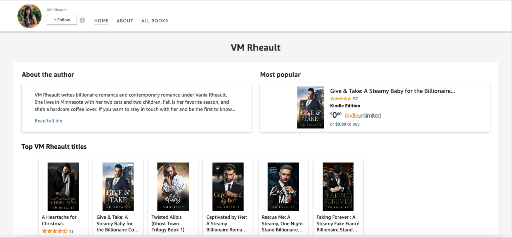
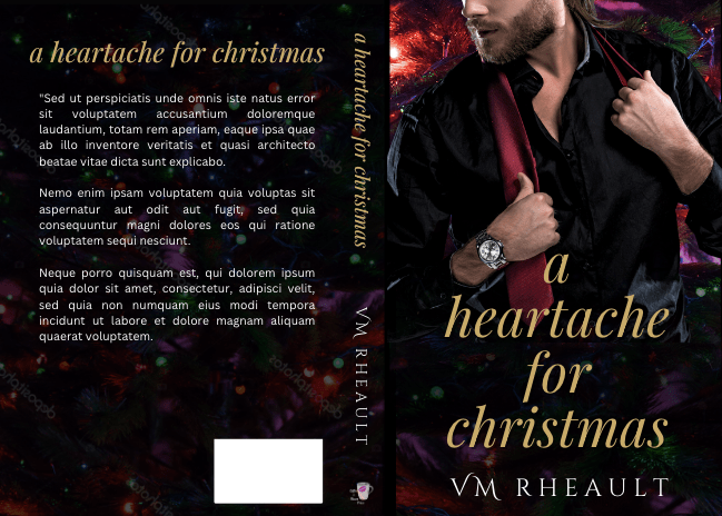
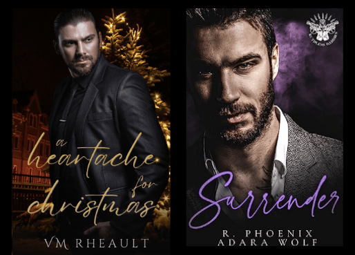
I’ve done my own covers, for good or for ill, for many, many years. Every year I get a little better, or maybe stock photo choices get better, or maybe I stumble upon a male model that hasn’t been used to death. I’m especially proud of the covers for Wicked Games and A Heartache for Christmas. Loss and Damages is fine too, but I didn’t need nearly the luck that helped me put Wicked Games and A Heartache for Christmas together.

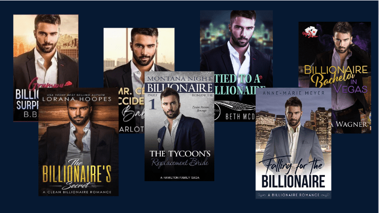
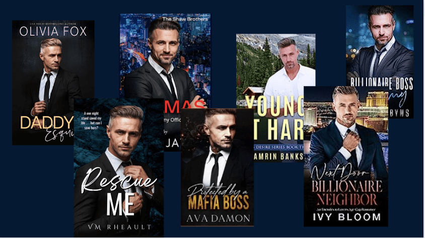
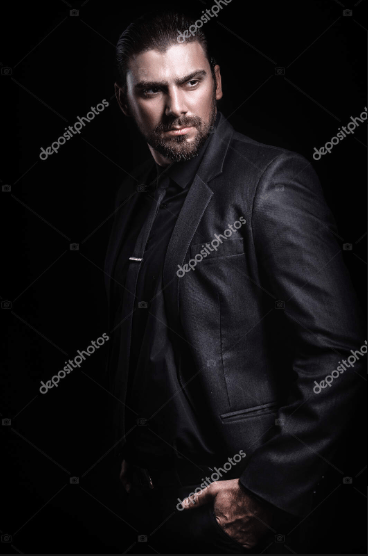
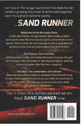
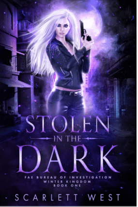
But I know that not every romance author wants to use men on their covers. What’s popular will come and go, and if I do come across a male model on a published book these days, a lot of the time he’s AI generated. I don’t want to use AI to make my covers. I want to pay photographers and models. Maybe they’re living paycheck to paycheck too. Anyway, right now I see a lot of illustrated covers, but I don’t plan on using one for my books anytime soon. Florals or object covers seem pretty versatile, and not even just for dark romance. I think some authors still use them for discreet paperbacks while using a shirtless male model for the ebook, but I’m actually seeing less and less of that. I’m not sure if it’s cost or if it’s just a trend that’s fading, but I’m glad. I never liked it and never did it myself. (Be proud of your men! LOL)

If you don’t have a lot of skill, you have to keep two things in mind when doing your own covers: choosing the right stock photo and what font you use. Those two things will make or break your cover because you won’t be able to use the skill you don’t have to make the stock photo better than it is or twist it to suit your needs, and font is the finishing touch, like a pretty bow on a present. So it’s really important that you know what you want and that what you want matches your skill level or you’ll just end up frustrated. It’s not much different from crafting the perfect scene in your head and then sitting down to write and forgetting the alphabet.

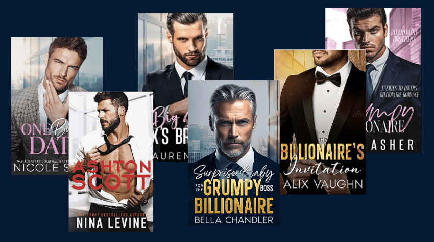
The first thing I would do is clock your genre. What your genre is and what kinds of covers are selling right now. It doesn’t hurt to take a look at the top 100 on Amazon in your genre not only for inspiration but to remember their readers will be your readers and you want to blend in. Then look at the author. If it’s a big name author like Colleen Hoover, looking at her covers probably won’t do you too much good. She sells with her name, not her covers. Same with some of the bigger indies, or indies who have picked up book deals. They already have a fan base and can get thousands of pre-orders without even having a cover yet. The midlist author who’s making a good living but not well-known enough to have name recognition will be your best bet.

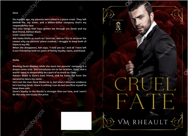
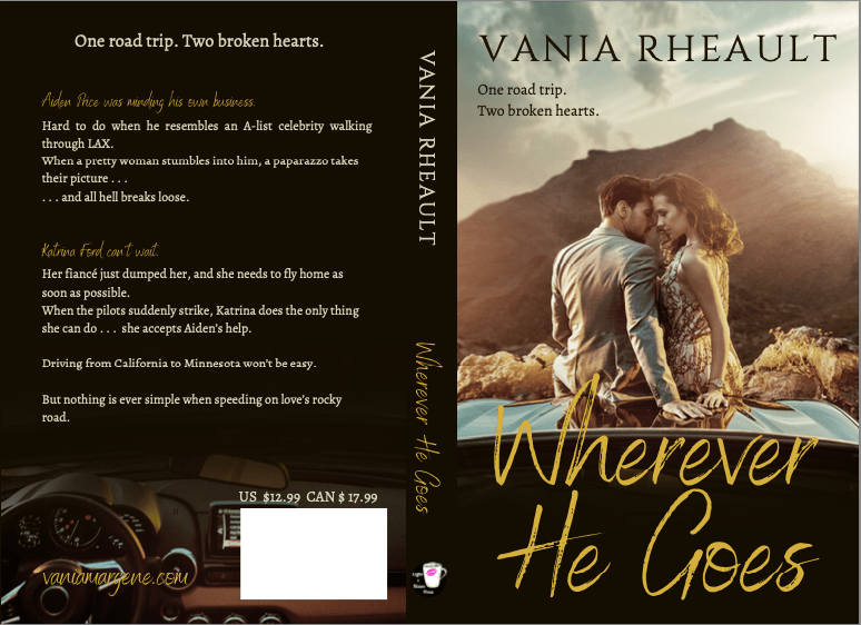
That said, let’s figure out what the book is about. Maybe an enemies to lovers. Something that would fit a simple floral cover. We aren’t going to get too crazy because the purpose of a “simple” cover is to a) still be good enough to keep because you’re stubborn like I am and want to do it yourself or b) stay as a placeholder until you can afford something better if that’s what you want. You may always do your own covers and swap this one out as your skills get better. So, maybe a romance that would fit a dark floral cover. A standalone, possibly, but if you’re writing a series, finding similar stock photos for other books wouldn’t be too hard. Once you get into the right search, you can find a lot of similar pictures on DepositPhotos.

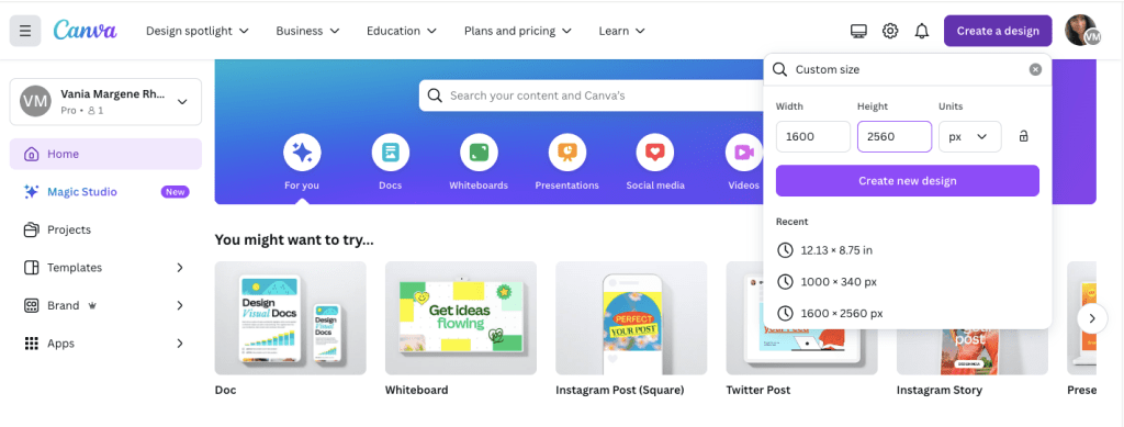
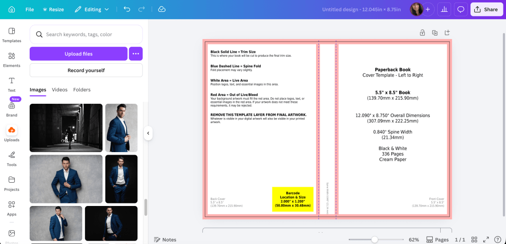
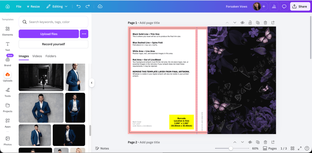
Let’s start with a blank template. We’ll do the full wrap since it’s easier to design the whole thing at once. I’m using Canva Pro, but because you’ll be using stock from a site like DepositPhotos and a font from somewhere like Creative Fabrica or a free source like 1001 Fonts, you can probably do your cover just fine with the free plan. If you don’t know how to get here, I have the instructions in a different post.

canva screenshot of empty kdp template for 5.5x8.5 paperback book

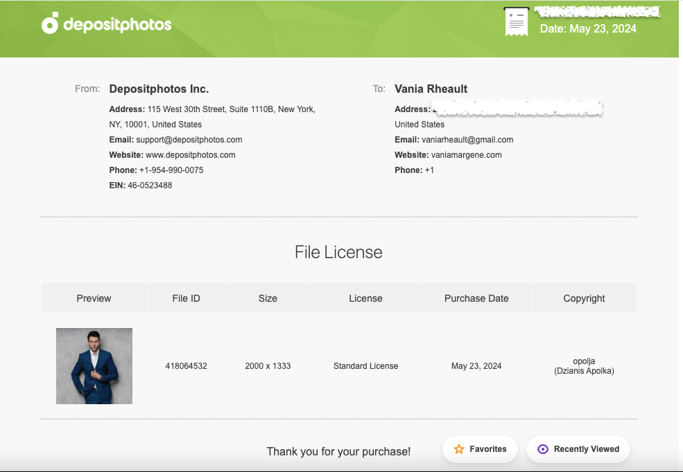
Next, go through photos on your stock photo site. I buy packages from App Sumo for DepositPhotos so that’s where I’ll always source my stock photos. What you’re looking for is something that will give you room for a title, maybe a series logo if you want. Also your author name. If you take a look at other floral covers, you can pick them apart and see what they have that’s similar. Before spending the money or credits on the photos, you can download the sample or use a screenshot of the picture first to try it. Then if you know for sure that you’re going to use it, you can buy it.

canva screenshot with purple flower photo on top of kdp template

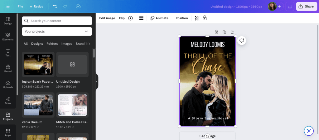
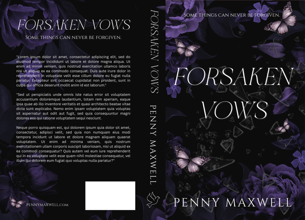
I chose some dark purple flowers. (I’ll link the photos below so you can find them easily if you want.) I like how they’re positioned. I don’t have to worry about making room in the middle for the title. They are a little dark though, so play with the brightness of your photos. You should bring out the color a little bit because when you print through KDP, their paperbacks are always darker than what you see on your screen.

canva screenshot of front cover with floral graphic on top of kdp template. the flowers are lighter compared to the previous photo

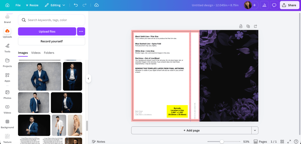
Okay, I brightened it up. You might not be able to tell I did much, but always do enough so you like it, and always order a proof. You’ll probably need to adjust the colors again once you see it in person.

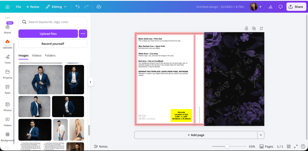
If you wanted to add texture like broken glass to the middle now would be the time. I’m not quite sure if it really needs it, but let me play and see what I can come up with. I wouldn’t bother using more stock for this. Canva will have something that will work and using their elements on your book cover is okay. It will barely be detectable, but it’s the little things like that that separate something that looks DIY from something that borders on professional.

I was able to find some broken glass in Elements that fit nicely since they were already on a transparent background:

floral cover with shattered glass in elements with arrow that author chose to go on the cover

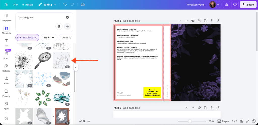
Position the glass where you want it. Remember you can play with photo by making it bigger or moving it around so you can put the glass shards where you want them to go.

canva screenshot of floral graphic on top of kdp template

Now that we have a “base,” if you wanted to add things that pertain to your book, you can discreetly put those in. Rings or strings of pearls. Ribbons. Whatever. I’ve seen a lot of covers with butterflies, though I have no idea what they represent. Innocence, maybe. I found one style I liked in Elements and messed with their color a bit to make them blend in.

canva screenshot of front cover on top of the kdp template with partial butterfly placement. also to the left is the element selection featuring the butterfly chosen for the cover.

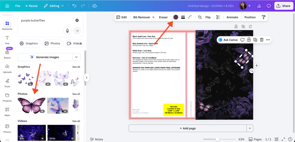
I don’t want to add too much, so the glass and the butterflies will do for me. Part of learning how to design covers is experimenting, so just keep at it until you find what you like. When you don’t know what you’re doing or haven’t developed your eye yet, simpler is always best. It’s really easy to add too much then it looks like Canva threw up all over your cover.

canva screenshot of KDP template. only the front cover with the graphic plus butterflies and glass is shown

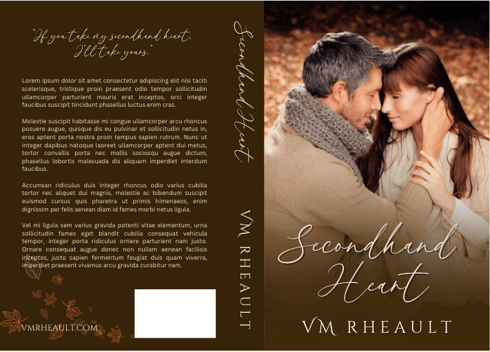
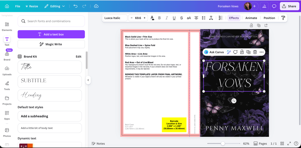
Now we can have fun with font. A bad font can ruin your cover. I’ve seen beautiful art, and a cover just isn’t the same if you can’t find something that will complement the illustration or stock photo and the book as a whole. I think for this one, rather than edgy, we’ll go with elegant. There aren’t any skulls or anything here, so let’s stick with something pretty. I get my fonts from a combination of places. Sometimes I use Canva’s, sometimes I buy from Creative Fabrica. Sometimes I use 1001 Fonts depending on if what I like is available for commercial use (sometimes they’re tagged as personal only). There are lots of places to get fonts. It doesn’t matter where you get them as long as they’re available for commercial use.

For this one, I went through a few before I found one I liked. It’s called Luxca Italica and it came with a bundle I downloaded from Creative Fabrica. The font for the tagline and Penny’s name is Cinzel. I think you can get that anywhere. I’ve read that you shouldn’t use more than three different fonts on your cover. I like to stick with two if at all possible. But I can understand if you need a clear font for the tagline, then your pretty font for the title, and then whatever you use your author name. I use the same font on all my books for brand awareness.

canva screenshot with front cover text for tagline, title, and author name

back cover and spine show KDP template

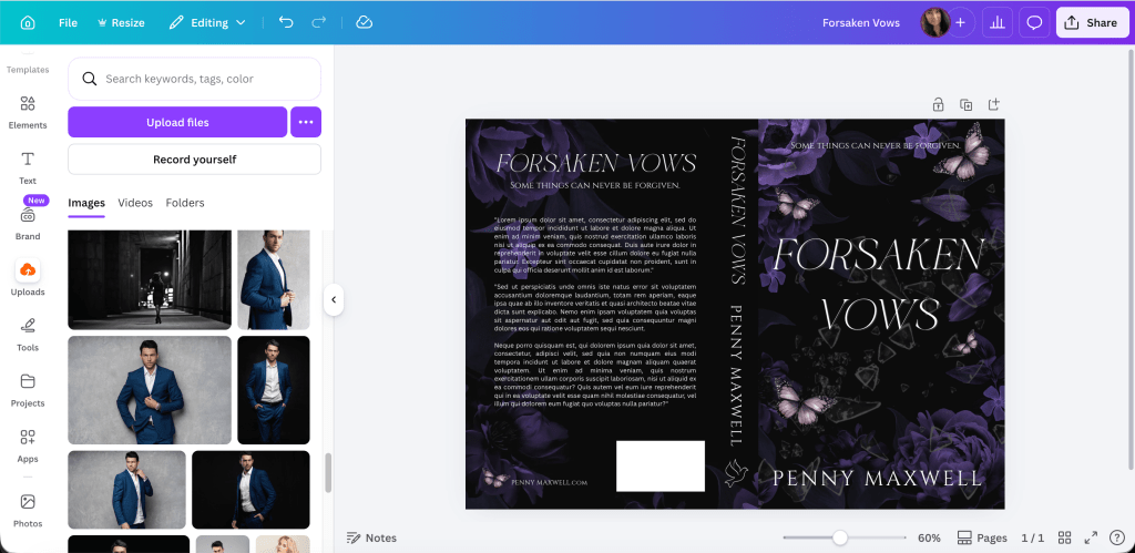
What this means, though, is that since we’re doing simple, that if you found the fonts you like, then you’re done with the front cover. Now we can do the spine and the back.

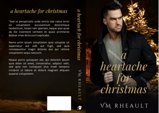
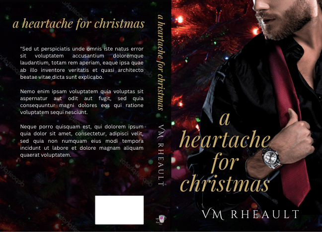
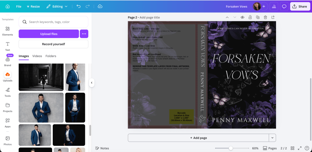
The back cover graphic will mirror your front, but you probably don’t need to copy it exactly. Especially since you want people to be able to read the blurb you’re going to put back there. What I did was duplicate the flower picture but then cropped it and made it fit the rest of the template. That way there will be plenty of black space for the words.

canva screenshot of completed front cover but blank spine and back cover. only the floral graphic is shown

Lower the transparency so you can fit the title and author name on the spine. The orange lines are the bleed lines. Don’t get too close to those. I also chose a dove just as a filler in case you have an imprint logo that you use.

canva screenshot of full wrap with transparency lowered on spine and back cover

Keep the transparency low so you can center your blurb. You don’t have to put the white rectangle over the yellow one if you don’t want to. KDP and Ingram Spark will fill that space in with the barcode. If you’re using your Ingram cover for Draft2Digital, they don’t like the white rectangle and will kick your cover back to you anyway.

I never know what to put in the lower left, so most of the time now I just add my author website. It seems to work okay. For this one, I added a butterfly that matched the front cover.

canva screenshot of full wrap of forsaken vows but with back and spine transparency to show font placement

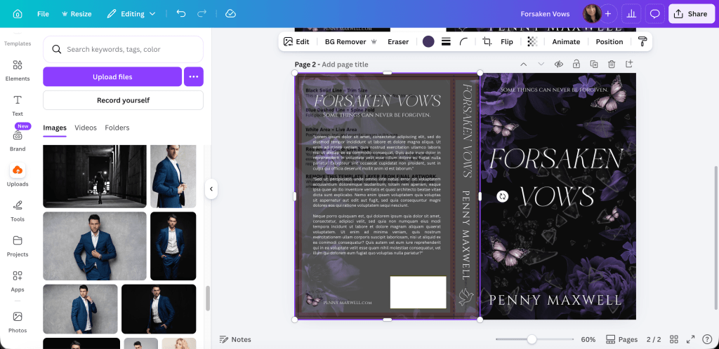
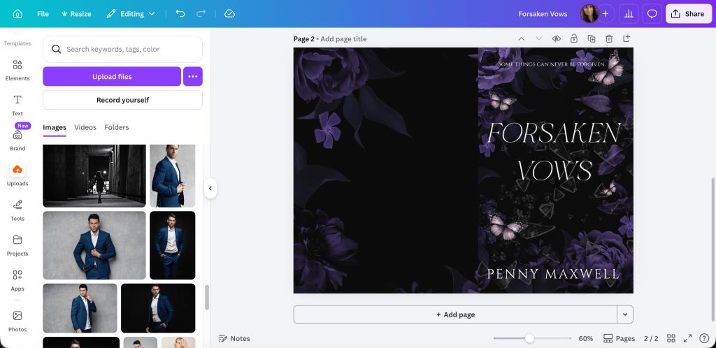
Now you can remove the transparency and look at the cover as whole.

canva screenshot of the full wrap for forsaken vows

If you’re not sure how it will look as an ebook cover or in promos, take a screenshot of the front cover and use a site like this one: https://diybookcovers.com/3Dmockups/#

“Dark romance book cover mockup for Forsaken Vows featuring deep purple florals, butterflies, and cracked glass over a black background.”

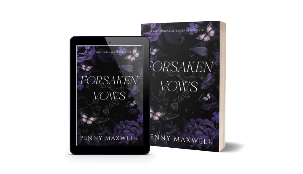
I think it looks really good, actually. Not bad for something I put together in a few minutes for not much money. The title font is clean and what we added to the flowers (glass and butterflies) doesn’t clutter.

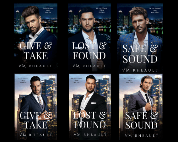
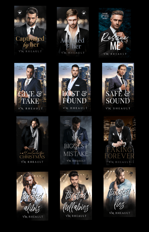
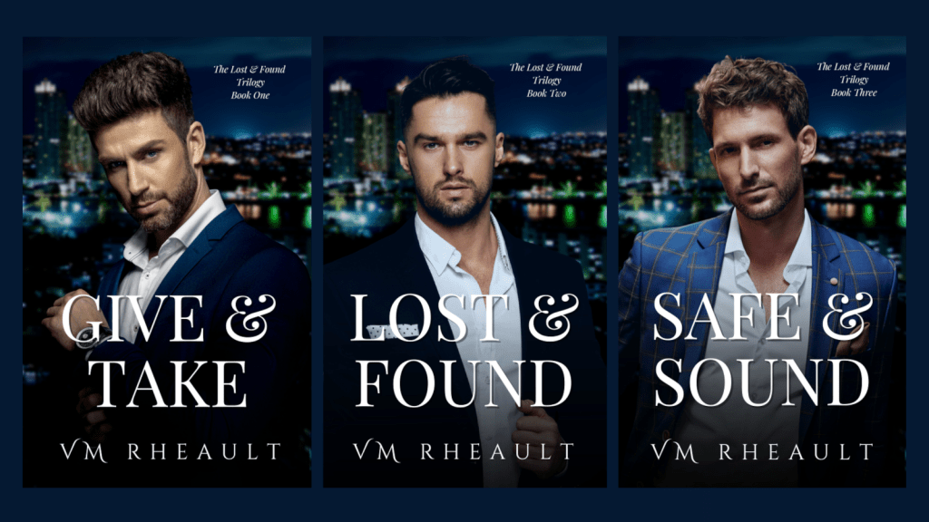
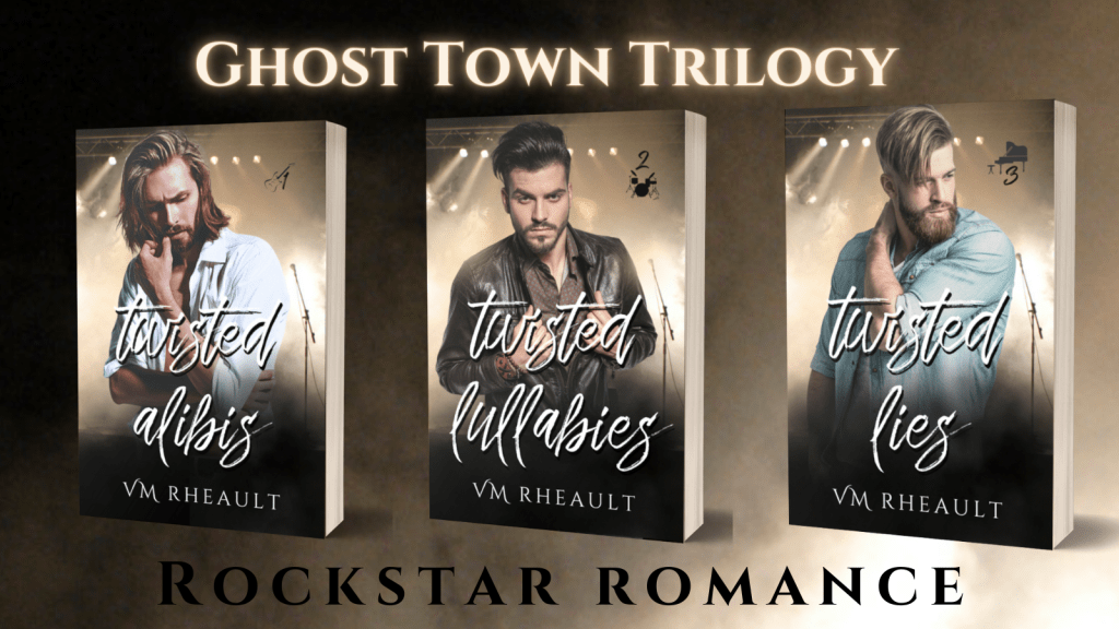
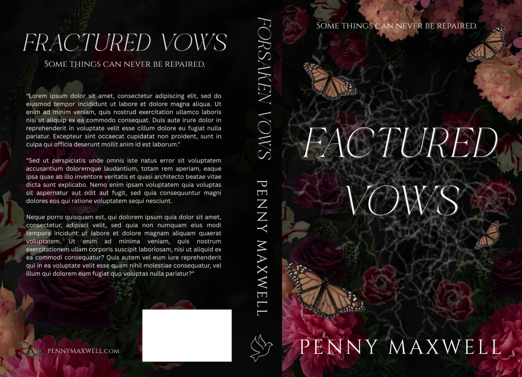
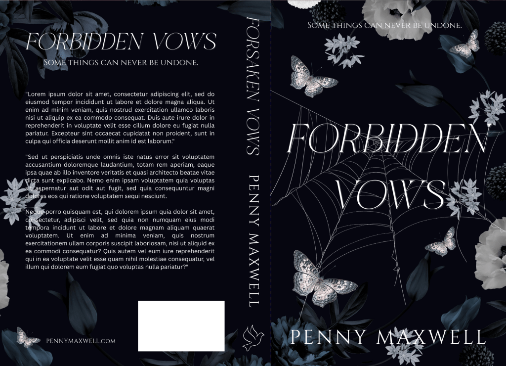
Now that you have a template of sorts, you can make covers for a series if that’s what you’re planning. I write all my books in a series first and design their covers at the same time.

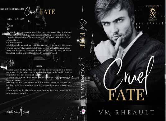
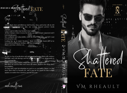
This could be a trilogy:

Mockup of The Broken Vows Trilogy by Penny Maxwell featuring Forsaken Vows, Fractured Vows, and Forbidden Vows displayed on tablets and paperback books.

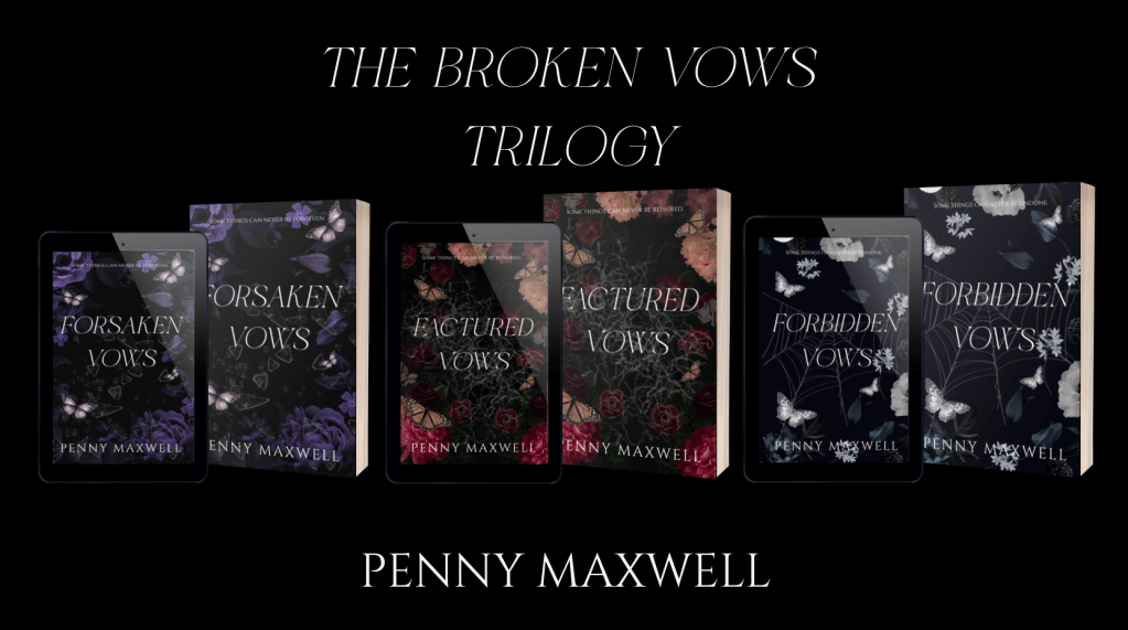
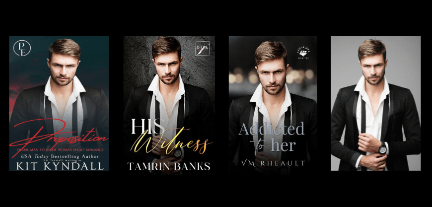
And here they are up close if you want to study them:

Here is the TL;DR of the post:

1. Look for flower graphics that have an empty middle for extra elements and title. You can start here if you purchase on DepositPhotos: https://depositphotos.com/similar-images/794277310.html

And here are the links for the individual photos:
Purple: https://depositphotos.com/photo/luxurious-blooming-garden-flowers-black-background-beautiful-peonies-bouquet-plum-799937840.html
Orange and red: https://depositphotos.com/photo/vintage-floral-card-garden-flowers-peonies-roses-tulips-rhododendron-leaves-521122292.html
Navy blue and white: https://depositphotos.com/photo/navy-blue-white-peonies-assorted-flowers-full-bloom-floral-gothic-797688972.html

2. If you’re doing a series, plan your theme. The middle elements for these books are: broken glass, shattered ice, and spider web. Keep extra elements the same as well. I chose butterflies but picked colors that blended in with the flowers. If you want to go creepier, you can do moths, insects, or birds.

3. Don’t be afraid to experiment and adjust your stock photos. Move the flower pictures around to position them in the way you want. You can even crop and just add only sections of the pictures. With the black backgrounds, as long as you’re not cutting off flowers mid-petal, you won’t be able to tell. Also colors. I changed the colors of all three butterflies. To make the black spider web pop against the already black background, I inverted the colors (an option in the edit menu when the photo is selected) and turned the black web white. Voilà.

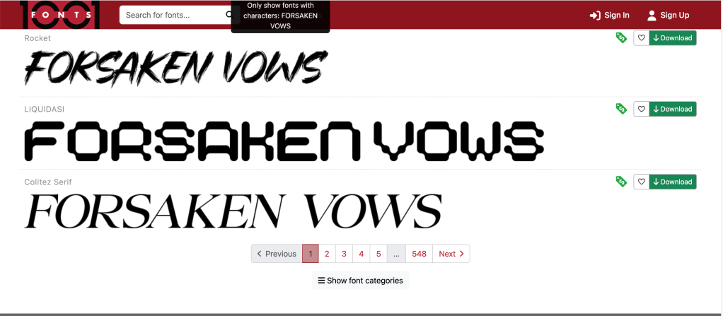
4. Take your time choosing the font. I went through about twenty fonts before I chose. Just click down your list to see which one looks best. If you don’t have very many, 1001 Fonts that I linked to above lets you try out your title before you download it. Colitez Serif looks like it would be a nice fit too, and it’s free for commercial use.

screenshot of 1001 fonts website. three different fonts in this view

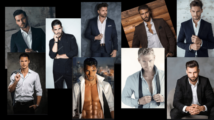
5. Remember to look at what’s selling in your genre now. Covers with men on them are really easy to create too, easier than floral covers. So even though cover trends change, it helps to know what’s selling at the moment.

6. Test and get feedback. Adjust if you have to. Maybe the photo isn’t right. Maybe you need to pick a different element for the middle.

7. Keep it simple. One or two elements and three fonts maximum. If you haven’t developed your eye, it’s easy to bog down your cover.

I hope this blog post helped you a little, or at least inspires you to try your own floral covers.

Good luck!


Quick Links:

My Canva full paperback wrap tutorial: https://vaniamargene.com/2022/06/13/updated-creating-a-full-wrap-paperback-book-cover-using-canva-plus-more-screenshots/

How to make an ebook cover from your full paperback wrap: https://vaniamargene.com/2024/09/09/how-to-turn-your-books-cover-full-wrap-pdf-into-an-ebook-cover/

Creative Fabrica for fonts: https://www.creativefabrica.com/

1001 Fonts: https://www.1001fonts.com/free-for-commercial-use-fonts.html

The DIY book cover mock up generator by Derek Murphy: https://diybookcovers.com/3Dmockups/

Didn’t Know What to Write About This Week

I tried four different times and started four different blog posts and nothing sounded right.

I came up with something Saturday night that was actually pretty unhinged and not like me at all. My gut told me not to publish it, and at the last minute, listened to my intuition (writing this on Sunday night at 9pm). Don’t need you all to think I’m losing my mind.

For now, if you’re publishing this summer and need some help, I have a few tutorials that will point you in the right direction:

I recently updated (like a couple days ago) how you can make a full paperback book wrap in Canva:
https://vaniamargene.com/2022/06/13/updated-creating-a-full-wrap-paperback-book-cover-using-canva-plus-more-screenshots/

Once you have that, you can make an ebook cover, and you can read how I do it here:
https://vaniamargene.com/2024/09/09/how-to-turn-your-books-cover-full-wrap-pdf-into-an-ebook-cover/

If you’re planning on publishing on IngramSpark, I talk you through it here:
https://vaniamargene.com/2024/03/18/an-ingramspark-tutorial/

That’s all I got, but it feels safer than what I was going to publish. I’ve felt good, just maybe trying to find some balance with living life now that I’m feeling better and where writing fits into all that with how the publishing industry is. I certainly don’t want to say anything I’ll regret.

Anyway, have a good week, and hopefully I can come up with something better next time.

How to turn your book’s cover full wrap PDF into an ebook cover

I’ve gotten a few questions about this, and I guess maybe I was remiss in not typing out the instructions before now.

In all honesty, I’ve been doing it the hard way, importing the PDF into GIMP, cropping out the back cover and spine, adjusting the DPI and size, then downloading the JPG file. When someone asked me in the comments of my updated full wrap post for instructions, I didn’t want to direct them to a software they might not have. My full wraps are made in Canva, so should the ebook covers.

So, I messed around a bit, figured it out, and to my surprise, found it was easier than using GIMP anyway.

For the screenshots, I used Melody Loomis’s cover for her book, Thrill of the Chase. I designed the cover, so I already had access to the PDF and she gave me her permission to use it.

Here you go:

Click on Create a Design.
KDP’s guidelines for an ebook cover are 1600 x 2560 pixels. Click on Create a Design and click on Custom Size. Enter in the pixels, like this.

Click Create New Design.

Next, you can either upload your book’s PDF or check your Projects folder. It will already be there unless you’re doing an ebook cover for someone else. The first time I uploaded a PDF I was really confused and kept thinking I was doing something wrong. So either way, your Projects folder is where you’ll find the PDF. I’m using Melody’s Draft2Digital cover, and it’s at the top because I uploaded it for this post.

Click on it so it’s laying on your empty canvas.

Click the cover to select it, if it isn’t already, and crop off the back cover and the spine.

Now grab a corner and enlarge it. At this point, just play with it until it fits the canvas how you want it. It won’t fit 100% and you’ll lose just a tiny bit on the sides, but it’s so little you won’t notice.

Click Share and Download.

Choose JPG because KDP won’t accept a PNG. If you have Pro, scoot the quality up 100.

Save it in a place and under name you’ll remember.

It will save in the correct size and DPI and you won’t have to do anything else to it.

That’s it. I should have written this out a long time ago, but I never thought to. Anyway, it’s simple enough to do and I should have been doing it this way from the beginning. After that reader posted his or her question, it did get me to thinking about it, and now I’ll never use GIMP to make ebook covers again.

If you have any questions, drop them in the comments below, and I’ll answer them to the best of my ability.

Thank you to Melody Loomis who let me use her cover, and if you’re interested in her Storm Series, you can follow her author page and check out her books here: https://www.amazon.com/stores/Melody-Loomis/author/B093KGD3ZC

Until next time!

Author Update and Monday Musings

Words: 1625
Time to read: 9 minutes

desk flat.  pink flowers, blue candle. text says, author update and monday musings

I don’t have much to update you on this week. I’m slowly making my way through my King’s Crossing proofs and I’m in the middle of book two right now. I’m not finding much, a word that should have been deleted here, a word that should have been added there. Like many authors, some of what I mark I’ll decide to leave alone, and that’s usually the hint I need to realize that after proofing these, there isn’t going to be anything left to change or to make better. I recommend everyone reads their proofs because it’s amazing what you’ll find when your book is printed out, and actually, ordering a proof is a cheaper than printing it out at your local Office Max.

Anyway, so that’s all I have for my author update.


As far as my Monday Musings are concerned, I want to defend all my Canva book cover blog posts. There are opinions circulating on Threads that pretty much say it’s not safe to use a cover made in Canva because Amazon won’t accept them if they ask for proof of copyright. This isn’t correct and I do not want any baby authors to get scared or bummed out they can’t use Canva to create their covers. The truth is, KDP/Amazon doesn’t care how you made your cover. You can use Canva, BookBrush, Photoshop, Affinity Photo, InDesign, GIMP, or even Word. What they care about is where you got the stock photos that you used to create your cover. Canva Pro gives you access to hundreds of thousands of stock photos, and you can use them, for anything but book covers because if KDP asks you if you have the licensing rights to use the photos, they won’t accept Canva’s. That’s it. That’s all it is.

When you buy a stock photo, you’re not buying the copyright of that photo. you’re buying the licensing, or the permission, to use it. The photographer and the model, through a model release, say it’s okay for you to use the photo on your book, and that’s the documentation that KDP wants. Canva doesn’t give you the proper permission to use their stock photos, not in a way that Amazon wants, anyway. So, whenever I talk about Canva, I always say you should buy your photos from places like DepositPhotos, Shutterstock, Dreamstime, or 123rf. You can browse Canvas stock and find the source and purchase it directly. Sometimes the source is Getty, and we all know most of us can’t afford that. For that reason, I never practice book covers using their stock because I might fall in love with something I can’t use.

The same goes for places like Unsplash, Pexels, and Pixabay. Those places are fine if you’re using stock for blog posts and aesthetics, but for an actual cover where you’re going to be making money from your book, you should buy your stock photos.

The standard licensing is fine–the extended license of a photo is primarily if you’re going to use the photo on something you’re going to sell, like a coffee mug. The standard license is fine for a mug if you’re going to make one for a giveaway, or something else like bookmarks, but if you’re going to sell those coffee mugs and bookmarks at a book table at a convention, then you need the extended license, which is a lot more expensive. That’s why I don’t make swag. It’s expensive and I don’t have a readership that would pay. If you want to make bookmarks or business cards, or even post cards, the standard license is fine–knock yourself out. VistaPrint is a good option.

Another reason someone said it’s not safe to use Canva book covers is because someone could copy it and you can’t do anything about it because you can’t copyright what you make in Canva. The thing is, anyone can copy a book cover, and it doesn’t matter where you make your cover. The reason most authors don’t have their book covers copied, even if they’re gorgeous, is because you’re just asking for trouble if you do. There’s no faster way to get blackballed in the author/writer community than copying someone else’s work. Now, can the author you copied sue you for that? Sure. They might start off sending you a cease and desist email first, ask you to change your cover, counting on that to scare you enough, and if you’re baby author who got swept up in loving a cover, or you bought one from a designer and you didn’t know she “borrowed” the design, then a cease and desist letter would probably be enough. But the threat to sue, I don’t want to say is empty, but a lot of authors don’t have the money to take you to court. So, it doesn’t matter where your made your cover, anyone at any time can copy it.

When you’re a romance author, we do get into some shaky and shady territory. We use the same models, a lot, even the same backgrounds, a lot, and when that happens, sometimes vibes are the same. I think most of us authors understand that and we just shrug and say, “It happens.” I even blogged about it, and you can read it here: https://vaniamargene.com/2023/08/14/romance-covers-finding-the-right-stock-photo/

I’m not a copyright lawyer, and when I talk about stock photos and book covers, that’s all my knowledge pertains to. Canva is used by people who are not authors, and when someone uses their elements to make logos and social media graphics geared toward selling products, I have read those logos and social media graphics don’t belong to that company. Maybe that’s true. I have no idea. I don’t work for a company that asks me to make social media graphics, so I don’t have to know the legalities of it.

When I make a cover in Canva, sometimes I do use a Canva element, like a gradient or a glow star, but I use DepositPhotos for everything else. When Amazon asked me for licensing information for the 3rd book in my rockstar trilogy, I took screenshots of the download information of the background photo, the model’s photo, and my profile information. I had other things on my cover (a small piano vector indicating what instrument the guy in the third book played) but I didn’t give them that, or the font information. If you’re ever asked, give them as little information as possible because right off the bat you’re dealing with a bot that randomly picked you and you don’t want to muddy the water with information they don’t care about. Keep it polite, give them the stock photo information, and if you don’t have it, they’ll tell you to change your cover. If that’s something you have to do, be smarter and buy your licensing agreements the way you should (or never use that cover designer again). (Here’s a blog post I wrote about scammy cover designers–https://vaniamargene.com/2024/04/22/author-update-and-vetting-your-book-cover-designer/)

I hate when “important” information is passed around on a platform like Threads. There’s no way you can include all the information you need in a post so you don’t confuse people. And if you do see blanket statements like, “Don’t use Canva to make your book covers because it’s not safe,” I always suggest you look up who’s saying it. A lot of times it’s going to be someone who benefits from your fear, like, you guessed it, a book cover designer who is going to be out money because you’re making your own covers.

I saw that once last year. A book cover designer in a book cover Facebook group was trying to go after GetCovers because they were “copying” book covers. After a lot of back and forth and nasty comments, even between her and the GetCovers owner, or whoever he happened to be, what it boiled down to was she was a book cover designer who was angry they could charge so little and she felt it was eating at her potential client base. It’s the same for editors, too. Anyone who says you can’t publish without paying an expensive editor is probably an expensive editor who wants to guilt you into paying their prices.

I’ve turned so jaded lately I just always assume people are looking out for themselves first, most, and always, so always, before you get scared, do your research.

Thousands of authors use Canva to do their covers. Some use it properly, purchasing stock photos from reputable sources like DepositPhotos, some take chance and use Pixabay or Unsplash, thinking that their “free for commercial use” agreement is enough, some use Canva stock and hope for the best. If you’re going to use Canva because it’s easy and user-friendly, then you’re not doing anything others aren’t doing. I know that shouldn’t be much of a consolation, but you’re hardly breaking the law. Even if I make a cover for someone else and they’ve downloaded their photos, I download them too so I have the licensing agreement under my profile in my downloads. And what I would send KDP, or what I have sent, looks like this:

This is the purchase proof for the model who will be on the third book of my King’s Crossing series.

That way the author I’m helping can say I made their cover, and I can turn around and give her the screenshots she needs to prove I paid for the licensing agreement.

I have said in the past that your books are your business, and it really doesn’t feel true until KDP smacks you with a proof of licensing for a stock photo.

Anyway, that’s all I really wanted to say. Like almost everything, if you mess up, it’s the operator, not the machine.

Have a good week, everyone! I’m going back to proofing.

Book covers for a series

I love talking about book covers, especially it terms of making them for yourself. It’s a creative process, and nothing will make you happier than when elements click into place and your covers–that you made!!–turn into something you’re proud to show off. And I don’t even mean for marketing purposes. You’re just so happy this thing you made looks so beautiful, you want to show it to everyone.

It’s not easy. There’s a lot to consider, and I like talking about my book cover process because I rarely make a cover that ends up on the book during my first try. The only time I can honestly say that is for Rescue Me, but all my other books I’ve either published and changed after the fact, or they’ve gone through many changes before they ended up on the final cover.

If you make you own covers, I don’t want you to be discouraged if it takes you a long time to get it just right. There are so many things you have to think about, like spice level, if you want elements or people, and if you go with people, if they’ll be half-naked, finding those models, and the font for your author name and title. All that on top of what skills you may or may not have. You may even go as far as ordering a proof, not liking how it looks in print, and changing your mind like I did.

I had covers for these before. I made proofs and had my friend beta read them, before they were ready to be honest, but she still gave me good feedback. I hadn’t written and published all that I had, hadn’t settled on any kind of author brand for my pen name. I was going with a dark look–the black and white and gold that is still popular on billionaire romances today–but I didn’t like them anymore and decided to redo them. Luckily, I buy the AppSumo DepositPhotos deal and changing the background and the models didn’t cost me much.

The first is the model/concept for books 1-3, and the second model/concept for books 4-6. The model on the second set looked more like what I was going for when I thought of the character, but he looks a lot like Eddie on Twisted Lullabies and I didn’t want to use him again if that was the case. DepositPhotos, I’m guessing, using face recognition software to lump models together, and sometimes it weeds out models that aren’t who you’re looking for and sometimes it doesn’t. There are times I can’t tell and don’t want to use the same model by mistake. They probably would have been okay, but I didn’t want to settle like I did with the first set of models on my Lost & Found trilogy so I moved on.

One thing you’ll hear a lot is that you should look at other covers in your genre, and that’s true. You should. But there’s also the caveat that you should look, but not copy, which can be tempting to do if you love an author’s cover and it’s something simple you can do yourself. You have to remember the publishing world is very small and there’s a 100% chance if you copy an author’s unique style, (and I don’t mean a headshot with the title over his chest that I’m finding on AI covers these days) she’s gonna find out about it.

Practice is vital no matter what kind of skill you’re trying to build and perfect, but have integrity and courteousness when practicing and packaging your book and don’t use what you make. Keep YOUR brand in mind, and something just right will come out of your experiments that will fit your books and the brand you’re pushing out into the world.

There was a book cover that I loved that incorporated flowers around the edges. What I made was just too much like hers, and I scrapped the idea. I wanted to keep the flower element though, and made this:

mock up book cover of book one
Cover made using Canva elements, model from DepositPhotos

I really liked this too, but somewhere along the line I started having issues with him. The characters in my series are younger than they usually are. These books are four and a half years old, the first I wrote using 1st person POV and in later books I settled on older characters. So, he was good age-wise, but he didn’t give off the tall billionaire vibe I was wanting, so I kept searching and found him.

mock up book cover of book one

I thought he was okay, didn’t see him around much on other covers. But there was something about him I didn’t like, and there’s a shadow on his shirt leftover from his photo shoot I wasn’t able to get rid of. He came in different poses, and I wanted to like him, so I gave him another shot but I decided to dump the flower, and I went back to my cityscapes.

mock up book cover of book one

He blended well, but there was something about his face, and in the end, I didn’t go with him.

At that point, I was trying different backgrounds, thinking about veering away from the single guy and doing couples instead. I was researching dark romance, billionaire romance, romantic suspense. Romantic suspense usually had a couple, but I needed to keep my brand in mind. I haven’t exactly found my readership yet, and I didn’t want to deviate too far away from what my author brand looks like I give my readers. I have noticed more couples coming back into style, the couple on top, the title in the middle and some landscape photo at the bottom. I gather those are more contemporary romance titles, small town maybe, like my series under my full name.

I liked the blurred cityscape. I liked the colors and that it was part of my overall author aesthetic. It’s time-consuming to find a background and models that work together without much or any manipulation and if I wouldn’t have found another male model I liked, I wouldn’t have kept it. I couldn’t have kept it, so it’s good to remain flexible, too. You can play with filters, black and white, whatever you need to find the look you’re going for. Canva makes that easy, at least. A click of the mouse here, and the click of the undo button there if you don’t like it.

If you have a background you like, you can make the “template” and just pop your models in it to see how they do. I liked this concept, and then found him:

book cover of book one. man dressed in navy suit standing behind blurry cityscape
both background and model found on DepositPhotos

I really liked this guy and knew I wouldn’t need to look more. He fit how I pictured Zane–not too young, not to old. He didn’t look short, just the right amount of scruff. I wish he was wearing a tie, too, but beggars can’t be choosers, especially since I had played around with these covers for a while by then.

Of course, you start to doubt if what you have is good enough. You start scrolling through book covers again, checking out backgrounds, wondering if the one you chose is edgy enough. This series has a lot of romantic suspense elements in it, and I thought maybe I should try to capture that with a grittier background.

I tried this one, as red is supposed to indicate danger:

stock photo of warehouse that has red light shining through wall of windows
https://depositphotos.com/photo/exterior-big-warehouse-windows-night-704046702.html
stock photo of a city street at night. snow on the ground
https://depositphotos.com/photo/scary-industrial-urban-street-city-night-winter-scene-vintage-factory-465032684.html

Then I tried a dark building, hoping to zoom in on the windows. I couldn’t make it work, and tried this one, and I almost went with it too.

stock photo of rundown factory building
https://depositphotos.com/photo/abandoned-ruined-industrial-factory-building-ruins-and-demolition-concept-177779994.html

But I realized that though this background might have worked for the first set of books, I still had to make the model match for the second set, and he didn’t go so well. Though I’ve seen him around a lot, and even played around with him when I was doing my Christmas novel last year, I decided to go with this guy since he blended well into the city background I liked.

book four cover. man standing in grey jacket behind blurry cityscape

I got the proofs and they look good. There are a few tweaks I’ll need to make but there always are. Overall, I like them, and I’m happy with the choices I made.

Photo of six book covers for King's Crossing Series. Books 1-3 has a man in a navy suit, books 4-6 has a man wearing a grey jacket
They’re hazy because my phone’s lense was diry 😛

I don’t have another series planned for a long time, and getting these done was a relief. I probably won’t even talk about covers for while because the only cover left on my plate right now is a simple one for a standalone I’m editing that I’ll publish after this series comes out. I’ve already got the guy picked out, actually, and have a concept in mind for how I want the title to look. If I do talk about it, it won’t be until next year.

Anyway, that’s all I have for this post. The creative process can take time, so I would start looking for models and playing when you’re maybe, halfway through writing your book? That way, when you’re closing in on the end, you’ll have an idea of what you need and you won’t panic. The beta reading and editing process can take time too, but you can always use that time to firm up your cover and write your blurb. It seems a lot with writing and publishing is hurry up and wait, but you don’t want to hurry at your book’s expense. I found out the hard way you only have one launch. Make the most of it and have everything set in advance.

Thanks for reading!

Author Update and Vetting Your Book Cover Designer

Words: 2519
Time to read: 13 minutes

blog post featured photo.  handsome man standing in front of windows. text says questioning your premade book cover sources

I was going to write about book covers at the end of my post, but I decided to move it to the top so if you don’t want to read my author update but still want to read that part, you don’t have to scroll to skip it.

One of the things I’ve been seeing a lot of online is scammers who are making premade book covers. That doesn’t seem so terrible–even I’ve mentioned making covers and putting them on this website, only for free in case anyone is having a difficult time and needs something quick that looks decent–and it’s not terrible, if they go about it right way.

Not everyone who makes premades is intending to rip you off, but many of them are. They think because you don’t know how to make a spine and back cover, that gives them the right to charge you $50-$100 dollars for something you can learn how to do on your own. I get that time is money and money is time, and for some authors it is worth it to pay out rather than learning how to do it yourself, and if you’re okay spending money on something someone did in under an hour, that’s a personal (and business) choice. What I am saying though, is that if you do decide to buy a premade, it’s really really important you vet where your designer is getting their stock.

Canva makes things really easy, and who knows, my instructions on how to do a full wrap may even be contributing to it. Anyone can make a cover on Canva, but what’s even worse is when scammers use Canva’s templates and only change the text to what the author wants. Years ago I was aware this was happening, but I kind of fell out of looking for it on Facebook, and it seemed to have died down. Then I was chatting with someone on Threads who saw it not long ago, and it made me realize scammers don’t every really stop, we just stop seeing it.

I also was talking to someone who does premades and she uses the stock photos that come with the Canva Pro option. Canva Pro has a lot of stock available, and they’re from all of the stock photo sites–Getty (which we know is god-awful expensive), Shutterstock, Pexels, and others. The problem with using the stock that Canva gives you access to is that KDP won’t accept Canva’s licensing agreement. I told the woman that and she didn’t care. Of course she didn’t care. She won’t be the one responsible if Amazon asks her authors for proof of copyright. They won’t have anything to give Amazon and what will happen is they won’t be able to use the cover they paid for. Scammed.

Some people think KDP won’t ask and in eight years of publishing, they didn’t ask me either, until the third book of my rockstar trilogy I released last summer. I had to give them screenshots of my DepositPhotos account (proof I was the owner and I’m glad my name matched my KDP account), proof that I downloaded the photos there, and the licensing agreement that goes with each photo. I had to do this for two photos (the man and the background) and I had to do it twice, because the first time, the KDP rep cleared me and told me to submit my book for publication again, but when I did, I was flagged again. That time after I re-sent all my screenshots, they let my book pass, but it was a very long and stressful wait. I couldn’t imagine being an inexperienced author having to deal with it, and having a book cover designer who wouldn’t care (and who couldn’t help you). I would be bawling my head off. Actually I was bawling my head off. Publishing is stressful, even when things go right.

So, how can you prevent getting scammed? The number one way is to ask for proof of licensing. DepositPhotos isn’t the only place you can buy stock at affordable prices. There’s also Dreamstime and 123rf. There’s Shutterstock which isn’t bad, but be careful with Adobe Stock if you’re a romance author. In their terms and conditions, they say they don’t want their stock used for romance book covers. You should always stay away from sites like Pixabay and Pexels and Unsplash. They may have free for commercial use pictures, but anytime you’re using a photo to sell something, like a book, always pay for the privilege. Stock photos aren’t that much, even if you buy them singly. A photo from DepositPhoto is only seven dollars. It’s worth it for peace of mind.

I don’t mean to imply people who make “simple” covers are scammers because they have no skills to make complicated ones (I make simple ones too, for myself and for others), but some premades can look fairly uncomplicated, sometimes cheap, and if you can say, “I could do that,” it’s usually a red flag you shouldn’t be spending more than twenty or thirty bucks or so. This is my opinion, but thirty dollars will pay them for the hour it took to put your cover together, seven dollars for the stock photo, and maybe a couple dollars for the font. I made this cover in an hour–it took longer to find the adjustable silver frame I needed to fit the bleed lines of the KDP template than it did anything else:

full wrap book cover. title Mine to Love. PIcture of a handsome man wearing navy suit in front of navy grunge background

I’m not suggesting book cover designers aren’t worth their fees–we’re talking about relatively simple romance/women’s fiction/thriller covers here that only require the right photo and correct font and font positioning to look decent, not in-depth fantasy covers that require hours to create. You can do a Google search for Canva book templates or look here: https://www.canva.com/templates/s/book/

Book covers and editing seem to be the top two services where scammers are abundant and vetting editing services will have to be a topic for another day. Please look out for yourself if you’re hiring out for a book cover or looking at premade websites. Always ask where they get their stock photos and if they tell you Canva Pro, or one of the free sites like Pixabay, don’t use them. Or, if you have the stock photo you want but not the skills to turn it into a book cover, buy the photo yourself and pass it on to your designer. Then you get the best of both worlds.

So, yeah, do ask for licensing proof. Also familiarize yourself with Canva’s templates. They have hundreds, maybe thousands, and browsing and noting what looks good, what fonts they use, etc, is actually a good way to teach your eye things like colors and balance. If you suspect your cover was made using a Canva template or you want to know where your designer got the stock photo, you can use a reverse look up. I use https://tineye.com/.

That’s all I have on the book covers topic. If you want to read my author update, you can keep going, otherwise I hope you have a wonderful week ahead!


I can’t believe April is going by so quickly. We don’t have much left of it but I’m hoping to finish my second to the last read through of book three by the end of the month. I’ll go ahead and read books 4-6 but I’m hoping it won’t take me long. While I do that, I’ll need to get serious about firming up the covers (I’m always having doubts) so that once I’m done, I can jump right into finishing up formatting and ordering proofs.

I said I would give you numbers on my blog post over on my author website, and I was poking around my stats. For my first author blog post, I had 26 visitors and 32 views. That’s just readers popping by on the website. I clicked on the subscribers tab (something I have never done for this blog) and it turns out WordPress does give you some email stats, and I had 300 opens and 27 clicks of links I put inside. I had a huge post that day, so the clicks could have been anything. The book promo that got botched in my last newsletter, or the buy-link for Give & Take since I said I was going to be taking that off sale soon, or the Bookfunnel link for my reader magnet that I’m going to put at the end of every blog post. I think with the number of subscribers compared to the number of opens, I have a 38% open rate on that email, and that’s about what I’ve always had. So perhaps the same people who were opening it before will still open it, and now that my blog is available to the public, I’ll continue to get more views and visits.

I have to admit, having it sent to emails, having it show up in the WordPress reader, and then linking the blog post to my FB author page makes it almost a preferable choice to a newsletter. I mean, I guess they’re the same, but they feel different, and I just think I’ll enjoy blogging more than sending out a newsletter. (And sometimes I boost a post on my FB author page for exposure, so there’s always that, too.) It’s a funny coincidence, but recently, Anne R Allen blogged about this very thing on her blog. Thanks to Nick Thacker’s ThackStack for bringing it to my attention. Nick consolidates the top weekly indie news stories, and if you like lists like that for easy access, you should sign up for his newsletter here: https://www.thackstack.com/

Anyway, so Anne has been a cheerleader for blogging for years, and she makes some great points between blogging and sending out a newsletter. Not that I’m trying to sway you into dropping your newsletter if you have one, rather, I’m making myself feel better for not jumping into another newsletter aggregator. She mentions Substack, a free newsletter option that’s available if you want to send a newsletter but don’t have the cash. You can read her blogpost here: https://annerallen.com/2024/04/substack-vs-blogging/ I didn’t consider using Substack as the newsletters I’ve read using that aggregator are geared more toward nonfiction, and blogging, since I’ve been doing it here for so long, seemed more of an easier transition. Coincidentally, I also have her book, The Author Blog: Easy Blogging for Busy Authors. I found it when I was going through all my books. It might be worth rereading since I’m doing away with my newsletter.

I’m not interested in monetizing anything–helping people on this blog is its own reward, and blogging for my readers is supposed to be a lead-up into buying my books. I would never charge for exclusive information, and I wouldn’t know what to make exclusive, anyway. I think a paid newsletter option is more for nonfiction writers who want to share their expertise in mini-chunks and still get paid. I suppose fiction writers could do the same, offering exclusive content, but the romance authors I know who do that require a signup to their newsletter or have tiers on Patreon. I’m nowhere near writing exclusive content like that (I’d just as soon add it to the actual book) or offering books before they’re published or commissioning artwork to share. I’m still finding an audience, finding readers, and trying to publish good books. I agree authors need a place for readers to find them, and that will be my website. At least my subscriber link in my back matter already pointed there, and that will just be my hub from now on.

I don’t have much other news on the author update front. I think my mind will implode once I don’t have my series to think about anymore. It’s been like a weighted blanket all these years–comfortable and heavy, but sometimes a little too much if you lie under it for too long. It would really be nice if it sold so I could stop worrying about my job situation that gets nearer and nearer as time slips away, but besides publishing the best series I can, that seems to be out of my hands so all I can do is enjoy the process.

I haven’t given you a health update since I don’t like sounding like a scratched record, but my health has improved since my appointment back in February. The creams are working and the pills to regulate my ovaries have had good results. I don’t feel as down as I used to and my ovulation symptoms for the most part have disappeared. Every once in a while I still get bloated and achy, but not as much as I used to. There are days where I can feel pretty “normal” but my mind can’t relax and enjoy it. That might be something I’ll have to deal with for a long time. I’ve felt like garbage for so long that my mind doesn’t understand my body’s feeling better. I don’t have anxiety attacks anymore, which is nice, though I do get a sense of unease sometimes, but it doesn’t feel like it used to. A little of that is probably work related because we’re going through some software changes and that makes everyone tense, and my coworker/friend is still ghosting me. I haven’t heard from her since the latter part of January, so I figure we’re done and even if she apologized, I would tell her to keep walking. If there’s one thing I’ve learned as I’ve gotten older is being alone is better than having faux friends in your life. Even now I have no idea why she stopped talking to me, other than keeping up friendships needed too much energy for her. I get it–I’ve lost a few friends during my health issues and you just can’t help it if you don’t have the spoons. But running low on spoons doesn’t make it okay to completely drop off, for her, or for me, so don’t think I’m playing with double standards. It’s just tough to get used to, kind of like wrapping my mind around feeling better. I’m not feeling “best” or “normal” but I can’t expect to after so little of a time, and maybe never since I dove deeper into what she told me at my appointment and found out there’s no outright cure. But I guess my coworker’s timing isn’t that bad. She chose when I was feeling better at least, instead of kicking me while I was down.

So, all in all, life has calmed down for me a lot and I’m looking forward to getting this series out and hopefully a hot summer. We didn’t have much of a summer last year, and I wasn’t feeling well enough to enjoy it.

This is a huge blog post, so I should wrap it up for now. Thank you if you’ve made it this far. I appreciate you all more than words can say. I hope you have a wonderful Monday!

picture of author sitting on ground in front of flowers. 

Text says, VM Rheault has written over twenty titles. When she's not writing, you can find her working her day job, sleeping, or enjoying Minnesota's four season's with a cup of coffee in hand.

My Marketing Secret–Shh!

fall leaves on dark background. text says: My marketing secret
This photo has nothing to do with anything. I just really liked the colors.

Most of the marketing we hear about is how, what, and how often to post on social media. Snippets and book trailers, TikTok videos and reels. Be yourself, don’t talk about your book all the time, support others.

Like I mentioned in a previous post, we think about marketing after we’ve written our books. That’s… not a great time to think about it, to be honest. Yes, we should all love what we’re writing and I’m not even talking about that, necessarily. One of the lessons I learned too late was how important your cover and title are. Each book you put out ends up in your backlist and your backlist is your brand. Each book is a brick in your author career’s foundation, and you want your bricks to look the same, be made of the same material, and be able to hold the same weight as the other bricks. I’m not saying you can never deviate, but having a solid foundation makes it a lot easier to experiment.

I’ve changed five of my books’ covers. My duet got an update I think only 6 months after publication, my Lost & Found trilogy, a year. By then I’d settled into a brand, and I knew that they were okay, but not the best they could be.

When I was writing Rescue Me, I knew it was high-angst, and both characters had some pretty crappy backstories. I wrote a poignant scene between them where they were sitting in the park. They were sharing stories, and he says to her,

“I saw a woman sitting alone in a booth, staring so forlornly into her wineglass she could have been a mirror image of how I was feeling. I sat down with her, and something happened. I can’t describe it. I thought, this woman understands me. I haven’t spoken one word to her, but she understands. When she gathered her purse to leave, I had never felt panic so debilitating. I had to ask her to be with me, and miraculously, she said yes. I was a stupid son of a bitch and didn’t get her name. Don’t ask Samantha what I was like the week afterward.” He blows out a breath, his chest expanding against my back. “You’re not the only one who’s been trampled on. You’re not the only one who feels unfit for someone else because of your pain. If you take my secondhand heart, I’ll take yours.”

REscue me, Vm rheault

Right away, I thought, what a great title. Secondhand Heart. I even started on a book cover for it. I lucked into the perfect couple, as Sam is older and Lily is a redhead, and the scene above happens to take place in the autumn in a park. I couldn’t have been happier.

mock up of Rescue Me's first book cover and alternate title, Secondhand Heart.

Couple sitting in a park at autumn time.

But by then, I’d already published my duet, and if you remember, I had several books on my computer waiting to be published. I had to make a decision–where did I wanted my brand to go? Billionaires have a specific feel. They’re in suits, they’re wearing “the watch,” they’re meticulous, sometimes they’re coldhearted. They’re untouchable until they meet the right woman. And all that needs to be conveyed in the cover, the title, the font, and the blurb.

The cover above is perfect, but it wasn’t going to meet the vibe of the genre I chose, and while the title fits perfectly, it’s not as hard and as edgy as it needed to be. The cover above is great for a contemporary romance novel, and while Billionaire is contemporary romance, the main category I put all my books into is, well, Billionaire.

And this is the lesson I kind of want you take away from this blog post. Even if the cover and title are perfect, it may still miss the mark and give readers the wrong message.

This is the cover I made that I went with. You’ll notice he’s in a Billionaire suit, and I think he’s wearing a watch. He’s stoic. When I chose him, I didn’t realize that I’d see him everywhere all the time (this model is very popular among indies), but he fits the way Sam looked in my head, and even knowing he’s been used, I would still choose him. Also, the title is a lot stronger–they did rescue each other the way couples who fall in love do. This is a one-night-stand-with-my-boss trope, and I was very happy with the tagline I came up with.

rescue me's full paperback wrap. 

Handsome man wearing black suit adjusting his tie. Rescue Me title

If you compare the two covers, they look really different, don’t they? The titles make them sound like different books, too.

You can start thinking about this stuff when you’re writing your book. Study other books in your genre, the bestsellers, the covers that are reeling readers in. How do the blurb, title, and cover work together to convey the genre? What kind of tagline or hook is on the cover, or the top of the blurb on the Amazon page?

This is part of marketing that we don’t talk about nearly enough. We always say that the cover is your biggest marketing tool, but we don’t say what kind of cover. You could have paid 1,000 dollars for the best cover ever, but if it doesn’t hit the mark with what your book is about and what category it’s in, it won’t matter how much you paid or how professional it is. It won’t entice readers. Or it will, but they’ll be the wrong kind of readers and you’ll pay for it with poor reviews.

Chances are the cover I made with the couple would have been okay–but they wouldn’t have fit in with my overall brand anyway, so an author has a lot to think about when it comes to cover design and title.

I have a terrible terrible time thinking up titles. I’m crap at it, and it took a couple of hours of brainstorming with my ex-fiancé to title my duet. I’m proud of their titles, and I like their covers now too. I need to push them more, but what I’ll do is a different blog post.

I like the direction my brand is going. Even though I slipped off the path for a second and did some rockstar romance, the covers blend in to what I have and they still sell better than all my other books (but I’m not taking the hint. I have no more rockstar plots in me, I’m afraid. Shep and Olivia landed in my lap, and maybe that will happen again one day, but I’m not going to look for it.)

How your books look on Amazon is important. A reader clicks on you, and they can see most of your covers at once. If they’ve already liked one of your books, knowing you’re going to deliver more may make them a fan. Maybe they’ll give you a follow. (This is the top half of my author page on Amazon.) https://www.amazon.com/stores/VM-Rheault/author/B0B1QSXVK4

a screenshot of the author's amazon author page

I’m all for consistency and lots of people say that genre-hopping isn’t that bad, but even if you know an author who is doing well at it, you have no idea how much they’re spending on ads and promos and other marketing activities. Without that transparency, their monthly royalties may look good but they could be pushing all their money back into their business leaving them breaking even at the end of every month.

Now that I have a brand, I want to keep it going, and I have to think of what kind of titles and covers I want for my books going forward. My six-book series is going to fit right in, and I’ve already made the cover for the standalone I’m going to write afterward. I won’t share my series covers yet, but here are the 11 books I have under my pen name right now, plus my reader magnet that is still free on my sister site. I’m proud of how they look. (And the guy on Faking Forever, I think is Eddie on Twisted Lullabies–don’t tell anyone!)

a compilation of the author's books under her pen name.

I’m not going to turn this post into a do-it-my-way-because-it’s-the-right-way post. It took me a long time to change my mindset around and start packaging my books in a way that would target the genre and in ways that would sell. It’s also something you need to learn, a lot through trial and error, researching genre and book covers, and in some instances, ignoring trends and staying true to your brand. Just because illustrated covers are still in, or because discreet covers haven’t gone away, that doesn’t mean you have to do it. Your covers are for your readers. Maybe one day down the line because of the lack of variety on DepositPhotos, I may have to start cutting off heads or doing item covers or text covers, but I’ll be really deep into my backlist then and hopefully have more of a readership that will borrow/buy anything I write.

I see covers all the time that don’t look very good, don’t fit the genre their authors say their books are in. It really doesn’t help when other people say their covers are lovely. Yes, they might be, but we already know, and maybe from personal experience like mine, that just because it’s lovely doesn’t mean it’s going to fit. Fit the genre, fit your story, fit your brand. And I think this is a lot of why we don’t talk about it–because negative, or constructive, feedback feels a lot like an attack on what you like. I still believe after all my time writing and publishing you can find a happy medium between what you like and what you need to do to sell your books.

If writing and publishing is really your way or the highway, there’s not much room for improvement. Flexibility got me where I am right now and I’ve already made half of what I did for the whole year last year. I hope finally releasing my series will keep that going.

I know it also took me a long time to get to where I am. Thousands of hours of writing and planning. Organizing and fixing mistakes. There’s always going to be mistakes, but if you can look ahead maybe you won’t make so many. I’m making fewer and fewer. I’m not going to re-edit A Heartache for Christmas because I was aware of my tics when I was writing it. I’m not going to re-edit my rockstars either, though I know I had a “when” problem. They still sound good and readers aren’t counting. This six-book series will probably be the first books where I was aware of everything before I published, but it only took 12 books. We all still learn every day, and the best news is, covers can be changed. Blurbs can be changed.

Put in place what you learn and keep doing it.

That’s all any of us can do.

If you want to read more about how “perfect” covers can still be wrong for your book, look at this BookBub article: https://insights.bookbub.com/gave-professional-book-covers-makeover/

Thanks for reading and have a great week!

picture of author that says, VM Rheault is a contemporary romance author who has written over twenty titles. 

When she's not writing, you can find her working her day job, sleeping, or enjoying Minnesota's four seasons with a cup of coffee in hand.

Monday Author Update

Being that I’ve been taking a break, I don’t have a lot to report this week. I managed to haul ten bags of clothes to the local thrift store, but that is only a fraction of what I wanted to get done. I still have a lot of books to go through and donate to the library for their book sales, both trad and indie books I’ll never get around to reading or never read again. I pay for a storage unit since I live in a tiny two-bedroom apartment that doesn’t have a garage, and weeding that out before it snows has somehow become a priority, if only to get rid of clothes I’ll never be thin enough to wear ever again and go through totes of books that I either need to donate or put on bookshelves once I get them purchased and my son puts them together for me. When I was out there last, I noticed I had a HUGE tote full of Harlequin Desires. Collecting them is a different activity than actually reading them, but running into a thrift store sale is too much of a temptation to avoid. I don’t have many vices, but buying old Harlequins at twenty-five cents a piece is, for better or worse, one of them.

September is slipping away from me, though, and I’ve read three out of four of the Lisa Marie Rice books I ordered. The post office lost one, so I ended up ordering it and reading it on my Kindle, which I should do for books anyway since it’s easier on my eyes and my carpal tunnel. I have one left, and then the other books that are related, but first we have a Hunger Games marathon and I have to read the prequel before the movie comes out. My sister, daughter, and I are going to a corn maze next month, so I’ll need to work on A Heartache for Christmas when I can so I can get it to my proofer by the middle of October. A November 1st publishing date is probably doable if I can get the book listened to this week. Formatting it will be a snap as I don’t think I’ll do the fancy insides like I did for my trilogy. The main thing is getting the cover done, since after some feedback in a cover group on Facebook, I decided to go in a completely different direction. This was the old one I was pretty much set on:

made with Canva using stock photos from DepositPhotos.com

It’s not terrible, but I think I was focusing more on the mystery part of the story instead of the romance part of it and my brand. So, with a lot of scrolling through DepositPhotos, I came up with a couple of different concepts:

The guy with the tie fits in with my books a lot better, and while it’s evident that’s a Christmas novel, the background doesn’t scream holiday, which is okay. The only problem I’m having at the moment is the font for the title, and maybe even the title itself, though I keep going back to it even after listening to suggesions from others. My default font choice when I have nothing else to use is Playfair Display, either plain or italicized and maybe all caps or not. My one problem with this guy is that the stock photo is only half of him, and it’s difficult (for me and my limited skills) to fill in the rest of the cover. The one with his whole upper body takes care of that issue, but then I don’t like how the title is off to the side. Here’s the stock photo I found:

found on DepositPhotos.com

I like him (love his watch) and he fits in with all my other billionaires, but he doesn’t come in a full-body pose where he’s doing the thing with his tie (why??). I don’t know if the cover that only has half of him works…I usually do have my titles over some kind of gradient to help them pop, but the men’s waists show, if only faintly. I know I said I would never cut off a man’s head, either, but here we are. DepositPhotos is getting really picked over when it comes to handsome stock photo men, and one of the things I do when I’m tired and feel like doing nothing but needing to do something is listening to music, scrolling through photos, and bookmarking them as potential cover models. The men in suits who are good looking and haven’t been used before (or very little) are getting few and far between so I may end up doing what Melanie Harlow does, and put men wearing t-shirts on her covers whether they are billionaires or not. What do you think?

I have time to decide since listening to my manuscript takes a few days and I won’t be done with that until I have to write another blog post next week.


I’m having fun on TikTok, or trying to, anyway. It still can take me over an hour to make a video simply because it takes so long to find a photo that fits in with what others are doing and to find a snippet. I posted one today and I forgot to take out one of the c*cks, so one of these days I’lll probably get suspended for going against community guidelines. Though, posting a snippet without the dirty words is rather annoying, and when I read a snippet from another author I feel like I’m playing fill in the blanks, sorry for the pun. I’m using more photos from DepositPhotos than ever before, not because I’m afraid of using what Canva has to offer, but the romance TikToks have a very gritty look to them, and while I don’t write dark romance, I still don’t want to look too out of place. I’ll probably buy another DepositPhotos pack from AppSumo as they go on sale around Black Friday. Anyway, I need to get into the habit of making them, since if I have time to make one, I probably have time to make two. It’s just choosing a book and finding a snippet that’s hooky enough to share.

I also find myself falling into different algos, and all of a sudden my feed is full of rescue horses. TikTok is very responsive to what you tell it you like, and #rescuehorsetok is not going to sell my books. I need to maybe unfollow some of the accounts and go back through the #booktok hashtag or #contemporaryromancereaders and push the algos back toward books. I hate seeing rescue vids anyway. They always make me so sad. I can’t wrap my mind around how cruel people can be.


I’m seeing on Twitter and in FB author groups some mild confusion about the new AI question on KDP when you publish a book. That wasn’t implemented when I published my rockstar trilogy, and I’m reluctant to go into a book’s content when I don’t have to, so I haven’t seen it for myself. There’s been a rumor that books will lose their discoverability if you don’t go through your backlist and check the boxes (for yes, your book was AI generated, or no, it wasn’t) but I don’t believe that. I’m not going through 20 books to check that box when I don’t have evidence (from Amazon) that I need to. Book sales ebb and flow, not to mention the sales dashboard lags, so if you’re having a slump, I wouldn’t jump to conclusions. Just like with the KU payout that somewhat snapped back, I’m going to keep on keeping on and only make changes if I have to. You can read an article about it here, but if I hear anything about discoverability of backlist titles, I will let you all know. https://www.theguardian.com/books/2023/sep/11/self-publishers-must-declare-if-content-sold-on-amazons-site-is-ai-generated


That is going to be it for me this week. I’d like to congratulate Brandie Easterling Collins on publishing her newest book! You can check it out here–available in Kindle, Kindle Unlimited, and Paperback. A new release is always so exciting! Good luck, Brandi, and Congratulations!

Romance Covers: Finding the right stock photo

Words: 1507
Time to read: 8 minutes

You know when you buy a new (or new to you) car? You’ve never seen it on the road before, but once you drive yours off the lot, it’s everywhere? That actually has a name and it’s called the Baader-Meinhof Phenomenon. That happened to me when I bought my Ford Escape a few years ago. I never noticed one in my life, but after I bought mine, they were everywhere. Not just the make and model, either, but the color.

the Baader-Meinhof Phenomenon
Or you're thinking about buying a particular car, and you begin noticing the same make and model seemingly everywhere. Second take: Seeing the same car everywhere is one example of the Baader-Meinhof Phenomenon at work. It is known as the Frequency Illusion or Bias and, more informally, the Baader-Meinhof Phenomenon.

photo of an arial view of yellow cars that all look the same.
Screenshot taken from the first results page of a Google search

I think that can happen when we look for stock photos when we create covers for our books. You’re searching for the perfect man (haha, aren’t we all) who will accurately depict what your character looks like. He’s got the vibe, the dangerous glint in his eyes, and you think, Yes! He’s the one! And like what happens in real life, maybe he’s not the one after all.

A lot of romance authors and cover designers use DepositPhotos for stock images for our covers. Not only because I’ve heard Amazon will accept their copyright contract if KDP asks you for proof you own the licensing to use the photo without argument, but because with deals like AppSumo around Black Friday and one or two other times during the year, you can get a package of 100 photos for $39.00. It’s a cost-effective way to buy images safe to use.

But it also limits the selection, and as more and more authors publish books, we’re going to see the same models on romance covers. I, of course, haven’t been immune to the selection (as you will see below). And I can’t even call it a meagre selection because DepositPhotos offers hundreds of thousands of photos.

But what I do wonder is if using a stock photo that’s been used a hundred times before confuses readers, lowers discoverability, and maybe, in terms of Amazon since they only use your cover photo for their ads, suppresses the ad lowering impressions and clicks.

Covers found in a Google search, graphic made in Canva

I’m not posting these book covers to shame the authors–in fact, I have used the same stock photos many do, so I’m in the same situation. The male model I used for Rescue Me is everywhere, and I honestly didn’t even know he was everywhere until after I published.

Images found on Google and Amazon, made with Canva

It’s even to the point where similar backgrounds are being used by some authors. I saw this one by Nicole Snow first, and now different variations are used by other authors. Maybe not all the time, but we know as trends heat up, indie publishing is quick enough to follow them before they fizzle.

Images found on Google and Amazon, made with Canva

You can find your own by doing a search for business city window backgrounds.

When I did my covers for my Lost & Found Trilogy, one of the reasons I took so long was because didn’t, DID NOT want to use the same models other authors and book cover designers have. I wanted to be original but still fit in–the secret sauce for selling books. Of course, that didn’t work so well. I scrolled through pages and pages and pages of men. It didn’t help I write a bit older, and the good-looking models are in their 20s and 30s. I got so frustrated I finally just closed my eyes, said whatever, and poked at my screen with the DepositPhotos website up. That’s not exactly what I did, but it felt like it. I’m still not happy with the covers, but I’m getting reads and sales. The models have been on other books, but they aren’t the best. The first guy is too smarmy, the second is fine, and the third has an odd look about him that I ignored.

I chose a darker background because everyone at the time was going light (like the city window backgrounds above) and I wanted something different. Does it work? Probably not. I tried really hard though to get the covers, the titles, the trilogy name, and the backgrounds as tight as I could so marketing them would be easy. There is no mistake they are a trilogy, but I still think that I could do better with the models if I had time and wherewithal to hunt. Time is relative, and I do have it, at the cost of something else. Like this blog post, or my Christmas novel. It it worth it to go back? That’s where the energy part comes in, and I don’t know. Maybe if I had a different place to source photos it wouldn’t be so difficult.

My rockstar trilogy was easier, but the models have still been used before.

I am really really happy with these though, so the few covers I have seen with the same models don’t bother me.

When it comes to covers and models that have been used relentlessly, I don’t know if staying away from them is helpful. There’s not a lot written on the subject, and from what I can see in groups, not a lot of reader feedback, either. There was talk a couple of years ago that some authors were choosing to do the illustrated covers for something different, but that had consequences. The cutsie covers don’t depict the right level of spice in some of the steamier books and either readers don’t pick up those books because they want sexytimes, or they picked up those books because they didn’t and got a nasty surprise with the open-door sex scenes.

It’s difficult too, finding sexy guys who are dressed because Amazon ads won’t let you advertise manchest covers. That was hard because when I was doing my rockstar romances, I found several shirtless models who would have looked great. Unfortunately, I need ads to sell my books and using a model that would get me suspended wouldn’t work.

I’m not sure what the solution is, but I plan to try to stay away from the men who come up first when you search for “handsome man in a suit.” Which really is funny, because when I search for it, the first guy that comes up is the one I chose when I redid my covers for my duet.

the same male model wearing a tux on different book covers written by different authors
covers found in a Google search, mine, and the DP search results
https://depositphotos.com/stock-photos/handsome-man-in-suit.html?filter=all

You can try your best to give them a different background or flip them so they appear different, but that’s not always going to work.

When I was looking for my man for the Christmas novel I’m going to publish in November, I was really excited to find a guy I had never seen on a cover before. My novel is kind of a romantic suspense that takes place over the Christmas holiday, and I needed someone who looks dangerous but protective. I starred him so I wouldn’t lose him and downloaded the composite the second I scrolled into him:

But, you know, nothing can be easy, and while I was scrolling Instagram, I came across this book cover on an account that posts new releases. If you’re on Instagram, you should follow them. I love looking at their new book release compilations. https://www.instagram.com/sebrero_sisters/

Anyway, so this is my working book cover, and this is the cover I saw on IG:

I like the guy and finding him on a different cover won’t deter me for keeping him. He looks different enough that I had doubts it was even him, but the tiny spot under his lower lip without any whiskers gives him away. This is the only cover I’ve seen him on so far, but now that I spotted him, that will probably change.

I like studying covers and looking out for the trends. Illustrated covers seem here to stay–I could barely find any real models on romance Christmas books when I was doing research for my own. I’m not interested in those and wouldn’t fit the story I’m writing anyway. Since I’ve done my own covers since I started publishing and probably will never stop, researching and taking note of the models and font choices is fun homework.

Are there repercussions for using the same models over and over again? I don’t know. I have noticed that there are levels of professionalism that doesn’t always coincide with sales. Some of the drabbest covers I’ve seen on Amazon have reviews in the thousands, so I wouldn’t always discount a middle-class cover. It gives me hope as I’ve often wondered if my books would sell better if my covers were more professional, but at this point, I really don’t know. That would have to be an experiment that I’m not quite ready to run. At any rate, tell me what you think! If you read romance does a recognizable model turn you off or doesn’t it matter?

Until next time!

All photos screenshot from DepositPhotos.com. Compilation made with Canva

Your book’s back cover.

It might be surprising to hear that your book’s back cover doesn’t have to be ugly. In fact, you can put as much time into the back that you do the front, and while your back cover may not get the love your front cover does, when a reader flips your paperback over, it’s a nice surprise to reveal a pretty back cover that they could potentially love just as much as the front.

Some authors may not put forth much effort or thought into their back cover as they are focused on ebook sales, and that’s something I think about too, since my books are in KU. No one cares about the back cover of a paperback they aren’t going to buy, and more than likely, if you’re in KU and catering to whale readers (let’s say, romance), unless you really knock their socks off, may not even remember your name once they’re done skimming, reading your book. I mean, that’s fine–I get page reads whether a reader devours and savors every word or they skim for the sex. But you know when a reader shells out POD prices for a paperback that they love you and your books, so why not reward them with something extra special? I don’t mean tucking a 20 between the pages, though that could be something fun to do at some point.

Here are some tips on how to make your book cover shine:

Don’t choose a solid color (and if you do, expect to add some embellishment or it will look plain [see below]).
This is difficult if the image you choose for your front is vertical and not horizontal. This is what was tripping me up when I was doing my most recent trilogy. For the first round of model picks, they were all vertical and didn’t share a similar background that would make a pretty wrap. It’s especially disheartening when you’re doing more than one book and you need to keep their covers similar. Most, if not all, of my covers use a horizontal image so the back cover is taken care of. I would recommend finding a horizontal photo that can be used for the back, spine, and front. If that’s not possible, or you have your heart set on a stock photo that’s vertical, you can use up all that blank space with your blurb, your author photo and bio, maybe an author logo, and the book’s title. My book, All of Nothing, used a vertical photo for the front cover, but I was lucky and turned it black and white and was able to use a black color for the back.

The blurb sucks (don’t read it LOL) and I would move the placement of my author bio to the right of the picture, but my blurb fills the space because I spaced it out. Now I usually add the title of the book to the back as well, but this book is four years old and revamping the back cover isn’t on the my list of priorities at the moment (especially since the paperback is with IngramSpark and I would have to pay $29 dollars to replace the file), though looking at how plain it is, I suppose it could be.

If you add an author picture, add your bio.
There’s no point in having your author photo on the back of your book if you don’t want to add a couple lines of bio to it. It will just be a floating head if you don’t. It’s not hard to say, Vania Rheault loves winter and lives with her two cats in Minnesota. When she’s not writing, she’s sleeping, and you can find her at vaniamargene.com. So many people agonize over what to put, but just think of two or three things that everyone knows about you. It doesn’t have to be interesting or insightful. If you balk at that, skip the photo. I also have an author photo and a longer bio in the backs of all my books. I remember when I was creating the back cover of All of Nothing I knew I needed to take up space, and one of my other standalones I wrote around that same time (Wherever he Goes) was easier to put together, though it had a vertical photo for its front cover too.)

You can tell I was working on my photo manipulation skills here, fading out the bottom for the title on the front and using the bottom of the photo for the blurb on the back. This is the original photo:

courtesy of depositphotos.com

I still love everything about this book and consider it one of my biggest achievements though it sells like crap. Meaning, I haven’t sold a copy since July of this year. Which is more recent than I expected, to be honest.

Have fun with how your blurb looks!
This might not be too big of a deal in person if you’re focused on digital sales, but if you ever do a book signing or a convention, the first thing a potential reader is going to do is flip your book over to read the blurb. If your blurb is a big block of text, no one is going to want to read that. As Bryan Cohen likes to say, confused shoppers don’t buy. Don’t intimidate them. Space out your blurb like the ones above, and keep your blurb down to 200 words or less. If you want tips on how to write one, look here. https://www.masterclass.com/articles/how-to-write-a-back-cover-blurb-that-sells (This is actually good advice for your book’s product page on Amazon, too. Make the most of the blurb formatter KDP has so generously updated when you publish your book.)
I don’t have any examples from my own books for this–dual POV takes up a lot of room if you want both sides for the blurb–some authors give both, some stick with the male, some stick with the female. I am trying something else out for my new trilogy that I’ll be publishing in January–columns for the POVs instead of long paragraphs. This is how my blurb for dual POV looks for Rescue Me, the book I just released:

For their names, I used the same font as the title, and really, it’s a pretty plain back cover, all things considered.
And these are the columns I’m going to try for the trilogy:

I’m especially proud of the ombre coloring of the text, and I’m excited to get these proofs. These are the prettiest book covers I’ve done in a long time, and though they may not be 100% billionaire, I’m hoping they convey the genre well enough they garner good sales. I won’t know until I release them, but I searched for “hotter” guys than what I put on my duet, so I hope it makes a difference.

Tell readers how to find you.
I have always referred to the bottom left-hand corner of a book’s back cover as the crap corner. It looks weird blank, and over the years I have changed what I put there. I used to have my social media icons there, now I mostly stick to my website. It still looks bare, but it’s better that nothing. At one point I created a logo to put there for my new pen name, but the cover looks clearer without it (in my opinion) and I always use the same font as the front cover.

The back of your book doesn’t have to be dull–and maybe it shouldn’t be. If you ever hope to go to an author signing or convention, or simply want to give your book away, it’s fun to have the back cover look just as pretty as the front. It tells your reader that you care about the final product of your book. If you want more ideas on back covers, here are a couple of articles I found on the subject.

Write a Book Back Cover They Can’t Ignore: Tips & Examples

Back Book Cover Design: Everything you need to know

A collection of front and back covers on Pinterest.

A couple more tips before I wrap up:
You don’t need to make your font huge. It’s tempting since you have all that space back there, but you don’t need the astronauts in space to be able to read it. Your back cover really will look funny once you hold your book in your hands, so add what you can to the back and keep your font size to a minimum. The font size for the columns on Give & Take is 10.6 in Playfair Display and you don’t need anything bigger than that.
Then two, if you publish through IngramSpark, they force you to match the price on the back with your list price, so you can’t suddenly decide to raise or lower your price without having to change the cover as well. I found that to be a huge PITA, so I stopped adding my prices to the back. If I were just publishing through KDP, maybe I would still since it looks professional to have the price back there (but I never buy the barcodes so I don’t have the price embedded into it anyway) but it’s not a big loss for the hassle it saves me.


Book covers from my friends that I like. All images taken from Amazon.com and these are not affiliate links.