Mistakes I See New Authors Making

Indie books versus traditionally published books

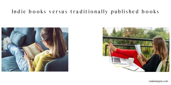
I’ve been reading a little indie lately. I hate splitting up the two — indie vs. traditionally published. Books should be books no matter who has written them or how they were published and printed.

But I have been reading some books I’ve found on Writer Twitter and in some author Facebook groups.

Even though we shouldn’t separate books by who has written them or how they’ve been published, there is still a little issue of what does make them different.

Quality.

Indies say taste is subjective and that quality means different things to different people. I certainly say this when it comes to my own writing. But I’m not blind to the issues my books have–especially Don’t Run Away, my first “real” book I count toward my backlist. I’ve gotten good reviews and bad reviews. The bad reviews have a point. I didn’t know as much about plot as I do now. I didn’t have as much practice in character arc as I do now.

Indie books versus traditionally published books (1)

And that’s too bad because it’s the start of a trilogy, and I’ve said this before. If you don’t have a strong start to a series, no one will read the others because your readers will assume the other books are more of the same.

But I also have positive reviews suggesting the book isn’t a total train wreck and investing a little money in promos and a little time redoing the covers hopefully won’t be a total waste down the road.

I went into this blog post with the information about my own book to let you know I understand. I understand the mistakes new authors make because I have made them myself.

The problem is, we have to move beyond those mistakes if we hope to attract readers. With six books in my backlist, I’m hoping this is something I can start doing. And soon. Attracting readers that is.

What have I noticed in the indie books I’ve been reading? Here’s a short but important list:

Telling, not showing. I’ve seen this in 99% of the indies I’ve read. In fact, I’ve read it so much I’m willing to go out on a limb and say this is probably the biggest thing that sets indies apart from traditionally published authors. No matter how bad you (or I) think a traditionally published book is, it will never be bad because the culprit is telling.

Indie books versus traditionally published books (2)

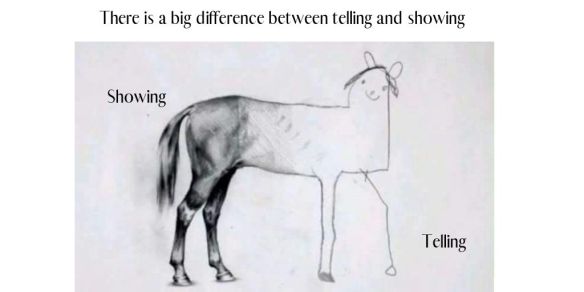
Telling is 100% an indie problem because a book full of telling will never make it past an agent or an editor at a publishing house.

The book I just ordered has a letter to the reader in the front matter, and she even states she enjoyed being the narrator of her characters’ story. And her book reads exactly like that. Two hundred and fifty pages of her telling us what her characters are doing and feeling.

No thanks.

I’ve worked with some writers in an editing capacity and unfortunately telling is probably the hardest part of writing to stop doing. There are whole books written on showing vs. telling, and I have no interest in writing one. The best way you can stop telling is write a lot, find your voice, listen to feedback, know your telling words, and write more.

  1. Write a lot. Find your voice. James Scott Bell has a lovely book about finding your voice. He explains it so well it will turn your writing around. It really will.
  2. Know who your characters are. Who are they as people? Their likes, dislikes. How they react to certain situations. What are their tragic backstories? Characters are people, not puppets. Part of finding your voice is knowing how your characters sound when they think and talk and being able to translate that onto paper.
  3. Know your telling words. Think, thought, feel, felt, see, saw, know, knew, heard, could hear. Felt is horrible. Search for it. In lots of instances just deleting those words will take the telling away.
    She realized he was lying to her.
    He was lying to her. All this time she’d believed whatever he told her. Now she was paying the price.

    We’re already in her point of view. You don’t need to tell your reader she realized he was lying. Just say he was lying to her. We understand she realized it because we’re in her head and she thought it. When you use these words you slip out of your character’s POV.

  4. If you’re still having a problem, work with an editor or a beta reader. Lots of writers can’t see it in their own work, but they can see telling in other writer’s work. Choose betas and editors who won’t lie to you. The book full of telling I’m reading now? It has 17 4-5 star reviews. That means 17 people lied to her.

Speech tags. I made it to Chapter 4 of a different book. It popped up in my Twitter feed so often I decided to give it a chance. I ordered the paperback, and wow. By Chapter 4, I counted more than 35 speech tags. I couldn’t read any more. I think we’re all victims of speech tags at some point in our careers. I know I was when I wrote Summer Secrets. My editor helped me with a few–but she should have been much, much harder on me. Since I’ve written more and honed my dialogue skills, I rarely use speech tags anymore. If you find you use speech tags, work on stronger actions and better dialogue to evoke emotion. Don’t depend on speech tags for clarity.

Here’s a before and after. Tell me which kind of dialogue you’d like to read for an entire book:

“I did. Just not the way he thought. A couple of goons caught me outside the hospital—” Callie bit off.

“The hospital. Jesus Christ,” Brandon snapped. “Do I have to check myself out and drive up there?”

“No! Just listen to me,” Callie yelped, pulling over in the middle of a residential section. She should’ve driven with Mitch. She had no idea where the police department was and couldn’t use her phone’s GPS while she was talking on it.

“I defended Mitch on the ice a couple days ago,” she stated, “and I dumped one guy on his ass. Tonight he and two of his friends caught me outside the hospital. Mitch happened to be right behind me and stopped them before they could do anything. I’m on the way to the station to give my statement,” she explained.

“Are you hurt?” he asked urgently. “You beating up guys? Callie, you’re supposed to be having tea parties and watching strippers. What the fuck?” he growled.

There are seven speech tags in this little section. They don’t sound terrible, in fact, upon reading this, you might think they actually lend something to the scene. But this is just one small section of a book. When you have a book that’s heavy on dialogue like my books are, reading all those dialogue tags can be tiring.

Look at that section again. These two characters are talking on the phone having a heated discussion. How did the writer make the dialogue sound? Do they sound like real people? A brother and sister who care about each other? Do you need the tags? Most sections of dialogue don’t need tags if you write the characters well enough the readers don’t need to be told who is speaking. Read the same section without tags. Does what they are saying draw you closer in because there’s nothing taking you out of the moment?

“I did. Just not the way he thought. A couple of goons caught me outside the hospital—”

“The hospital. Jesus Christ. Do I have to check myself out and drive up there?”

“No! Just listen to me.” Callie pulled over in the middle of a residential second. She should have driven with Mitch. She had no idea where the police department was and couldn’t use her phone’s GPS while she was talking on it.

“I defended Mitch on the ice a couple days ago, and I dumped one guy on his ass. Tonight he and two of his friends caught me outside the hospital. Mitch happened to be right behind me and stopped them before they could do anything. I’m on the way to the station to give my statement.”

“Are you hurt? You beating up guys? Callie, you’re supposed to be having tea parties and watching strippers. What the fuck?”

Sound better? If not, that’s cool.

Exercise: Take a book you particularly enjoyed. Find a dialogue section (the longer the better) and count how many tags the author used. You might be surprised.

Nothing is happening, or the author tries to make a big deal out of nothing. I did this with Don’t Run Away, much to my sincere regret. I made Dane make a big deal about being married before and how nasty his divorce had been. And now I look back and think, who cares? Everyone goes through a divorce (or it seems like it, anyway), and yes, those divorces can be nasty. Especially when kids are involved. I understand small things can be a big deal, but they should still be only a small piece of the whole puzzle. And readers have called me out on it, calling Dane a weak character for not being able to move past his divorce. That’s what the book was about, but I still should have made him more ready to be in a relationship than I did. Or made Nikki smarter so she steered clear of him.

In the book where I only reached Chapter 4, all the characters had done up until that point was sit around and talk. And not about anything particularly interesting. Ask for feedback from someone who won’t lie to you. If the beginning of your book is boring, if there’s nothing happening, no one is going to get to the part where it finally does.

If you have a too slow of a start, people will bail before they get to the good stuff. If you want help with your first pages, read Your First Page by Peter Selgin. He walks you through what will make your first pages pop!

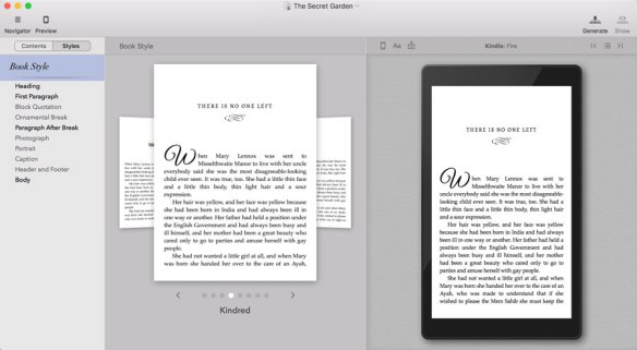
Bad formatting. I buy paperbacks because when it’s slow at work, I can read. We’re not allowed tablets, but I prefer paperbacks anyway. That being said, a lot of paperbacks I see are a mess inside, and all I can think is I hope to God they never host a book signing or do a giveaway on Goodreads. Maybe authors don’t put much time into their formatting because they don’t think they’ll sell many books. But the problem is, you will sell some at a convention, or you’ll want them for giveaways, or you may want to stock them at your indie bookstore. If the manager of that bookstore flipped open a poorly formatted book, he’d probably tell you to fix it first. Draft2Digital has a free paperback formatting tool. Or give someone a $25 gift card to Amazon and ask they do it on their Vellum software.

It’s a sad fact that you could have the most entertaining story in the whole world but no one will want to read it if your book doesn’t look like a book inside. I struggled with this too, when I published 1700. I cried, literally, until someone reminded me about the KDP Print template. Back then it was CreateSpace, but they do offer a free interior template. There weren’t the easy and free tools available there are today. (It’s crazy how the industry has changed, even in three years.) Even if you don’t know how, there is no reason why your book should look like a mess. And if you really can’t find the means to format a paperback book, you’d be one step ahead not offering one at all.


These are only four things I’ve found in the latest indie books I did not finish (or DNF in shorthand), but they are doozies and enough to turn away any reader. In the case of the woman whose book is all telling–she’s putting herself in a tough spot. She wants to write a series, but she’s waiting to see if her first book takes off before working on a second. Her book will never take off, but not for the reasons she thinks. It’s too bad.

Reading indie is a valuable experience. I love to support my friends, and of course, there are some fabulous writers out there making a living off their books.

The issues I’ve outlined can be fixed over time by studying craft and writing a lot. It’s not a coincidence that a lot of indie books I find fault with are an author’s first book.

We all mess up our first book. Unfortunately it’s a really important book. You can’t build on a crumbling foundation.

What are some things that you’ve noticed in indie books? Anything that has turned you off?

Let me know!

Thanks for reading!


My books are available everywhere! Check them out!

Don’t Run Away: books2read.com/dont-run-away
Chasing You: books2read.com/Chasing-You
Running Scared: books2read.com/running-scared

Wherever He Goes: books2read.com/whereverhegoes1
All of Nothing: books2read.com/allofnothing1
The Years Between Us: books2read.com/the-years-between-us

Try the Tower City Romance Trilogy Today!

all graphics made in canva. all photos taken from canva except for the horse meme that i don’t feel guilty grabbing online because it’s everywhere.

Tower City Romance Trilogy Cover Remake

I’ve always said never to look back, always move forward, but in this business, sometimes it’s not always feasible to keep your eyes straight ahead. As authors, we have a back list (or hope to write one) and as much as I hate to admit it, or put time into it, we do have to do a little maintenance from time to time.

My maintenance included redoing the covers for my trilogy. I needed to redo them for a couple of reasons.

  1. People were mis-categorizing them. Because the couples had all their clothes on, people were thinking the books were sweet romance. When I did my Freebooksy for Don’t Run Away, they even went so far as to email me and ask if I had selected the wrong category when I paid for my promo. Don’t Run Away‘s one star review on Amazon made it clear the woman was appalled at the swearing and the sexiness on the first page. At first I blamed her, but she judged my book by its cover and thought it would be a sweet romance. So, okay. I finally took responsibility for it and now my covers (hopefully) reflect a little more of what is inside the book covers . . . and bed covers!
  2. Kobo turned down a promo ask. I know this might not have anything to do with the cover of Don’t Run Away. I mean, it was my first ask, and Mark, in Killing It on Kobo, stresses the need to ask and ask and ask. And only when you get tired of asking maybe then reach out to the Kobo Writing Life team and say, hey, what’s up? Why am I never approved for a promotion? As I’ve said before, real people are behind Kobo Writing Life. A real person looks at the books submitted for promo, and a real person chooses what she thinks will fit inside the promo. I asked to be in a Free Contemporary Romance promo, and maybe my cover didn’t fit what she was looking for.
  3. But this will help with other areas of marketing, too. It’s not just at Kobo that I will see some benefit from changing my covers. I may snag more eyes on Amazon and the other marketplaces as well. I’ve killed all my Amazon ads right now, but it will be an interesting experiment to start them up again (if I do) with the new covers.
  4. My skills are better. I’ve said a million times it’s easy to slap text onto a cover using Canva.com and publish your book. That’s what I did with the trilogy. Found photos that kind of worked and found some font, and did the best I could. But since I made the covers two and a half years ago, I’ve learned GIMP better. I hadn’t heard about Canva. I did my original covers in Word, if you can believe it. So even just  learning about Canva’s existence helped tremendously. I pay for the Pro access, just because I love using it so much, and I figured it’s the least I can do for their team.
  5. I found other places to buy pictures. Lurking on Facebook groups aimed at helping indie authors helped me find other places for book cover photos. Using depositphotos.com helped me find the couples I ended up using for the trilogy, where before the only site I knew was safe was canstockphoto.com. Only the one for Don’t Run Away sticks out a little as it has a darker background and not a white one. While I could have snipped the couple out and pasted them onto a white background (because, yay, I have the skills to do that now), I didn’t think about it that much, and I don’t regret not doing it. The new covers are still 100 times better than what they were. So you lose a couple battles to win the war, and just be happy you won at all.
  6. I learned to experiment with font. Back then, Word didn’t have much choice, and font is like the photos–not everything is safe to use.
  7. I learned to really take a look at what is popular in my genre. Before I was publishing on a regular basis, and before I understood what indie publishing romance meant, I thought a cover was a cover, and that was it. But now I know that publishing romance is a whole different ballgame. Speaking of ballgame, want a series about baseball romance? Got it. Motorcycle club romance? Check. Billionaires? Check. Firefighters. Navy SEALS. And those are just the mainstream subgenres. Then we get into, um, dinosaur romance, Bigfoot romance, I’m-Going-To-Chain-You-Up-And-Make-You-My-Sex-Slave romance, reverse harem romance, and everything in between. So you better believe that your cover should at least *hint* at the sub-genre your book is in. And my fully-clothed happy couples didn’t depict any sexy-times. I don’t write sub-genre, though, so choosing couples that didn’t skew toward a certain sub-genre was tough. Too sexy and they’d look like erotica. If the men were too rough, the books would look like bad-boy romance, or alpha-romance. Study your book’s genre and make sure that your cover fits what is popular in your genre. Wolves on the cover equals shifter romance, and don’t forget it! 😛

    A friend pointed out that my trilogy was about running, and it is. But running isn’t sexy, and the photos of couples I found running were even less sexy, and not cover-worthy by a long shot.

    Here are a few covers from the top 50 contemporary romance right now. Guess what sub-genre they’re in.

    Lots of skin, some tats. A couple menages, if you look at the top 100 full list. Tell Me to Stay by Willow Winters seems to be the couple with the most fully-clothed. And even they are in a provocative pose. I did some homework for my covers and I’m happy with what I came up with.


I’m hoping I don’t have to go back and redo those for a long time. If ever. I redid the paperbacks for both KDP Print and IngramSpark. And in turn, I needed to update the insides. Replacing all those files is a lot of fun, said no one ever.

On the bright side, I’m getting better at handling IngramSpark, and yes, I did the full covers in Canva for both KDP Print and IngramSpark. Thanks, Canva!

Here are my old covers:

One thing you can probably notice is Nikki and Dane are a bit back. Then Alyssa and Brett are a little closer, and then Marta and Ian are in your face. LOL  When you’re doing a series and you don’t have much skill, it’s extremely difficult to make your covers look like they belong together. It’s why I wanted to hire out this time around. It would have made things so much easier if I could have just shoved this onto someone else.

While I was looking at the top 100 in contemporary romance, I began to notice a trend and I started playing with photos and text. Keeping in mind that every second I was “playing around” I wasn’t writing my current series. Blah! But I came up with some mock-ups of how I wanted the trilogy to kind of look:

These were just concept, and I didn’t notice right away that it looked like the same guy. Not a terrible thing if the trilogy was about so gigolo or something. Also, the backgrounds are a little cluttered with items like the faucet and sink, and items like that don’t make the covers look clean. I really like the couple I found for Chasing You, but in the end I didn’t use them either. You can see what I was trying to get at, anyway, and this first attempt brought me a little closer to what I was looking for. And they are far from what I had originally.

This is what I ended up with:

They look like they belong together. The men are shirtless, and the women all have long-sleeved white shirts on. That was very lucky for me. They give off a sexier vibe, and the font fits in. Do they look 100% like what is on the Amazon top 100? No. But they don’t look as if they belong on the Amazon Top 100 of Sweet and Clean Contemporary, either. I paid for the photos from depositphotos.com and I was lucky enough to find the sexy font free for commercial use. I never realized before how brunet men with scruff could look the same, but I’m hoping people can tell they are a different guy (at least, I hope he is!). Doing these has really made me wonder what I’m going to do with the four-book series I’m writing right now. It’s enough to give me hives, that’s for sure!


I guess what you really want to know is if I’m making any sales off the new covers. The answer to that would be no. Not any measurable improvement. Don’t Run Away is permafree on all platforms, and I consistently give away 1-4 copies every day on Amazon, and a handful here and there on ibooks, Nook, and Kobo. So far that hasn’t led to actual sales for the other two books in the trilogy on Amazon, or for the others in my backlist for that matter, but the first book isn’t as strongly written as the other two, so that’s to be expected, I guess.

I’ll throw some money at them and see what happens.

At some point, I’ll be redoing the cover for All of Nothing, too. Though I have gotten GREAT feedback, it doesn’t fit in with what’s hot right now, and that’s the name of the game. Fitting in while standing out!

Tell me what you think!

If you want to try Don’t Run Away, it’s free on all platforms, and you can find it by clicking this link. It will redirect you to any platform where you buy ebooks.

Thanks for reading!

Try the Tower City Romance Trilogy Today!


Everyone in this business has a business–Be careful what you pay for!

When I was looking to hire out for my trilogy covers, I became overwhelmed. Very quickly. We all look for products and services that won’t break the bank, but will maintain some level of quality.

Finding that balance is harder than keeping a kid from screaming in a candy store after you tell him no.

Quality that won’t break the bank that is delivered in a reasonable amount of time. Ugh.

quality cost and time I’m a part of various groups on Facebook, and I’m not going to divulge any groups here. (I don’t want to embarrass anyone, nor do I want to get banned.) Not necessarily to look for products and services, but to keep my ear to the ground and learn tips, tricks, and obscure rules that may never occur to me know in the first place. Like, apparently it’s against Adobe Stock’s terms of service to use their stock photos on romance/erotica book covers. Who would ever think of that? (And who determines if it’s romance vs. women’s fiction?) When I went onto the Adobe Stock site, there was nothing that mentioned photos could not be used in this manner, but it seems to be common knowledge among the Facebook group I’m involved in. After a quick Google search, I did come across this discussion thread, and it appears the questions were answered by an Adobe Stock employee. Luckily, a lot of their pictures of kissing couples, after a quick perusal, seem to be available on other sites.

And that’s the point.

When you hire someone, you are hiring not only their skill, but their knowledge. It’s their job to know the rules, the guidelines, the terms of service.

skills-3371153_1920

Not long ago I was scrolling through my feed, and a post caught my eye. A woman was explaining that she and her husband were starting a premade book cover business. It turns out that they had used free photos from stock sites like Pixabay. I’ve only learned this recently myself that you shouldn’t use free photos on a book cover because the people in the photo may not have signed model release forms. Also, a lot of these photos have name brand items in the photo that cannot be used on a for-commercial-use item, like a book cover. So if you purchased a premade from someone who used a photo that shouldn’t be used–you’ll be the one to get into trouble, not the person who made the cover. I’ve heard other stories like designers on Fiverr who steal images to incorporate them into “original” covers.

Looking for someone I could trust made my head spin and my checkbook cry . . . and I gave up.

The indie publishing rush has opened up the arena for cheats and thieves, scam artists and simply people who think they can do something and charge you for it when their skills are less than adequate to get the job done.

In the case of the woman using free photos for her premades, that’s insulting anyway. Anyone can get their hands on a free photo and shove some text on it using Canva. Part of a designer’s fee should pay for a stock photo that hasn’t been around the world wide web a few thousand times. {Insert crass whore joke here.}

girl reading

We’ve all seen her before. Would you want her on your book’s cover? No matter how pretty her hair is.

But how do you know what you don’t know? Maybe I can help.

There are three major things an indie pays for:

  1. Covers for their books.
    Don’t simply pay and walk away; even if you’re extremely happy with what you’ve been given. Especially if you’re extremely happy and maybe want to make this person part of your publishing team.
    Ask where they purchased the photos. A cover could have quite a few elements that make up the whole. If you are in doubt if any image is okay to use, look at the terms of service and make sure the photos were used in a legitimate manner. It could take some digging but better to know now, than after your book is published. Copies of your paperback may never be recovered.
    Ask where they found the font. There’re plenty of places that offer free-for commercial-use fonts. Your designer could have purchased a font suite, or picked them up singly as the need for them arose. If you’ve hired someone to do your cover, it never hurts to be sure the font is okay to use.
  2. Editing.
    Someone really can’t, well I was going to say someone really can’t cheat you with editing, but of course they can. They can charge you for a shitty job. I’ve been a victim of that. Note to self: a writer does not an editor make.
    Editors are human–even traditionally published books are published with typos. But not all editors are created equal and some will be better than others. Always ask for a sample. Some will do it for free, some will charge you a small fee and then put that sum toward the total if you hire them.
    If they won’t give you a sample, steer clear. After the sample, take a look at it. Does it look like they ran it through Grammarly? Used the Hemingway App, or ProWritingAid? Does it look like an actual human read it and made real-life comments? And do those comments make sense? Did they maybe give you a link of proof to back up their edits? (I do this with my friends, especially if I had to look it up myself to make sure.)
    If this person’s rates are reasonable and you don’t have to wait five years to have your manuscript back, maybe it’s a good idea to get a second opinion on his or her work. Because you’re ultimately building a team to help you publish your future books. And someone who can do the work and charge a fair price is worth their weight in gold.
    You want people around you that you can trust to do a good job. If she gives off a good vibe, and the second opinion of her work pans out, you may have an editor you can trust for many years to come.
  3. Formatting.
    This one makes me mad. You know why? Because Vellum has made it super easy to format books–both ebook and paperback (they offer large print, too!). It will generate files for Kobo, Nook, iBooks, and a generic epub for places like Draft2Digital and Smashwords. They will also give you a fabulous interior for paperbacks with dropped caps for chapter starts, and options to have the name of the chapter in the headers, which will change with each new chapter title! Trying to do that in Word would make me an alcoholic! There is a small learning curve, and I had to Google a couple of questions that popped up when I did a friend’s book, but after a couple of books, you can get the hang of it pretty quickly and format a book in less than an hour. Especially if you have all of your front and back matter written, and your links are already gathered together into one place.
vellum formatting ad

A picture of what using Vellum looks like. Taken from their site.

And this what drives me INSANE! People are charging for this. I realize that everyone deserves compensation for their time. And if you purchase a Mac so you can use Vellum, you’re investing 1500 dollars right off the top for your business. But holy cow, if you hire someone to format your book and you know they are going to use Vellum, maybe you can network a little bit and find someone else who will do it for trade. Or if you already have a Mac and you know you’ll be producing a lot of books in the future, buy it yourself. You can take a look at it here.
Another way you can format your book is to use Draft2Digital’s formatting tool. You don’t have to publish with them to use the tool, but you do have to create an account, which feels like they are locking you in to use them to publish, but they aren’t. They format both paperback and ebook and there is no charge to use their service.
If you like Word and have a little knowledge about how to make the page numbers and End Section features work for you (the template adds them, but inevitably you’ll have to add chapters), you can try the template KDP Print offers you. This used to be the way to do it when you didn’t want to pay for a formatter, but it’s no longer the best way. Still, if you’re stuck using this, it’s better than not having a paperback option at all. There are scammers I’ve run into on Twitter who charge to do for this for you. I don’t know if they still do being that Draft2Digital offers you a free way, and almost anyone can find someone who uses Vellum because it’s that good. Once I pinned a tweet cautioning against paying someone to copy and paste, and a woman who did indeed charge for this simple formatting thought I was singling her out. I wasn’t, but she retaliated by giving me a poor review on a book of mine on Goodreads. She also charges for website building through Wix, and Wix, I’ve heard, is one of the easiest websites for a beginner to use. My friend Aila has a blog post about it, and she made Wix sound so good, I was tempted to change!

So, just be careful who you pay and for what. If you’re paying someone simply so you don’t have to do the work, that’s one thing, because we’re all willing to pay for convenience in one way or another. But sometimes it’s just easier to learn how to do things on your own.


Everyone from huge vanity presses asking you  to “invest in your book” to the person charging to copy and paste your book into a template provided by KDP Print for free are happy to take your money.

Trust doesn’t come easily to me, and I’d rather learn what I don’t know to stay in control.

There’s nothing wrong with charging for a service, just as there is nothing wrong with paying a fair price for that service.

Just be sure that the price balances the skill and you both walk away happy. Maybe a lovely business relationship will develop.


As a silly side note, I used a photo from Pixabay in a blog post last year. I said in the post I found the photo there, and since Pixabay offers photos free for commercial use, I was safe in using it for my blog. But I found an email in my author email (I rarely check that account) and this gentleman had emailed me about a photo I had used.

Hi there, 

Thanks so much for including one of my pictures on your page. I love seeing my work featured around the web.

This is the image the page is on: https://vaniamargene.com/tag/fear/

And this my image: https://www.flickr.com/photos/158456412@N05/40174218953/
Could you please link to https://www.mytradingskills.com as per my attribution credit request on the image?
Thanks very much and have a great day!
XXXX

Name: XXX
Title: Creative Director
Website: www.XXX.com

Imagine my surprise when I found that in my box. Of course, I changed the attribution in my blog post, just to keep feathers from being ruffled (who knows if he’ll even check), but could you imagine if his email had held any weight? I was scared for a second. So always make sure that the photo is safe to use. And that is your job, whether you hire someone or not.

I always give attribution to the photographer and print the photo ID in my front matter of my books. That causes some extra work for me because I had to swap out my files when I redid the covers for my trilogy. But I feel it’s best. I also credit using Canva.com to make those covers.

Cover all your basis, guys and gals, because we are in BUSINESS, and other people are in business too. Never think for one moment that someone will give you a pass if you make a mistake.

Happy and SAFE publishing!

Publish Safely!

photos taken from Pixabay and/or taken from and made in Canva.