I tried four different times and started four different blog posts and nothing sounded right.
I came up with something Saturday night that was actually pretty unhinged and not like me at all. My gut told me not to publish it, and at the last minute, listened to my intuition (writing this on Sunday night at 9pm). Don’t need you all to think I’m losing my mind.
For now, if you’re publishing this summer and need some help, I have a few tutorials that will point you in the right direction:
That’s all I got, but it feels safer than what I was going to publish. I’ve felt good, just maybe trying to find some balance with living life now that I’m feeling better and where writing fits into all that with how the publishing industry is. I certainly don’t want to say anything I’ll regret.
Anyway, have a good week, and hopefully I can come up with something better next time.
I’ve gotten a few questions about this, and I guess maybe I was remiss in not typing out the instructions before now.
In all honesty, I’ve been doing it the hard way, importing the PDF into GIMP, cropping out the back cover and spine, adjusting the DPI and size, then downloading the JPG file. When someone asked me in the comments of my updated full wrap post for instructions, I didn’t want to direct them to a software they might not have. My full wraps are made in Canva, so should the ebook covers.
So, I messed around a bit, figured it out, and to my surprise, found it was easier than using GIMP anyway.
For the screenshots, I used Melody Loomis’s cover for her book, Thrill of the Chase. I designed the cover, so I already had access to the PDF and she gave me her permission to use it.
Here you go:
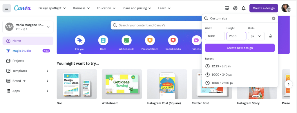
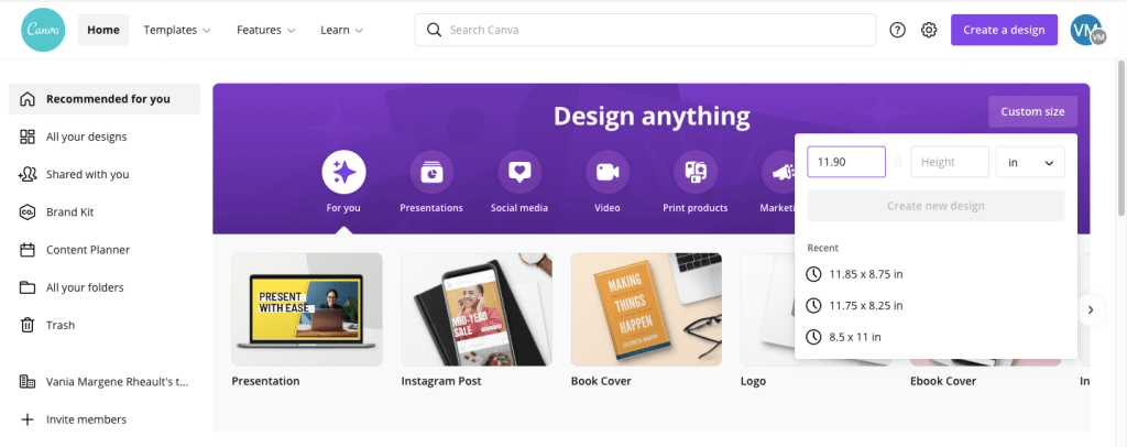
Click on Create a Design. KDP’s guidelines for an ebook cover are 1600 x 2560 pixels. Click on Create a Design and click on Custom Size. Enter in the pixels, like this.
Click Create New Design.
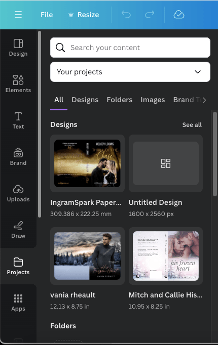
Next, you can either upload your book’s PDF or check your Projects folder. It will already be there unless you’re doing an ebook cover for someone else. The first time I uploaded a PDF I was really confused and kept thinking I was doing something wrong. So either way, your Projects folder is where you’ll find the PDF. I’m using Melody’s Draft2Digital cover, and it’s at the top because I uploaded it for this post.
Click on it so it’s laying on your empty canvas.
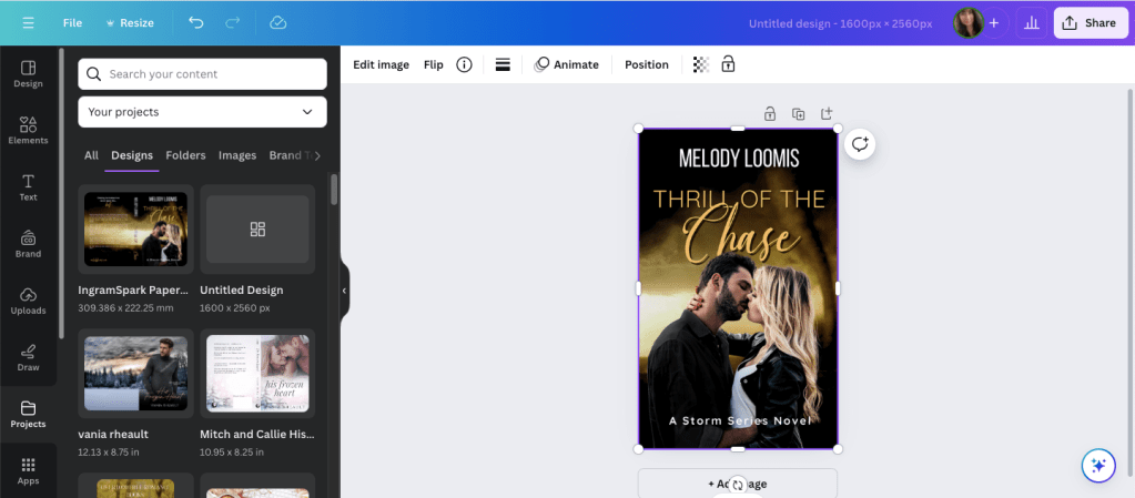
Click the cover to select it, if it isn’t already, and crop off the back cover and the spine.
Now grab a corner and enlarge it. At this point, just play with it until it fits the canvas how you want it. It won’t fit 100% and you’ll lose just a tiny bit on the sides, but it’s so little you won’t notice.
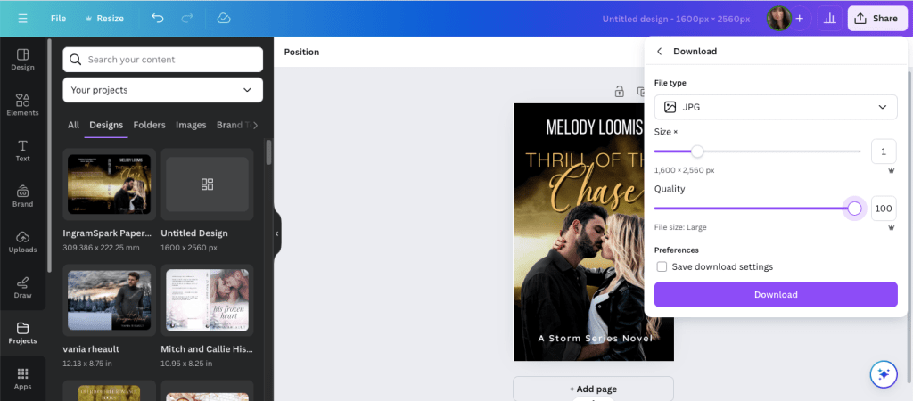
Click Share and Download.
Choose JPG because KDP won’t accept a PNG. If you have Pro, scoot the quality up 100.
Save it in a place and under name you’ll remember.
It will save in the correct size and DPI and you won’t have to do anything else to it.
That’s it. I should have written this out a long time ago, but I never thought to. Anyway, it’s simple enough to do and I should have been doing it this way from the beginning. After that reader posted his or her question, it did get me to thinking about it, and now I’ll never use GIMP to make ebook covers again.
If you have any questions, drop them in the comments below, and I’ll answer them to the best of my ability.
I don’t have much to update you on this week. I’m slowly making my way through my King’s Crossing proofs and I’m in the middle of book two right now. I’m not finding much, a word that should have been deleted here, a word that should have been added there. Like many authors, some of what I mark I’ll decide to leave alone, and that’s usually the hint I need to realize that after proofing these, there isn’t going to be anything left to change or to make better. I recommend everyone reads their proofs because it’s amazing what you’ll find when your book is printed out, and actually, ordering a proof is a cheaper than printing it out at your local Office Max.
Anyway, so that’s all I have for my author update.
As far as my Monday Musings are concerned, I want to defend all my Canva book cover blog posts. There are opinions circulating on Threads that pretty much say it’s not safe to use a cover made in Canva because Amazon won’t accept them if they ask for proof of copyright. This isn’t correct and I do not want any baby authors to get scared or bummed out they can’t use Canva to create their covers. The truth is, KDP/Amazon doesn’t care how you made your cover. You can use Canva, BookBrush, Photoshop, Affinity Photo, InDesign, GIMP, or even Word. What they care about is where you got the stock photos that you used to create your cover. Canva Pro gives you access to hundreds of thousands of stock photos, and you can use them, for anything but book covers because if KDP asks you if you have the licensing rights to use the photos, they won’t accept Canva’s. That’s it. That’s all it is.
When you buy a stock photo, you’re not buying the copyright of that photo. you’re buying the licensing, or the permission, to use it. The photographer and the model, through a model release, say it’s okay for you to use the photo on your book, and that’s the documentation that KDP wants. Canva doesn’t give you the proper permission to use their stock photos, not in a way that Amazon wants, anyway. So, whenever I talk about Canva, I always say you should buy your photos from places like DepositPhotos, Shutterstock, Dreamstime, or 123rf. You can browse Canvas stock and find the source and purchase it directly. Sometimes the source is Getty, and we all know most of us can’t afford that. For that reason, I never practice book covers using their stock because I might fall in love with something I can’t use.
The same goes for places like Unsplash, Pexels, and Pixabay. Those places are fine if you’re using stock for blog posts and aesthetics, but for an actual cover where you’re going to be making money from your book, you should buy your stock photos.
The standard licensing is fine–the extended license of a photo is primarily if you’re going to use the photo on something you’re going to sell, like a coffee mug. The standard license is fine for a mug if you’re going to make one for a giveaway, or something else like bookmarks, but if you’re going to sell those coffee mugs and bookmarks at a book table at a convention, then you need the extended license, which is a lot more expensive. That’s why I don’t make swag. It’s expensive and I don’t have a readership that would pay. If you want to make bookmarks or business cards, or even post cards, the standard license is fine–knock yourself out. VistaPrint is a good option.
Another reason someone said it’s not safe to use Canva book covers is because someone could copy it and you can’t do anything about it because you can’t copyright what you make in Canva. The thing is, anyone can copy a book cover, and it doesn’t matter where you make your cover. The reason most authors don’t have their book covers copied, even if they’re gorgeous, is because you’re just asking for trouble if you do. There’s no faster way to get blackballed in the author/writer community than copying someone else’s work. Now, can the author you copied sue you for that? Sure. They might start off sending you a cease and desist email first, ask you to change your cover, counting on that to scare you enough, and if you’re baby author who got swept up in loving a cover, or you bought one from a designer and you didn’t know she “borrowed” the design, then a cease and desist letter would probably be enough. But the threat to sue, I don’t want to say is empty, but a lot of authors don’t have the money to take you to court. So, it doesn’t matter where your made your cover, anyone at any time can copy it.
When you’re a romance author, we do get into some shaky and shady territory. We use the same models, a lot, even the same backgrounds, a lot, and when that happens, sometimes vibes are the same. I think most of us authors understand that and we just shrug and say, “It happens.” I even blogged about it, and you can read it here: https://vaniamargene.com/2023/08/14/romance-covers-finding-the-right-stock-photo/
I’m not a copyright lawyer, and when I talk about stock photos and book covers, that’s all my knowledge pertains to. Canva is used by people who are not authors, and when someone uses their elements to make logos and social media graphics geared toward selling products, I have read those logos and social media graphics don’t belong to that company. Maybe that’s true. I have no idea. I don’t work for a company that asks me to make social media graphics, so I don’t have to know the legalities of it.
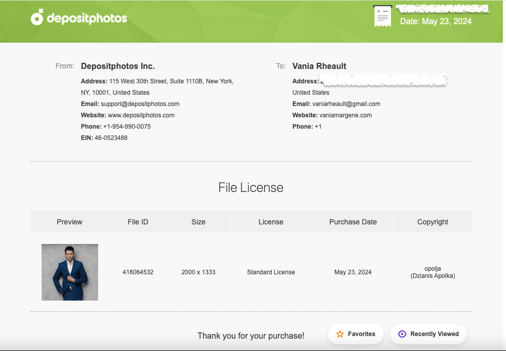
When I make a cover in Canva, sometimes I do use a Canva element, like a gradient or a glow star, but I use DepositPhotos for everything else. When Amazon asked me for licensing information for the 3rd book in my rockstar trilogy, I took screenshots of the download information of the background photo, the model’s photo, and my profile information. I had other things on my cover (a small piano vector indicating what instrument the guy in the third book played) but I didn’t give them that, or the font information. If you’re ever asked, give them as little information as possible because right off the bat you’re dealing with a bot that randomly picked you and you don’t want to muddy the water with information they don’t care about. Keep it polite, give them the stock photo information, and if you don’t have it, they’ll tell you to change your cover. If that’s something you have to do, be smarter and buy your licensing agreements the way you should (or never use that cover designer again). (Here’s a blog post I wrote about scammy cover designers–https://vaniamargene.com/2024/04/22/author-update-and-vetting-your-book-cover-designer/)
I hate when “important” information is passed around on a platform like Threads. There’s no way you can include all the information you need in a post so you don’t confuse people. And if you do see blanket statements like, “Don’t use Canva to make your book covers because it’s not safe,” I always suggest you look up who’s saying it. A lot of times it’s going to be someone who benefits from your fear, like, you guessed it, a book cover designer who is going to be out money because you’re making your own covers.
I saw that once last year. A book cover designer in a book cover Facebook group was trying to go after GetCovers because they were “copying” book covers. After a lot of back and forth and nasty comments, even between her and the GetCovers owner, or whoever he happened to be, what it boiled down to was she was a book cover designer who was angry they could charge so little and she felt it was eating at her potential client base. It’s the same for editors, too. Anyone who says you can’t publish without paying an expensive editor is probably an expensive editor who wants to guilt you into paying their prices.
I’ve turned so jaded lately I just always assume people are looking out for themselves first, most, and always, so always, before you get scared, do your research.
Thousands of authors use Canva to do their covers. Some use it properly, purchasing stock photos from reputable sources like DepositPhotos, some take chance and use Pixabay or Unsplash, thinking that their “free for commercial use” agreement is enough, some use Canva stock and hope for the best. If you’re going to use Canva because it’s easy and user-friendly, then you’re not doing anything others aren’t doing. I know that shouldn’t be much of a consolation, but you’re hardly breaking the law. Even if I make a cover for someone else and they’ve downloaded their photos, I download them too so I have the licensing agreement under my profile in my downloads. And what I would send KDP, or what I have sent, looks like this:
This is the purchase proof for the model who will be on the third book of my King’s Crossing series.
That way the author I’m helping can say I made their cover, and I can turn around and give her the screenshots she needs to prove I paid for the licensing agreement.
I have said in the past that your books are your business, and it really doesn’t feel true until KDP smacks you with a proof of licensing for a stock photo.
Anyway, that’s all I really wanted to say. Like almost everything, if you mess up, it’s the operator, not the machine.
Have a good week, everyone! I’m going back to proofing.
The creative process is messy, much like falling in love, and like relationships, sometimes you have to take two steps backward before you can take a step forward. Sometimes you rush, getting married or getting pregnant before you’re ready, publishing a book with a cover that’s only so-so, and while there are remedies for all three situations, they aren’t always pleasant.
I started thinking about my Christmas cover the second I started writing A Heartache for Christmas. I knew I was going to need time to go back and forth, and I didn’t want to make the same mistakes I did when I published my Lost & Found Trilogy. I don’t like the covers, settled on them because I didn’t know what else to do and I wanted to publish. I’ve spent the past ten months regretting the decision, and only God will know what waiting and publishing with proper covers could have done for my launch and sales.
Sometimes you can get a burst of creative juice at the zero hour, and that’s pretty much what happened to me: I created the perfect cover two days before I uploaded everything to KDP to order my proof, and that was after eight weeks of writing, several attempts at a cover, and too many hours of scrolling through men to count.
The problem was, and I see a lot of authors go through this too, is that there is so much that needs to go into your cover. You have to blend in while standing out, do what the top 100 in your genre are doing without looking like your pilfering a design, try to stay away from the guys who are hogging the covers and give some other hot dude a chance, all the while trying to stay true to your brand and the look you want to present on social media and to your readers. It doesn’t help if your design skills are lacking because that only limits what restrictions are already in place. So, when I first started thinking about my cover, I started with these ideas:
*I looked at other billionaire Christmas novels. A big concern was that this isn’t a holiday RomCom, and I didn’t want to give any readers a false impression, so an illustrated cover was out. Not to sound harsh, but there were quite a few billionaire Christmas covers out there and they just seemed cheap, like you know you’re sitting down for a B-list movie and you’re expecting the worst. My blending skills are nil, so finding a background with a model that takes little manipulation is a must. I didn’t want my man to look cut and pasted in front of a Christmas tree, nor did I want to settle for a Christmas lovers stock photo that had been used before. I scrolled a lot, not finding anything to draw inspiration from and concluded that whatever I make would be fine. There was no set billionaire holiday cover to use as a template.
*I thought a lot about my genre. The billionaire Christmas thing was only part of my book. There is also a mystery involved and a little violence (not between my H and h, though) and I definitely wanted that to come across in the cover. This wasn’t a lighthearted romp, even if it did take place over Christmas and New Year’s Day. This novel is very angsty, kind of dark (but not sex-dark, if you know what I mean) and it also takes place in a small town, which means I couldn’t use the reliable city background that I’m used to. It’s a lot to take into consideration, but I also know you can’t (and shouldn’t) cram every facet of your book onto the cover either. Choose the themes that stand out the most, and I decided on dark and the guy. That gave me a lot more room to play with but even then I still made plenty of mistakes before I came up with the right thing.
*Choosing the guy. You know from a previous blostpost that I don’t like using male models that have been on hundreds of covers before. I think in some ways it can pull your book down and make readers confused. There was an article I read somewhere, or maybe it was a discussion on FB years ago, where it was speculated whale readers don’t remember the author of the book, they only remember the book. If that’s true, the last thing you need as a romance author is for a reader to think she already read your book because the cover might resemble a different book she read. You might think this isn’t a concern and that I’m over thinking it, and maybe I am. But seeing the same five models on a fresh wave of new releases can’t do much for your book if your new release is grouped in with them. If you you missed that blogpost, you can read it here.
*Title. Choosing a title has always been a pain in my ass, or a$$ as we have to say on TikTok, much like naming my characters. I pull something out of the air and hope for the best. I wanted something with Christmas or Holiday in it, because I wrote this book specifically for a Christmas release. It takes place over Christmas in Minnesota–I don’t think you can get more holiday than that. I also didn’t want to use modified Christmas lyrics, though I did sort through some songs just to see what I could find. I asked Al for help, but nothing he came up with triggered anything. I finally settled on A Heartache for Christmas because while this book does have an HEA, there is nothing happy about this book until the end. A friend gave me a few suggestions, and I almost with with Heartache for the Holidays because I like the alliteration, or Holiday Heartache, if you wanted to shorten it up, but this isn’t a Harlequin Desire so I didn’t think I needed to be cute. I also didn’t want to cram my title full of keywords like a lot of indie romance authors are doing right now —A Grumpy Billionaire’s Christmas Gift–for example because that just seems like you’re trying too hard. That’s what the blurb is for anyway.
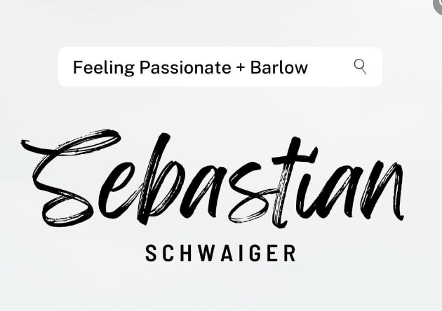
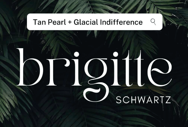
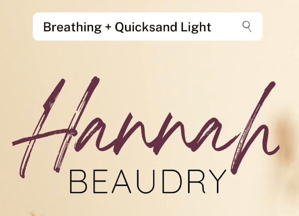
*Fonts suck. You can go through a million of them and nothing will work right. My go-tos when I have a hard time are Playfair Display, either in all caps (like my Lost & Found trilogy) or lowercase italicized (like my 3rd person holiday series). I also like Calgary if you need something simple yet classy (Faking Forever and my reader magnet My Biggest Mistake). I didn’t want to follow the trend of stuffing my title full of keywords, but I do like the script plus serif font duos that have been popping up. The fastest way to find a duo that goes together is to search duos on CreativeFabrica or do a Google search for font pairings. I ended up buying a font duo off CreativeFabrica for eight dollars. Canva also has some font duos, and I think I was looking in their newsletter emails because I captured some like this for future inspiration:
It helps to have the cover done so you can experiment, and finding my font duo was the last step I took, though I ended up changing the man and the background at the last minute. I kept the fonts because they still worked.
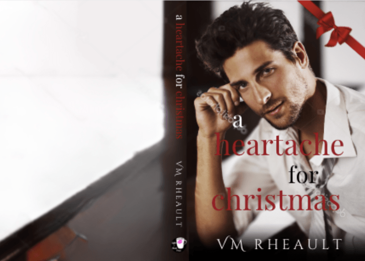
When I came up with my first cover, I decided on the guy because I had never seen him before:
This attempt didn’t stick around for very long. If you’re experimenting and come up with something you hate, that’s okay. It’s part of the creative process. You can see I went with my standby for the title font, but I struggled with how to make it look “Christmasy” — hence the bow — because that was a concern of mine at the time. The guy is younger than my MMC, and while I have never seen him on a cover before, he didn’t look right on mine, either. Canva has some great manipulation tools now. They aren’t 100% foolproof but I’ve used their magic erase with some success. This was the original picture of him:
After I decided against him, (though his drink looks really good) I thought maybe I needed to do more of the Christmas part of the story, and I looked through lots of Holiday stock photo backgrounds. Lots of trees and fireplaces, like this one:
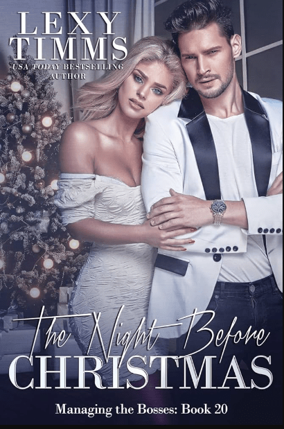
Lexi Timms used a similar background for hers, but I don’t have the skills to do something like it (and there’s that guy again):
I mocked up a lot of half-hearted attempts at trying to figure out what worked and what didn’t, what I could do with Canva and what I couldn’t. I came up with this one, and I mentioned it in my blogpost I referenced above about book covers:
It was one of my better attempts, but I still wasn’t happy with the guy. I liked the background and I thought I lucked out because it depicted Christmas but in a dark way. If hadn’t had time to play, I might have stuck with him just because it fit my needs. I’m not even sure where I was with writing it, but I knew I had time and kept looking for a better guy.
Later I found this model and kept the background:
I actually workshopped him in the Indie Cover Facebook group, and but everyone agreed there was something missing. I still think so too and maybe if I was’t writing Billionaires, it would have worked for a simple Romantic Suspense that took place over the holidays, but I knew I needed more. They also said the font wasn’t the best, and the word placement needed work. I agreed and went back to the drawing board. (Don’t skim over this part. Feedback is important and could trigger an idea that makes all the difference.)
I decided I was trying to put too much emphasis on the mystery part of the novel and in my next attempt went in a completely different direction while keeping with the Christmas theme:
The title didn’t grab me but I did give other things a chance. I thought the guy and background was good. I like his hands and his watch, but I hated that his head was cut off, and when I put the KDP cover template on top of him I noticed that I was going to lose even more of his face:
That was when I thought I needed a new man (not the first time in my life, let’s be honest). I asked in the Book Cover Design 101 FB group I’m a part of and they offered some suggestions as to what I could do to keep the part of his face I had, but they were out of my skill set. Canva has a magic fill AI option but when I tried to build up his head using it, I got a caveman instead, and that idea went out the window. Here’s the stock photo I was trying to work with:
I almost still kept this cover though, because it was the best I had come up with by far and my time was running out. I had already finished and read through my book a couple of times by then and was almost settled on the final draft:
You can see I had almost everything in place besides the blurb I don’t write until I can’t do anything else without it. There is nothing wrong with this cover (depending on how much of his face I really would have lost, but I wouldn’t have found that out until I ordered a proof). It probably would have sold my book just fine. But there was still something pulling at me and telling me I could do better.
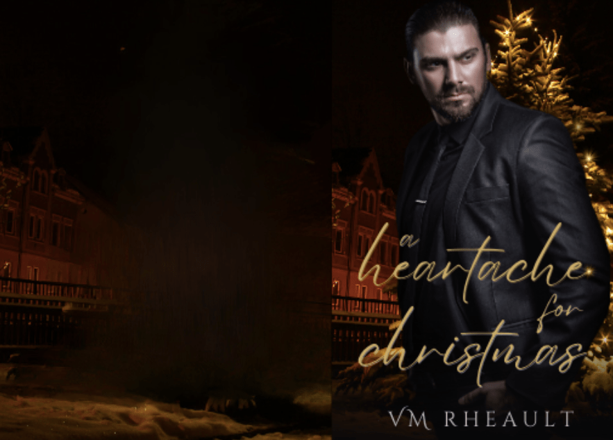
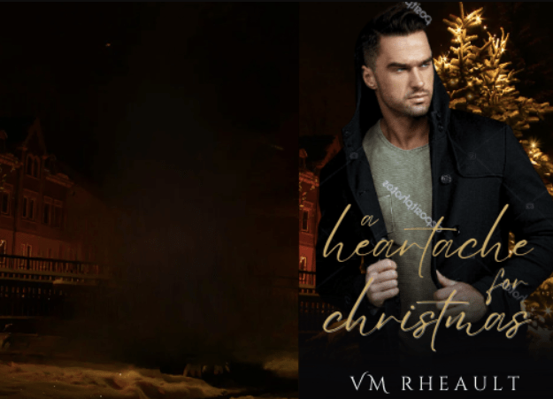
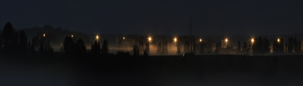
I started looking through backgrounds again on DepositPhotos. I looked up the trees, using search phrases like “dark trees” “dark Christmas” scrolling and scrolling. I found something almost by chance, (which is how most of my covers are made–by a chance find), and I favorited it right away so I wouldn’t lose it:
landscape wildlife Indian summer forest
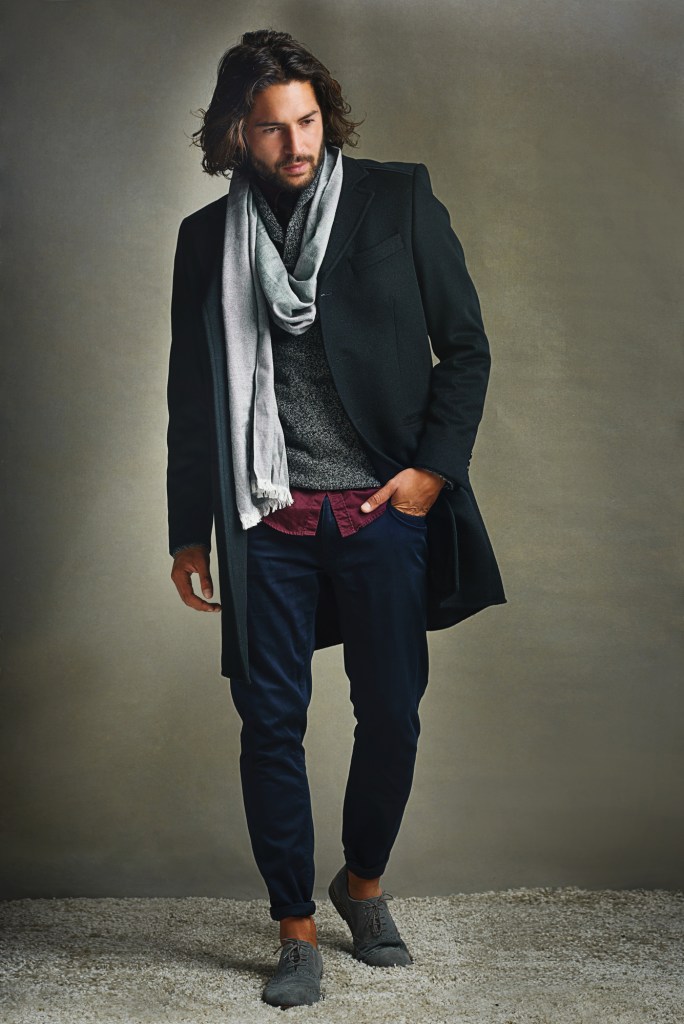
Then I started looking through all the stock photos of men I have starred over the past few weeks trying to build up a selection of models that haven’t really been used before but could still work on a cover meaning, handsome enough. I came across this guy, and after I plopped him in front of the background, everything fit together like the last handful of pieces of a jigsaw puzzle:
Shot of a stylishly dressed man posing against a gray background in the studio.
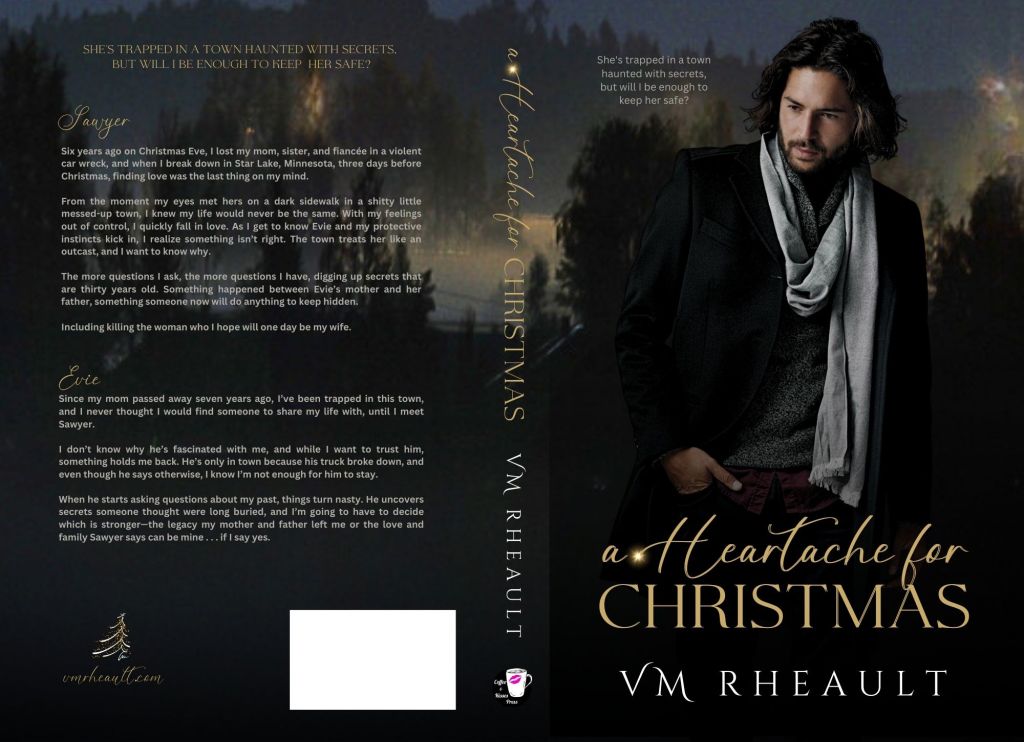
I zoomed in on the background, used Canva’s magic erase to blur out some of the lights, and with the font duo I had purchased, came up with a new cover two nights before I uploaded to KDP:
The Christmas tree vector in the corner on the back cover I used as my chapter headers:
I needed to have a little knowledge of GIMP because this is the stock photo:
An abstract of Christmas tree with sketch stroke and yellow stars as decoration.
I used color fill in GIMP to change the colors:
Then I placed it on the back cover.
I used the title’s script font for my author website and that was the last detail I added to the back.
Overall, I’m really pleased with how this cover came out. I haven’t seen the proof yet, but I’m hoping it’s just as pretty in real life as it is on screen.
If you want to ask me for tips, this is what I would advise you to keep in mind:
*Manipulate, Manipulate, Manipulate. (As much as you know how.) Don’t forget you can use the adjust feature in the “edit photo” tools. You can use the shadows and highlights, brightness and contrast, and black and white to adjust the colors of your photos. Zoom in and crop when you need to. Flip if you have to. Canva isn’t as flexible as Photoshop or the person who knows how to use it, but there is still a lot you can do with Canva’s tools–you just have to experiment.
*Look for similar colors between the background and your model. My cover works well because he blends in without me having to do anything to him. His black melds with the trees, and his scarf pops with the clouds/fog. Even his skin tone complements the orange lights. The colors of my text blend in–the blurb and the tagline aren’t white–they’re a light grey. Attention to detail matters.
*Don’t be afraid to try things. I went through a lot of men and a lot of backgrounds. Not everything will work, but sometimes you won’t know until you use a screenshot or download the composite photo and try. The least likely photo might be the one to make it on your cover.
*Have patience. I didn’t have patience when I created my trilogy’s covers and now I’m still paying. It takes a lot of patience to scroll through and bookmark photos you think you may want to use some day. I have over 700 photos bookmarked in my DepositPhotos account. One I “gave” to a friend because I knew it would fit her book. Put on a TV show and scroll. I have a lot of men that might one day make it onto a cover. You just never know.
*Create a steal file of inspiration. Lots of authors do this. See a cover you like, save it. You’re not necessarily going to copy it, but if you pick it apart, study the vibe, you could find elements that you could use in your own covers. That goes for fonts, too. If you like a font, save a screenshot of it. In the Book Cover Design 101 group, I bet you there will be at least one person who can identify it for you, or use a website like What the Font to get similar examples.
*Start as early as you can. All this is a process and it takes time. Like getting good at anything, you can’t expect to create the perfect cover the first time out. Also, get feedback. It hurts to be told something you made isn’t working or could be better, but you need to know that. The ultimate goal is to sell your books, not boost up your ego. (Let sales do that.)
I hope this was a helpful post. Let me know if you have any questions in the comments, and I will do my best to answer them for you!
Housekeeping before I jump into the post: There is still time to read Jeeves Reads Romance’s interview and enter the giveaway. The last time I looked at the entries, there weren’t that many, so there is a good chance of winning! I’ll ship to the US and Canada and the giveaway goes on until July 4th, 2022.
Sometimes it’s great not to have anything to report. Kind of makes for a boring blog, but I’d almost rather have nothing to say than too much to grouse about because my luck went sour (who am I kidding–it’s been sour for a long time and only now just starting to turn around). I’m hoping those days are over for a little bit as for now, nothing is going on with my health (feeling better with the girly issues that have been plaguing me for the past year and a half) and I’m slowly getting over my breakup. I think it will hurt for a long time, but it’s not as heart-shattering as it used to be. The next couple of weeks are all about finishing up my adulting with a mammogram, eye doctor appointment, and a dental cleaning scheduled. But once I get those checked off my list, I won’t have much more to do and I can enjoy the rest of the summer. I’m loving the heat and I spend as much time outside as my schedule allows.
It’s been 27 days since the launch of my first book in my duet and the first book under my initials as a pen name. I’ve gotten a sale and some page reads, but I expected that. Book ones (in my experience) never do well because readers wait for the other books to release. When the second comes out, I’ll use a couple of free days in Kindle Select for book one and buy a cheaper promo. I’ve always gone with Freebooksy which is $120 for a steamy romance, but I’ll try something new like Ereader News Today or Fussy Librarian, maybe even Mark Dawson’s Hello Books. Authors are saying they don’t see the return on investment they used to, but I’ve never used any of those before and if the readers see a new name maybe they’ll take a chance on a free book. It still has 0 reviews and I wonder if I made a mistake not using Booksprout. There is just something about a book that doesn’t have any reviews. The product page looks like something’s missing. I’d even settle for a four-star a this point. At least it would tell potential readers it’s an honest review.
Wha’t I’m probably more excited about is I’m 73k into a new book that will be book one of a trilogy. I think I’ll work on them through the summer and into the fall, and just drop them all at once after Christmas. I need more books on my author page and if I do that, I’ll have six by the end of January. Then I can slowly release my 6 book series like I planned and have 12 by the beginning of 2023. I’ll have a good gauge if my books will resonate with readers by then. Right now the reads I’ve gotten from KU for Captivated are slow and spread out enough I know the people who have borrowed it read until the end, so that’s good news, at least, and probably the only perk to a snail’s pace start.
I’m looking forward to starting an editing series on the blog, and I’ll be interviewing up to 5 editors who edit for indie authors. I’ll start posting those after the 4th of July. I think craft and quality go a long way to how well you can market your book. It doesn’t matter how much money you spend on a cover, ads, or if you pay to get your blurb written for you. If the inside is disappointing, you won’t turn your readers into repeat customers. I (hopefully) geared the questions as something indie writers can learn from, so whether you’re writing your first book, indie publishing and looking for writing tips, or querying, you can read advice from editors who have seen it all.
I’ve been a little disappointed with the quality of covers on Twitter these days, and to keep my hand in with my own cover skills, sometimes I’ll redo them (for my own satisfaction). I would never approach an author and say their cover is bad and offer to replace it, so mostly they stay in Canva. I like this one, and maybe one day I’ll even write a book for it. The cover I redid also had a snowy cabin at the bottom and a couple up top, but I wanted to see if I could mesh the colors in a more cohesive manner and find a way to position the title better. This is not the name of the book nor the author who published the original. Actually, I think it’s one of my better covers, and I’m pleased with the stock photos I found. I didn’t buy the photos since I didn’t think it was worth it for now, and I used a combination of Canva and GIMP.
Speaking of Canva for book covers, the updated instructions I published this month have been viewed 94 times, so it’s it’s still a popular topic. The older post gets the most hits, but the information is still good and I pointed them to the updated post if they want to read that instead.
I’m eagerly anticipating what the rest of the summer will bring. More writing and more blogging, for sure, and book 2 of my Cedar Hill duet will release August 1st.
I’ve come across this question a lot these days, mostly I think because a lot of authors use Canva for their ebook covers and graphics for promos. Some bloggers have compared Canva to Book Brush, and while Book Brush can do many things Canva can’t, I feel that Canva is more versatile and I prefer to use it over Book Brush. Especially since Book Brush is more expensive and if you already pay for Canva Pro, you’re not looking to plop down another $146 (for their popular package) a year on another program.
I’ve never made a full wrap in Book Brush, though it is a feature they have available in their paid plans. I made my first paperback wrap in Canva not even knowing if it was possible. It was the old cover for Wherever He Goes and it was a complete experiment applying what I knew from making covers in Word before I knew Canva existed. I ordered a proof not knowing what to expect, but the cover came out beautifully, and since then I’ve done all my wraps in Canva and for a couple other authors too.
These days if there is trouble with a cover, it’s probably a KDP Print glitch. Their POD printers are overworked and underpaid just like all of us these days and I’ve heard reports of covers not printing well, interiors that are crooked, pages falling out of the binding, and even text of other books inside yours. That is a KDP Print problem, not a Canva problem. The only issue I’ve ever encountered doing a paperback wrap in Canva is that IngramSpark requires a CMYK color file while Canva saves in RGB as does GIMP. IngramSpark will still accept your file, but they warn you the coloring in the cover might be off. If this is truly a concern of yours, don’t use Canva for a full wrap. Learn PhotoShop or hire out. I publish with IngramSpark and in a blog post from a couple years ago, I compared the books from IngramSpark and KDP Print. While everyone insists IngramSpark prints with better quality, I did not find that to bethe case, and Canva had nothing to do with it.
That being said, there are a couple things you need to know before you do a full wrap in Canva.
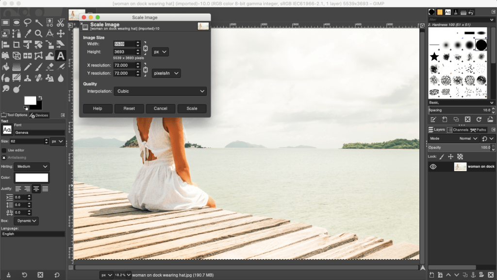
Your stock photo must be in 300 dpi. I buy my photos from Deposit Photos, and lately when I download a photo, the image size is huge but the dpi is only 72. You have to fix this or your cover will come out pixelated and you won’t know why. You can download GIMP for free and use the SCALE IMAGE (under Image in the menu) to fix this, or if you already have Photoshop, adjust the dpi and save. That is the photo version you want to upload into Canva.
This is the screenshot from a photo I used to make a mock cover the other day. You can see that the dpi is only 72. And if you take a look at the width and height, sometimes that is too huge for Canva to accept and they’ll ask you to fix the size. The width and the height doesn’t matter so much, and you can change the width to a lower number. This is a horizontal photo and I chose 3000 for the width. Press Enter and it will automatically resize the height. With the DPI set to 300, export it as a jpg or png, it doesn’t matter, Canva accepts both. (If I’ve lost you on this step, you’ll have to do your own digging. I rarely use GIMP and this post is by no means a tutorial on how to use it, because yeah, I don’t know how to do very much.)
You have to have your interior already formatted for paperback. That includes the front and back matter, the font you chose, gutters and margins and all the rest. Unless you want to play, it’s helpful if this is the final version of your paperback interior. It’s already been through betas and your editor. It should be ready to publish. If it’s not, you can experiment with your cover for practice, but you need the final number of pages for your spine’s width. KDP Print gives you ten pages of wiggle room. That’s not much and more often than not, they’ll make you resize your cover using an updated template.
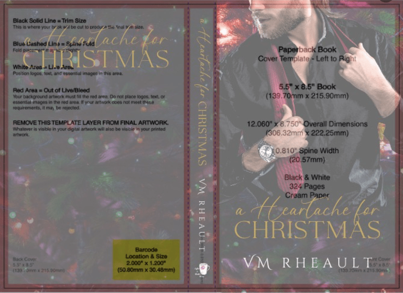
Choose the trim size you want and page color you want. I see this question all the time in the FB groups, and most say it doesn’t matter. It doesn’t matter. Though if you’re concerned with printing costs, the more pages you have–250+–the larger the trim size you want (6×9 is best) because more pages means higher printing cost. My novels run anywhere between 70k to 90k and the only thing that I use as a yardstick is this: My series books are 5×8. My standalones are 5.5×8.5. I don’t know why I do this, but it’s a system I’ve fallen into. If you write epic fantasy and your books are 400 pages, choose the 6×9.
This is one of Lindsay Buroker’s epic fantasies. Amazon makes it easy for you to check out what other authors in your genre are doing. You can see that this book is 528 printed pages and she chose a 6×9 trim size. Her spine is 1.32 inches. It’s a thick book. When you publish and set your prices, KDP Print will offer you a royalty calculator and you can price your book based on the royalties you’ll make when you sell a paperback. Price too high and you won’t get many takers. Price too low and you won’t make anything on the sale. Try to find a happy medium and fit in with what other authors in your genre are doing.
As for the color, I always choose cream for fiction. Seems the standard is cream for fiction, white for nonfiction. There may be exceptions, but that’s what I go with.
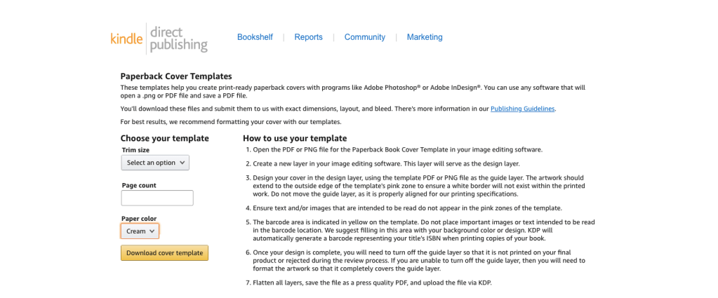
When you have the number of pages from the formatted file, know your trim size and page color, you can Google KDP paperback templates.
This is only for paperback. As of this writing, they are rolling out a hardcover option. It’s in beta right now, but offering a hardcover is what you’ll need to decide based on your business goals. I write romance and I focus my marketing on readers in Kindle Unlimited. A hardcover edition of my book doesn’t interest me, and if I ever wasted the time to create one, it would be for vanity purposes only.
Download the template. It will come in a ZIP file. Open it up and save the PNG as a name you’ll be able to find later. You can’t upload a PDF into Canva, only download, so the PNG is the one you’ll want.
Now it’s time to do some math.
When you want to do a full wrap in Canva, you need to know the canvas size. This is where I think a lot of people get tripped up. How do you figure out the size of the canvas so your template will fit? Your canvas size has to be the size of your book’s trim, plus spine width, plus the bleed. These numbers will change based on the trim size you choose for your books and the spine size. You won’t be able to use the same canvas size over and over unless you choose the same trim size AND your book is the same number of pages every time. That’s going to be highly unlikely, so it’s best just to realize you’re going to need to learn how to do the math.
We’ll start with the template:
The template will tell you how wide your spine is. You need this for the math. There is another way to figure out spine if you don’t download the template first, but this is the easiest way so no use giving you more math.
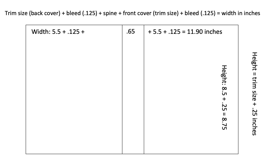
Then this is how you figure out the size of the canvas:
For the width of the canvas: The width of the back cover plus bleed, plus spine, plus the width of the front cover plus bleed.
If we use the template above as an example, the template is 5.5 x 8.5. This is what we add together:
That is the inch width you put into the custom dimensions box in Canva. The default is pixels, you’ll need to change it to inches.
If you need to see it in a different way, I made this for a friend:
The height of the book is 8.5 + the bleed .25 = 8.75. This is the number you put into the height box in the custom dimensions.
Hit enter or click on Create New Design and you have the canvas for a 5.5x 8.5 sized book with a .65 spine. It might not look like much, but now you can upload the PNG of your template and put that into the canvas.
It will take a little moving around, but keep as much orange as possible because that’s your bleed line. Anything on the orange or beyond has a chance of getting cut off in printing. The spine guidelines keep your text from bring printed on the front or back covers. Make sure the template covers the entire canvas.
You might have noticed I didn’t tell you your template needs to be at 300 dpi, and it doesn’t. You’ll be building your cover on top of this template and you won’t see it at all when your book is printed.
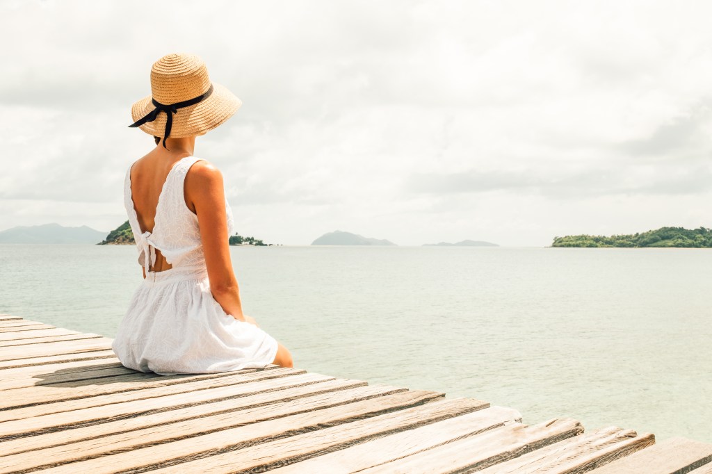
When I say that you’ll be building your cover on top of this, I mean you’ll be putting the stock photo and all the text on top of the template. What you use for your front cover and the back cover is going to be up to you. Some authors use a horizontal photo like the woman on the dock above and use it to create a full wrap from the one photo, like this:
Woman in white dress sitting alone on the pier. Back view (purchased from Deposit Photos)
You can see I flipped her and used a filter, but I used the whole photo for a full cover wrap. I built it on top of the template using the transparency feature and it looks like this:
Using the bleed lines, you can put the font where it needs to go. It’s not perfect–the author name isn’t centered and can come down more. When you’re done with the bleed lines, change the transparency of the photo back to 0 and this is what you’ll download. Download the file in print-ready PDF for your KDP dashboard when you upload your files for publishing.
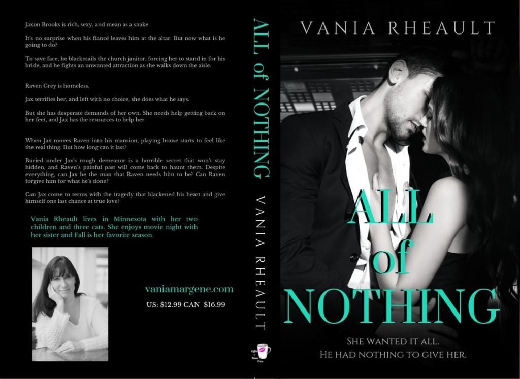
Lots of people say they don’t know what to put on the back of their covers. The sky is the limit, really, from just the blurb to reviews of the book to your author photo. I’ve only done my author photo once, and that was for the back of All of Nothing:
The only thing I would caution you on is you don’t need to make the blurb font huge. It was one of my mistakes first starting out. And if you don’t want to put a white box for the bar code, you don’t have to. KDP Print will add it when they print your cover. Google for more full wrap ideas.
For the woman on the dock, I blew up the part of the water giving the back cover a grainy texture that matched the photo but some authors like the full photo wrap. It keeps them from. having to worry about getting the bleed lines on the spine perfect for printing. POD printing isn’t an exact science anyway, so chances are even if your PDF is perfect, the spine will be a little off. No matter how centered my title and author name are, almost 100% of the time they won’t be centered on the spine when you order a copy. Now that I’ve done it both ways, I think I prefer the full photo wrap.
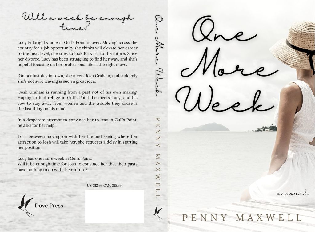
I added a white gradient (that you can find in Canva) to the bottom to white out the dock a little bit making Penny’s name more readable. When it comes to cover design you know your own abilities. I’ve often said I’m lucky I write romance and can find a cute couple and slap some text over them and call it good. It’s not that simple, obviously, but if I wrote in epic fantasy, or even thriller, I would have to hire out. I’m not interested in learning beyond what I know. I’m a writer, not a graphic designer.
Developing an eye for book covers takes time and a lot of practice. Sometimes what you think looks good on the screen won’t translate well to a printed cover at all and you’ll be back to the drawing board. If you’re tackling book covers for the first time, you may be investing in some proof copies just to see how your work looks printed. If your business model makes paperbacks important, then you’ll put a lot of time into learning how to make your paperbacks look amazing. Like I said before, my business model centers around KU readers and it’s more important to make sure my cover grabs attention at thumbnail size and indicates to readers the second they look at it what genre it is.
It might seem like I skimmed over the most important part: the math. We can do another book with a different trim size just for practice.
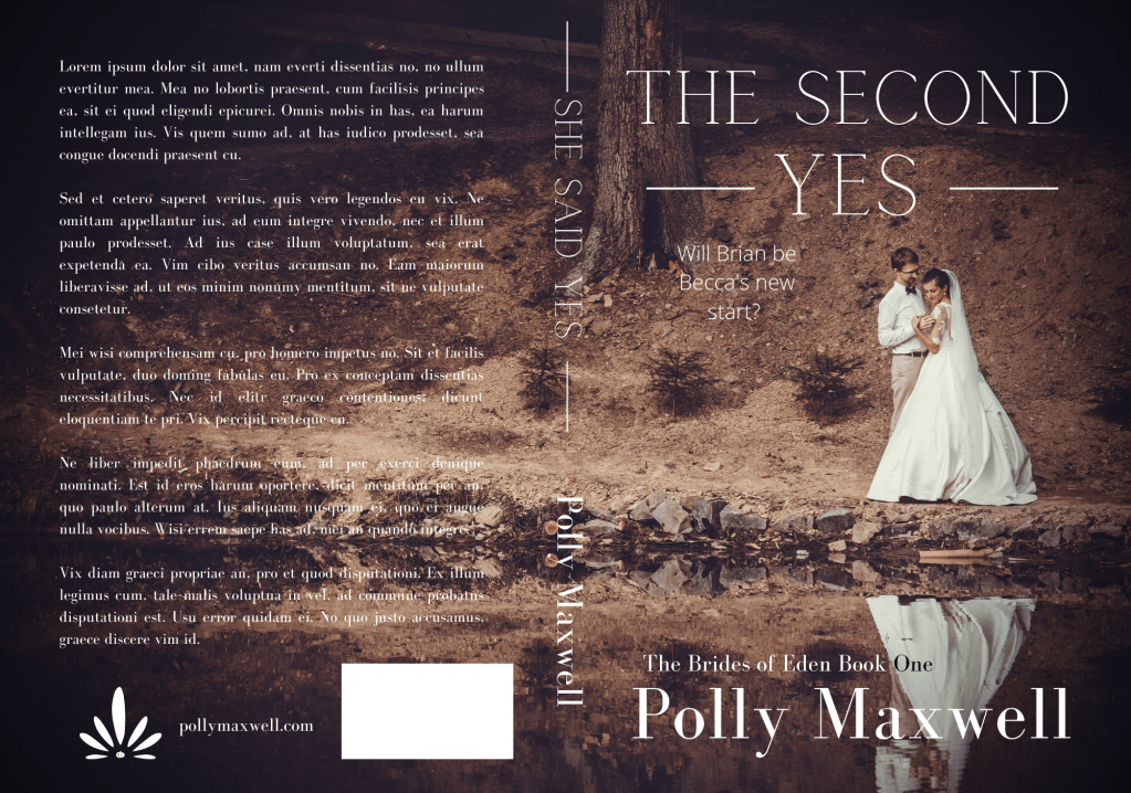
This is the template the first book in my Rocky Point Wedding series. The trim is 5×8 and the spine is .70 inches. If we do the math for the Canva canvas it would look like this:
5.0 (back cover) + .125 (bleed) + .70 (spine) + 5.0 (front cover) + .125 (bleed) = 10.95. That is the width you would need to put into the custom box.
The height would be 8.0 (cover) + .25 (bleed) = 8.25. That is the height you would put into the custom dimensions box.
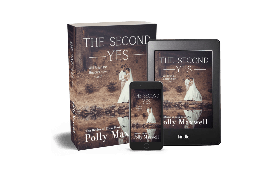
This is the cover I did for the first book in the series:
I did most of it in Canva, though I added some transparent gradient in GIMP for blending the two photos. Everything I know I taught myself, and it’s not fair i’m trying to shove four years of practicing and learning into one blog post. You’ll have to do your own experimenting.
Some odds and ends I picked up on the way:
Don’t buy a bar code. You don’t need one. KDP Print and IngramSpark will generate one for you. I buy my own ISBNs though, and that will be a choice you need to make if you’re in the States and expected to pay god-awful prices.
Don’t use free photos from Unsplash, Pixabay, Pexels, et al. Cover your butt and secure your business and use photos that you pay for from trusted sites like Shutterstock or Deposit Photos. Same with fonts. Not everything is available for commercial use. Be careful.
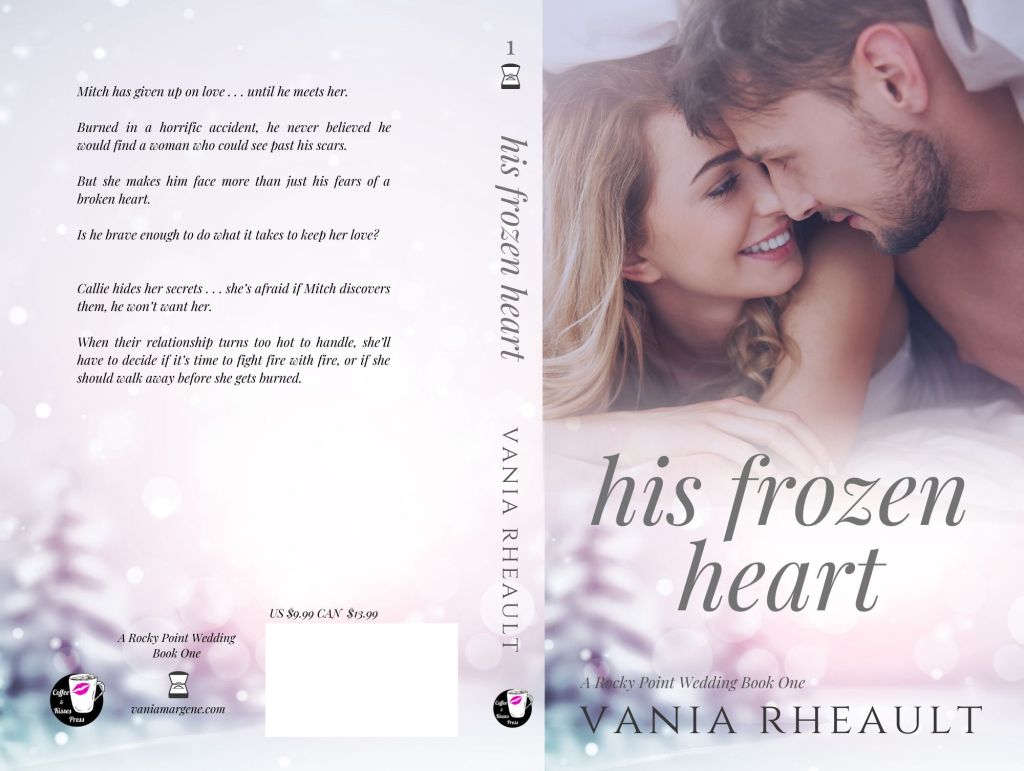
Use caution when choosing the models on your covers if you write romance. Amazon has gotten very picky lately, and the cover for His Frozen Heart disqualifies me from being able to run ads on Amazon Advertising to that series. Needless to say, that sucks.
You can use the same canvas size for an IngramSpark template. The one difference between an IS template and a KDP Print template is the spine for IS is narrower. The only adjustment you’ll be making is your font size for your title and author name on the spine will be smaller.
Elements (font, symbols ) can shift when you download your PDF and they will look “off” when you upload to KDP. I haven’t found a solution for this except to overcorrect, save, and re-download so the elements are in the place they are supposed to be. When you download the PDF, check the file before uploading to KDP. You’ll see if anything has shifted and you can correct it. The KDP Print previewer will show you exactly how your book cover and interior will print. If you don’t like ANYTHING in the previewer, fix it because printing won’t change it.
There are videos on how to create a full cover wrap in Canva–and you might find them helpful–but the few I’ve watched leave out important steps like making sure your photo is 300 dpi. This is going to take some trial and error. I remember being soooo nervous waiting to see if the cover for Wherever He Goes was going to look good.
I think that’s all I have. I know it seems like a lot of information, but blogs and videos won’t take the place of practice. If you have any questions, leave me a comment. I’ll answer to the best of my ability. If you’re making covers with my tips, tweet me at @V_Rheault on Twitter. I want to see what you’re doing.
The amount of information out there is insane, right? You don’t know who to believe, what to believe, if anything is true, and I’m not talking about what’s on social media right now with regards to COVID, but with indie publishing. There are scammers out there, people who want to make a buck off of your inexperience. These people aren’t nice, and you’ll run into them time and time again joining FB groups and Twitter people tweeting their “services” such as they are.
But when you get up into the bigger indies, the ones who are making a bit of money and they turn to the non-fiction, or entrepreneurial side of things, you do expect them to know what they’re talking about.
I’ve mentioned Nick Stephenson on the blog before, incidentally when I was blogging about book covers not that long ago. Because I love all things book covers, when I got an email (yeah, I’m signed up to his newsletter) saying he could make a book cover in 10 minutes using BookBrush, I was intrigued.
I already know I won’t ever use BookBrush, I prefer Canva, and they’re cheaper. I know BookBrush is specifically created for authors and Canva is meant for anyone who needs to make a quick graphic design. I like Canva, know how it works, and I’ve loaded quite a few fonts in my kit over the past couple of years. I don’t think I’ll change anytime soon.
Anyway, so I settled in to watch it, and you can watch it, too.
I had a hard time with the video, and not only because it’s basically one big BookBrush commercial with a probable affiliate link included that he failed to mention was an affiliate link. I could be wrong, but why take the time to make a video and not include a link where he could make a bit of money if his watchers decided to try it out?
So, I watched it, and didn’t really like the cover he came up with at the end and here’s why:
He advocated using Unsplash for photos, and anyone who does book covers knows that using free photos is a no-no. Especially with people in them. Websites like Pexels, Unsplash, and Pixabay do not collect model releases and these websites do not vet photos. There are things in these photos that are not for commercial use. I went to Unsplash and typed in tennis shoes. There were several photos of generic shoes, but there were also some photos that came up with Nike (the swoosh is a dead giveaway) and Adidas. To a newbie wanting to make a book cover about say, running or a personal journey or something, they might think a nice looking photo with a pair of Nike shoes would be okay because they found it on a free-for-commercial-use website. Do the same search on Deposit Photos and not one pair of Nikes shows up at all, or any logo for that matter.
He chose Romance and that is a very nuanced genre. The couple he picked had all their clothes on, and in romance (read: reader) circles, that would indicate the book to be sweet and or clean. Heat levels are depicted by the amount of skin showing on a cover, and that’s something Nick didn’t mention in the video.
He didn’t do a full wrap. I admit his way could be okay for a short story or a reader magnet that may not need the level of quality a book cover would need to promote sales. Reader magnets are supposed to bring signups to your newsletter though, and I wouldn’t imagine anyone signing up for a newsletter if the draw is going to be a short story with a crappy cover. So while you may not want to fork over $100.00 for a premade for a short story or novella that won’t go on sale, eventually your newsletter subscribers are going to be your bread and butter, and you need to treat your fans with the respect they deserve.
Not all the fonts on that website are for commercial use. Only the fonts with the green dollar tag are. The other problem I had with the font is that it’s not very romancy. Yes, I get he was trying to make a point in that he could make an ebook cover in 10 minutes, and he did. But font is a big deal when it comes to covers and this one, even though it’s free, just doesn’t work.
I don’t mean to pick on him, and I did make a comment on his YouTube video, so don’t think I’m ragging on him behind his back. My comment isn’t as long as what I wrote out for you here, but enough that maybe I did slap him down a little bit. I don’t mind calling out people who aren’t being entirely on the up and up. Passing out bad information is bad, no matter who is doing or how cute his accent is. I know us American ladies are a sucker for a cute accent, but don’t let him talk you into using free photos. It’s just bad news.
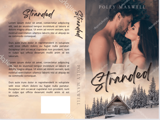
Here’s my version of a sweet wedding book cover:
Stock photo taken from Deposit Photos. Title font, Calgary. Author font, Bodoni FLF Cover created in Canva
With the photo I chose and the title, maybe it’s gearing more toward Women’s Fiction than sweet Contemporary Romance, but it just proves my point: you need to take a bit of time to think about your cover and put some effort into choosing the stock photo, font, and overall design.
I know he was trying to prove his own point: that using BookBrush is an easy tool and you don’t have to pay out hundreds of dollars for a simple cover by a designer. And that’s true, kind of. Someone asked in one of my FB groups what is the best software to make a book cover with, and lots of people chimed in with Photoshop, Canva, Affinity Photo, GIMP, the usual suspects. I told him I use a mixture of Canva and GIMP but I said it doesn’t matter what software you use. If you haven’t developed and eye for what looks good, you’ll always make crap.
If you’ve followed my blog for any amount of time, you guys know I love talking about book covers. I especially love talking about scammers trying to rip you off by slapping a pretty font over a free photo from PIxabay and charging you $50.00 for something you can do yourself in Canva for free. I recently called out a “designer” for doing exactly that, and the icing on the cake was another member of the FB group posted her cover with the same exact photo and said she, too, had been taken for a ride. The universe was on my side that day! I would post a screenshot, but the original poster took it down a couple minutes after. Hopefully in embarrassment with her tail tucked between her legs!
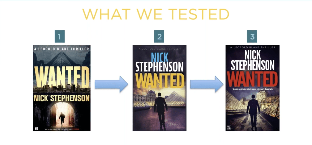
I know I can’t save the world, and if I tried, I wouldn’t have enough time to write. I do like talking about covers though and what draws readers to buy our books. I’m watching a replay of a webinar with Nick Stephenson, and like any webinar talking about sales, he goes briefly goes over a book cover case study with one of his own books.
Taken from Nick’s free webinar
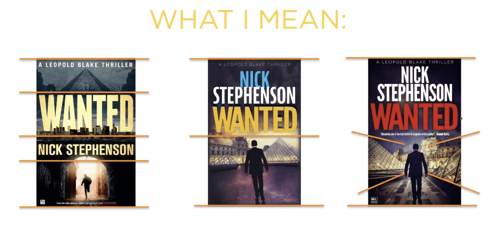
What he said is that the first cover wasn’t doing a good job. So they tried book cover number two, and eventually number three. Number three had the highest click-through and he explained in the next slide why:
Taken from Nick’s free webinar
Apparently, the red title that is associated with thrillers helped, along with the placing the elements that draw the eyes toward the center of the book. I like the first cover though, and I wonder how it would have done had he just changed the butter yellow font color to the dark red that works with thrillers. I think the guy running through the tunnel draws the eye to the center of the book just as well as the silhouette on the third cover. What do you think?
But it just goes to show that even a perfectly good cover may not be doing its job.
Anyway, in the FB group I’m in, there was a thread about cover pet peeves, and I thought it was a silly thread because this is something that authors seem to forget. Your book’s cover isn’t for you.
Just like most people agree that reviews aren’t for the author, they’re for readers finding their next book, covers, also, are only for readers. If you get too precious about your cover, or you’re too attached, or you let pride stand in the way of sales, what are you trying to prove? And to who?
names protected to hide the . . .
Listen, if I have to find a picture of a pig and a chicken falling in love to sell my book, then that’s what I’ll put on my cover. I didn’t write my book so it would sink to the bottom of the charts because I cared more about my likes than what will sell my book.
Stock photo provided by Canva. Template provided by Canva.
Genres have cover expectations, and unless you have a solid audience already in place, you need a cover that will sell books. I’m not sure why authors have such a hard time understanding this. I know some of it is cash. Especially if you pay out and you can’t afford to swap. I mean, I’ve heard of that happening, and it’s too bad. But you’re not going to make anything off a book that has a cover on it that isn’t appealing to readers.
Authors can make fun of man-chest covers, or the boring couple with the script font on the front, or all the thriller covers that look the same (girl in red jacket running away from the camera in the fog), or all the Urban Fantasy with the tough girl holding a fireball, but in doing so it just closes their minds to the possibility that being the same as other books might not be a bad thing. And why make things harder than they need to be? Discoverability is difficult!
That thread just really boggled my mind like so many indie decisions do, I guess.
I want my books to sell. That means genre specific tropes, cover to market, good blurb, correct categories and keywords, a nice look inside without typos.
Readers have a lot of choices these days, over 8 million to be exact. Why purposely give them a reason to keep scrolling?
Okay, I think I’m done musing and I’m going to bed. One day I’ll probably get kicked out of all my Facebook groups, but I just can’t help it. I just shake my head at the authors who want to do it their way then end up crying because they don’t sell books.
Can you ever really have your cake and eat it too?
Let me know, because I don’t care enough to try.
Man chest? Yes please. 🙂 Stock photo provided by Canva. Font provided by Canva. Cover design by yours truly.
So if any of you follow Mark Dawson or you’re concerned about marketing strategies, or you were thinking about taking an ads course, or if you’re in any writing groups at all on Facebook, you know that Mark Dawson’s Ads for Authors course closed last week. Whenever Mark opens up his course, I have a huge case of the nerves. Why? Because everyone raves about this course. How helpful it is. How it’s a lifetime pass to ads and all your questions and all of the answers until you die. You can’t be an author and learn how to sell your books without it. After hearing it’s God’s gift to sales, you’ll run out and sign up, right? Well, the next time it opens is in the winter, and you’ll need that time to save up the fee, because you know why I haven’t signed up? It’s $849.00. You read that correctly. It’s almost a $1,000. And if you take the cheapest payment plan, it does cost over $1,000 dollars payable over two years’ time.
You know how indies say, “I can’t afford a cover, or a professional edit, etc, etc, etc, because I’ll never earn my money back?” Yeah. That. How many books would I have to sell to earn back $849? That’s the whole point of the ads course, right? To learn how to make that kind of money? Sure.
So how about this one? In Mark’s SPF University, there’s a course on how to write a bestseller by Suzy K. Quinn. People have raved over this, and I’m always wanting to work on the craft part of being an author. Some would say working on craft is the most important part of being a writer because it always starts with a good book. But her class is a whopping $297.00. People say they learn so much from that class. But hey, that’s two car payments for me. Or half a month’s rent.
And I’m not picking on Mark Dawson. John Truby also has a writing class. He gave a intro talk about it at the 20booksto50k conference in November last year. And you can watch it here.
And that’s just classes. We haven’t talked tools yet.
Bookbrush. A platinum yearly fee with them is $250.00. Canva. A yearly membership with them is $120.00 a year. But if you compare the two, you get quite a lot more with Bookbrush, as you should since it’s double the cost. There there’s Vellum, and if you don’t have a Mac you have to run it through Macincloud, and if you do want a Mac, well, everyone knows how much they cost.
Never mind paying for clicks on Amazon Advertising, and the same goes for running Facebook ads and Bookbub ads. (Don’t bother with running ads on a platform you don’t understand. You might as well give me your money. I’ll use it to buy promos.)
Can we add newsletter providers too?
Oh, I forgot about website hosting and a domain name. Maybe a business upgrade on WordPress.
A yearly subscription to Microsoft Office 365.
Forgot coffee. And booze. Are you even a writer if you’re not drinking something like a fish?
Let’s just say that indies have a lot of resources and not all of them cheap, ah, budget-friendly.
How much does it cost to be a writer? Well, nothing. I mean, literally 0 dollars. It takes no money to be a writer. Maybe two dollars. Grab a pen and notebook from the dollar store. Or scrounge your kids’ school supplies for things they didn’t use after everything moved to online learning because of COVID-19.
There’s a joke in the running world that running is the most expensive free sport there is. Shoes, race fees, GPS watches, the rest of the gear. The list is almost as long as what a writer needs to be an author. Being an author is the most expensive free thing you can do right? Tell that to my $150.00/pair Brooks running shoes so I don’t get tendonitis in my ankles.
But how much money does it really take to invest in your business?
The problem is, not anyone is going to know but you.
I had a friend step back from writing. She’s focusing on her family. That’s great; she has to do what’s best for her. And while she’s never said she won’t come back into the writing/indie space, what she did invest in will just sit while she decides what she wants to do. She bought a Mac, she purchased Vellum. She bought a yearly subscription to Canva Pro. Granted, that can run out, but I don’t know how much of her paid year will go to waste while she’s not using it. She purchased her domain name for a blog she took down. I gave her a free developmental edit of her book, so there’s something, but she paid for a cover for a book that will sink in the Amazon store because she won’t be promoting it (and by promoting it, I really mean writing the next book) while she takes a break.
So how much money should you spend? Start small. I pay for Word. I don’t use a writing software like Scrivner. But you don’t have to purchase Word, either, though the .docx is compatible with Vellum and other conversion websites as well as KDP. There are free options like Open Office or Google Docs.
There are some things indie professionals say you can’t skimp on like a professional edit, or a decent book cover. And that’s true. You don’t have anything if you don’t have a good book. That’s why there’re craft classes out there. But you don’t have to pay $300.00 for a class. There are a ton of craft books, and all you need is to invest some time into reading them. In fact, there are a lot of free resources on YouTube if you learn better listening to a speaker. Brian Sanderson has a set of lectures on Youtube people say are really good, and you can get started here. And over the years John Truby has spoken about craft and you can watch those YouTube videos for free. I’ve shared several talks I’ve enjoyed from the 20booksto50k conference in Vegas last year. The group puts those on YouTube for free too. Chris Fox’s channel is valuable, as is David Gaughran’s new channel.
I suggest narrowing down what you need at the moment you need it. If you only have one book out, probably you don’t need an $800.00 ads course. If you only have one book chances are working on craft would suit where you are in your career a lot better than learning an ad platform or any kind of marketing strategy.
I have fear of missing out, and a lot of writers I know do too. It’s tough not to want the newest brightest thing. Especially when all your groups on Facebook are raving about it. I can’t afford Mark Dawson’s class, and if you can’t either, there’s no point in feeling bad about it. It is what it is. I’ve learned a lot taking Bryan Cohen’s free ad challenges, and he doesn’t push you to pay for his class. I break even with my ads, and that’s okay. I’m not losing money and I’m picking up new readers. At this stage in my career, that’s a win for me.
Having all the tools and technology won’t make you a writer and I have a feeling that was what my friend was aiming for. She was collecting the tools of the trade, but in two years wrote only 60,000 words. For some indies, that’s a word total per month.
Think about what your goals are, what you want out of your career and when you want them. My fiancé bought me a Mac and purchased Vellum for me. I format a lot of books, and pay my fiancé’s kindness forward and will format free for others. Like I said, I pay for Word. It’s my main (umm, only) writing software and I use it every day. I pay for Canva. I bought Publisher Rocket because I do experiment with ads (and right now those small ads are my main source of sales). I’m ashamed to say I threw $40.00 at something I don’t even know what it is or how it will help me. All I know is she said it was her final offer because she wasn’t going to sell it anymore, and I swallowed it hook, line, and, sinker. Some kind of author toolbox website that I probably will never be able to find because I was too busy throwing money at her to pay attention to what I was buying.
It happens, and probably more frequently than we want to admit. The panic sucks. The fear of missing out on something that will make us a bestseller. And we especially panic when we think everyone else but us has the magic bullet.
A good rule of thumb is to exhaust all the free possibilities before going to paid. Newsetter providers have tutorials. So do lots of people on YouTube wanting to help you. Podcasts have been a great way to learn things, and I like to multi-task. Listen while you’re doing chores, or running errands, or taking a walk. I use my phone to take notes if they mention something of interest I don’t want to forget.
No matter how you learn what you learn, probably the one thing you’re going to need to invest is time, and in a lot of cases, that time is better spent writing.