Who Are You Writing For? Yourself or Your Readers? Be Honest.

There’s a lot of fear in a writer’s heart. Lots of it. Am I good/smart/brave/pretty/handsome/wistful/*insert adjective here* enough to be a writer? Am I writing books people want to read?

I see this all the time. The fear. The agony of publishing. The waiting on pins and needles for reviews to start coming in. If they do. Then we have to wonder, is a bad review better than no review? Bad reviews mean that someone read my book, right? Or *gulp* tried to.

I have to admit, I see this stuff and I go wwwwwhhhhhhyyyyyyy?

Why_

There shouldn’t have to be this crippling anxiety when you write and publish a book. Not if you do it right. What do I mean by right? Well, I have some ideas.

The first and foremost is be honest who you’re writing for. Are you writing for yourself? Because if you are, then you have no justification to piss and moan when someone doesn’t read your book or want to read your book. Because after all, you wrote it for yourself so what do you care if no one else is reading it? So, be honest. I find that with a lot of indie myths floating around out there that this isn’t so easy. Some of my favorite indie myths? Indie myths

  1. Build it and they will come.
    This is the stupidest thing I ever heard. Your book is not a sports stadium. (And even sports stadiums are built with specifications. Could you image a stadium built with no bathrooms because the owner didn’t want to pay to put them in?) No one is going to find you unless you push your book out there. Even publishing houses make you do most if not all of the marketing for your book yourself. If you’re an indie, this means contacting book bloggers, paying for ads, hosting events on your FB author page. Setting up your own signings at bookstores. How does this fit in with writing for yourself? You can write what you want all day long, but if you’re writing what no one wants to read, why bother?
  2. Writing to market is a cop-out.
    I love this one the most. Do you know what writing to market even means? My friend Holly put it like this: Writing to market isn’t being a sell-out. Writing to market is writing what people like to read. That’s it. It’s not any harder than that. So what does that entail significantly? Knowing your genre. What tropes are used? What kind of characters are in that genre? It can even come down to how many pages does a book in that genre typically have? Know the genre. It’s why your reader picked up your book in the first place.
  3. Experimenting is okay/write what you love/it’s your book.
    I agree up to a point. You have to experiment to find your voice. You have to love what you’re writing because this is your hobby, this is your passion, and if you hate it, you might as well go to work instead and hate it there and get paid for it, too. And it is your book. Absolutely. The choice of genre and POV is in your hands. But you have to stay within the confines of the genre you choose. I don’t know how many more times I can say it. And if, for God’s sake, you have to experiment with a medieval Zombie sex plot, no one is saying you have to publish the *insert derogatory adjective here* thing.
  4. And the worst indie myth of all:
    I DO WHAT I WANT
  5. I’m an indie and I can do/write/publish what I want.
    This is hurtful for so many reasons. One, because what you do affects all of us. You know that saying “one rotten apple poisons the barrel?” It’s true. Indie publishing already has a bad enough reputation, do we need to add to it by publishing whatever crap you decide to write? You hurt me, and I hurt you. And if you think I’m full of crap, think again. Another reason this hurts is because you are hurting yourself on a personal level. One crap book and your reputation is on the line. Readers remember you. Don’t think they don’t. I have a list of readers I don’t like, both indie and trad-pubbed, and you know what? I don’t buy their books. Easy-peasy.

So what does all this have to do with the fear I was talking about earlier? Well, I’m willing to guess and say, if you follow the rules (yep, I went there) and produce a good book, you may find that the idea of people reading your book won’t scare you as much as it did.

What are these blasphemous rules I speak of?

  1. Know the genre you’re writing in. When a publishing professional asks, If you were to put your book on a shelf in a bookstore, where would you put it? That’s a serious question. We all dream of being in a bookstore, and I don’t think that means being in the back room because the manager hasn’t got a fucking clue where to put your book. Follow the tropes and expectations of that genre.
  2. Get the thing edited. I don’t care by who. Just do it. You have a typo on the first page, and it can be something as simple as using a period in dialogue when it should have been a comma, you lost me. And probably about 100 other readers who were interested. They aren’t anymore.
    And if this is your first book and you have no idea what you’re doing? Get a developmental editor, too. Your plot needs to move, your characters need to grow. If you have trouble crafting a good plot (ie no plot holes) and your characters are flat out boring, don’t publish.
  3. Have a cover that matches your genre. Seems like a no-brainer, but it’s amazing how many authors do what they want with no sense of what is going on in their genre. This could be because they don’t have a genre, and well, that sucks. No genre, no cover, no bookshelf space, no book. It takes two seconds to Google the hot 100 on Amazon in your genre. If your cover looks like a sweet romance, but you wrote erotica, you’ll piss off a lot of people. And you know that means? Bad reviews.
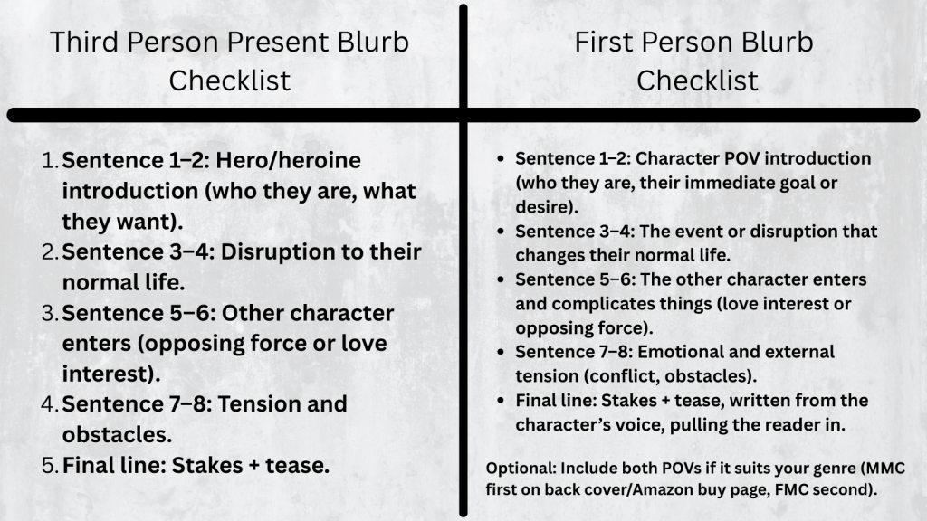
  4. Write a decent blurb.

If you do all these, and yeah, it takes work, time, and money, and you publish the best book you can, there is no reason why you should be scared people will read your book.

Let me tell you a little story.
A someone told me they were petrified people were going to find and read their book. This puzzled me, as they published the darn thing–they should want someone to read it. Naturally, I looked them up on Amazon. The cover was okay; it prepped me for a chick-lit plot with some naughty bits. Can’t beat comedy and sex. The blurb sucked, but well, writing them is hard, so I gave them a pass. Their author bio was written first person, a no-no, but well, I guess some people don’t know that. I used the look inside feature that Amazon has so graciously set up for us so we don’t waste money, and I found the book was a mess. Their cover didn’t match the serious tone of the book, the formatting was horrible, and it was evident from the first paragraph they didn’t have an editor. They’re scared people are going to find their book? They should be.

There are things you can do to control the quality of your book. Find an editor/critique partner/beta reader who will teach you things, not just blow smoke up your bum. Read craft books. Go to writing conferences and have your first pages critiqued. Read in your genre. For the love of God, choose a genre. It makes writing a lot easier, trust me. And after you hit publish, you did it. Own it.

And seriously. If you are writing for yourself, when you’re done, print it out and shove it under the bed. Maybe the monster under there can edit it for you.

Am I too harsh?

Tell me what you think!

Vania Blog Signature

What Draws a Person to Buy Your Book: A VERY Scientific Poll and Results

Your first pages do a lot of work for your book, and this blog post was going to talk all about it. This very scientific poll I ran on Twitter was going to lead the way. But it bought up way more than just first pages, and this post turned into an overall-type thing. I’ve always enjoyed knowing how others make decisions, and here’s a small idea of what attracts readers to your book.

twitter poll

What I found was that some people are really brutal with a book. You get the first sentence with some, others, maybe the first paragraph. That’s it–if your potential reader even gets that far.

If you have a typo anywhere, forget it. I have little patience for typos. I’m starting to feel quite agent-y about the whole book-buying thing. All it takes is one little nope, and I’m done.

this-is-the-cutest-nope-ever-5457814

I would imagine though, that if an author knew how many readers s/he was losing due to a small error, it wouldn’t seem so cute.

The picture above was just a poll, but there were a lot of comments, too:

first lines twitter poll 7

This is a great thing to keep in mind. Your writing style won’t hit home with everyone. I dislike first person present. There is only one author I will read who writes that way. I’ve turned down beta requests and review requests because of this. I might as well be reading something like, right?

first lines twitter poll 5

Reviews were one aspect of the whole thing that I didn’t consider. Mainly because I don’t look at reviews unless it’s a non-fiction book. Taste is subjective, and unless the reviews say it’s poorly edited, I don’t think someone’s opinion would have much weight with me. And I would know if it’s poorly edited by reading the first couple paragraphs.

first lines twitter poll 3

Liking the blurb makes sense–if that is poorly written, there’s a good chance the book will be too. But blur-writing is a skill in itself, and you need to either pay someone who has the skill to do it or learn it yourself.

first lines twitter poll 8JPG

Being swept away by a book is the best sign. If you’re reading on Amazon and you run out of the free sample and you want more . . . that’s the goal of every author right? Because it’s not such a long stretch from being sad the sample has run out to clicking the buy button.

first lines twitter poll 6

Some people give their books way too much of a chance–and I think this happens when someone has already bought the book and doesn’t want their money to go to waste. That’s one thing you have to watch out for when buying indie books from Writer Twitter. We’re all friends, but just because that person is a friend, that doesn’t mean what they’ve written is any good. It’s an unfortunate fact that some of your friends will publish crap. Be it because they can’t afford hire an editor, or didn’t want to take the time, didn’t take the time to have beta readers weigh in on their book, or because they don’t do anything in their non-writing time to get better, (reading craft books, reading other fiction) sometimes you just can’t trust the people you know are good writers (or know how to format correctly, either).

first lines twitter poll 4

While I was thinking of mainly indie books, Jamie brings up a good point. Trad-pubbed authors don’t control the book cover or the blurb. If you’re turned off by those two things, you won’t make it to the inside. Although, if you are trad-pubbed and have a little marketing power behind you, maybe a high number of good reviews or positive word of mouth would counteract a cover you don’t like and a blurb that sounds boring.

first lines twitter poll 2

Leanne brings up the book’s title, something else I didn’t think of, at least for this poll. I’ve lamented in the past about my title for On the Corner of 1700 Hamilton. I loved it then, not so much now. I don’t think the title has helped sales. *Laughs* But I bought the ISBN number for it so to retitle it I would have to trash the number, and that’s a waste of money. But anyway, to get back to Leanne, she likes the title and the cover.
If you want to laugh at some, look here.

first lines twitter poll 1

And last, but not least, Laurie likes the blurb as do most of us.

This poll surprised me, but it shouldn’t have because it’s a no-brainer to have a decent cover and a good blurb. But taste is subjective, and what you like for your own book may not be the best for your genre or your book’s content, so it’s always a good idea to research what is selling in your genre and try to fit in and stand out at the same time. Got it? Good. 😛

If you have a poor cover, some won’t bother with you at all. If you have poorly written-blurb, that’s probably a good indication the inside isn’t written well either, and potential readers will pass you by.

Publishing is a cutthroat industry; readers don’t have time for your poorly written book.

So, what makes a reader buy your book?

  1. A good cover. Something that fits within your genre.
  2. A good title.
  3. A good blurb. Hire someone. Learn how to do it and get honest feedback from people you trust.
  4.  Have awesome first pages.
  5. Format it correctly. Your book could have won the Pulitzer, but if you leave the automatic 8 pt. space between paragraphs, I’m not reading you. Simple as that.
  6. Decent reviews won’t hurt. At least one five star review so when you tweet the link to your book the five stars will pop in the tweet. I’m kidding. Kind of.

I rarely tweet my own books, but this is what it looks like:

never tweet my own books

Might not help if someone found your book on Amazon, but if you tweet it now and then, it can’t hurt.

This blog post was going to be about first pages, but I wanted to feature my Twitter poll, so I’ll write about first pages another day.

Thanks for reading, and tell me what you think!

Vania Blog Signature


The Evolution of Don’t Run Away’s Cover

This is an old, terrible post and unless you want your eyes to bleed, you shouldn’t read it. Or, go ahead if you want to be amused while I flailed helplessly and gave advice when I shouldn’t have been giving it. There are better posts to read about my book covers. Try this one about matching the vibe of your book to your cover and why a “perfect” cover might not always be the right one: https://vaniamargene.com/2024/04/08/my-marketing-secret-shh/


They say your cover is the most important part of your book. I don’t know who “they” are, or if that’s necessarily true, but your cover is important. It needs to convey your genre, it needs to be eye-catching. The font for your title and author name needs to look professional, yet suited to your genre.

This is a tall order if you want to do it yourself. Way back when I was new at this, I didn’t know as much as I do now, and I was adamant that indies could do their own covers. And you can. You should.

But let’s step back and figure out what a “good” cover is.

I wrote Don’t Run Away as a NaNoWriMo project in 2015. After I released Summer Secrets, I started editing it, I mean, really editing it, so that it was publishable. I took out all the head-hopping, the mixed up POVs, and I turned it into the book that’s going to be released on the 18th. So for the year I spent editing, I blogged about the publishing process and making your own cover. While I blogged about making your own cover, I came up with some doozies, that were, ah, well. See for yourself.

blog post 1

Yeah. I blogged about creating this cover. Did I say that I liked it? No. Am I embarrassed that I put something like that on the internet? Yes. But that was naivety and inexperience. Cover design takes practice and a good eye.

Did it get better? No.

back cover blurb

Then I came up with this piece of crap. Yeah, it’s better than that pink monstrosity above, but I would never buy a book that had this for a cover.

Luckily for me, lots of time went by, and I took a break.

When I was nearer to publication, I came up with this:

20813949_10155382724650751_814775920_n

And that’s not so bad. I even would have maybe used this. But the problem was, or is, is that Don’t Run Away is book one of a trilogy, so not only did I need to make one cover, I needed to keep in mind that I needed two other covers, and they needed to look like they belonged together.

I came up with these two for books two and three:

I mean, as far as covers go, they aren’t that bad. But ultimately, I turned all three of them down because, in the end, I felt the couples looked fake. When you look through sites like www.canstock.com or www.dreamstime.com there are three different categories of people. Real people:

canstockphoto11400894

You don’t want real people on your cover. I think this is where a lot of indies go wrong. Real people aren’t models, and the photographer didn’t touch up the photograph to make it look less real. I suppose if you found the perfect person, you could run the photo through some filters, modify it somehow so that she doesn’t look like a real person giving you a goofy look through some weeds. But you definitely have to do something to it. That’s where the pink “hell no” cover at the beginning of this post comes from. Real people don’t work.

The second category of people on stock sites are real, but they look better than real.

canstockphoto15361212

She looks good, ya know? She looks like model material, but approachable. The photographer added some sunlight. Depending on your genre, these make perfect covers.

The third category of people are fakes:

woman-grass-young-outdoors-fashion-portrait-style-boho-40902938

There’s a genre for actual models (erotica and porn), and I didn’t need anything like her for my covers. I needed my couples approachable. My characters aren’t billionaires, they aren’t sheiks, or princes, or even CEOs. My characters hold down-to-earth jobs and have real people problems. I needed my covers to convey that.

So I did manage to find this couple, and I was lucky to find two other couples that looked like they were taken by the same person. Two of them were, but the third was taken by someone else. I probably won’t write anymore trilogies, but if you do, or even a duet, or even more than three, make a plan for your covers because it’s a pain in the ass to change them. Not only do you have to go through the submission process again for CreateSpace, if you use IngramSpark, they charge you for every change you make. And you have to remember to change your cover on Goodreads, too. (Which isn’t the best because your old cover will always be attached to your book on the book’s page.)

Here are the three I chose for my covers:

canstockphoto11573436 (2)
canstockphoto38274429 (2)
canstockphoto46133644 (1)

I also decided to make the whole picture wrap onto the spine and back cover, so the position of the couple was important too.

Here’s how Don’t Run Away turned out:

don't run away cover

I’m pretty proud of it. And it turned out nice in person (ignore how goofy looking he is):

IMG_9499
IMG_9500
IMG_9501

Of course, even when you find the perfect picture, you need to play with font, where everything will go, that kind of thing. At first my cover looked like this:

Don't Run Away Experiment

And I didn’t have any qualms about it. But after the proof came in the mail, I realized the title was way too big. It didn’t need to be that large. My friend Gareth made the crack that, what, I didn’t need people be able to see it from outer space? No, I didn’t. So I fixed it, but then the spine was off:

23134703_10155603226795751_388290689_o

I was tempted to leave it, but I couldn’t. So again, I sent it in to be fixed, and it came back okay.

I guess my point is, covers go through an evolution of sorts, and it’s never too late to start playing around with fonts and photos.

Look around at other covers and see what’s popular in your genre. Maybe even see if other covers are using the same people you’re thinking about using.

I found this nice one while looking around:

fake running to love

The site selling it wanted $50.00 for it. I’m sorry, but I like mine better, and it was free. Well, did pay http://www.canstock.com five credits for the picture, which turned out to be around 4 dollars. The fonts I used were all allowed for commercial use for free and I downloaded them from http://www.1001fonts.com/. Be careful if you use this site because some are for commercial use, and some are not.

That ends my cover adventure for Don’t Run Away. If you want to know how I used the photo for the spine and back cover, let me know. It’s fun, and it solves the problem of what to put on the back. Some people don’t care about the back since you’ll sell more e-reader versions, but still. If you ever do a book signing or a giveaway, perhaps on Goodreads, you’ll need a paperback version.

Let me know your thoughts!


Adventures with CreateSpace

Publishing your own books isn’t easy. After you write it and pay to have it edited, or self-edit the best you can, you still have to format the insides, write front and back matter, write the blurb, and design the cover. And after you’ve managed to do that, you still have to submit it, and if you’ve got it wrong–well.

rawr

It’s enough to make you pull your hair out. I’ve been working on Summer Secrets since last August. I’m not kidding. It’s when I opened the file and started with that first sentence. It feels like forever, though some writer friends kindly remind me that they’ve been writing their current WIPs for years. I feel for them, I really do, because there’s nothing I want more than to push these books into the world and never look back.

But alas, I cannot because CreateSpace, to borrow the words of my friend Brickley, is a temperamental hag, and what I’m doing isn’t good enough for her.

Don’t get me wrong, that’s a good thing. It’s a great thing because of course I want to publish my best work, and I want it to look its best, too. But I’m beginning to lose hope that I’ll ever be able to publish a book without some issues. Well, this is only my second try, and some things have changed since I published 1700 last year, so I should cut myself some slack. Publishing will always be a learning curve, and yep, I’m learning.

First off is my font. CreateSpace didn’t like the font I laboriously searched for. It’s not embeddable. That doesn’t mean I can’t use it (always look for a site that says their fonts are free for commercial use or pay because my first choice was $35.00, and let’s face it, publishing a book costs enough as it is), but CreateSpace gave me warnings up the wahoo. Interestingly enough, in the email I received saying my cover had been rejected, they mentioned my interior file was fine. The email and the interior viewer said two different things, so the only thing I can do is wait for the proof.

My cover was rejected?!

confused cat

You caught that, huh? Yeah, let me tell you it was a surprise. I knew I had the measurements for the page set up just right. I triple-checked the numbers. The only thing I could think of when they said I didn’t leave room for bleed, (though I know I did because my measurements were spot-on with what they said they needed) was that my font on the cover was too close to the edges. I can’t show you because I’m not revealing my cover yet, but I fixed it, lowering my font size and bringing in the margins on the blurb. I did the same thing to my title and my name. I’m hoping this fixes it. If it doesn’t, I’m going to have to call.

No one said publishing was boring!

excited cat

I’ll let you know how it turns out.

Until next time!

Kindle Cover

That’s great, you say, but paperbacks don’t sell, the cover looks too complicated, and I don’t want to do that right now; I would just prefer to publish on Kindle and be done with it. What do I need for a cover then?

If you’re not interested in doing CreateSpace, then you’ll need to do the cover, yes, and it will just be the front, or rather, the picture customers will see on Amazon. You’ll still need to write the blurb for the product information, but you won’t have to worry about it being put on the back of a paperback.

Open a Word document, make a text box of your chosen trim size, being 5×8, 6×9, whatever. I advise you to do it this way in case you decide down the road to offer a paperback after all, then all you will need to add is the spine and back cover and adjust the page layout (remember all that math . . . yeah . . . ).

When you’re done, saving it in a photo format can be a bit tricky, however, if you’re doing it in Word because there’s no option to save as a jpeg, jpg, or a tiff file, the only files being accepted by Kindle Direct Publishing (KDP). They don’t take a PDF like CS does.

What I did when I made the cover for Under Lock and Key, was after I made the cover, I used the Snipping Tool and “snipped it” and saved it as a jpeg. After I did that, I ran it through GIMP and made sure it was 300 dpi. Always make sure your images are 300 dpi or dots per inch, so your picture is clear online.

Cover basics are the same for Kindle: you want your cover to look pleasing, your name and title clear as a small thumbprint for a potential reader to see.

I made a quick one for my e-reader story using a photo I here found so I didn’t have to pay money for a blog post.

2017-03-28

This is a screen shot of the cover I made in Word. There is a lot wrong with it. The title isn’t legible that small in that font, and my name is too dark to be seen. But I’ll leave it this way since this is only an example. Plus the bottom of the Y is cut off (it seems like I like doing that) so you would want to adjust that text box. 😛

Now use the Snipping Tool: 2017-03-28 (2)

And be as precise as you can. If you get some of the white in there, you can crop it out with GIMP when you check it for dpi:

2017-03-28 (3)

Save it as a JPEG file in the Save As Type:

2017-03-28 (4)

Right now it’s going to save as a PNG, so you need to change it to JPEG using the down arrow on the right:

2017-03-28 (5)

That will save it in the file you need. Now you can upload it into GIMP and crop it if you need to, if you accidently snipped some white, and make sure it’s 300 dpi. That’s all you need to do for a cover for your Kindle:

Make it in Word
Snip It
Save it as a JPEG
Run it through GIMP.
Export it under the Save AS so the change in dpi sticks

My picture was only 72 dpi, so I changed it to 300. I exported it to save the changes and this is it:

gimp picture

And that’s all you need. It’s a lot less involved than doing a book cover, and there are a lot of authors who only offer an e-reader option for this reason. Under Lock and Key is a short story, so I didn’t do a paperback for it. But I like paperbacks, and I will probably always offer them to my readers if I can. It might be an expense because I do purchase my own ISBN numbers, but it’s a personal choice.

You can make your cover as simple or as involved as you want. You can buy a template, hire an artist, whatever you choose to do.

When you offer both paperback and Kindle, the thumbnail that shows up is for your Kindle. It’s easy to make a new cover, for the Kindle, but if you’re going to do that you have to decide if you’re going to change the cover in CreateSpace. You don’t to make your readers angry thinking they’re going to get your new cover but they get a completely different one in paperback because you didn’t change it in CreateSpace. I like to keep all my things the same. When I redid the cover for 1700, I changed both. I think it’s courteous that way. I don’t want my readers not to trust me for any reason.

I think that’s it for Kindle Covers. I only need to tell you how to format your Kindle file, and that’s up next!

Until next time!

CreateSpace Recap

I started this publishing series eight months ago. Sorry about that. But in that time I’ve published a book (two novellas together), wrote 150,000 more words (in the form of 6 novellas that will be published together), and fixed 1700’s typos inside and the cover. I have also started fixing my 2015 NaNo project just so I can say it’s done and move on.

When I started this series, it was my intention to tell you how to publish a quality paperback cheaply and easily.  I think in this recap you’ll see I did that. Even now, I am so tired of hearing that you need to pay for this, pay for that, to publish a quality book.

Indie publishing went from, “It’s not a real way to publish” to “It is a real way if you pay for everything.” No one can afford to pay for the ISBN number, the editing, the formatting, the file conversions. And believe me, there are people who will do it all for you. For a price. But the sad part is if you are willing to take a few minutes (okay, hours), read a few books,  you don’t need to pay for anything.

Let the recap of eight months begin.

  1. You wrote a book! Congratulations. Let it sit for a few weeks, even a few months, write something else, read it again. Have a few people read it. Ask them to look for plot holes, flat characters, scenes that don’t move the story along. If you use Word, download Grammarly. It’s a decent checker for things I miss or wouldn’t think to look for. Buy the Hemingway App for more help ($20.00 is a decent investment). Use anything you can get your hands on to make your work as clear and as typo-free as possible.
  2. Grab a trad-pubbed book and copy the front and back matter. You need the copyright page, the acknowledgments. The title page. Dedication page. The author page. You’re in charge of all it.
  3. Get your author picture taken. I want to see you sitting in a cafe with a cup of coffee in your hands, smiling. Because you just wrote a book, and you’re going to publish it, and you are proud of it, and you’re going to own it, dammit! Have your best friend take it and buy her a cup of coffee for her trouble.
  4. Buy your ISBN or don’t. At the beginning, I leaned toward buying your own, protect your work and all that. But if you’re not sure what your publishing plan is, (like one a year, if that) take the free one CreateSpace gives you. No harm done.
  5. Choose the size of your book. If you’re writing smut you’re not going to be able to choose the smut-sized trim sold in Walmart. But choose the size you want, the color (cream or white) pages you want.
  6. Based on that, download the free template from CreateSpace so you can format the inside of your book. CreateSpace wants you to have an easy experience, a good experience, so you keep using them. The template is easy. Download it, copy and paste your manuscript into it. You don’t need to copy the template exactly. Their template comes with a Table of Contents I do not use. Change the font if you want, maybe the size. And please make a couple different copies of your MS. If something goes horribly wrong, well, that would bad. Play around with the template before you copy and paste your MS into it. See what you can change and what will mess up if you touch it.
  7. Make your template for your cover. If you make changes to the number of pages in your MS, you’ll need to recalculate the spine width and change the paper layout dimensions. I forgot to do that when messing around with 1700. I changed the spine text box but not the paper layout. That’s probably why I had some of my spine color wrapped on my front cover.
  8. Write your blurb. Maybe you already did this. Have one of your beta readers read it, make sure it sounds good. I gave you some resources how to write a good one. It takes a little bit of help, though, so don’t be afraid to ask for it.
  9. I wrote about your cover a lot. Remember, if you don’t like the thought of doing your own cover, don’t. Use the CreateSpace Cover Creator, or buy a cover that’s already done. Hire someone. This series was to help you do it as cheaply as possible. People *do* judge a book by its cover, so if this is something you don’t want to tackle, I don’t blame you. There’s a lot of choices out there.
  10. CS  takes a PDF of your cover (in the Save As option on Word, PDF is a choice). Submit that, submit your interior, and you’re done. They say 24 hours, but it only takes them 12 to get back to you and tell you if it’s approved or not. Remember the flattening warning you’re going to get. That’s okay. Order the proof, check it over. When I got my second proof for 1700 I read it like I was reading anyone and looked for typos. Spend some time on it, because the proof is exactly what people will be getting when they order it. It takes about 5-10 days to get the proof in the mail. If you want your paperback and the Kindle to be live at the same time, don’t go through the Kindle stuff until your paperback is ready to go. Kindle only takes 5 hours to approve your files. You can have them live on the same day. I had trouble with CS so my Kindle version was live for a couple weeks before my paperback was available. That’s up to you and how you want to do it.


And that’s it. I recommend Chris McMullen’s book and you can find it here. He explains a lot of the technical stuff with the template and he goes into Word a lot more than I do. There’s a lot of tutorials and YouTube videos out there. When I started eight months ago, I didn’t know as much as I do now. Indie publishing is a continual learning process because things change. I’ve learned to read only things that were written in 2016 or even more recently because old information may not help.

If you need any more help, drop me a question. I’m sure you can Google the answer probably faster than I can answer it, but I’ll be going through this whole thing in a couple more months when Summer Secrets is ready to be published. I’ve come a long way with doing covers in Word, and I’m confident that with the patience I’ve learned, the tricks I’ve taught myself playing with the CS interior template, and the tutorials I’ve watched about picture manipulation, the process will go smoothly. And I hope yours does too.


Congratulation-Banners-black-small-1

Promises, Promises

At the beginning of this publishing series, I promised you could make a nice cover with a picture and some words. I got a little fancy with the cover we just went over, and if you’re reading this all the way through and got discouraged, I apologize. I’ll show you how to make a nice cover now, just a picture and some words. That’s it. I promise.

Start out with a new Word document. Go back to the formula for the paper set up. If your book is going to be 5×8 with cream paper, your page set up calculations will be:

Inches: 5 + 5 + spine + .25 (bleed) = what you need.

A 334-page book with cream pages will have a spine of .835 inches. (334 x 0.0025).

5 + 5 + .835 + .25 = 11.085

Height is always easier because you’re not doubling anything. So the height for the page set up would be 8 inches plus .25 for bleed.

8 + .25 = 8.25

The paper layout will look like this:

paper layout

Word rounded down, and I’m not sure how that affects our calculations. I would guess it’s insignificant or Word wouldn’t do it.

Follow the rest of the directions in the blog post where I typed out the list of steps.

You’ll have your handy template that looks like this:

blog cover template

This template is for a 5×8 trim size with cream colored pages. Number of pages, 334. (A nice, long book. :)) (FYI, You’ll always have an even number of pages because a page has two sides.)

The problem with the picture I like is that it’s square, not rectangle, so when I put it into the template, it stretches. Stretchy is not the same as stabby; sometimes stabby can be a good thing.

stretchy

If you don’t mind she looks a bit stretched out or you swear you can’t tell, that’s your prerogative. I’m sure down the road it will bother you, so you might as well do it right the first time. I guess I don’t need to tell you, to avoid this you can always find a rectangle picture. There are plenty out there and CanStock will even filter square pictures out in your searches.

Using the Crop feature, I cropped it using the Aspect Ratio, portrait 2:3.

crop

Fix the dimensions of the picture so it fits into the 5×8 box.

crop1

It brought them closer, but that’s okay.

So this is what I have so far:

back cover done1

I downloaded a new font. I used the same picture on the back, but flipped it and lightened it. I did forget to mention in the last post that you probably want to put the price above the ISBN box. That way if you do happen to have a book sale of some kind, you can have the price on there, and if you put it on discount, customers can see that it is.

back cover done2

If you think the cover picture is too bold for the white spine and the back cover,  you can lighten up the cover edges a bit like this:

back cover done3

You can do what you want with the blank space by the ISBN box. Maybe your author picture, maybe your imprint picture. Whatever. But I did what I promised you from the beginning, I gave you a lovely cover with just one picture, no fancy picture effects you need to learn how to do. Oh, wait, take all the lines off. I swear, there is always something.

back cover done4

And don’t worry about the cursor. That will go away when you save it as a PDF to submit it to CS. Also, remember not to freak out if this is all you have and you want the Kindle cover too. CS will offer it to you, and you can download it.

I think this is it for covers. I’ll post a recap of everything I’ve talked about then I’ll tell you how to format your file for Kindle.

Thanks for reading!


Your Book’s Back Cover

I’m sick today, so I’m going to cover your back cover rather than try to edit. Hopefully, this is a bit easier than looking for typos and fixing head-hopping. One can hope.

Where did we leave off? Oh, here:

cover-and-spine

So what we have here is a decent cover, plain spine. Ultimately, you want your back cover to blend in with what you’ve already got. Despite what Mr. Smith says, people,  at some point, will be holding your book in their hands. Maybe you can get your book into an indie bookstore, or you can sweet talk Barnes and Noble into hosting a book signing. Even if you’re just going to give your book away on GoodReads, it’s important to take a bit of time on your back cover.

blog back cover

Is this the right picture? I don’t know.  I’m sick and I’ve changed laptops as well. Anyway, so it might not be the exact picture (downloaded from Pixabay), but it will work. You are never cemented into what you’ve got going on. You can change your mind anytime, so if you come across a picture you like more, by all means, use it. What we’re going to do with it will make it work, even if it isn’t the exact same thing. You’ll probably want everything to mesh, though, so at this point, since I don’t have the other picture I used I would have to redo the cover. Not a bad thing, but ugh. Anyway. Let’s put the ISBN box back where it needs to be so we know how much room we have to work with.

isbn box
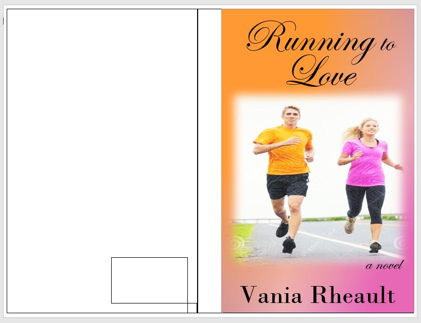
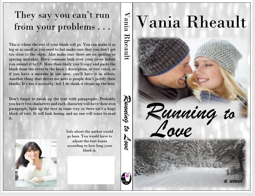
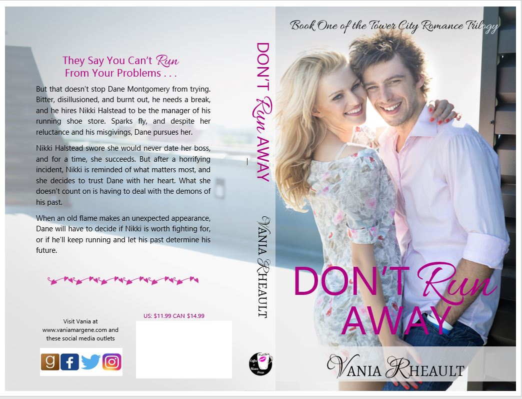
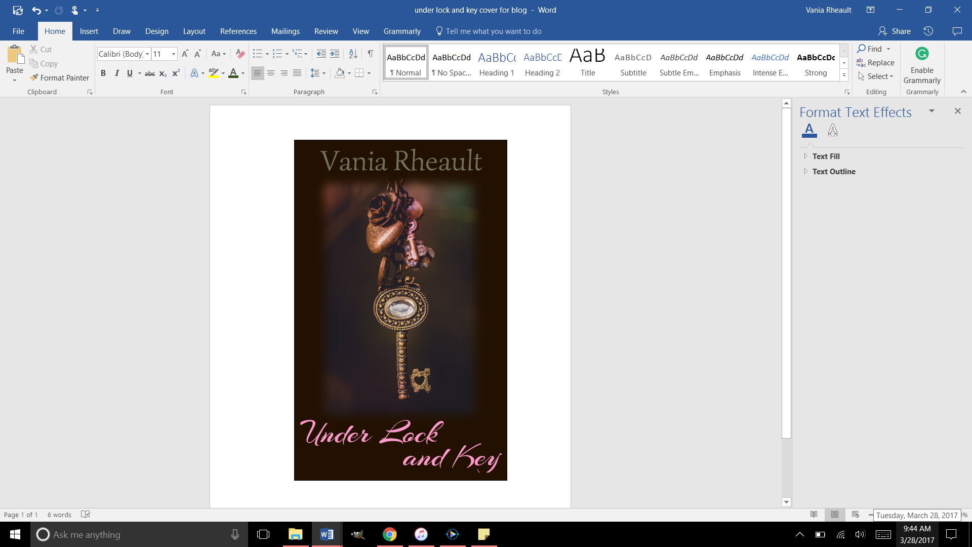
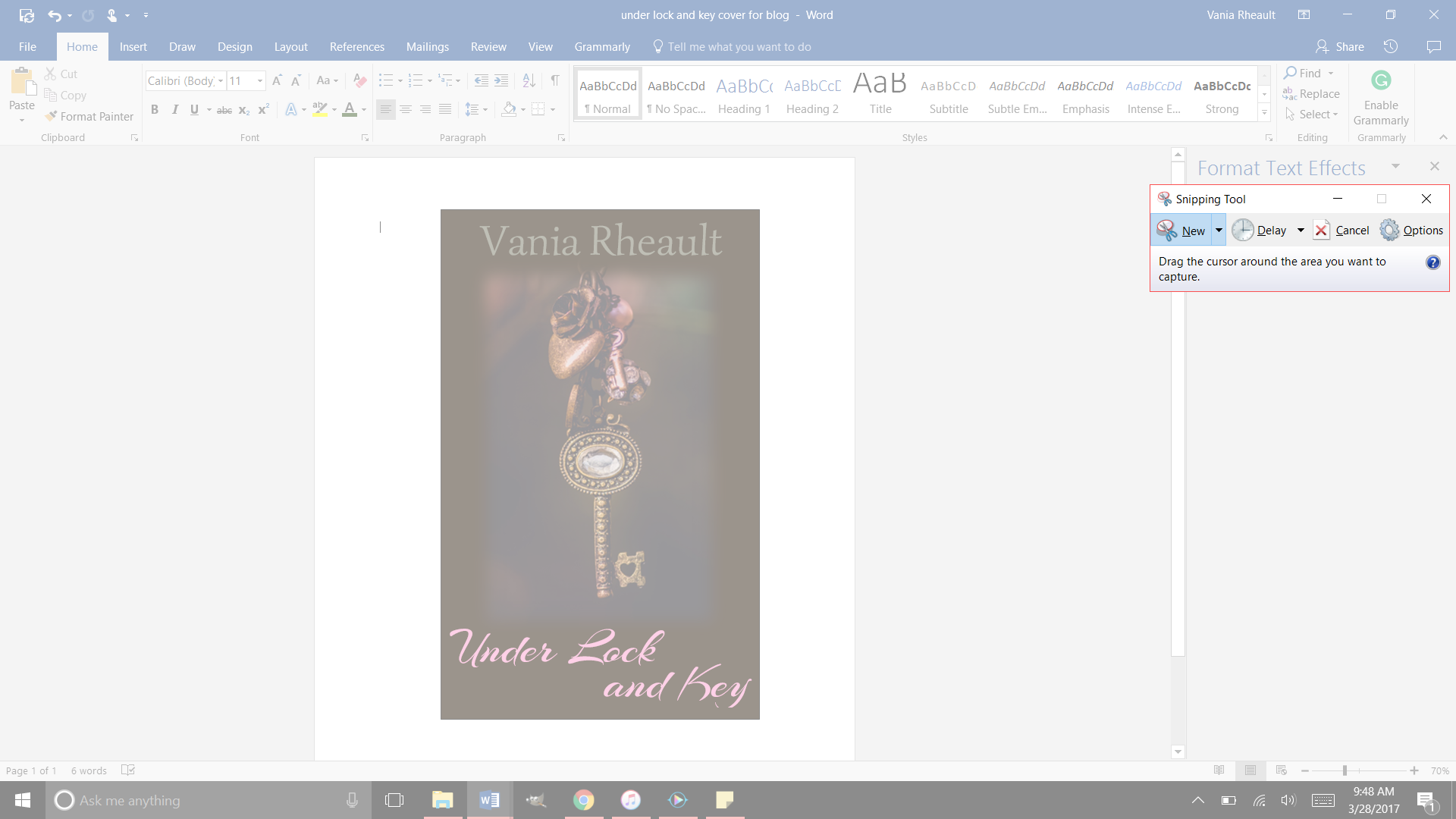
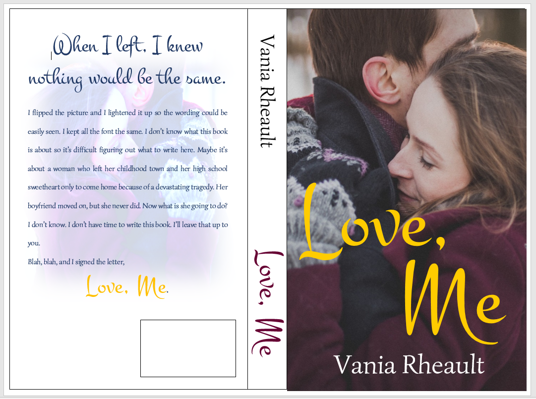
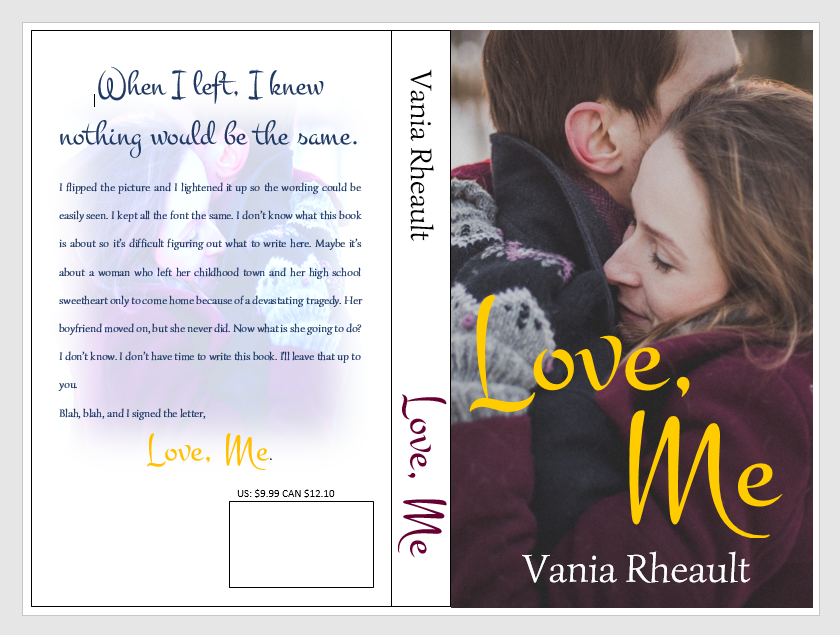
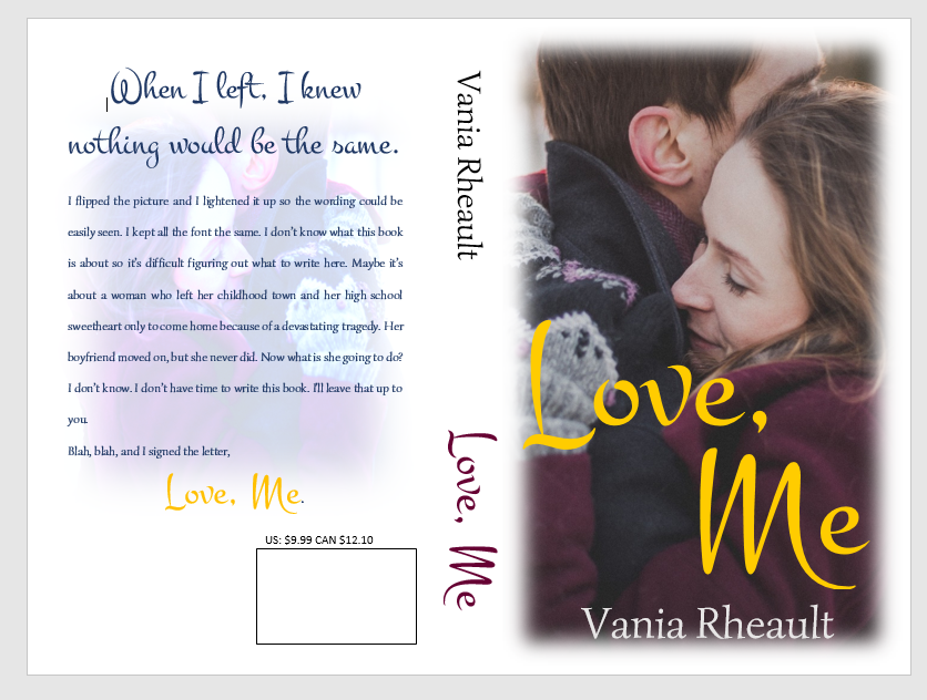
The little box is to make sure you know where your ISBN box belongs. You can take off the outlines for both, and take off the Fill for the little box.

isbn box 2

There.  So, some people put their author photo and a small bio on the back. Lots of trad-pubbed books do that, so if you want to go through the trouble, you are welcome to. I didn’t for 1700. For curiosity’s sake, let’s try.

cover photo on back

That looks alright. You would need to adjust the picture and the boxes to how you like them. You can’t move your ISBN box. It’s where CS wants it to be. Also, remember you can’t get too close to the edge of the cover; you don’t want anything to accidently be chopped off in the bleed. All I did was create text boxes and used Fill With Picture for the author photo and took off the outline for both. I chose No Fill for the wording because the black looks fine on the silver.

All that’s left is the blurb, and if you were interested in some kind of large tag line, put that on there as well. I will because I like the idea of it.

back cover 1

I had to use another text box, and I just took out the Fill and Outline. If you tried to type in the big text box that is used for the back cover outline, the text will actually disappear under the photo and you won’t be able to see it. I also don’t want my cover to be a hodge-podge of font, so I’m going to stick with the fonts I used on the cover and the spine.

back cover blurb

That pretty much sums up the back cover. You might think the spine looks boring now, but your book won’t be spread out like this and I don’t think the full white spine will scream at you then as it does now. You could always fill in the spine text box with the grey and white light picture we used on both covers, and if you didn’t like it you could always get rid of it.  A book’s cover is a huge experiment and it takes a lot of tries before you get to something you like.

In fact, being the perfectionist I am, I don’t like guessing if I used the same photo on the front and back so I’m going to change it.

back cover done

I used the same font, pictures, and no, I hadn’t used the same grey and white light picture, so it’s the same now. I used three different text boxes for the title font so I could move the words around. I used a smaller font for the “TO” and I stuck to the same two fonts for all the words on the front cover, spine, and back cover to lend consistency to the entire book.

2017-03-14 (1)

This is a cute little pic of all the text boxes we used to create the cover. These are why you’ll get the error message in the CS email when you submit your cover. In Word, there’s no way to flatten these. CS will do it for you and that’s not a big deal. In GIMP, if you create your cover in that software, there is a way to do it. Being I’ll only make two, maybe three covers a year (if I’m lucky) I’m not going to bother. You’ll also get the same message for the interior if you happen to have any pictures on the inside like scene spacers, or if you have your author photo in the back as well. Maybe you’ll have pictures of your other books, that will also cause CS to give you the error message. That is one of the few things CS will fix for you, so as long as you know the cause of the error, you don’t need to worry about it. The important thing is you like your proof when it comes back.

There is one more thing I’m going to have to you do; I never had a problem with 1700, but I’ve heard others have. Delete the outside text box lines. I’ve heard they show up. They didn’t on mine but better to be safe than sorry.

no outlines

There. All the lines for the spine and cover are gone. You have a gorgeous cover, and it was free (besides paying for the pictures, anyway). All it takes is a little time and patience. It’s fun to mess around, but if you get discouraged, look for a tutorial and learn what you want to do with your pictures. I’m hoping you crank out more than one or two a year, but if you can’t, that means you have plenty of time to learn photo manipulation to get what you want.

I gotta go blow my nose, so I’ll chat with you later!

Congrats on a great cover!

Writing a Blurb for Your Back Cover

This post was updated 8/17/2025. It kept getting hits but I offered no real advice since the original was written back in 2017 and I had no idea what I was doing.


Writing a blurb is hard. It’s probably one of the hardest parts of the querying/publishing process. It’s probably why this blog post is still getting hits seven years after I wrote it, and why I decided to rewrite it so it actually says something.

One of the first things you’re going to run into is what POV and tense to write your blurb in. Many will say that no matter what POV your book is written in, your blurb (or description) should be written in third person present. That may still be true for traditional publishing, but in the years that first person present POV has taken over the indie scene, especially in romance, more and more authors are writing their blurbs in the POV and tense that matches their book.

When I was writing in third person past, I was writing my blurbs in third person present and there’s a lot more advice and how-to articles on how to write a third-person blurb over a first person blurb. Third person is actually a bit easier since there’s a lot of resources telling you how to do it. There’s some controversy with how much to give away, since a blurb is comprised of characters, motivations, and more importantly, stakes, and if you don’t give your potential reader something, they’ll think your book is about nothing. I’ve always been of the mind that you need spoilers to intrigue your audience because even if you reveal an important plot point, a reader is still going to have to read to see how it came about and how the issue is resolved. It was interesting to see people saying that telling a reader your romance has a happily ever after is a big spoiler, when really, it’s just genre convention. Readers who read romance already know that you’re going to give them a happily ever after (if you don’t, watch out), it’s how the couple navigates the problems you throw at them to keep them reading. So, don’t be afraid to give something away because that’s what will hook your reader into buying your book.

When I was writing blurbs for my third person books, I was following this formula:

Introduce your character:
Mitch has given up on love . . . until he meets her.

What happened to change their normal life:
Burned in a horrific accident, he never believed he could find a woman who would see past his scars.

What are the tension and obstacles:
But she makes him face more than just his fears of a broken heart.

Stakes/hook:
Is he brave enough to do what it takes to keep her love?

The whole thing is pretty short:

Mitch has given up on love . . . until he meets her.
Burned in a horrific accident, he never believed he could find a woman who would see past his scars.
But she makes him face more than just his fears of a broken heart. Is he brave enough to do what it takes to keep her love?

Then I have her POV:

Character:
Callie hides her secrets . . . she’s afraid if Mitch discovers them, he won’t want her.

Then I skip a whole bunch of parts and end with:
When their relationship turns too hot to handle, she’ll have to decide if it’s time to fight fire with fire, or if it’s time to walk away before she gets burned.

At ninety-one words, I could have added a lot more. Blurbs are typically around 150 to 200 words and you can see my ninety-one words leave a lot of room on the back cover:

full book cover wrap of His Frozen heart.  handsome man wearing black long sleeved t-shirt. standing in front of a frozen woods at sunset


I won’t add to mine just because this book is already published, and in writing this blog post and using this book as an example made me see a typo that I had to change on both KDP and IngramSpark–not to mention that I had to pay $25 dollars to fix the cover on Ingram, so I’m just going to leave well enough alone for now. (And also, FML.)

But the basic formula to follow for a third person present blurb is:

Sentence 1–2: Hero/heroine introduction (who they are, what they want).

Sentence 3–4: Disruption to their normal life.

Sentence 5–6: Other character enters (opposing force or love interest).

Sentence 7–8: Tension and obstacles.

Final line: Stakes + tease.

Here’s the blurb for book two of that series, His Frozen Dreams (and yay, there are no typos!):

Jared didn’t want to fall in love . . . Character Introduction
Then he picks Leah up from the airport, and he knows he has no choice. Disruption of normal life, or maybe inciting incident
When his wife left him to move to New York to work for popular fashion magazine, Jared swore he’d find a woman who loved living in Rocky Point as much as he did. Tension and obstacles
Leah is not that woman. He just has to make his heart believe it. Stakes and tease

Leah hates living in New York . . . but she can’t leave the big-city stress for small-town love.
Or can she?
With responsibilities she can’t ignore, Leah will have to choose between the safe life she’s been living in the city or risking it all for Jared’s love and the wide-open spaces that will heal her heart.

This blurb, too, could probably use some plumping up, such as why Leah hates living in the city, maybe hint at the responsibilities that keep here there. But I have the tension of her having to choose between taking the easy way out and staying or risking it for Jared because he loves her.

It’s simple as far as blurbs go, but working with the formula makes it easy to put something together.

Writing first person present blurbs I found to be much more difficult because not only do you have to have all those pieces of what makes a third person blurb, you also have to infuse the character voice into it as well.

Here’s the formula for a first person blurb. You’ll find it’s not that different from a third person blurb:

Hook / Who I am / What I want – Open in the protagonist’s voice, showing who they are or what they desire.

Disruption / Inciting Incident – What shakes up their normal life or challenges their goal.

Love Interest / Conflict Introduction – Introduce the other character or opposing force through the protagonist’s perspective.

Tension / Stakes – Show personal stakes and obstacles, reflecting their thoughts and feelings.

Tease / Final Hook – End with a line that keeps the reader curious and shows the character’s voice.

Let’s take a look at the blurb I wrote for Captivated by Her the first book I published under my pen name when I switched to first person:

Rick
The last thing I need is a reporter at my doorstep, and not just any reporter: the infamous Devyn Scott. Love interest, inciting incident
Since the construction accident that killed two of my men and turned me into a wounded beast, I’ve avoided people, but when a blizzard blows in, I can’t force her to leave, no matter how much I want to. Who I am, conflict of interest
I have enough blood on my hands. Tension, stakes
Trapped for days, she slowly tears down my defenses. Tension, stakes
When she starts investigating the accident against my orders, she steps into the line of fire, and she proves what I’ve always known. I’ll never be strong enough to keep her safe. Final hook

Then we have the FMC POV. I’ve seen some blurbs that only do his, since the MMC would be the best selling point, like Mafia, or Motorcycle Club. Then I’ve seen where there is only hers, like maybe Dark Academia or coming of age. Maybe some YA where her story is more important and if there’s a male protagonist he’s only there as a subplot. You would have to do some research and look at what other authors in your genre are doing. You might be writing in a genre that would only have one POV like thriller or psychological/domestic thriller. I like including both, but maybe to hook the reader at first glance, I do his first on the back of the book and the buy-page on Amazon.

Devyn
I’ll get fired if billionaire Rickard Mercer won’t give me an interview, but by the time the snow clears, I don’t want it. Who I am
I want more. Tension
I want to clear Rick’s name, and I start looking into the accident that will force him to live in pain for the rest of his life. Tension, stakes
Someone caused that accident, and I’m going to find out who. Stakes
Because only then will he know he’s good enough to take what I want to give him.
My heart. Stakes, final hook

That blurb has 218 words in it and hits the 150-200 guidelines. It also fits well on the back of a book wrap:

full wrap of Captivated by Her. handsome man wearing black suit. title is captivated by her author name vm rheault

Here’s a printable checklist you can download and keep:

checklist of first person pov and 3rd person pov.

all information is listed in the blog post

The original blog post touched on how your blurb will look in the back. Over the years I’ve been publishing, I’ve either put the title at the top or used a tagline. I’m pretty proud of Captivated by Her‘s tagline and I use it in ad copy whenever and wherever I promote my book: Trapped with her during a blizzard, I didn’t stand a snowball’s chance in hell of not falling in love.

If I ever redid the cover now, I probably wouldn’t center it like I have it here. My style has evolved but not too much. Considering I don’t sell many paperbacks anyway, I don’t get too hyped about about things.

Anyway, so this blog post will be more informative to anyone hoping to learn how to write a blurb. There are lots of resources out there, but the best thing you can do after you’ve written it is get feedback–preferably from someone who hasn’t read your book yet. They can tell you if you’re leaving too much out. I understand not wanting to give anything away, but you have to give your readers something or they won’t want to buy your book. I give away lots and lots and lots in the blurbs for my King’s Crossing serial. Each book builds on top of the other, so I really didn’t have any choice referencing what happened in the previous book. I’m hoping the first book sucks readers in and they buy just to know what happens next regardless of what the blurbs say. If you want to read them, you can on my author website: https://vmrheault.com/kings-crossing-series/

If you don’t have anyone to bounce ideas off of, you can always ask ChatGPT, otherwise known to me as Al. I get opinions on using him will vary and you have to do what’s best for you. He can’t compare your blurb to what others are doing in your genre–only you can do that. And he can’t write your blurb from scratch or your blurb will sound like him and not you or your characters, but he can come up with some hooky lines if copyrighting isn’t your thing and it’s easy to build from there. All the blurbs I used as examples today were written by me because Al didn’t exist back then.

There are a couple of resources that I’d recommend if you’re having trouble finding feedback. The Indie Cover Project on Facebook has members who will give you feedback and you can find that group here: https://www.facebook.com/groups/582724778598761

Also I’ve seen people give blurb feedback in Authors Optimizing Amazon and Facebook Ads and you can find that Facebook group here: https://www.facebook.com/groups/393917614473395

You might have your own Facebook groups where you can post, but I wouldn’t recommend using a blurb not read over by someone, even if it’s only Al.

I think that’s all I have, but this is a lot better than what I had before.

Good luck!

Your Book’s Spine

There’s not much you have to do with your spine. Remember, if you are publishing a novella, after formatting, your manuscript must be 100 pages or more. This is where the 5×8 trim size (the smallest size CreateSpace has to offer) comes in handy. You can also maybe bump up the font size in your manuscript if spine text is that important to you. But don’t go too big, you’re not publishing a Large Print edition.

Let’s look at the cover and template again:

blog-spineee

You kind of want the front cover, the spine, and the back cover to blend together. We don’t have a lot of colors to work with here, so I would probably leave the spine white and use the same fonts I used on the cover and keep them black.

title-1 
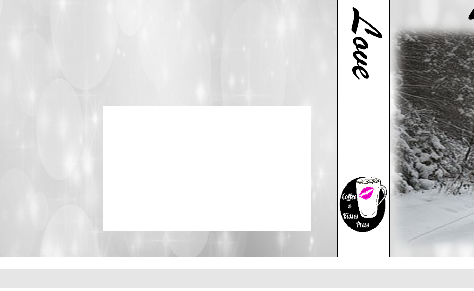
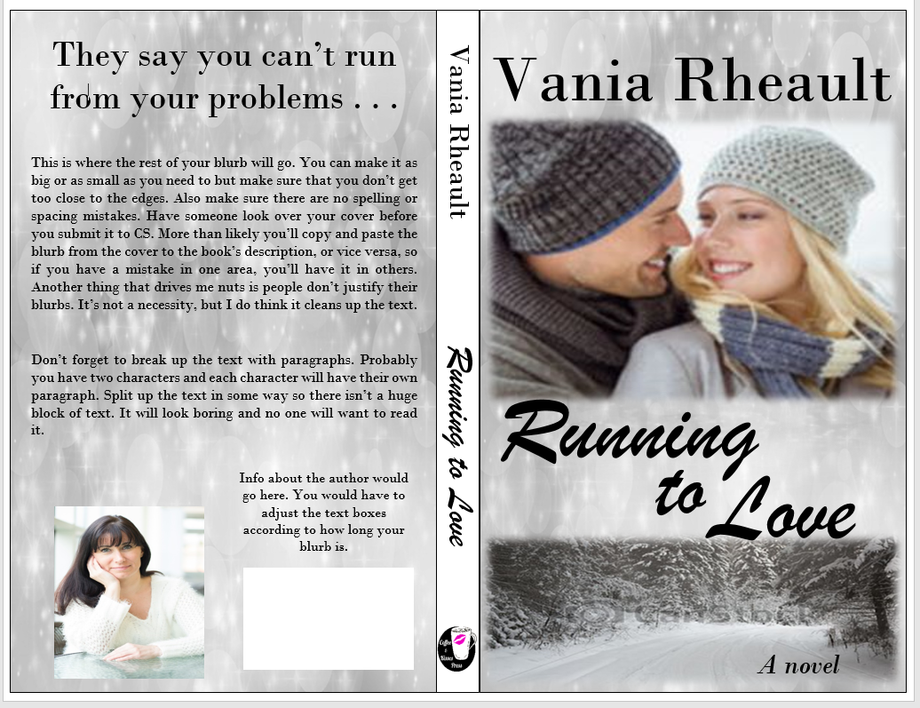
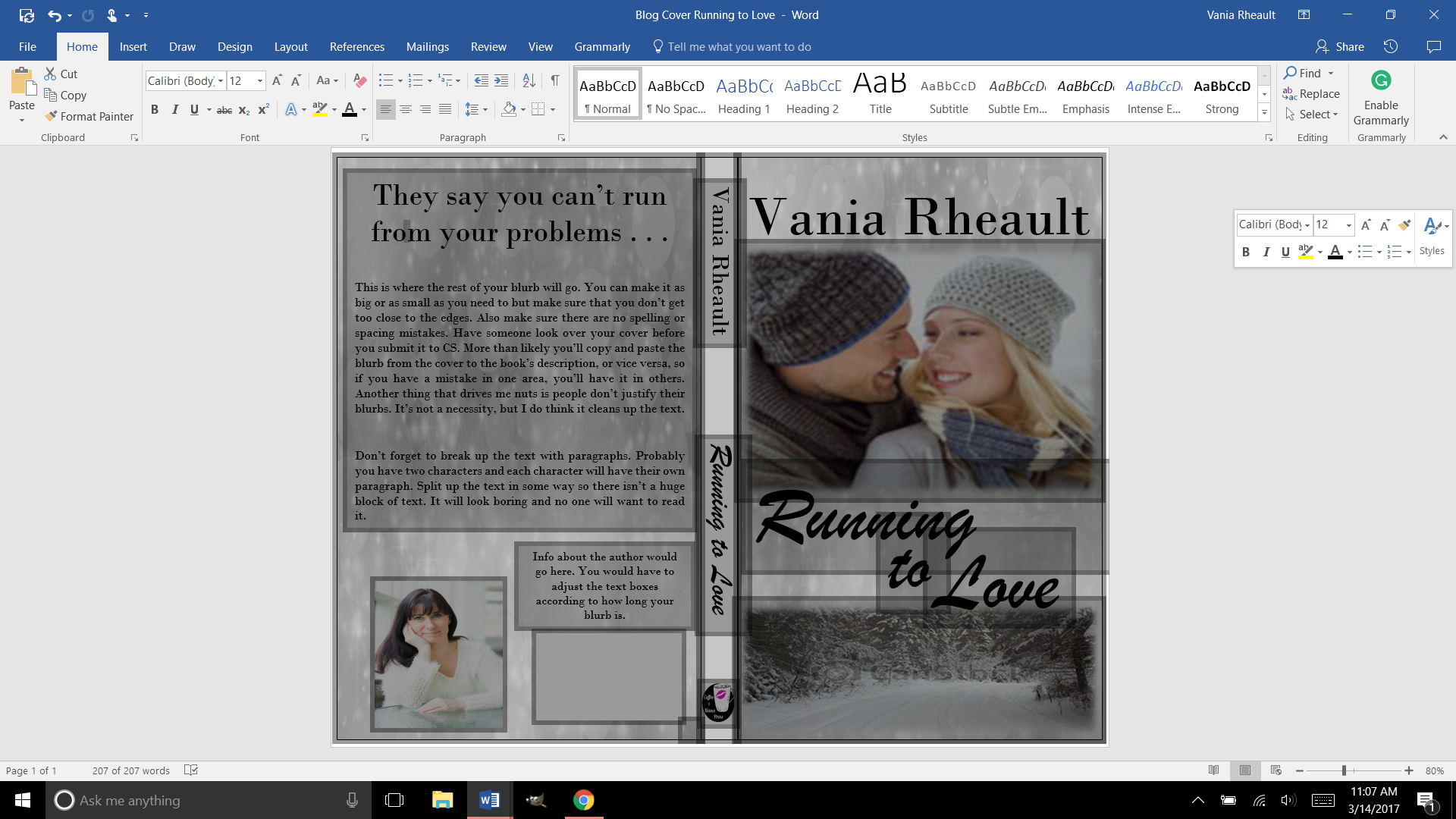
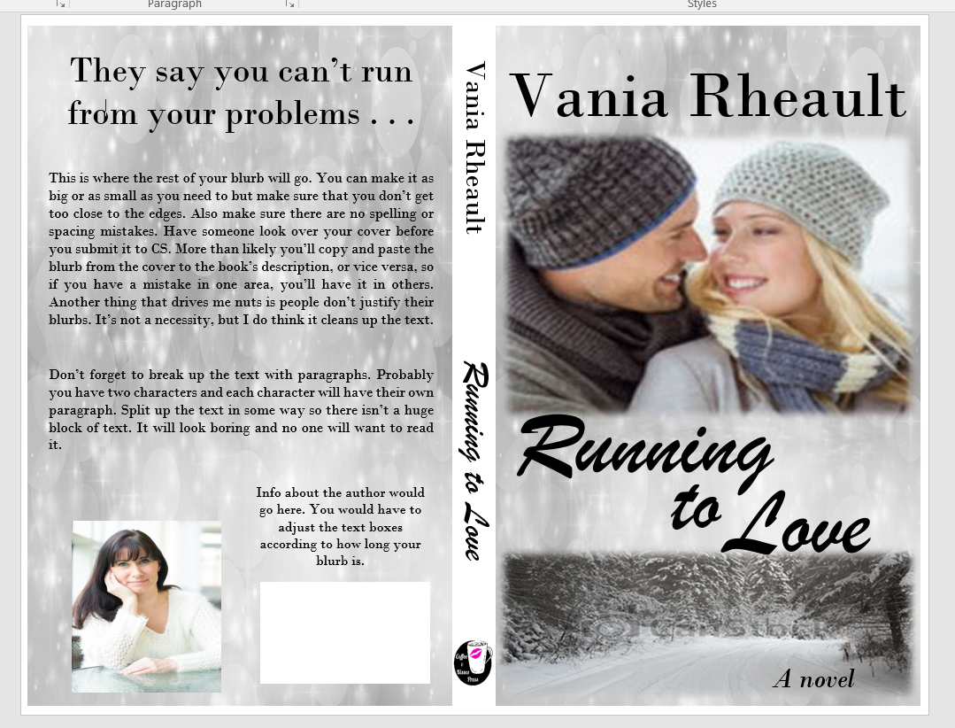
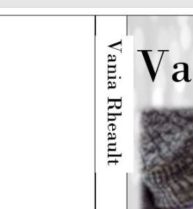
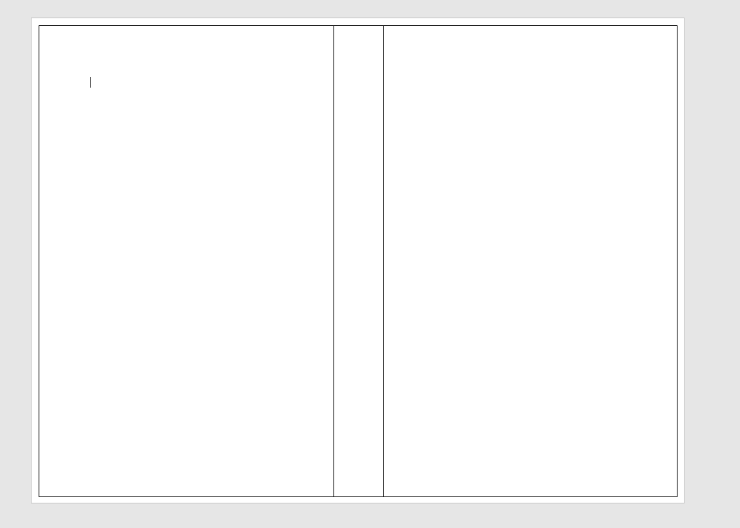
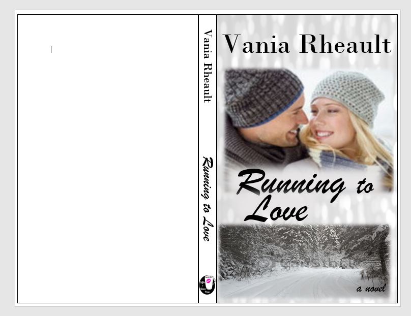
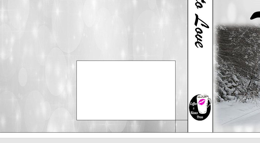
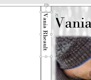
Draw a text box in the text box. Don’t make it bigger than you need; smaller text boxes are easier to work with.

Experiment with the font and the size. You can manually enter in the font size and work with the numbers even if the font size is not available in the drop down selection.  You can see here that my name is not centered on the spine, but I chose the biggest font size that would fit.
title-2
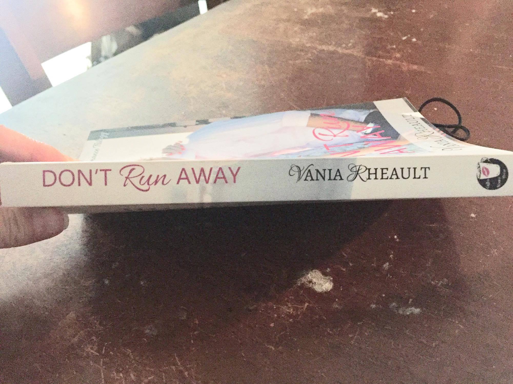
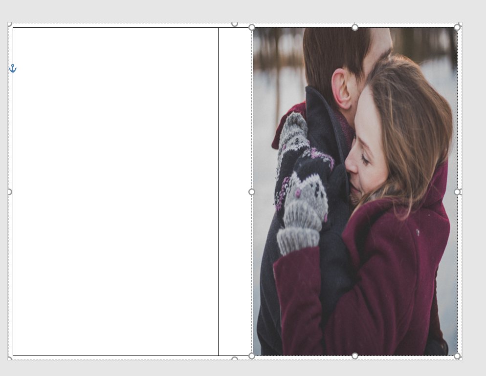
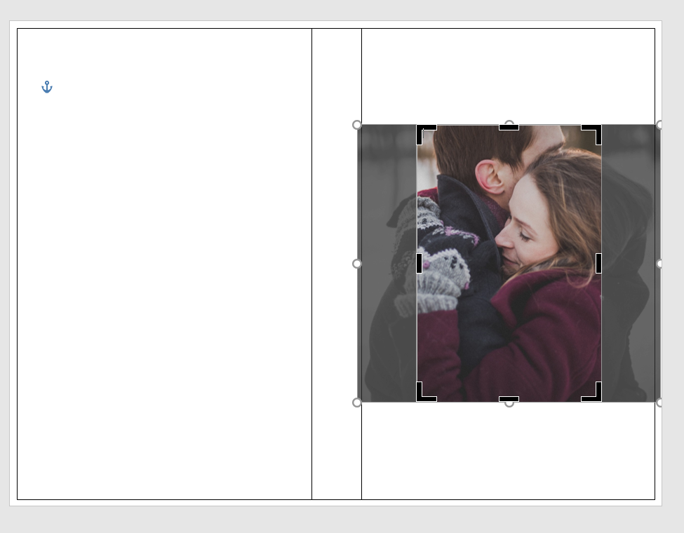
Move the text box so your name is centered on the spine:

The text box overlap doesn’t matter, we’ll fix that. The most important thing is that the letters are clear and big and as centered as you can make them. If your hand is shaky, or your mouse is temperamental, use your direction keys on your keyboard to move the box around.

title-3

Take off the edges by making sure the text box is selected and selecting No Outline in the Shape Outline option in the Shape Styles menu.

The white box is still visible on the cover so you need to select Shape Fill and select No Fill to make the box clear. This option is above the Shape Outline option we used to make the lines disappear.

shape-outline

You can see my name isn’t centered, it’s a little high, but the text box is gone. Move the text box around so you can center your name the best you can. CreateSpace won’t fix any issues you have. On my first attempt on The Corner of 1700, the bottom of the C was missing because I didn’t adjust the text box when I made the font bigger. Anyway, move the text box.

title-4-not-centered

That looks pretty damn near perfect.  There’s no rule that says your name has to go on the top and the title on the bottom. Do what you want, just make sure the text is in the right direction. Take a look at traditionally published books and do you the best you can. Fiddle with the colors if you want, play with font and size.

title-5-centered

Do the same with the title.

spine-1

I use an imprint and like to put it on my spine. Insert a text box.

imprint-spine

Use the Shape Fill to insert the picture, then use the No Shape Outline to get rid of the text box lines.
imprint-spine-2

You’ll get a warning from CreateSpace if this image isn’t 300 dpi. Mine printed fine at the 79 dpi because it’s so small, but you might as well make sure it’s 300 dpi in GIMP in case you want to use it anywhere else.

So far, this is what we have. It looks pretty good, and I think the title and author name are centered and as big as I can make them. If your book is thicker, you could even put the couple’s picture at the top; I’ve seen that done before, and I’m sure you have too. But the thinner the book the less room you have. That isn’t an excuse to plump up your book for no reason. CreateSpace charges you for printing costs, which means a higher price for your book the thicker it is.

cover-and-spine

We’ll look at the back cover next. I think you’ll find the worst part about the back cover is writing the blurb!

Until next time, keep experimenting!